Last updated on 22nd November 2023
Have you ever tried out a new product and felt lost the whole time? Perhaps you poked around for a few minutes to see if you could figure it out yourself, or maybe you completely abandoned the product, never to return again. Either way, your first experience left a bad taste in your mouth.
That all-too-common new user experience is a result of bad onboarding, and it could be having a huge impact on your company’s revenue. Turn the tables and create a kickass onboarding process that gets your users to stick around. As you do, use the tips, examples, ideas and tools in this guide to inspire your approach.
What is a customer onboarding process?
Customer onboarding is the process a new user goes through to become acclimated with your product. The onboarding process starts from the moment a new visitor begins your signup funnel, continues as they tour your product for the first time, and never truly ends; you should continue to use onboarding as you educate your user base about new product functionalities and features. No matter when it happens, great onboarding quickly and effortlessly answers several key questions for your customer, including:
- What does this product or feature do?
- How do I use this product or feature?
- How will this product or feature add value to my life?
Onboarding experiences come in all shapes and sizes, but there are three popular methods the best onboarding processes include.
1. In-product tours
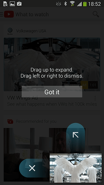
Most product designers and developers build onboarding right into the user interface itself, using UI elements like tooltips, modals and coach marks to guide new visitors through their first experience with the product. Take a look at how YouTube uses coach marks in the example below to explain their new picture-in-picture feature.
2. Emails
Email is a great supplemental onboarding tool that can further educate users about your product’s features and benefits. A common email most companies include in their onboarding process is a welcome email, like the example below that Pandora sends to new users. Welcome emails have 4x the open rate of other types of emails, and are shown to perform even better when they include video. Pandora takes advantage of that information by using short looping videos in their welcome email to add interest and movement to an otherwise static experience.
You can also use email in other strategic ways to enhance your onboarding experience, like reminding new users to access the product during their free trial, digging deeper into product benefits, and sharing social proof to build value. We’ll take another look at some great onboarding emails later in this article.

3. Videos
Video is a great onboarding tool because it replaces dull, verbose copy with compelling, attention-grabbing visuals – something that’s especially critical when you’re trying to communicate important information to a new user. According to our Video Marketing Statistics 2023, 96% of people have watched a video to learn more about a product or service.
Check out this video Airbnb used to onboard customers to their new product offering, Beyond by Airbnb. They could have used web or email copy to explain that Beyond is a full-service hospitality extension to their current brand – but there’s no denying this video evokes more excitement and awe than words could do alone.
Another company that leverages the power of video during the onboarding process is Quickbooks; they embed this video right into the new user dashboard to help first-time customers acclimate to the interface and complete a few introductory actions.
What are the benefits of customer onboarding?
If you’ve had a frustrating initial experience with a product, you know just how disappointing bad onboarding (or a complete lack of onboarding) can be. But beyond that, great onboarding just makes business sense. Here are the main benefits of investing in a killer onboarding process.
Great onboarding improves retention
You only have one chance to make a good first impression, and new users are a hard group to win over. They expect your onboarding process to be simple and easy, and if it isn’t, they aren’t afraid to leave. In fact, 77% of users ditch an app only 72 hours after downloading it. Even then, only 2.6% stick around after 30 days. This means during the onboarding process, it’s key that you not only show a customer how to use your product, but explain the value it delivers as well. In doing so, you’ll decrease churn and improve retention – and ultimately your company’s bottom line.
Onboarding helps users understand your product’s features
Without onboarding, users are left to figure out your product on their own, and it’s likely they’ll glance over features that could add value to their lives. On the other hand, when you use onboarding to walk them through your product’s functionality, you ensure they’re armed with the information they need to make the most of their experience. Consider weaving video into your customer education narrative – especially since 73% of people would rather learn about your product through video than text. For a great example, check out this video Samsung launched to spotlight its security software’s features:
Onboarding can address customer inquiries head-on
Great onboarding can decrease your customer service requests in two ways. First, if you do a great job teaching new customers how to use your product, they’re less likely to have questions down the road. But even more proactively, many companies embed FAQ videos directly into their product or website, saving users the time and hassle of contacting your support team, and thus reducing support queries. In fact, 47% of businesses say using video as an FAQ tool has helped them do just that. We saw a great example from Quickbooks earlier, but this accounting software leader and all-around user experience expert takes video onboarding to the next level. They host a large collection of support videos – like the one below – directly in their product for customers to access anytime, anywhere.
4 examples of kickass onboarding processes
Now that you’ve got the onboarding basics down, let’s take a look at how some great products execute these best practices to build awesome onboarding experiences.
1. Slack
Slack, a popular team messaging platform, is known for its great design and attention to user experience – and their onboarding proves they’re worthy of the accolades. After signing up, the company uses a series of modals and tooltips to explain how to customise the platform to fit your team’s needs.
Notice how they start with a simple welcome message and let users know walking through the product will only take a minute or two, immediately addressing any concerns that learning to use the tool will take too much time.
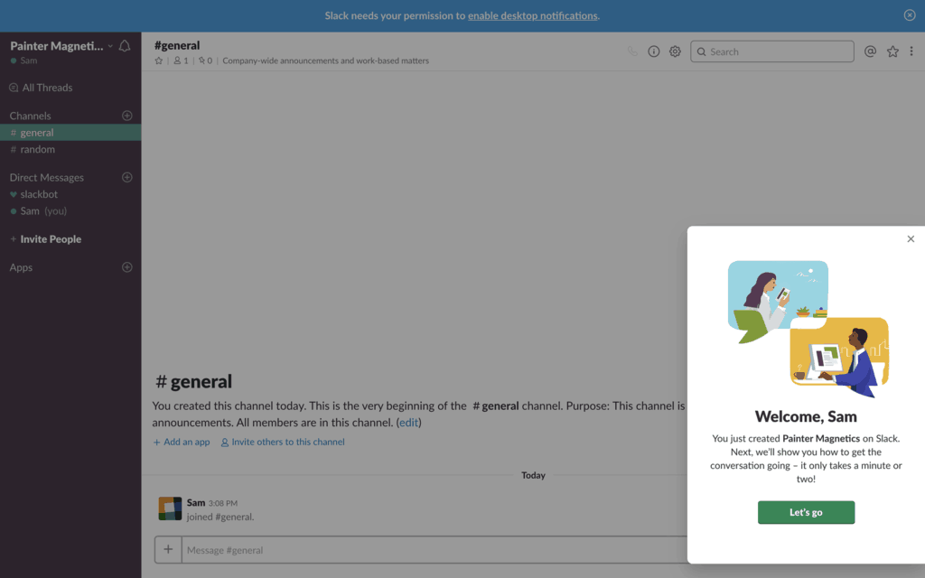
They then walk users through three actions: creating a channel, posting a message and uploading a document, allowing new visitors to quickly feel comfortable getting Slack set up.
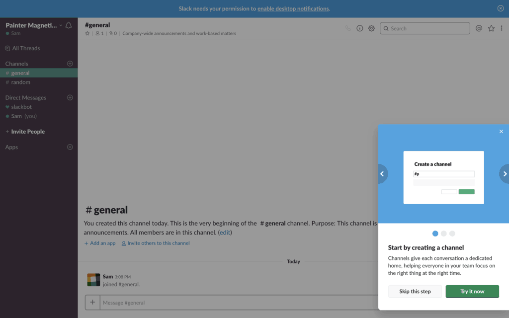
Finally, each action is paired with a tooltip that shows users exactly what to do and where do to it in just a few short sentences.
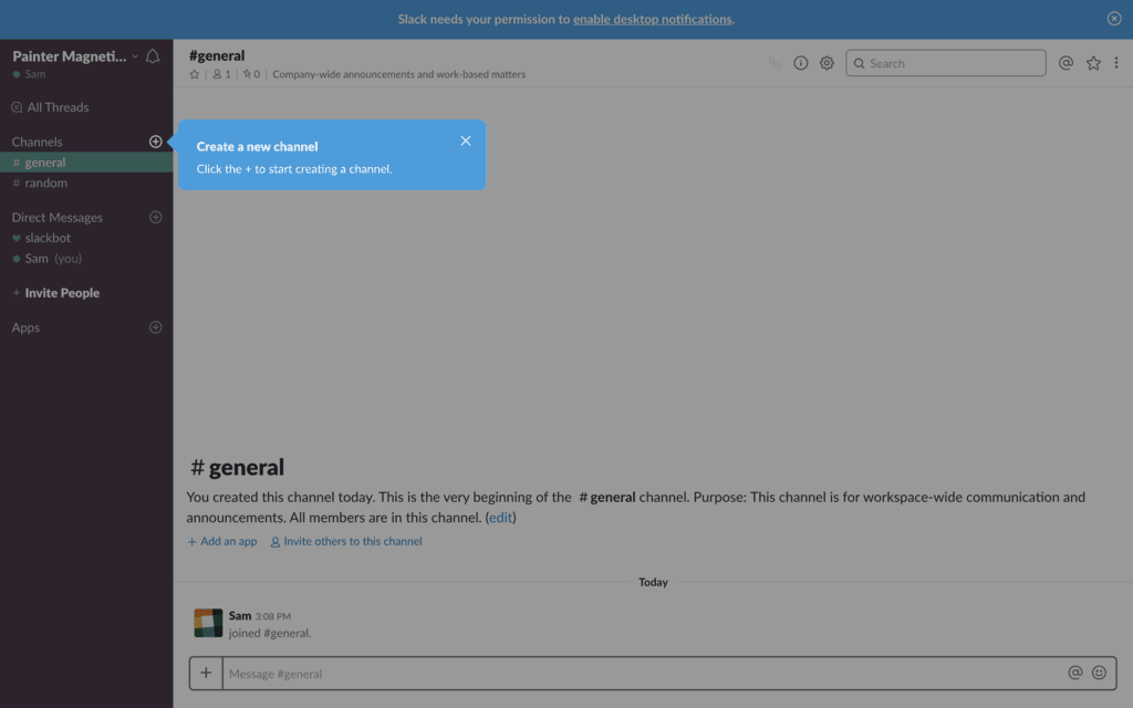
This onboarding process is simple, streamlined and so easy to navigate. We give it two thumbs up.
2. Headspace
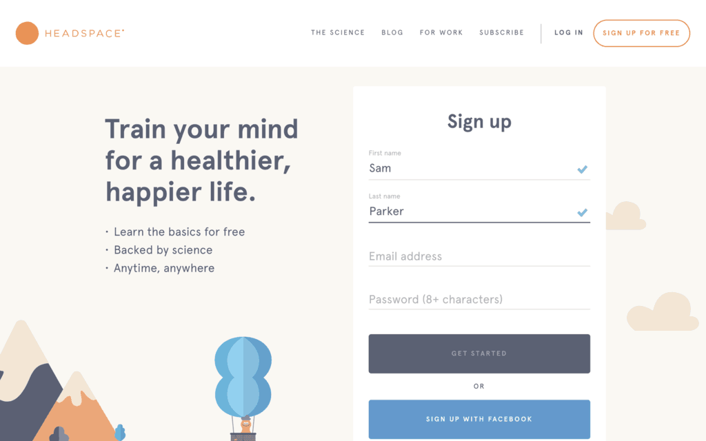
Headspace is a meditation app that guides people through learning to meditate for the first time. Their app helps cultivate feelings of calm and tranquility – and so does their onboarding experience.
It starts off with a simple sign-up form that only asks for the information the company needs, avoiding unnecessary barriers that come from lengthy forms.
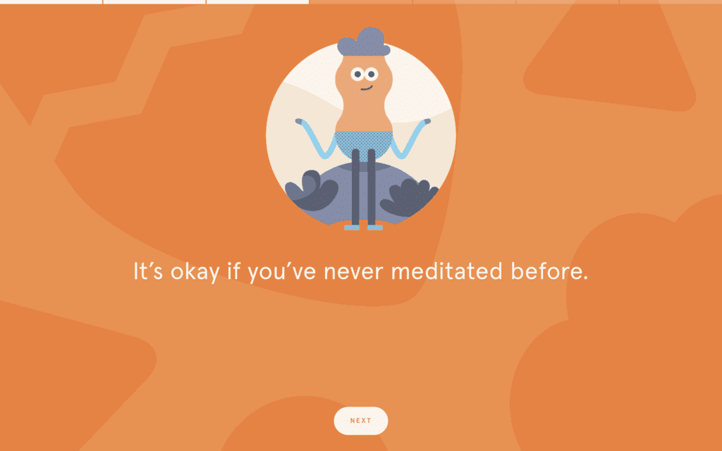
They then use friendly illustrations and easy-to-read text to prepare users for their first meditation. We especially like the progress bar at the top of the screen that gives people a sense of how far along they are in the process.
Headspace’s entire onboarding process is praiseworthy – but our favourite part is their use of video. Instead of drawing out the education process with dozens of screens, they embed a video into the product to quickly run through the basics.
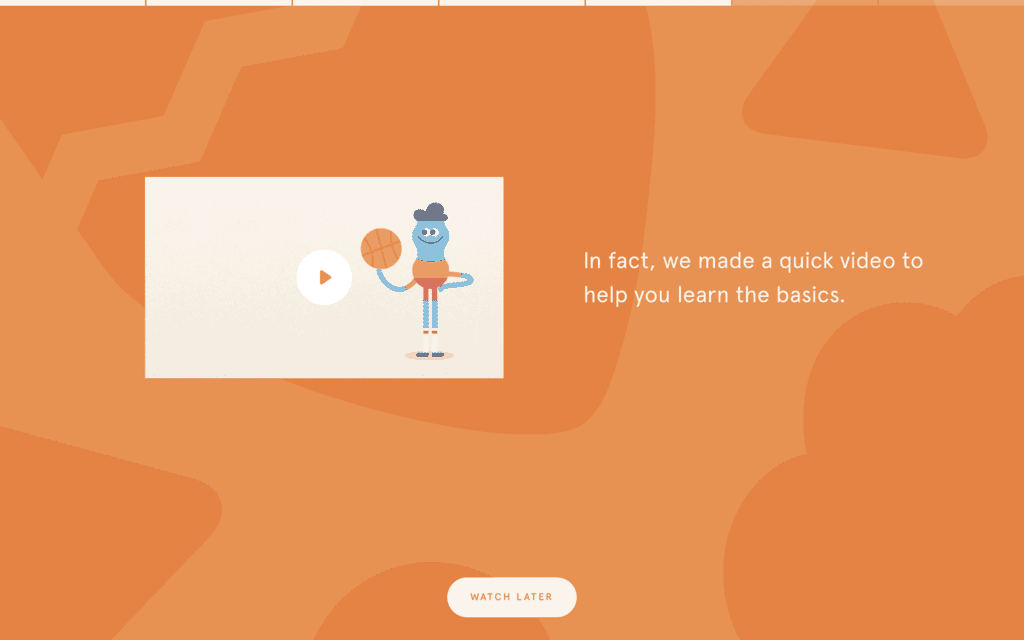
To round out the onboarding experience and improve new user retention, Headspace sends customers an email a couple days after sign-up to remind them to jump back into the product to continue their new meditation practice.
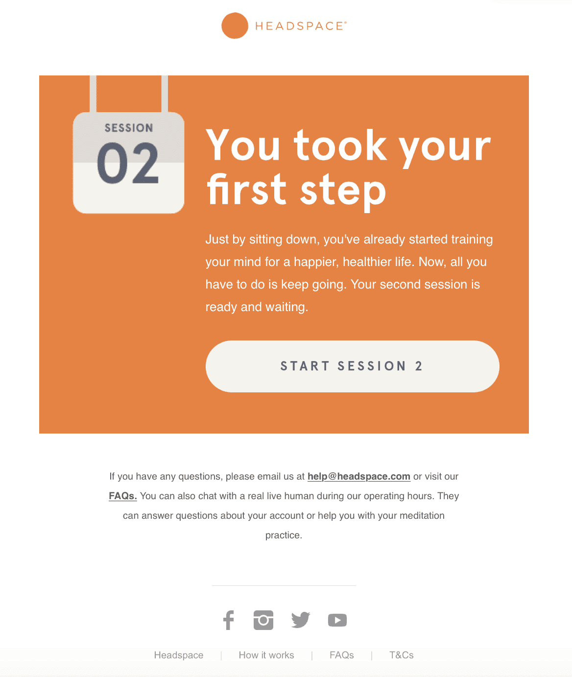
Headspace shows that onboarding can be both educational and packed with character. As you’re strategising your own approach to onboarding, don’t forget to infuse your brand’s personality into the mix.
3. Dropbox
Dropbox has long been recognised as a leader in onboarding; they once added a video to their onboarding experience that resulted in a $24 million increase in revenue. So it was no surprise that their onboarding experience was thoughtful, simple and easy to navigate.
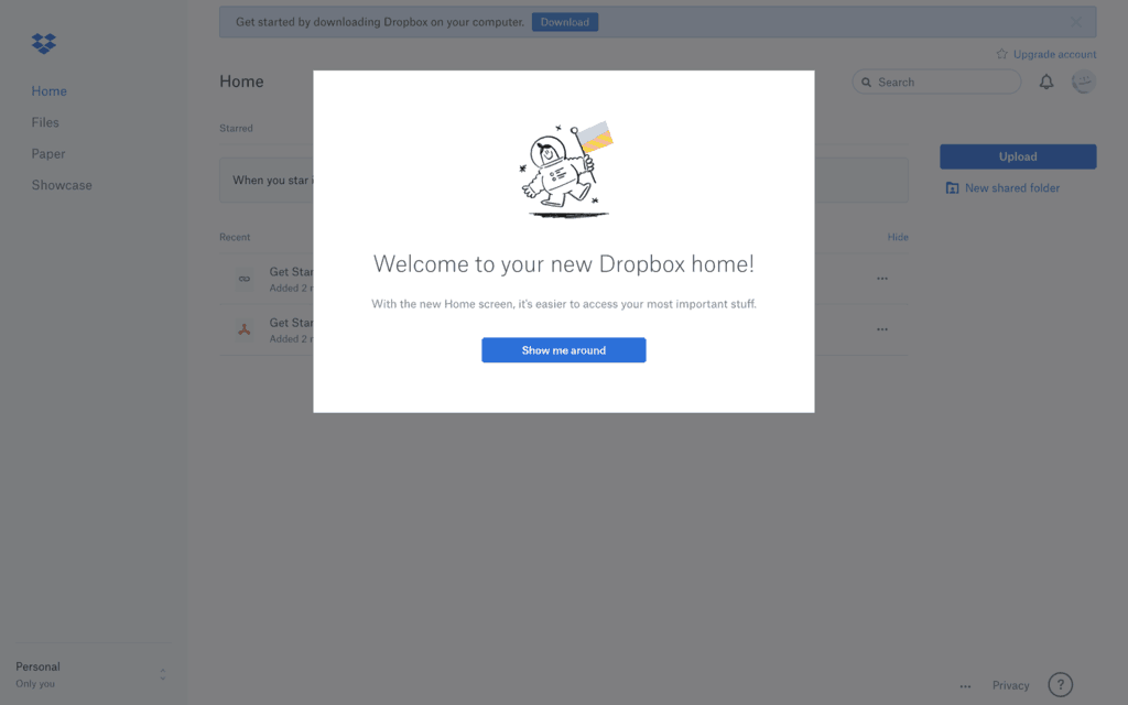
It starts with a fun welcome message and illustration, along with an invitation to take a tour of the product.
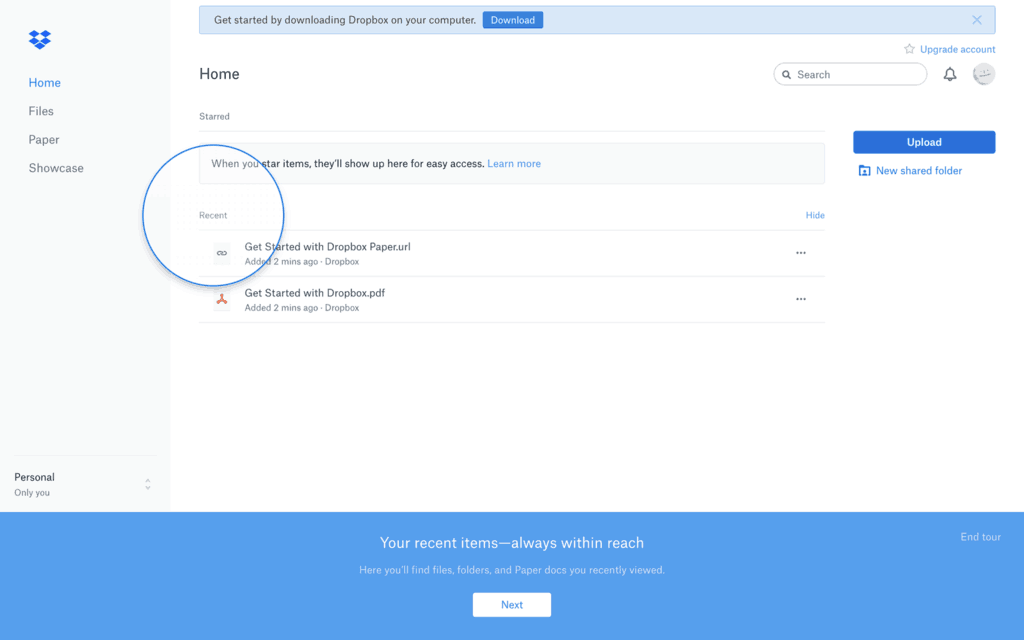
After starting the tour, they use a combination of coach marks and modals to show users how to access product features. Notice how users are able to end the tour at any time, preventing frustration from people who are already familiar with the tool.
Finally, they end the experience by inviting users to explore the tool for themselves. Notice how their modal changes from blue to green to signify the completion of the onboarding process.
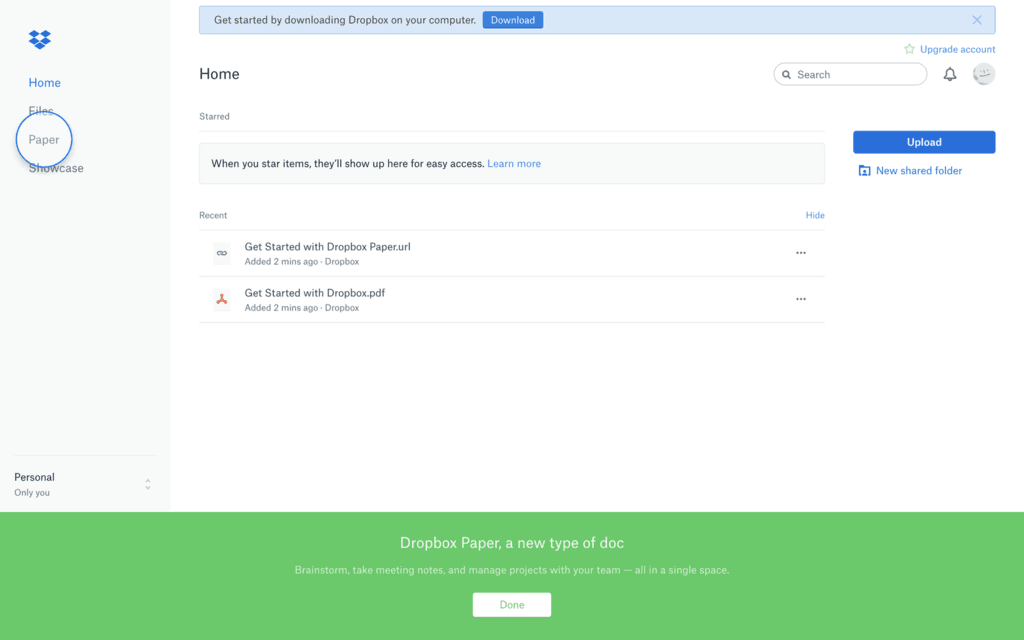
The entire process gives users all the information they need to use Dropbox in about 60 seconds, and it earns an A from our team.
4. Duolingo
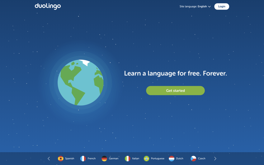
Duolingo is an e-learning platform that teaches users how to speak another language in just a few minutes a day. Unlike other language software, their brand is bright and approachable, so it makes sense that their onboarding process starts with a vibrant visual. Notice how they build value in their copy, using a single yet super-powerful statement to compel people to get started.
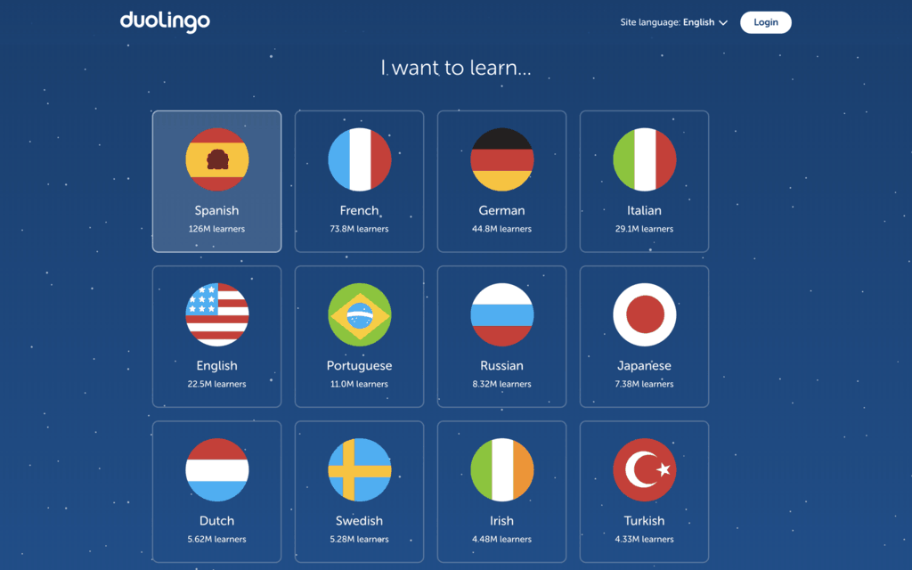
Next, an easy-to-scan chart prompts users to select the language they want to learn. Throughout their process, notice how they couple illustrations with copy to make screens easy to visually absorb.
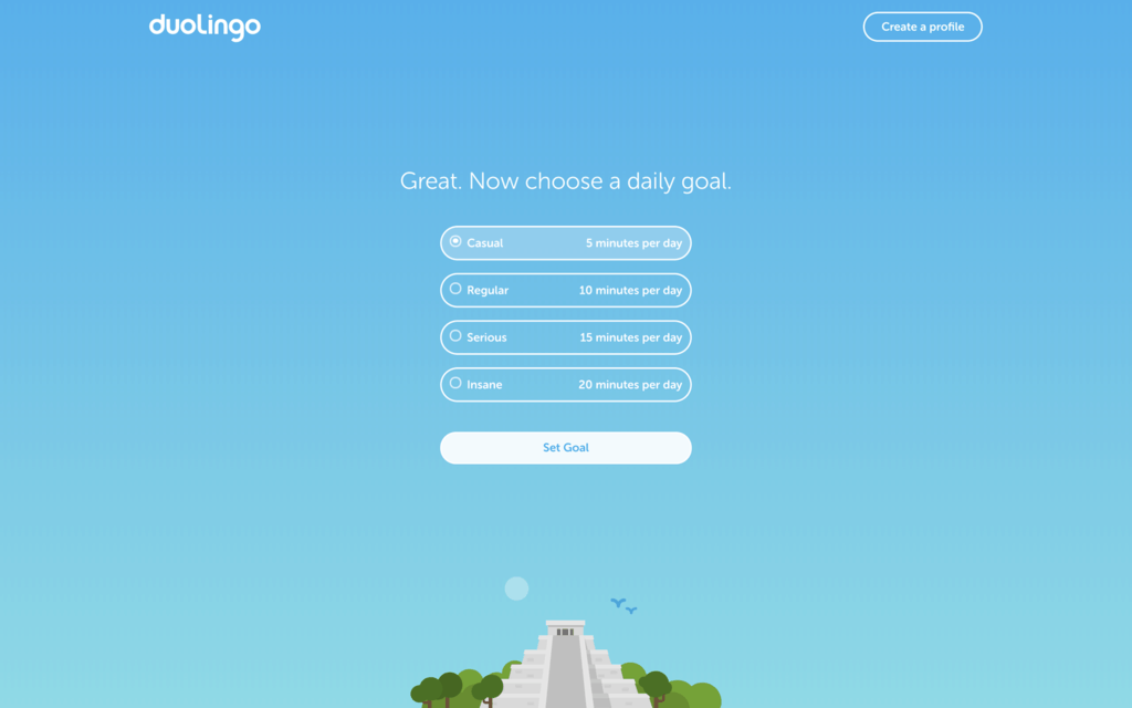
Duolingo then asks users how long they want to practice each day so they can tailor the program to fit their needs.
Finally, users take a simple language test to assess their current knowledge level. Meanwhile, a progress bar lets them know the test won’t take too much of their time.
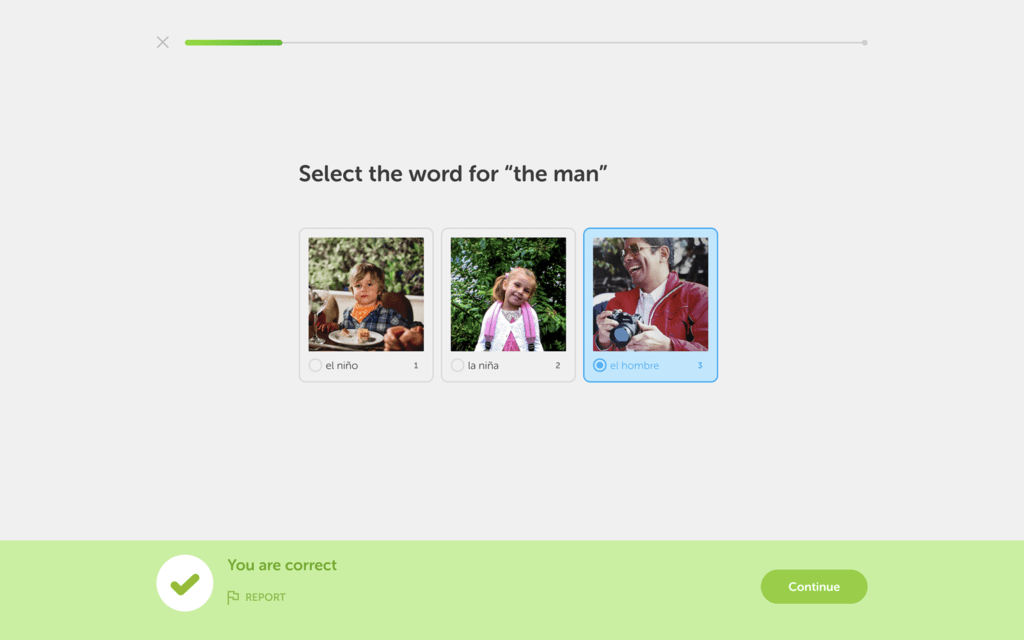
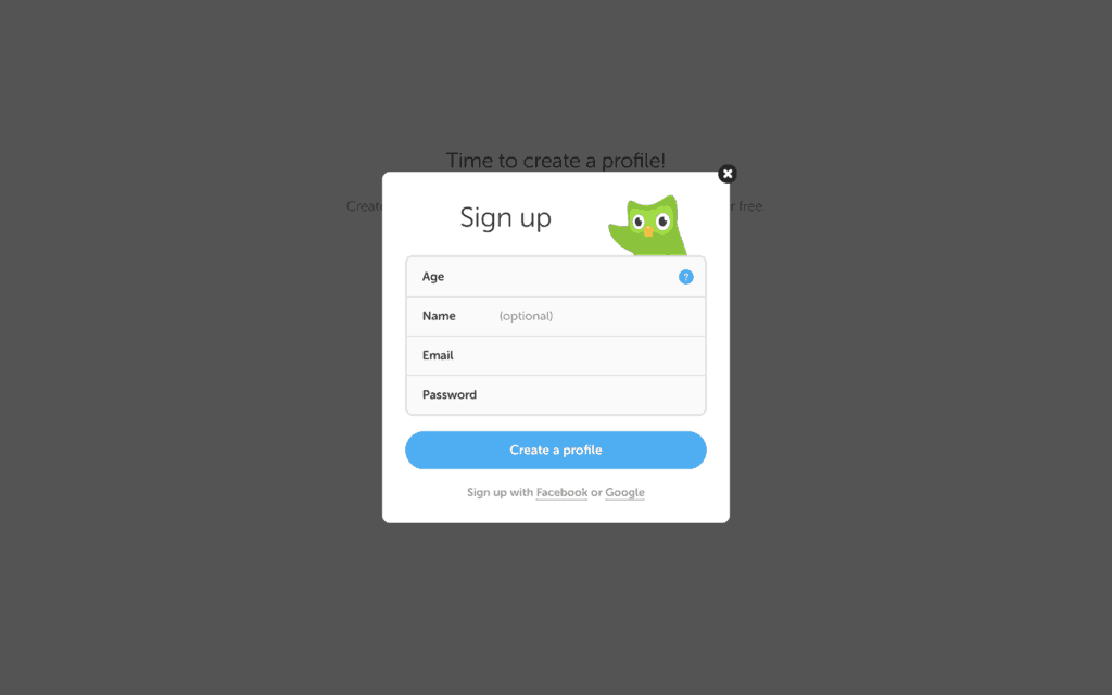
After taking the test, visitors are prompted to create an account. Like all the other great onboarding processes we’ve seen so far, Duolingo opts for a minimal signup form, allowing users to sign up with their Facebook or Google accounts as well.
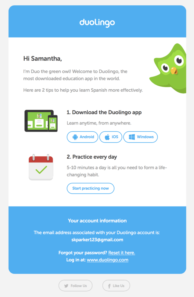
To wrap up the experience, Duolingo sends new users an email with information on how to make the most of the app. We love the email’s use of minimal but punchy copy, bright colors and a numbered list that makes it easy to read in 30 seconds.
From start to finish, Duolingo’s onboarding is clear, uncomplicated and filled with on-brand illustrations and copy. This product is speaking our language; we give it five stars.
5 steps to creating your own customer onboarding process
Now that you’re feeling inspired by the brilliant examples above, you’re probably beginning to think about how to create your own onboarding process. Let this 5-step guide get your creative juices flowing.
1. Define your objectives
Before diving right into tactics, assemble your team and define your ideal onboarding experience. What are the first actions new users want to understand? In the Slack example above, for example, they taught new users how to create a channel, send a message and upload a file. You should also reference your product’s analytics to determine what users are trying to do when they land in your product, and where they’re leaving. Let that data inform your approach.
2. Experience mapping
Now that you’re armed with a vision, break it down into a user experience map. As a team, define how you’ll use the tactics we discussed earlier to onboard users. What in-product UI elements will you use? When will you use email to welcome and educate your customers? How can video add some life and personality to an otherwise boring onboarding process? Map out the user experience to ensure it’s simple, easy to navigate and achieves the objectives you defined in step 1.
3. Content design
Now that you have a high-level plan, your team is ready to execute. Let your product designers and copywriters start coming up with the onboarding content itself. This can include designing new user interfaces and emails, as well as writing email content and video scripts.
4. Content development
After you’ve settled on design and copy, it’s time to bring your onboarding to life. This should involve getting developers in the mix to build your in-product onboarding and emails, and potentially hiring an agency to produce top-notch explainer videos for your new onboarding plan.
5. Performance analysis and iteration
Just like your website or product, onboarding is never “done.” As you implement your new onboarding campaign, keep a close eye on your product’s analytics to ensure your users are taking to the new approach. Keep looking for hiccups in the user journey so you can improve and iterate over time.
3 tools to help you onboard new customers
Equipped with an overview of onboarding and how to create a welcoming experience for your new users, you’re probably already brainstorming what your onboarding could look like – but you don’t have to go it alone. There are plenty of tools available that can make your life easier while also improving the experience for your new users. Here are three of the most popular tools you can use, along with our favourites from each category.
1. Email automation platforms
Having a thoughtful email strategy is critical to the onboarding process, but managing email marketing can easily become a full-time job. Offload some of that work to an email automation platform. With these tools, you can set up recurring emails that get sent automatically when a user takes an action, like signing up or requesting a demo.
Mailchimp
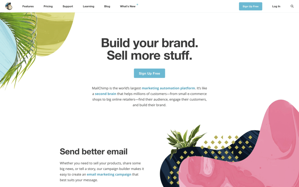
Mailchimp is one of the most popular email marketing platforms in the world. Their robust set of features lets users send automated emails, target customers who viewed your website but didn’t sign up, and even create custom landing pages for marketing campaigns. The best part – Mailchimp has a free plan for customers with 2,000 subscribers or less, so you can test out the platform before committing to a paid plan.
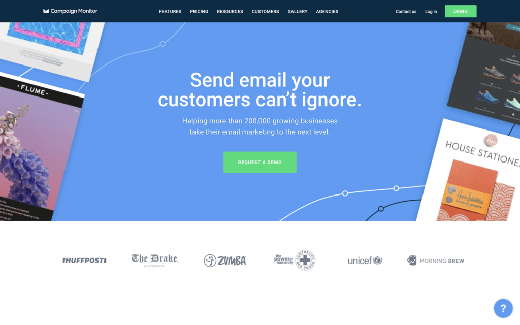
Campaign Monitor
Campaign Monitor, another popular email marketing platform, also lets you send automated emails – but their most impressive feature is their personalised customer journey tool. It allows you to set up a user experience map that branches when users take action, meaning you can serve up relevant content based on each user’s individual choices. They also have a drag-and-drop email builder and hundreds of templates so you can create a highly customised design that matches your existing brand identity.
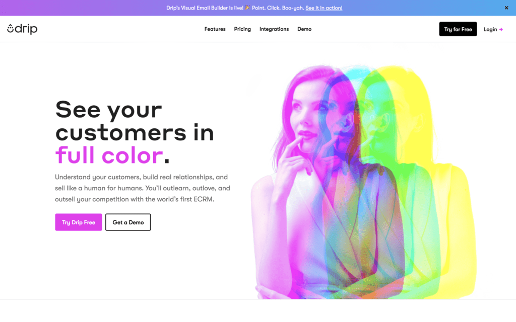
Drip
Drip is part email automation, part CRM, part analytics tool. This unique platform comes with a robust metrics system that tracks conversions on an individual and list-wide level, helping you analyse the effectiveness of your efforts and identify high-quality leads. Drip also boasts an industry-leading deliverability rating, meaning your emails are less likely to end up in a spam or junk folder.
2. In-app messengers
Sending users messages while they’re in your product is a great way to guide them through the onboarding process, answer common questions and introduce them to your best features. Check out these popular tools that let you setup in-app messaging on your website or product in just a few hours.
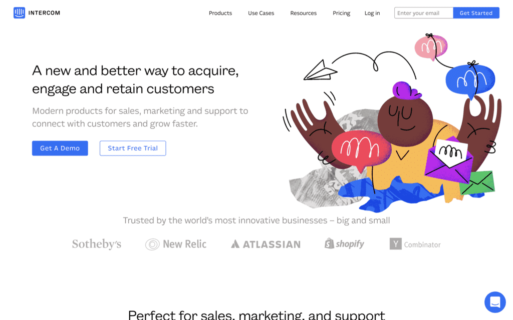
Intercom
Intercom offers users a wide range of marketing automation features, but one of the most impressive is their in-app messaging. With Intercom, you can send one-off or automated in-app messages to guide new users through their first product experience. We specifically love Intercom because their messaging platform supports rich media; your notifications can include text, images, buttons and even video to create a more dynamic experience for your new users.
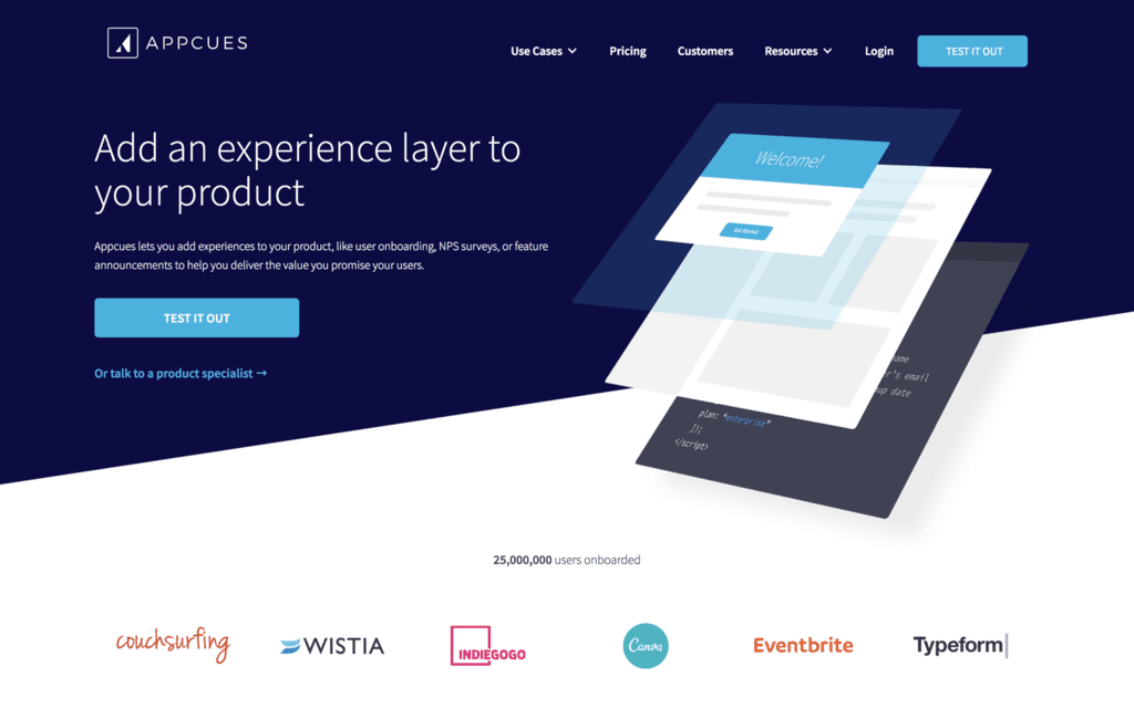
Appcues
Appcues is a product designed specifically for product onboarding. Their platform lets you integrate in-app messages and product walkthroughs into your new user experience without a single line of code, overcoming the time- and resource-expensive builds that usually come with programming an onboarding experience. As an added bonus, Appcues also comes with a built-in analytics and A/B testing feature, letting you easily iterate and refine your onboarding process over time.
WalkMe
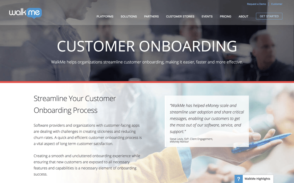
WalkMe is digital adoption platform that’s designed specifically to engage new customers and guide them to take action. While their in-app messaging is sleek and simple to use, the tool also comes with other onboarding features like walkthroughs, live chat and surveys. If you’re looking for an all-in-one onboarding solution, this might be the tool for you.
3. AI chatbots
As artificial intelligence continues to advance, many product marketers are taking advantage of powerful chatbots that are around 24/7 to answer customer inquiries. Not only are chatbots a smart way to immediately engage with customers as their needs arise, but they’re also a cost-saving opportunity; chatbots can help lower the cost of expensive customer service and support teams, and allow your human resources to refocus their efforts on more innovative, creative work. Give your new customers round-the-clock access to the information they need with one of these popular chatbots.
Drift
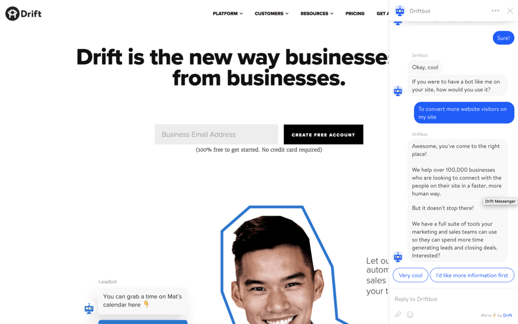
Drift’s chatbot – Driftbot – comes with several features that can improve your onboarding process. When new users land on your website, Driftbot administers a series of questions that qualify leads; this feature not only creates a more engaging customer interaction than filling out a long form, but it arms your sales team with lead data they can reference during a product demonstration. Speaking of demos, Driftbot makes that easy too; the bot syncs with sales team members’ calendars so new users can schedule a demo in a matter of seconds.
LiveChat
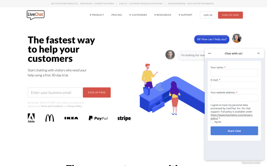
LiveChat is an advanced chatbot that solves 8 out of 10 customer inquiries on the spot – talk about ROI. This bot is highly customisable; not only can you program your own greetings and responses, but you can tailor the chat window to match your brand exactly. What we love the most is customers can rate a chat with a thumbs-up or thumbs-down at any time, helping you address issues and improve the chat experience over time.
Olark
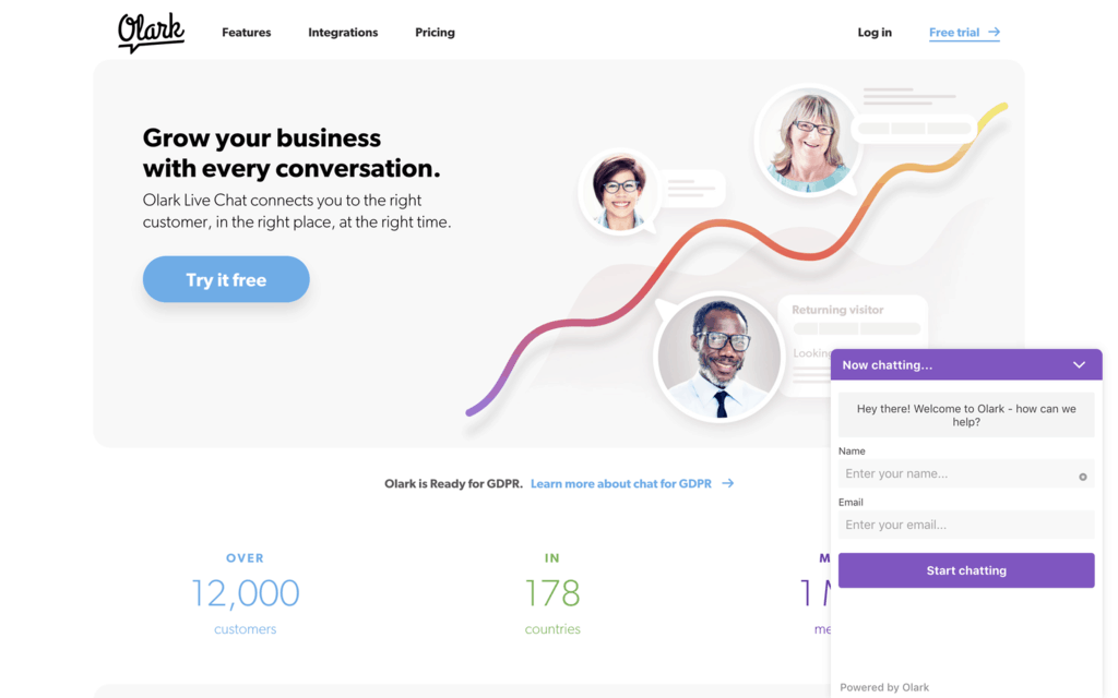
If you’re not quite ready to venture into the world of bots, you might be interested in Olark. Olark is a chatbox that connects your customers with your customer service team instantly. It allows you to enter canned responses that your service reps can click and send in seconds, but keeps a human connected to address any serious or abnormal questions that arise.
Learn more about customer onboarding
As you set out to bring your own onboarding process to life, use the tips and tricks in this post to inspire your journey. For a more in-depth guide, check out The Ultimate Guide to Onboarding Users with Video, where we share even more pointers and dozens of creative onboarding examples to get your process started.


