Last updated on 9th February 2024
It’s one of those words that says so much. ‘Onboarding’: it goes much deeper than ‘orientation’ or ‘induction.’
It’s not just about pointing customers in the right direction, or giving them a cursory introduction to your product or service. It’s about bringing them ‘on board’ – ready to sail, if you’ll excuse the horrendously cheesy line, on a mutual journey, towards a shared destination.
There are many reasons why onboarding has become such a hot topic in the last decade. Perhaps most importantly, customer expectations have increased. Customers don’t expect to have to work things out for themselves. They expect the same level of support and service post-sale as they had while they were making their mind up.
And it all means that companies are investing heavily in onboarding.
Unfortunately, the data suggests they aren’t going far enough…
It’s pretty clear, then: whatever you’re doing to welcome and onboard your new customers – there’s always room to do more!
Why email?
Email is, quite simply, a phenomenal tool for powerful user onboarding at scale. It’s right up there with the best. There are a few reasons for this.
2. It’s direct – straight into the recipients’ mailbox.
3. It can be automated. You can create powerful onboarding email workflows then simply sit back and let them work their magic. Each new sign up or purchase can trigger these emails, meaning the ongoing input is minimal – but the support you’re giving to your customers is comprehensive and long-lasting.
But what does a great onboarding email look like? Well, we’re glad you asked! In this article, we’ve compiled 33 of our absolute favourites, from brands (big and small) across all kinds of different niches.
Let’s dive into them, and take a look at what exactly makes them so great…
1. Crello
Crello is a free graphic design software that lets you create your own designs, posts, covers and animations. It’s aimed at novices, offering the promise to ‘Create like a pro’ with ‘No design skills needed.’ They’re really hot on email, with a regular flow of helpful content to their users’ inboxes, and that starts right from the beginning. This email – ‘From newbie to pro in 2 minutes’ – features a huge amount of value – including a tremendous 79 second video that walks the user through creating their first design.

2. Bulb
Bulb – the UK’s biggest green energy supplier – is really shaking things up in the industry. They provide members with renewable electricity from solar, wind and hydro, and also provide gas that’s 100% carbon neutral.
Part of the ‘new’ model of providing energy is that the customer is able to submit their own meter readings online. This is a crucial step to get up and running – and that’s made perfectly clear within this email.

3. Filmsupply
Filmsupply.com is a platform to help people find premium stock footage for their video projects.

4. Project.co
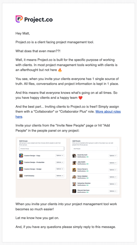
Ok, full disclosure – Project.co is our project management system we built to manage our production process. But we’ve included it here because this is an approach to onboarding we have found to be pretty effective.
When somebody signs up to use our system, they go into an onboarding flow which lasts for the duration of our 14-day free trial.
The onboarding emails are dedicated to explaining the tool’s benefits to users, as well as showcasing particular features that they might want to know about. The idea is that by going through this series – a sort of mini email training camp – the user will be totally set up for success using the tool, optimising retention and engagement.
5. Squarespace
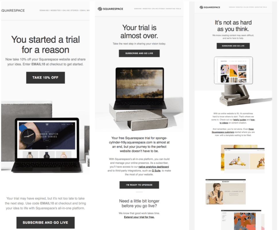
Squarespace is an all-in-one website builder targeted mainly towards photographers, restaurants, musicians, small businesses, fashion designers and artists. It’s very much designed with ease-of-use at its core, so that people with little or no experience are able to create highly professional websites.
6. Flock
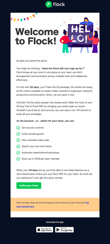
Flock is a team messenger and online collaboration platform that offers a range of communication tools for business teams. Part of their positioning is that they offer a free 30 day trial. When you sign up for this, you receive the below email, welcoming you aboard and giving you a flavour of the things you can do with the platform.
7. Dorsia
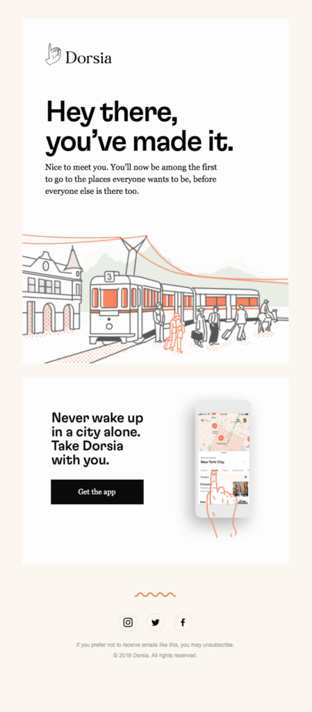
Dorsia is a travel guide for ‘untourists’ – people who like travel, but avoid trendy, popular destinations with big crowds. Like any brand that markets to such a specific type of audience, there’s a real sense of ‘lifestyle brand’ to Dorsia, of belonging to a group that doesn’t follow the flock. Signing up to Dorsia, you receive a welcome email that really sums that up.
8. Glitch
Glitch is a community where you can build (and find) cool apps and websites. This is the email you get when you sign up to join that community!

9. Havenly
Havenly is an online interior design tool for ‘real people.’ The tool connects you with an interior designer so you can collaborate and bring your home vision to life.
This is a really process-driven business model, and the first thing Havenly do after sign-up is send an email that lays out that process, making sure people understand it – and have the knowledge they need to begin when they are ready!

10. Peloton
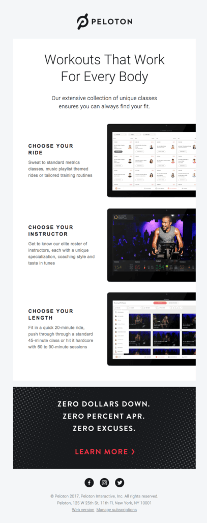
Peloton is a unique mix of physical product and online subscription – with a static exercise bike, which connects to an online service offering live studio cycling in the comfort of your own home. In simple terms, you can do a gym-level spin class from wherever you have room to store the bike.
11. Typeform
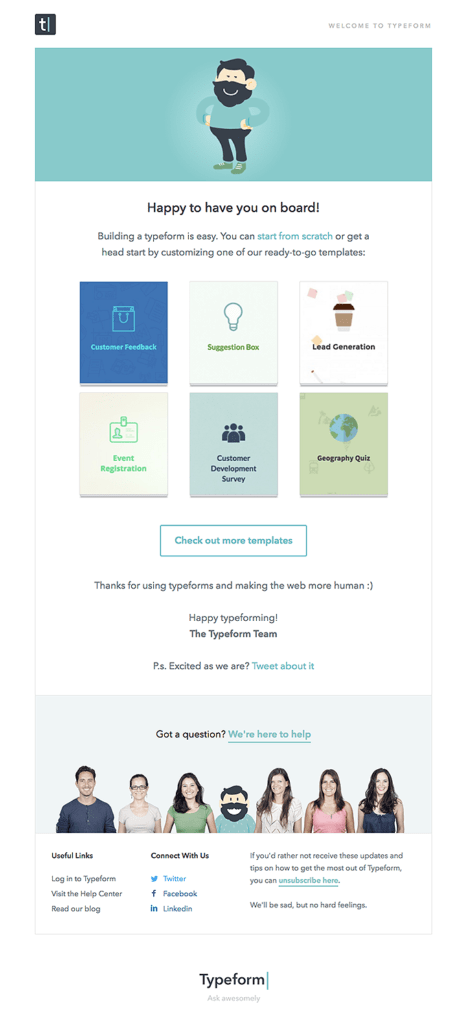
Typeform is an online tool that helps people create interactive experiences for their websites such as online form building and surveys. The below email, offering a warm welcome after sign up, goes to everybody who creates a new account.
12. Tinder
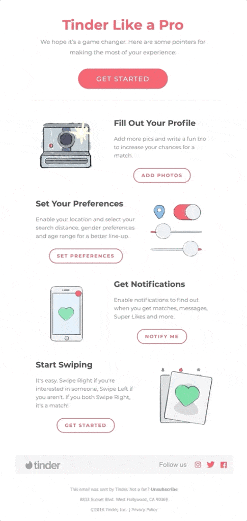
Tinder is the world’s most popular online dating app, with 75 million monthly active users. It allows users to create a profile – then anonymously swipe to like or dislike other profiles based on their photos, a small bio, and their interests. This email is designed to help new users get the best possible experience, and build their knowledge of how to use the app.
13. Amazon Alexa
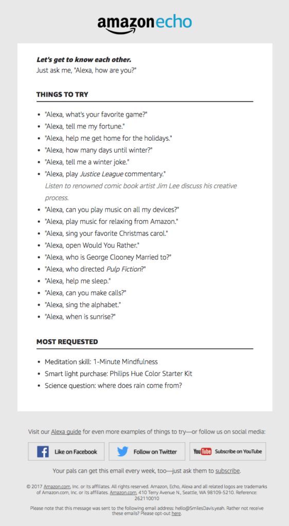
Alexa is Amazon’s voice assistant – the secret sauce behind the Echo and Echo Dot speakers, as well as a variety of other voice-enabled Amazon products. This email – ‘Let’s get to know each other’ – is all about giving new users an understanding of Alexa’s true capabilities.
14. Curiosity
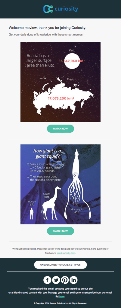
They say every day’s a school day, and the guys at Curiosity certainly seem to agree. Curiosity.com is a repository of cool and inspirational articles and videos, designed to help you learn something every day.
15. Bellroy
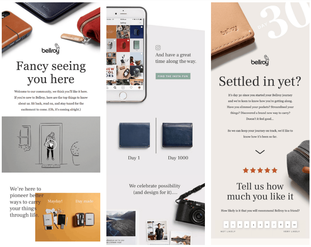
Bellroy is an Australian accessories brand which specialises in carry goods such as bags, folios, wallets, pouches, phone cases and key covers. As you can tell from the veritable feast of screenshots below, they are huge on email – but it’s not just quantity, it’s quality too.
Each of these emails offers a huge amount of value and info about the Bellroy brand and products, with plenty of signposts and calls-to-action designed not just to sell products but to inspire, encourage and educate the reader. If the basic smell test is: ‘Would I be happy to receive this in my own inbox?’ then Bellroy passes with flying colours.
16. Suiteness
Suiteness is an online booking platform that lets people book connecting (adjoining) suites and hotel rooms. This is particularly useful for groups who want to travel together and stay connected.

17. Uber
Unless you’ve been living under a rock, you probably know that Uber is a multinational ride-hailing app offering peer-to-peer ride sharing, ride service hailing and food delivery!
During the Uber signup process, you’re asked whether you want to drive or ride…and the onboarding material you receive varies depending on the option you choose.
This email was sent to a recipient who signed up to ‘ride’ in the Chicago area.

18. Upwork
Upwork is an online platform that connects businesses to freelancers and agencies. Both these parties can sign up for an account through Upwork to either pitch for jobs – or find people/teams to work on projects on a flexible, ad-hoc basis.
The email below is sent out to help out a new user connect with someone to collaborate on their first project.
As we’ve seen in other examples, the instructions are short, clear and succinct – there’s no space wasted on unnecessary details. It’s a simple, 3-step process to help someone place their job. The messaging is inherently positive and optimistic – “This is going to be great,” – and it also concentrates on highlighting just how easy and seamless the process actually is. Finally, best of all, at the bottom of the email, we see a link to an explainer video that shows the reader how it all works.

19. Printful
Printful is a SaaS tool that lets you create and sell custom products online. They use print-on-demand dropshipping to print orders…well, on demand! You simply add your designs and artwork, determine which of their range of approved products the artwork will appear on, set your pricing, and add them to your store.
You can add Printful to your store in a variety of ways, including integrations and APIs – the below email is sent out when you integrate through Shopify.

20. Shopify/Oberlo
Shopify is the world’s most popular eCommerce platform, giving individuals, SMB’s and larger businesses everything they need to sell stuff online.
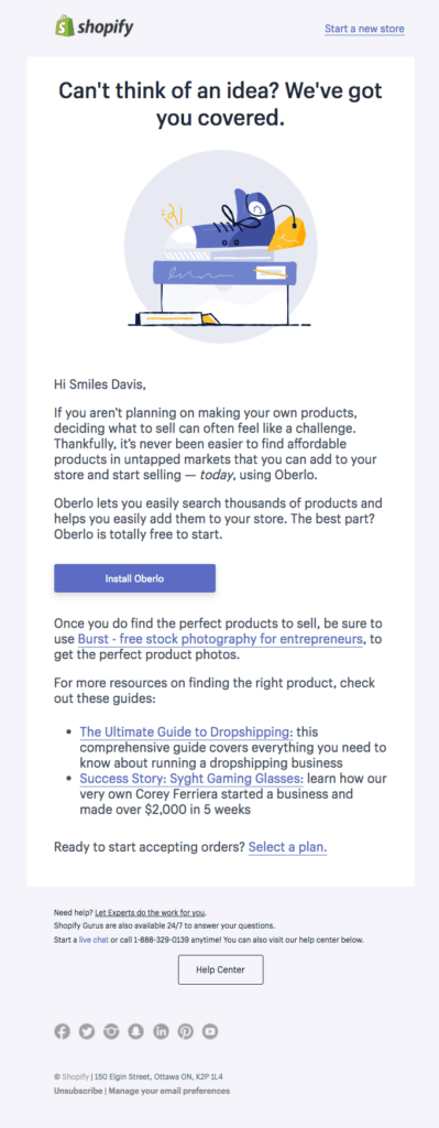
Shopify comes with a free 14-day trial, which a lot of people sign up for simply to take a look at the system. At this point, they might have no real product to sell – they’re simply in the exploratory phase.
And that’s where this email comes in! Calling out directly to people who ‘can’t think of an idea’ it offers the option to install Oberlo – a drop-shipping tool that lets you add products to your Shopify store in a matter of seconds, ready to sell.
What’s great about this email is that it turns a negative into a positive. Can’t think of an idea for a product to sell? No problem – give Oberlo a blast.
21. Jet
Jet is a sort of online department store, with a curated assortment of local and leading brands to shop in one place. They push shoppers towards the Jet newsletter as a way to get all the latest news and offers.
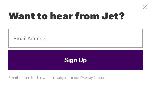
After signing up, the below email lands in your inbox as a welcome message.

What we love about it:
22. SanityCheck
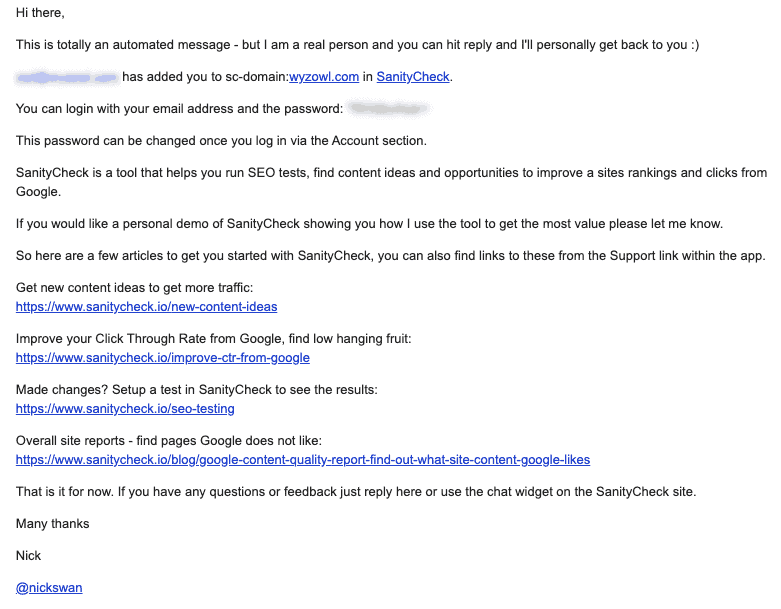
Ok, so all the examples we’ve looked at so far have been beautifully designed. But what if you could onboard effectively just with plain text? SanityCheck is a SaaS platform that gives you more value from the data available through Google Analytics.
The below email is one you receive after someone adds you to the account. It’s a plain text email that doesn’t look particularly impressive, but, weirdly, that helps it cut through the noise a little.
23. Headspace
Headspace is a mental health app that specialises in mindfulness, meditation and sleep improvement. It’s a hugely popular app, with an estimated 65 million downloads worldwide. It’s also a freemium app which gives away some content for free, but offers premium subscriptions for £9.99/month or £49.99/year.
As always with apps that have a lot of ‘buzz’ around them, a lot of people will download the app to take a look – and then take no further action. This makes onboarding really important, as it can make the difference between an ongoing user and immediate churn.

24. Mailchimp
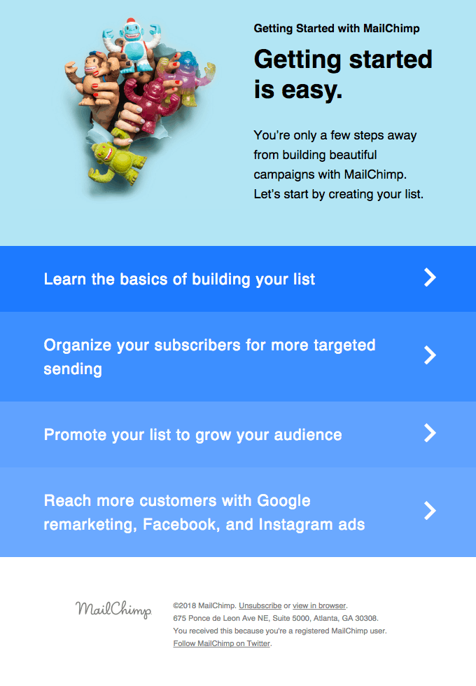
Mailchimp is an all in one marketing platform to manage email, ads, landing pages and CRM. As a highly complex, multifaceted SaaS platform, an ongoing issue is likely to be that the audience struggles to get up and running.
25. Booz Allen
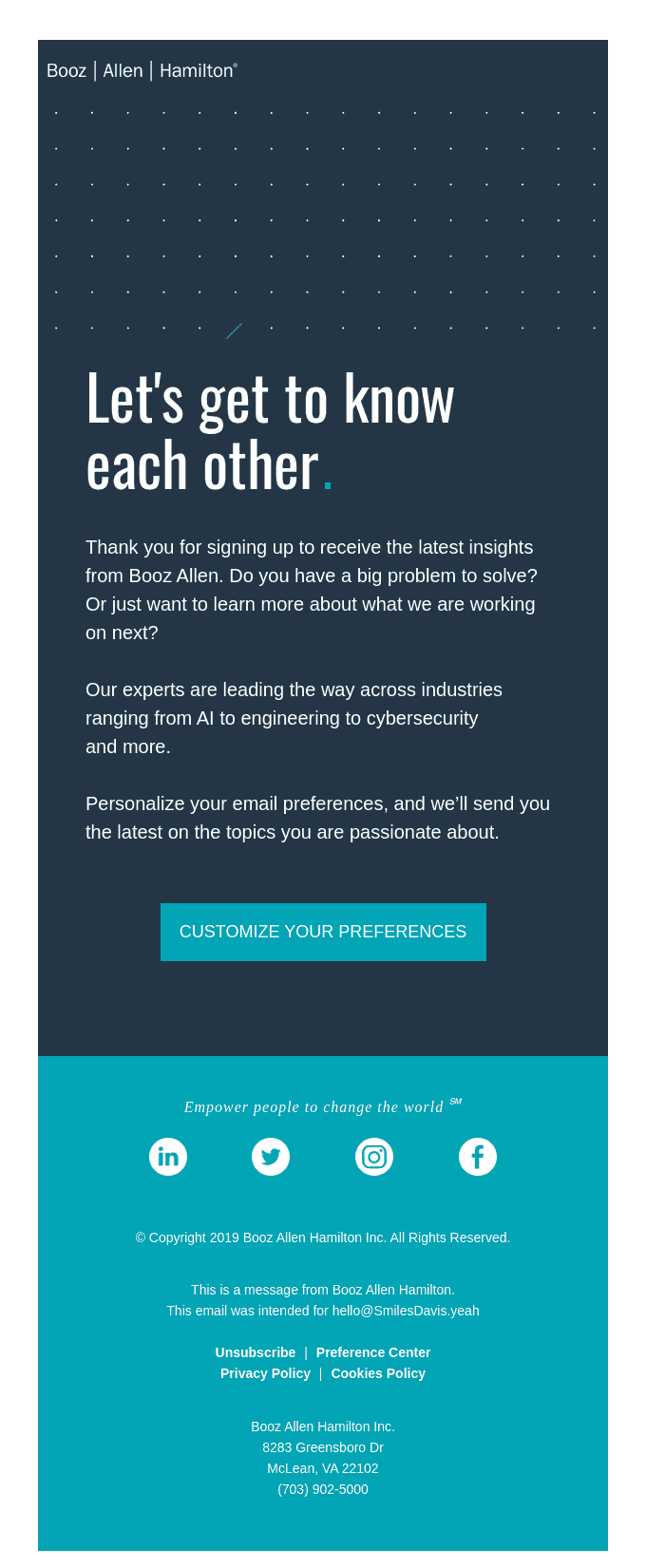
Booz Allen is a management and IT consulting firm, also offering analytics and digital solutions. All sounds a little complicated – but with more than 100+ years of experience, they’re certainly doing something right!
26. nDash.co
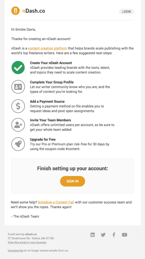
nDash is a content creation platform that’s used by some huge brands including LinkedIn, Hitachi and HubSpot. This is the email that’s sent out when you create an account on their system.
27. Refind
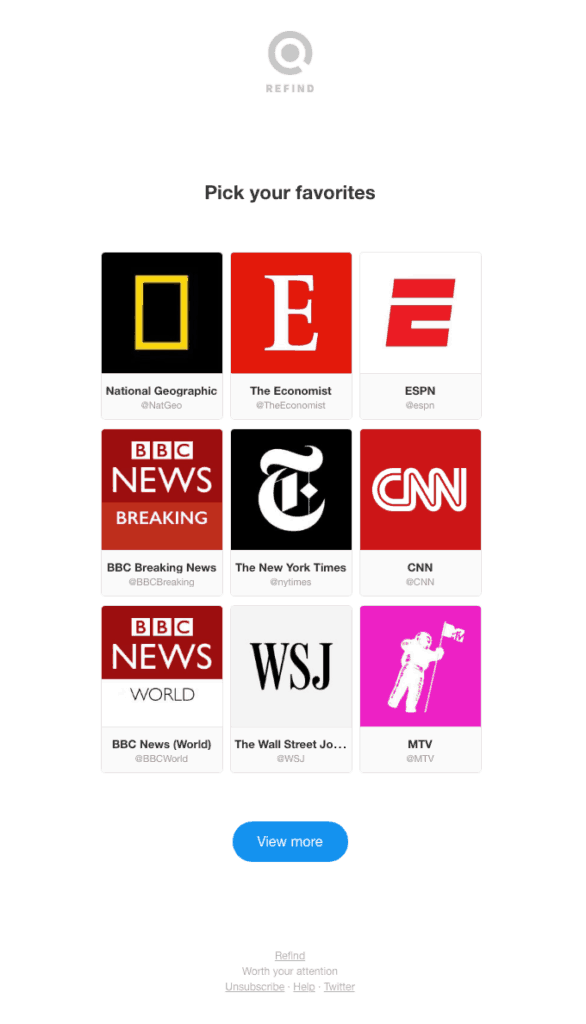
Refind is a content curation platform that lets you build a sort of reading list based on your favourite topics, websites and influencers. Each day you get a compiled list of articles to read – a great advantage in a world with so much noise to filter through!
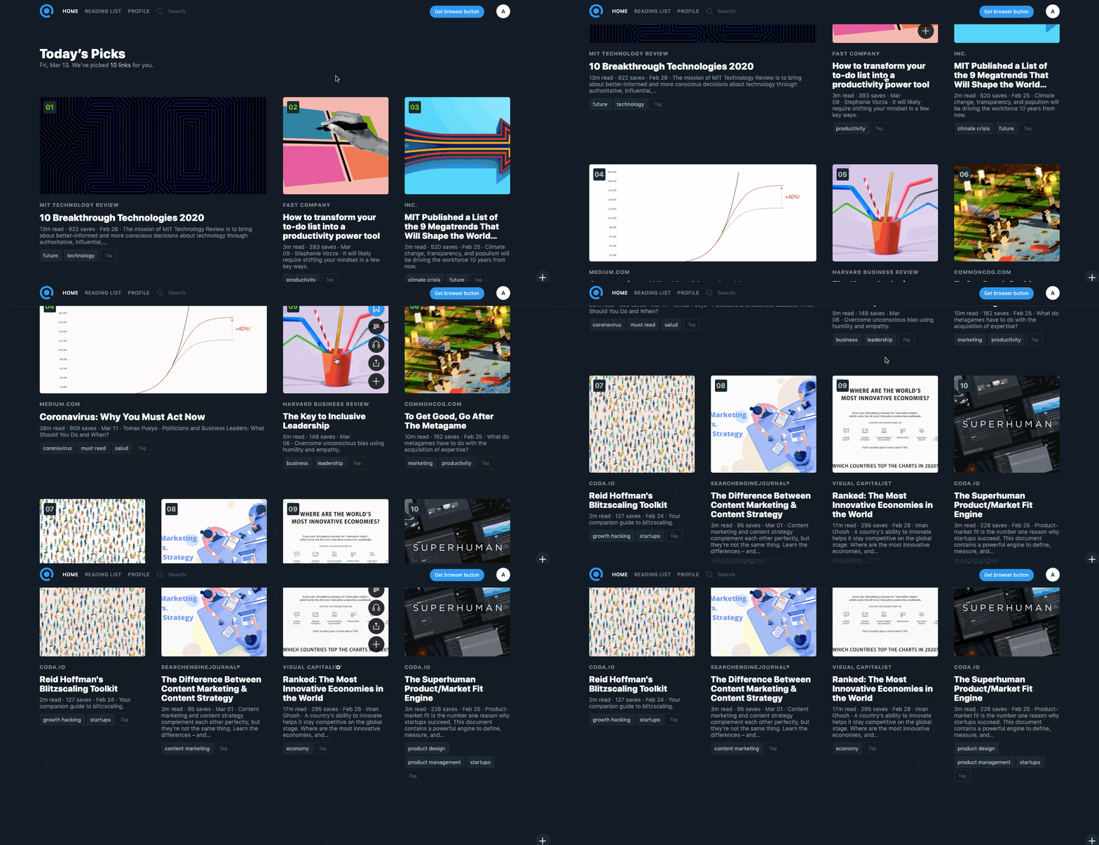
Your interests are specified during the sign up process – but what if you don’t specify them? That’s where this email comes in…
28. Square
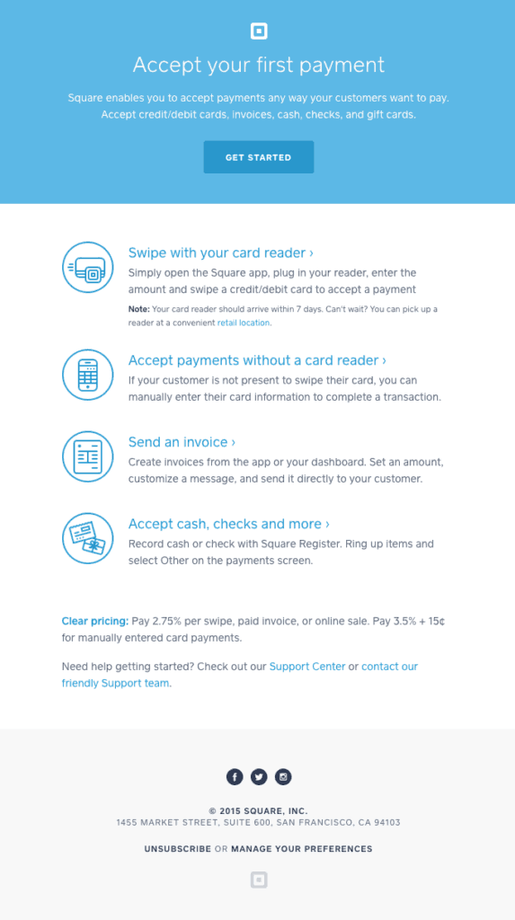
Square is a credit card processing solution that helps businesses get paid! This email is designed to help people accept their first payment – again with a multi-step process.
29. Findmypast
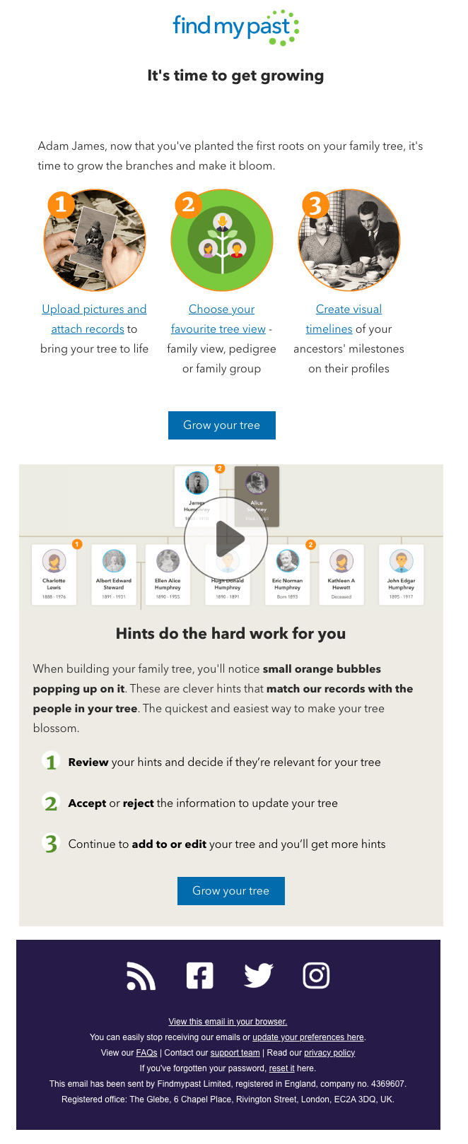
Findmypast is an online family history tool that lets you build and explore your family tree. Like so many of the SaaS tools we’ve looked at in this article, they offer a free 14-day trial, graduating to a paid monthly or annual subscription model after that time has passed.
Signing up for an account is really quick and simple – but the real value behind Findmypast is in what the tool can do in terms of unearthing family history. It’s also where things can get complicated – Findmypast is home to a staggering 4 billion searchable records. That sort of thing can quickly get overwhelming. And – when you’ve got users who haven’t paid yet – there’s always a chance that they’ll be overwhelmed to the point of cancelling their subscription.
Findmypast is therefore huge on onboarding – getting people to make that first bit of progress that demonstrates the value of the product and hopefully makes them more likely to keep using it!
30. Apple
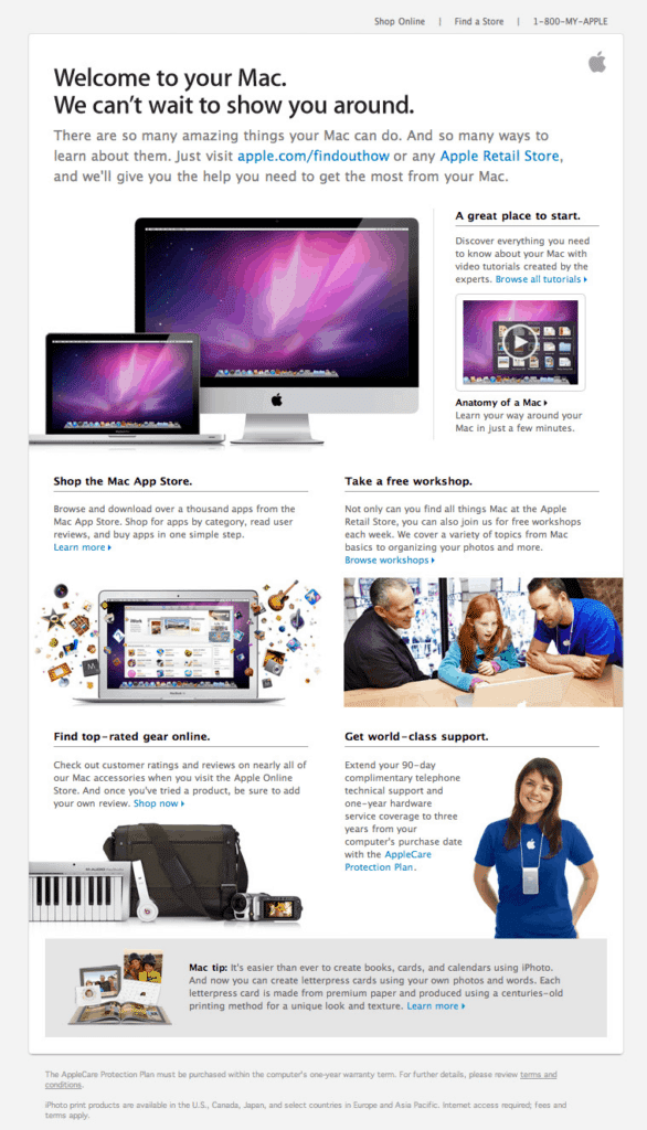
Of course, Apple does a lot right when it comes to marketing – and onboarding is no exception. There are countless examples we could choose here, but we’ve particularly chosen to include the two below. One of these is a product tour for a newly bought Mac – getting the user familiar with what it can do. The other is an introduction to the App Store, which is sent to new Apple users upon registering a new device.
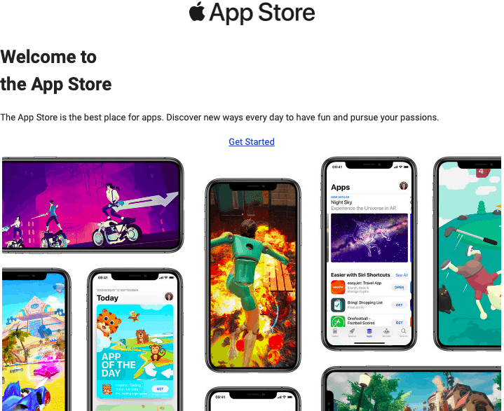
31. Casper
Casper is a British company that sells highly engineered mattresses and sleep products. Instead of a newsletter, they send a Snooze Letter – which, as well as being a fun play on words, is also a great description of a very interesting and powerful onboarding technique!

32. Magic Spoon
Magic Spoon is a keto-friendly low-carb cereal brand, offering ‘childlike cereal for adults.’ When you sign up for email alerts, you get a great welcome email, including a discount code for free shipping on your first order.

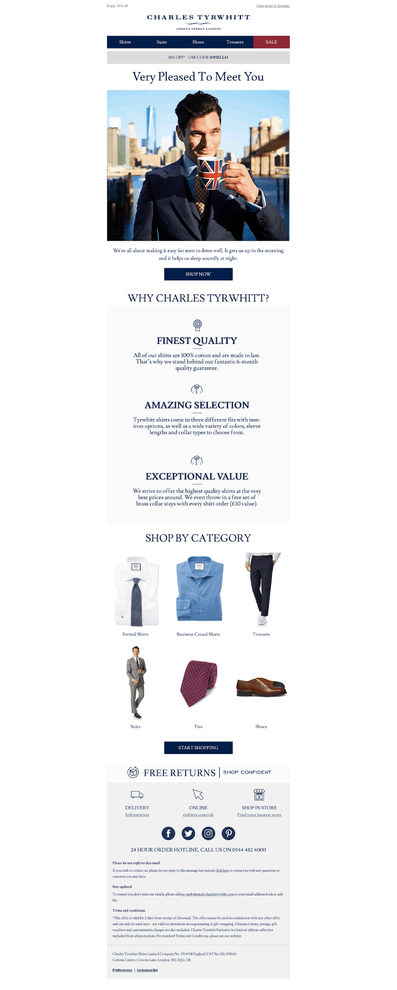
33. Charles Tyrwhitt
Charles Tyrwhitt is a men’s clothing retailer specialising in dress shirts, ties, suits, casualwear, shoes and accessories. Shoppers who sign up to receive an email newsletter from the company get the welcome email below – which gives a great intro to the brand.
Thanks for reading!
Ok, so that’s a lot of examples, with a lot of potential takeaways.
To wrap up the article, let’s take a look through the consistencies – the common trends and patterns that separate the ‘meh’ from the ‘amazing’ when it comes to onboarding, and summarise them in a series of top tips.
Show interest in your audience: it’s not quite as common throughout the list, but something that’s really impressive in some of these examples is the commitment to finding out more about the reader to help better serve them. Onboarding is often a two-way street, so remember to encourage feedback and insights from your audience, too.
Less is more: what comes across time and time again is that the best examples are simple and concise. Writing a 1,000 word email simply isn’t going to work here. People will scroll their email for seconds at a time rather than minutes, so you need to grab their attention by highlighting the value of the email and their next step quickly and powerfully.
It’s a marathon not a sprint. Similarly, don’t assume that you need to hammer home every message in one email. Onboarding isn’t a moment, it’s a process. A series of shorter emails is much better than one long barrage of information!
Clear signposting. You might have noticed that, in each example here, we see multiple calls to action. This is a great way to make sure wherever people are up to in the process, whatever their pain point, there’s something for them to read, someone for them to speak to, or something for them to do.
Video is the secret ingredient. Finally – the examples that use video really stand out. This is significant, since our data reveals that – when asked how they feel companies could improve re. onboarding – 69% of people say that they feel more video should be used.
What do you think of the examples we’ve shared? Have you received any onboarding emails that really impressed you?


