Last updated on 24th November 2023
Ever since the first video was posted to YouTube in 2005, the site has been constantly ballooning in size, and so has the world’s love for video content.
YouTube is now the world’s second most-visited site, right after Google.
All of this traffic is great for your YouTube channel, but the amount of creators online means you’ve got a lot of competition.
To give your channel the best chance of standing out, we’ve collected 36 YouTube banner ideas and examples to inspire you.
Fashion & Beauty
The Fashion & Beauty category on YouTube is huge. There’s even a dedicated “Fashion & Beauty” icon within the “Trending” section of YouTube that, when clicked, takes users to a curated section of the site that features content from within that world:
Let’s take a look at some YouTube banner examples from creators within the Fashion & Beauty category…
1. Nikkie Tutorials

Nikkie Tutorials is a huge channel with almost 14 million subscribers. The videos feature Nikkie – a makeup artist – typically giving makeup tutorials and also testing different products.
The banner for the channel does an excellent job of illustrating that. It shows Nikkie in the centre – the focal point of the channel – and then various hands reaching in, holding different makeup products and utensils.
Biggest learning point:
Get across as much information as you can, visually.
2. HauteLeMode

HauteLeMode is a channel that reviews celebrity fashion in an energetic and sometimes satirical way.
The banner for this channel is clean and simple, yet also shows off the cheeky personality of the channel. It’s very different to the NikkieTutorials banner and shows that you don’t need a huge budget to create a banner that is uniquely you.
Biggest learning point:
Showcase your personality
3. Pretty Over Fifty

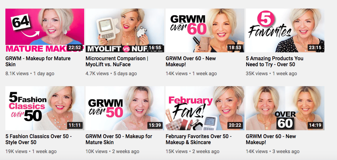
Pretty Over Fifty does exactly what it says on the tin. It’s a channel for people who are over fifty and looking for skincare, makeup, and style tips.
It’s a small channel when it comes to the Beauty & Fashion section of YouTube, but still very well branded.
The banner for the channel features the logo and the signature pink colour that is featured in most of the video thumbnails:
Biggest learning point:
Make sure your banner fits your brand.
Business
YouTube has become a great place to get advice on everything from how to change a tyre to how to start a business.
There are many business professionals and entrepreneurs that use the site as a platform to share best practices, talk about the latest industry trends, and even promote their products.
Here are some great ideas from current business YouTube banners…
4. CreativeMornings

CreativeMornings is a breakfast lecture series that features different professionals in the creative community.
The banner for the channel is very simple and achievable for anyone, even if you’re just starting out on YouTube.
It seems like they’ve used stock photography for the base of the banner, and then included their logo over the top, and also linked their social media channels in the bottom corner.
Simple, yet effective.
Biggest learning point:
Consider using stock photography to bring your banner to life.
5. Robin Sharma

Robin Sharma’s channel is packed with inspirational videos, along with straight-forward tips and tricks for entrepreneurial types from all backgrounds.
This banner is great because it’s big and bold, and reads almost like a testimonial. This is an object lesson for ‘personal brand’ YouTube channels, because it leaves you in no doubt whatsoever as to the channels credentials and credibility!
Biggest learning point:
Don’t be afraid to use bold and punchy text – and don’t be shy about your credentials!
6. Fast Company

Fast Company is a diverse channel that covers all different topics, from innovation in technology to ethical economics.
This banner is, at first glance, pretty straight-foward. But it’s also visually interesting, featuring a spectrum of colours and geometric shapes. And it gives potential viewers useful information on the video posting schedule.
Biggest learning point:
Let people know when your videos are out.
Lifestyle & Vlogging
The Lifestyle & Vlogging section of YouTube has essentially allowed people to transform their home videos into multi-million dollar businesses.
Some of the most popular vloggers, like Zoe Sugg and her brother Joe Sugg, have gone onto build business empires and even become celebrities in their own right, featuring on television shows like The Great Celebrity Bake Off.
Let’s take a look at some YouTube banner examples from vloggers…
7. Tanner Fox

Tanner Fox is a popular vlogger in his early twenties with a channel that currently has just over 10 million subscribers.
His videos feature various stunts and pranks that are aimed at a loyal fanbase of teenaged viewers.
The banner for this channel is great because it appeals directly to that target audience with various sticker-like graphics, images of the cars featured on the channel, and Tanner himself.
Biggest learning point:
Appeal to your target audience.
8. Louise Pentland

Louise Pentland could be classed as a “mummy vlogger”, a category of the Lifestyle & Vlogging community that focuses on parenthood and the day-to-day of raising children.
This YouTube banner uses bright pastel colours to draw the eye, and also places the logo front and centre – so you know exactly who’s channel you’re on.
Biggest learning point:
Take advantage of bright, bold colours.
9. Refinery29

Owned by Vice Media, Refinery29 is a digital media and entertainment brand aimed at young women. The videos on the YouTube channel cover everything from the latest in trending fashion, to social experiments, and bite-sized documentaries.
The YouTube banner reflects this assortment of content by showcasing stills from different videos within the logo. This is a clever way to show people, at a glance, what the channel is all about.
Biggest learning point:
Think outside the box, and find some way to showcase your video content with your banner.
Gaming
Gaming is a big part of YouTube. Think with Google reports that two out of the top five YouTube channels with the most subscribers worldwide are gaming-related.

On top of that, 48% of YouTube gamers say they spend more time watching gaming videos on YouTube than actually playing games!
So, it’s clear that Gaming is a competitive category on YouTube. Here are some banner examples that stand out among the crowd…
10. VanossGaming

VanossGaming is a big channel, with over 25 million subscribers! With such a large following, there’s no need for him to be overly promotional with his YouTube banner.
Unlike many of the examples we’ve seen so far, VanossGaming opts for a slick and clean banner that shows a shiny gold version of his usually black and white logo.
Biggest learning point:
Sometimes less is more.
11. Markiplier

Markiplier is another massive channel, with almost 30 million subscribers. This channel focuses largely on games but also throws in a couple of general entertainment videos here and there.
Despite being a similar channel to VanossGaming, Markiplier’s YouTube banner is completely different.
The banner space here is currently being used to promote the channel’s interactive movie – in collaboration with Youtube Originals – A Heist with Markiplier.
Biggest learning point:
Use your YouTube banner as a promotional opportunity.
12. GamerGirl

GamerGirl is a YouTube channel featuring gameplay commentary on popular games like Minecraft and Roblox.
What’s cool about this banner is that the inspiration from these games shines through. The banner is colourful, cartoonish, and also features lots of Easter Eggs from the channel that fans will be able to recognise instantly.
Biggest learning point:
Hiding a few Easter eggs in your banner can be fun!
Travel
Travel videos are popular on YouTube as they’re a great way for people to feed their wanderlust when they’re stuck at home.
It should come as no surprise that the popularity of travel videos soared in 2020 due to the worldwide lockdowns put in place because of the COVID-19 pandemic. It has been dubbed by some as “the year of virtual travel”, with YouTube channels like Edinburgh Zoo seeing their view numbers increase from around 100,000 to 5 million per month.
Let’s take a look at some inspirational travel YouTube banner examples…
13. The Lodge Guys

The Lodge Guys travel pretty much everywhere, but their channel is also focused around their personal lives and includes a lot of daily vlogs.
Their banner is a great example because it features images from their various travels, but it’s also clean and clear.
The eye is also instantly drawn to the CLICK HERE TO SUBSCRIBE – FREE button placed in the bottom right-hand corner. This is a useful way to remind people to subscribe when they visit the channel.
Biggest learning point:
Make sure your banner is clean, clear, and easily digestible.
14. TheTimTracker

TheTimTracker is a Disney travel vlog – as you can instantly tell from the banner.
This colourful and cartoony banner, featuring the Mount Everest ride and Disney Castle in the background, is bound to appeal to the channel’s ideal audience right away.
It also includes the very useful information, “New Videos Every Day!” at the bottom of the banner, letting viewers know when to expect the latest video.
Biggest learning point:
Include items that are instantly recognisable and reflect your channel’s content
15. Hey Nadine

Hey Nadine is a channel that promises travel advice in addition to adventures. And the channel definitely delivers on that promise, covering everything from simple packing tips to a vlog on Kilimanjaro.
This beautiful banner instantly sparks feelings of adventure, giving users that dose of wanderlust they initially visited the channel for. But it also doesn’t neglect the practical information, such as the posting schedule, social media links, and reminding users to click the subscribe button.
Biggest learning point:
Strike a balance between amazing visuals and practical information.
By the way, if you’re looking to create travel videos for your own YouTube channel, take a look at our travel video production page for more information.
Fitness
With the rise of companies like Peloton, at-home fitness has become the norm. Many people turn to YouTube for free health and fitness videos, and there’s a lot of varied content on there for people of all ages, sizes, and fitness levels.
If you’re in the fitness industry, here are some Youtube banners to inspire you…
16. The Fitness Marshall

The Fitness Marshall posts short, fun, original dance workouts to popular songs. The channel also has a unique style of comedy that they blend in with the videos, making them more enjoyable for viewers.
This fun-loving attitude is reflected in their banner. It shows the three main dancers from the channel in active stances, and they’re also wearing the channel’s activewear brand, subtly promoting the products. The logo for their activewear brand can be seen in the centre of the banner.
Biggest learning point:
Find subtle ways to promote your brand.
17. Yoga with Adriene

Yoga with Adriene is possibly the most popular yoga channel on YouTube, with almost 10 million subscribers. And yet the banner is as simple as it gets.
This banner shows the logo for the brand, and a couple of links in the bottom right-hand corner – nothing else.
However, those links are important. Note that this channel links to an Amazon store – a great way to encourage viewers to buy products!
Biggest learning point:
Promote your store (if you have one).
18. Chloe Ting

Chloe Ting posts short workouts that are designed to be completed together as part of a workout program.
These free workout programs are called out in the banner with a link, and the word “FREE” is really attention-grabbing. You can add up to 5 links to your YouTube banner, but only the first will show up with a title (of your choice).
This banner is also great because it shows Chloe working out, in action, providing inspiration for viewers who are looking to get started.
Biggest learning point:
Make use of your links!
Kid-Friendly
Kids love YouTube. In fact, according to a recent survey, British and American children were three times as likely (30%) to want to be YouTubers or vloggers as astronauts (just 11%) when they grow up!
Kids love YouTube so much that the platform has now created a separate app especially for kids. The YouTube Kids app is a service oriented towards children, with curated selections of content, that allows parents to filter videos by age rating.
So, let’s take a look at banners that appeal to kids on YouTube…
19. SoulPancake

SoulPancake is a content creation company that explores life’s big questions, celebrates humanity, and champions creativity. The channel is home to the viral video, Kid President:
This banner is beautiful in its simplicity. The flashes of pink, blue, and green make the banner almost look like a galaxy of some kind, with their logo in the centre. And, of course, around the logo we can see simple graphics that represent the content from the channel.
Biggest learning point:
Simplicity can be beautiful.
20. National Geographic Kids

National Geographic Kids is a big channel that covers a wide range of topics. Their videos feature awesome animals, cool science, and everything weird and wonderful that sparks the curiosity of kids.
Their banner is an amalgamation of all this weirdness and wonderfulness – showing different animals, science experiments, and even a spaceman. The pop of colour also helps the banner stand out to kids when they land on the channel.
Biggest learning point:
Don’t be afraid to make it weird!
21. Geek Gurl Diaries

Geek Gurl Diaries is hosted by Carrie Anne Philbin, a Computing & ICT teacher. The channel has a strong focus on learning and covers interesting topics, like programming.
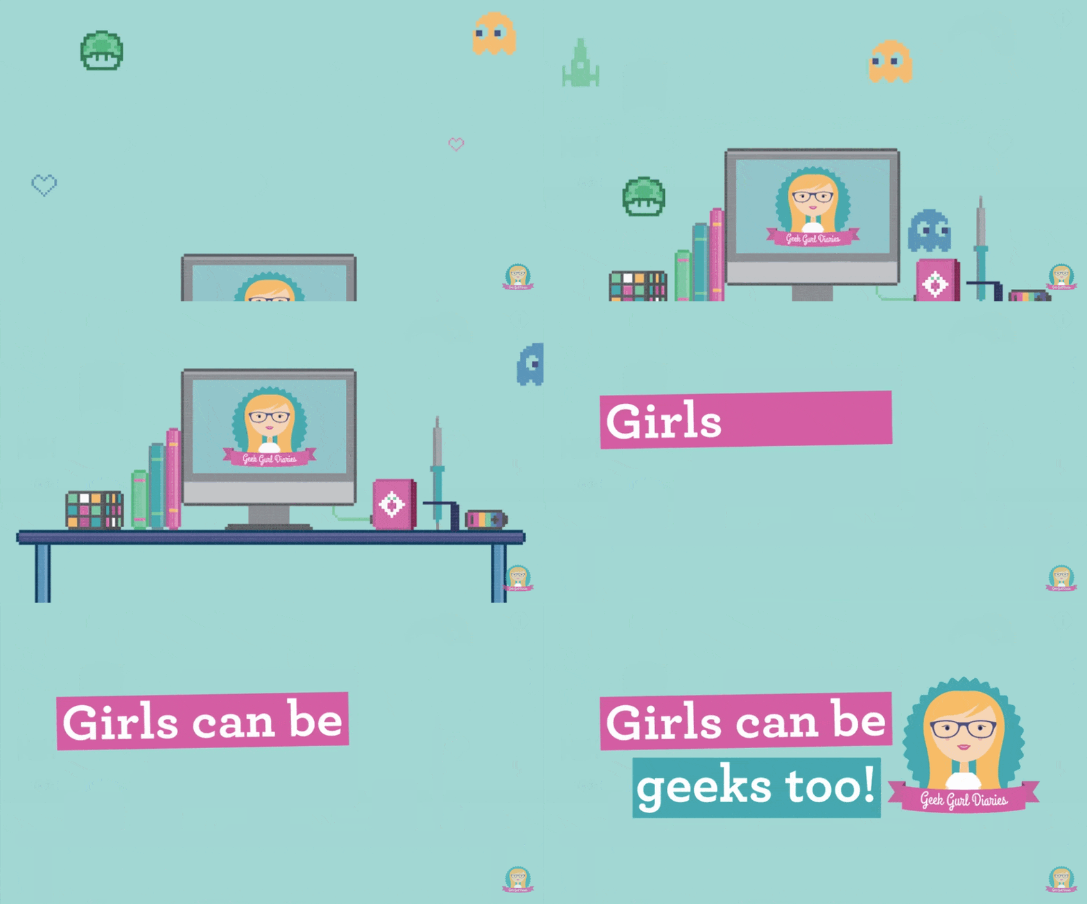
The banner for this channel is really unique compared to everything we’ve seen so far. The retro style includes lots of callbacks to fun “geeky” stuff, such as Super Mario, Pacman, Rubik’s cubes, and more.
The banner is actually just a static version of the channel intro, seen here:
Biggest learning point:
See if you can weave elements of your channel intro into your banner, and vice versa.
Music
As of February 2021, the five most viewed YouTube videos were all music videos – with view counts ranging from 4 billion to almost 8 billion views. Yep, billion.
That’s the top five videos on the second most-visited website ever, all falling under the “music” category. So it’s safe to say that music is a pretty big deal on YouTube.
Here are some music channels with great banners to inspire you…
22. Lofi Girl

Lofi Girl is a music channel that features relaxing mixes that people can use to help them study or sleep. They have a mantra that reiterates this on their banner: Study. Chill. Sleep. Repeat.
This banner creates a peaceful scene and has a lot of layers. There’s something new to be found every time you look at it.
Little touches, like the warm glow from the lamps and the city lights in the distance add to this idea of tranquility. It almost welcomes people into this channel as a quiet room they can escape to.
Biggest learning point:
Paint a picture.
23. Kerrang!

Kerrang! and Lofi Girl couldn’t be more different, and this is reflected in their banner art.
Kerrang! is a channel that features metal, punk, and rock, and includes the slogan “Life is loud!” in the About section of their YouTube channel.
The banner looks like a photograph that was taken mid-concert and replicates exactly how they want people to feel when they watch and listen to their videos.
Biggest learning point:
Evoke a feeling.
24. Jazz and Blues Experience

The Jazz and Blues Experience channel is pretty self-explanatory. It’s a place for people to discover (and re-discover) the greatest jazz & blues hits.
Like the Kerrang! banner, this too evokes a feeling. We can see a jazz musician in the background and the bold font chosen replicates that of a poster for an old jazz and blues club.
The banner also includes a lot of practical information. Through text it tells potential viewers what they post, asks them to subscribe, and also promotes their Christmas album.
Biggest learning point:
Include practical information to get your point across.
Foodie
Just how did we discover new recipes before YouTube?
Okay, we read books. But recipe books are expensive, limited, and not nearly as engaging as videos.
According to our 2021 state of video marketing survey, 69% of people said their most preferred way to learn is by watching a short video.
Let’s take a look at some YouTube banners from the foodie category…
25. Tasty

Tasty is the world’s largest food network, and their YouTube channel covers everything from beginner’s recipes, to food challenges featuring world-class talent.
The banner for their YouTube channel is perfect because it’s bright, simple, and catches the eye with delicious-looking food, just like their food-focused video thumbnails.. It’s a wonderful representation of the channel name.
Biggest learning point:
Make sure your banner reflects your video content.
26. NishaMadhulika

NishaMadhulika is a channel that focuses on vegetarian Indian recipes that are easy to cook and even easier to eat!
This banner does so many things at once. For starters, it shows the beautiful kitchen and the host and chef of the channel, Nisha Madhulika.
In addition, the banner includes lots of relevant information such as the channel link and hashtag. Hashtags are a great way to encourage your audience to tag you in their posts so that you can engage with – and build – your community.
Biggest learning point:
Consider using hashtags
27. Binging with Babish

Binging with Babish is a cooking channel that shows viewers how to make recipes from their favourite TV shows and movies.
This banner is very slick, professional, and smart, replacing the ‘i’ in Babish with a whisk and showing the host out of focus in the background.
Like others on this list, it also includes important information up front where it’s easy for potential viewers to find.
Biggest learning point:
Think of a smart, out-of-the-box way to present yourself and/or brand
Product Reviews
Unboxing is a YouTube phenomenon that has taken the world by storm. It simply involves people taking brand new products out of their boxes and reviewing them for viewers.
According to The New York Times, the reason people love product review videos so much is that they give viewers the same feeling as retail therapy, without the price tag. They dubbed it “unboxing therapy”.
Let’s take a look at the YouTube banners of some popular product reviews channels…
28. ToyBoxCollectibles

ToyBoxCollectibles is a family-friendly YouTube channel that features the unboxing and reviews of different products, such as board games, plushies, and collectibles.
The banner is very cutesy – reflecting that family-friendly aspect of the channel. It has the logo front and centre, and is surrounded by graphics that are in-line with the brand both from a content and a colour scheme point of view.
Biggest learning point:
Consider using graphics.
29. Dope or Nope

Dope or Nope is a comedic unboxing channel, with the host reviewing everything from magic tricks to weapons.
Similar to Geek Gurl Diaries, this banner is a static version of the channel’s animated intro. It’s fun. It’s bright. It’s colourful. And it uses awesome 3D graphics. But the greatest thing about this banner is that it’s all about the logo.
Biggest learning point:
Make your logo the star.
30. FunToys Collector

FunToys Collector is another family-friendly channel that reviews different children’s toys for a younger age group (pre-school children and under).
The host of this channel actually stays behind the camera so it’s no surprise that they aren’t featured on the banner.
The main focus of the banner – just like the channel – is toys. The banner gives potential viewers a hint of what they can expect when watching the channel.
Biggest learning point:
Treat your banner as a teaser for your videos.
Comedy
According to Think by Google, Comedy is one of the top four content categories watched by users on YouTube, along with music, entertainment, and “how to” videos.
But if you create comedy videos then you probably feel pressure for everything related to your channel to be “funny”, including your banner.
Maybe some banner inspiration can help…
31. MrBeast

MrBeast is one of the most accomplished creators on YouTube, with an incredible 55 million subscribers and counting. In addition to being funny, he’s also very charitable.
This banner encompasses both sides of MrBeast. He tells viewers that he’ll donate to charity if they subscribe, but the way this appears on the banner makes it seem like mock bribery. This theme continues with the link to his Instagram channel which states: “Follow or I sue.”
Biggest learning point:
Use your humour in your banner.
32. MyHarto

MyHarto is a comedy channel that originally exploded online because of a regular segment called “My Drunk Kitchen”. But the channel also covers lots of different topics, from lifestyle videos to travel vlogs.
This banner is funny, cheeky, and a little bit unusual. It doesn’t really say much about the channel at all, just that this is a place where you don’t need to take yourself too seriously.
Biggest learning point:
Don’t take yourself (or your banner) too seriously.
33. nigahiga

nigahiga is a long-established YouTube channel. The first video was posted all the way back in 2008, and the channel has now accrued over 4 billion views total.
Upon first glance at this banner, you probably wouldn’t guess that this is a comedy channel at all. It looks like a channel for lamp enthusiasts! The reason behind this is that the YouTuber behind the channel – Ryan Higa – calls his fans “Lamps”, so the banner is like a private joke for viewers.
Biggest learning point:
A private joke between you and your viewers can strengthen your relationship.
Educational
YouTube is a great source for learning. A study by Pearson found that YouTube is the most preferred learning tool of participants aged 14-23, with 59% choosing YouTube over other tools.
How do you get across the educational value of your YouTube channel through your banner alone?
Let’s take a look at some examples to find out…
34. TED-Ed

TED-Ed is a collection of carefully curated educational videos. Most of the videos are collaborations between esteemed educators and talented animators.
Animation is a great way to educate viewers because it uses engaging graphics to break down complicated ideas into simple and easily digestible visuals.
The banner for the TED-Ed channel works well because it reflects many of the different topics and animation styles covered on the channel.
Biggest learning point:
Consider creating a collage of your content.
35. Kurzgesagt – In a Nutshell

Kurzgesagt – In a Nutshell is another YouTube channel that uses animation to break down complex themes into easily digestible stories for viewers.
The channel puts a lot of effort into their animation and usually only posts one video per month. This explains the simple message in the banner art: Quality over Quantity.
The banner also gives them a place to showcase the visual style of their videos, giving potential viewers a taste of what to expect.
Biggest learning point:
Always remember: quality over quantity.
36. Tibees

Tibees is a channel that posts videos about physics, math, astronomy, and the history of science. But the host of the channel, Toby, approaches these topics in a light-hearted way.
This light-heartedness is reflected in the channel’s banner. The banner is bold, fun, and a little bit different. Yet it still accurately represents the content of the channel.
Biggest learning point:
Have fun!
4 Tips for the best YouTube banner
1. Add links to your social media channels
While the banners in this article were all really different, one thing they had in common is that they all included links to their social media channels, websites, and other places they wanted to direct potential customers.
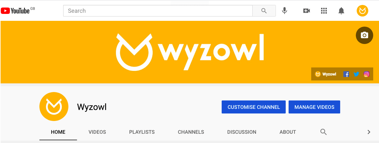
Adding links to your banner is easy. Just go to your YouTube channel (making sure you’re logged in) and click on the big Customize Channel button.
From there, you’ll be taken to the Creator Studio. Click the “Basic Info” tab and scroll down
to “Links”.
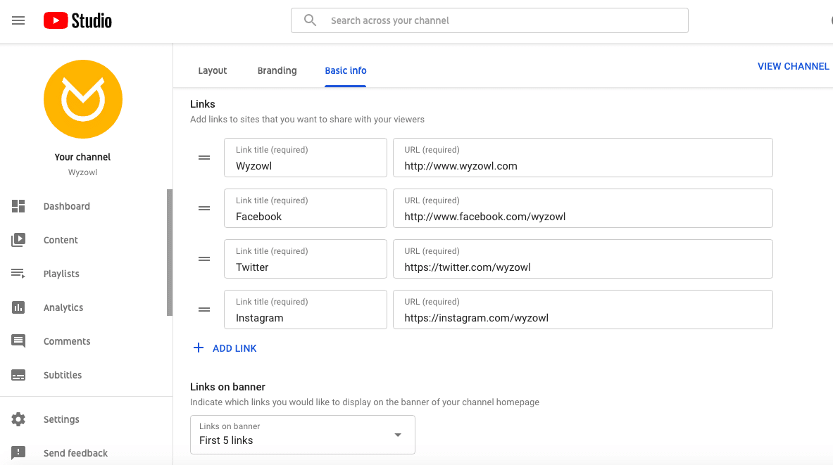
Then you can add any links you like and give them a title. You can also choose how many links to include in your banner (up to a maximum of 5).
2. Keep it fresh
You can update your YouTube banner whenever you feel like it! It’s a great way to keep your channel fresh and inviting – for both new and existing viewers.
You can also switch up your banner to promote different products at different times – just remember to change your banner after your promotion is over.
3. Treat it like an extension of your brand
Your YouTube banner needs to fit in naturally with the rest of your content. It should be like an extension of your brand.
Use the banner examples you’ve seen here to consider how you can make your banner fit in with your videos. Think about font, colours, and personality!
4. Make sure it’s the right size
If your art is spilling out of the sides of your banner, and it’s clear it doesn’t fit the dimensions correctly then this is going to look messy and unprofessional to the people who visit your YouTube channel.
It’s important to make sure your banner is the right size. Check out our new guide for 2021 to find out everything you need to know about YouTube banner size and dimensions.
Final Thoughts
There are so many different directions you can take when creating a YouTube banner. But the main thing to remember is that it reflects the personality of your YouTube channel!
If you’re looking for fun and professional videos to fill your YouTube channel, click here to find out how Wyzowl can help.

