Last checked for accuracy on May 31st 2024
YouTube banner size
The current YouTube banner size guidelines are as follows:
-Minimum image dimensions: 2048 x 1152 pixels, with an aspect ratio of 16:9
-Minimum image safe area for text and logos: 1235 x 338 pixels
-File size limit: 6MB
YouTube channel art size guidelines
Now, let’s dig into the finer points of YouTube channel art size guidelines. First of all, why so many sizes? In a nutshell, it comes down to how your YouTube banner art will display on the many different sized devices people use, from Android to iPhones all the way up to TV screens.
You want your YouTube banner to look great whether it’s displayed on the largest-size screen at the full 2560 pixels width down to the smallest-size phone screen – or any size in between. Otherwise, you’re potentially losing views of your videos and new subscribers.
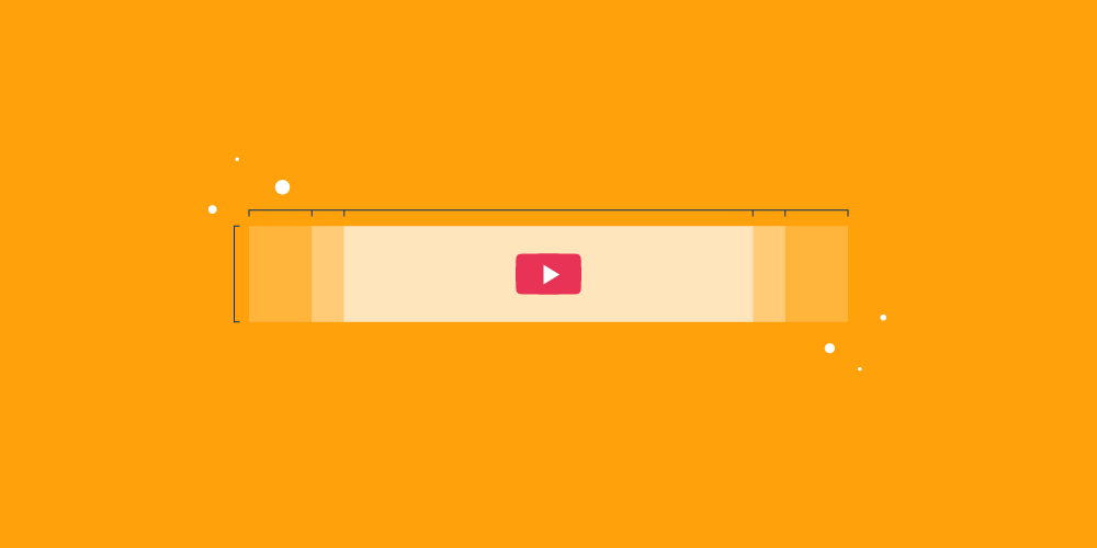
Here’s a visual guide to YouTube banner dimensions to help put those numbers in perspective:
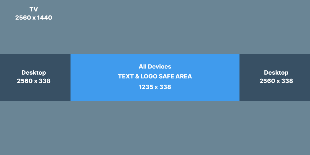
As you can see, there’s a pretty huge range of sizes you’ve got to plan for to make sure your YouTube banner art displays optimally on all screen sizes. What looks spectacular on a large screen may be rendered senseless on a smartphone screen. Let’s take a look at a few examples in action:


Depending on your image, it can be tricky to get it right on every size screen. But there’s one key that will help make sure your viewers always see your YouTube banner in the right light, and that’s by knowing your “safe area.”
Know your YouTube banner safe area
To ensure your YouTube banner is viewed optimally, you’ll want to understand your “safe area.” If you’re hearing them for the first time, your “safe area” is the minimum area you need to ensure your banner displays correctly.
Clever YouTube banner examples
Now that you’ve got the dimensions, file sizes and all-around guidelines for your YouTube banners, it’s time to start thinking about design. To help inspire you, we’ve put together a few of our all-time favourite YouTube banner examples. These are some of the most creative and effective banners we’ve ever seen!
Food Insider

For Food Insider’s YouTube page, they’ve designed a banner showing a series of delicious slices of food from their YouTube stories. The banner has five mouthwatering glimpses of food separated by clean white stripes that match their logo. It’s a nice reminder that your YouTube channel art is part of your brand. Stay true to your brand guidelines, even on social networks.
Wyzowl

We’re one of the world’s leading animated explainer video companies, and we wanted the videos on our channel to speak for themselves. As such we’ve gone with a basic banner that shows our logo and our brand colours, with links to some of our other social channels embedded in the bottom right. It’s a colour palette and design theme that matches up well with our website.
Gunnarolla

Gunnarolla is a globe-trotting producer who makes entertaining short films and music that shows off his unique (and humorous) perspective on the world. For his YouTube channel banner, Gunnarolla has gone for a very similar layout to Food Insider, with his logo in the centre and the addition of his posting schedule below.
Remember, he’s not working with global name recognition the way some of the larger brands on our list have, (like our next mention Google). Gunnarolla wisely spells out what he’s about for his audience.

You recognise those colours, right? With such a recognisable brand and colour palette, Google can play it looser and more image-centric than less recognisable brands who need to spell out what they do.
This beautifully executed piece of YouTube banner art does all it needs to do. The Google logo is nowhere to be seen but it’s still immediately recognisable as Google.
Refinery29

Refinery29’s YouTube channel art ranks among the most ingenious we’ve ever seen. Instead of repeating their logo again, which is also part of the home page, they went in a completely different direction. They wrote out their company name “Refinery 29” in block lettering, which is comprised of images from their website and video content. The effect is like being able to peek through a window to look inside what’s going on at the Refinery 29 YouTube channel, but only being able to catch tantalising glimpses. Guess we’ll just have to watch and find out!
GoPro

GoPro cameras are known as the choice of outdoor sports enthusiasts. GoPro’s YouTube channel features a banner with the ultimate panoramic shot of a surfer catching a giant wave. They go 100% aspirational. No overlay. No multiple images sandwiched together to give different views. Just one, long gorgeous GoPro shot. The branding over the image is minimal, which lets this spectacular shot shine without distraction.
Want even more inspiration? Take a look at 36 YouTube banner ideas.
YouTube banner template
If you need to make a banner for your channel, using a template can make things so much easier. Thankfully, there are a number of graphic design tools that offer a huge amount of free templates – check out this roundup of the best tools available:
How to upload YouTube channel art
Now that you’ve seen some of our favourite YouTube banner art, let’s go through the process for uploading your YouTube banner step-by-step.
Here’s how to add new or existing images to your YouTube channel banner.
1. Sign in to your YouTube account.
2. Click on the thumbnail in the top right, then click “Your channel”.
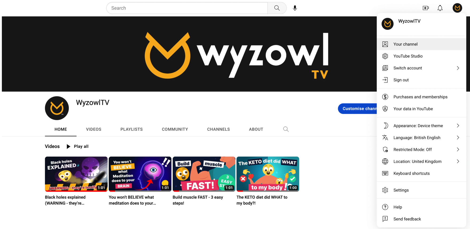
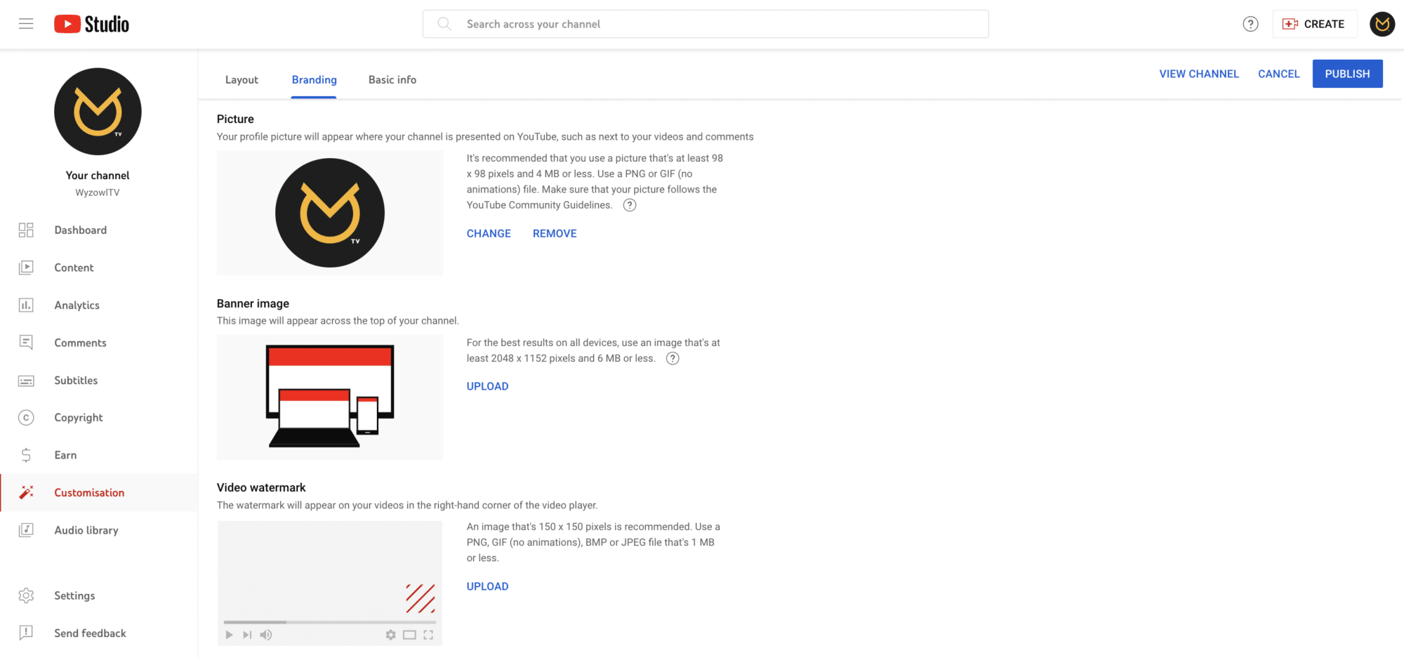
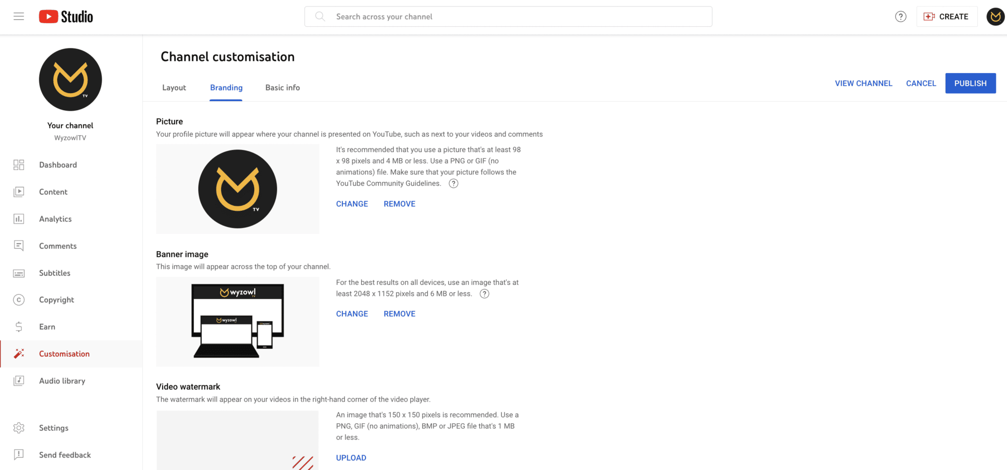
3. Click anywhere on the banner area. This will take you to the below screen where you can upload, change or remove your profile picture, video watermark, or – the one we want – banner image. If you don’t have a banner yet, you’ll see the option to ‘Upload’ one…
If you already have a banner and you’re just giving it a refresh, then you’ll see the option to ‘Change’ or ‘Remove’ it.
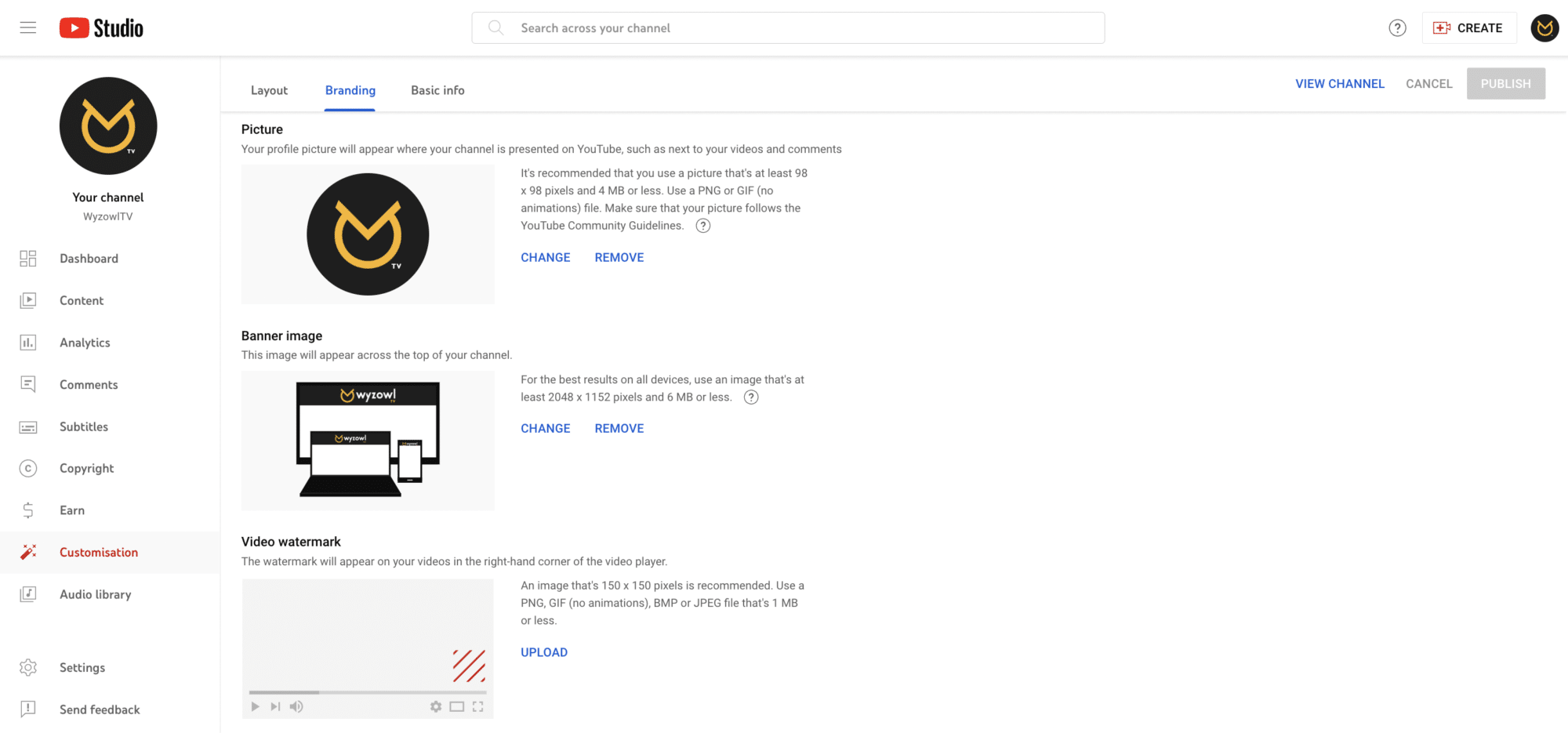
4. Click ‘Upload’ or ‘Change’ and upload your selected image file, taking into account the size requirements we mentioned above. A preview will appear showing you the way your selected YouTube banner art will display across different devices. At this point, you can adjust the crop to change the way an image displays.
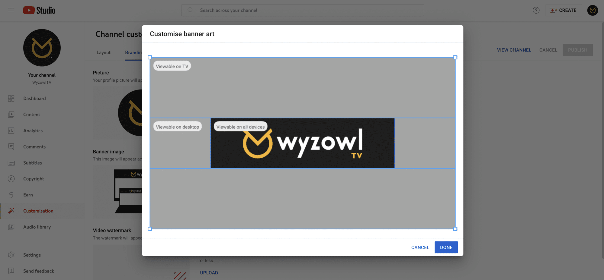
5. Click “Done” when you’re happy with your image!
6. Don’t forget to hit ‘Publish’ in the top right of the Channel Customisation screen to save your changes!
What happened to YouTube banner links?
YouTube used to give you the option to enable up to five links to your social media accounts through your banner. It looked like this:
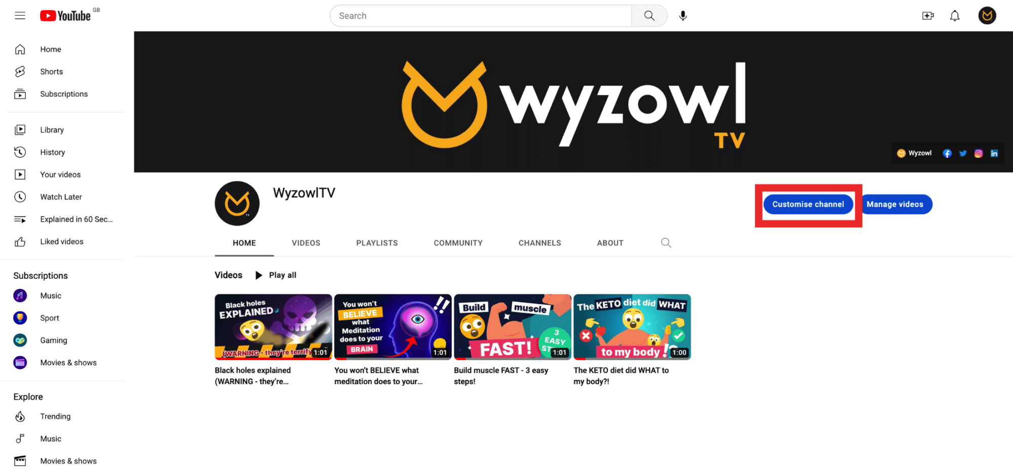
However, you may have noticed from other creators’ channels – or your own – that this isn’t the case anymore. Instead, YouTube allows channels to upload more links (up to 14) to different platforms and these are included directly under the channel description:

The first link gets shown in its entirety and the rest can be viewed on your ‘about page’, so it’s worth putting your most important link at the top of the list!
To add links to your channel, simply head to Customise channel and then click Basic info:
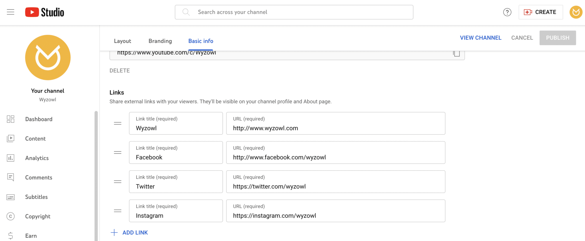
From here, you’ll see the option to add links.
Final thoughts
We hope these examples have inspired you to see your own channel banner in a whole new light. Still hungry for more tips to power up your YouTube game? Then check out our extensive range of YouTube-focused articles, including:
21 YouTube Video Ideas for Businesses
How To Get Verified on YouTube
The Best Fonts for YouTube Thumbnails

