Last updated on 17th May 2024
A great YouTube banner is a great first impression for your channel: it sends a clear message that your channel is well-maintained, well-loved and worthy of your viewers’ time!
There are plenty of tools out there that promise to help you create channel art that blows your viewers’ socks off.
But which are the best? Here are our top 5!
5 Best YouTube banner creators – reviewed
Canva
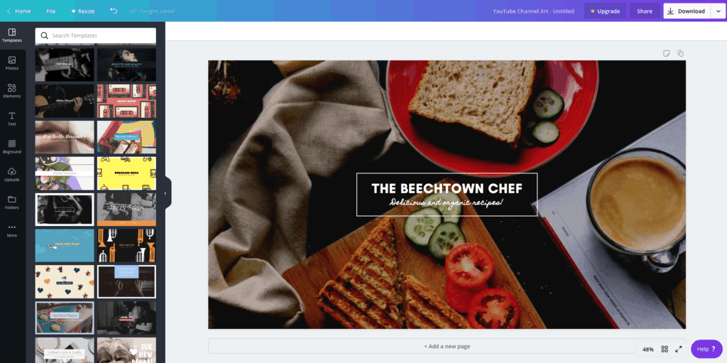
Canva is a simple yet powerful tool to use, drag and drop graphic design tool, offering a rich library of free colours, fonts, illustrations, images, and templates. You can upload images of your choice or pick from premium images too.
The best part is that you can prepare your banner in four simple steps. The only drawback is that you’ll need to pay for accessing certain images and design assets. Choose from a free version, Canva Pro for collaborating with a small team, or Canva Enterprise to design with over 20 team members.
To see what else Canva can do, check out our full review.
Use Canva for FREE: Start on Canva’s free account or start a trial of Pro. Check it out here: Go to Canva >>
Visme
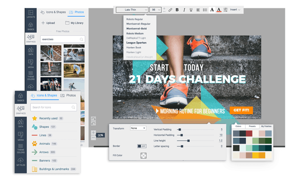
Visme makes it easy to create great designs, with an extensive collection of 50+ free templates and hundreds of fonts. Additionally, a bank of free images, filters, frames, vector icons, editable colour schemes, and other customisable shapes can help add life to your banner.
You can also upload your brand fonts, colours, and other design elements. However, you can only do so if you’ve Visme’s brand kit set up, which requires you to purchase the standard package. This can limit your options if you’re hoping to design a personalised, on-brand cover with the free version.
Use Visme for FREE: Start on Visme’s free plan or start a trial of their paid plans. Check it out here: Go to Visme >>
Snappa
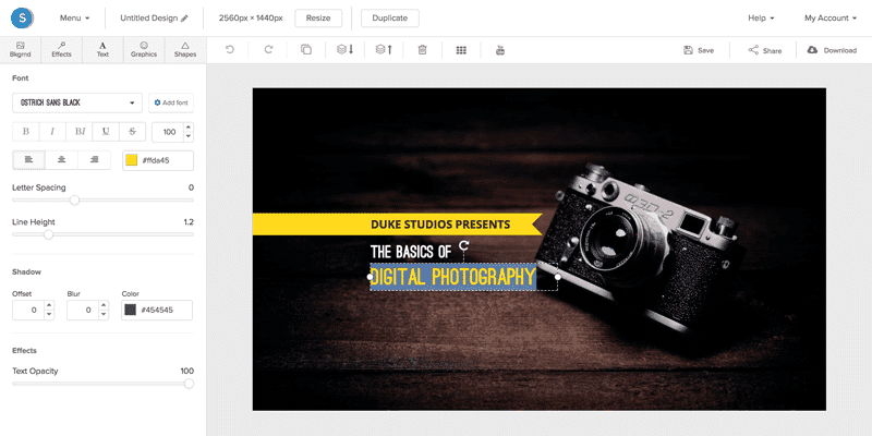
Snappa is a user-friendly channel art maker offering a wide variety of over a million high-resolution stock images with easy-to-tailor templates, graphics, text, and shapes. Its reserve of over 200 typefaces, and fonts can help add personality to your designs. Besides, you’re free to upload your images and branding elements too.
The good news is Snappa offers a lot for free including its most powerful features such as automatic image resizing (woo-hoo!). This means you can repurpose your YouTube banner and use it for other social platforms by automatically resizing it. The only catch is that the freemium version limits you to 5 downloads and shares. The Starter plan for Snappa is free, whereas Team and Pro packages are priced reasonably.
If you’d like to know even more about Snappa, check out our full review.
Use Snappa for FREE: Start on Snappa’s free plan or start a trial of Pro. Check it out here: Go to Snappa >>
Creatopy
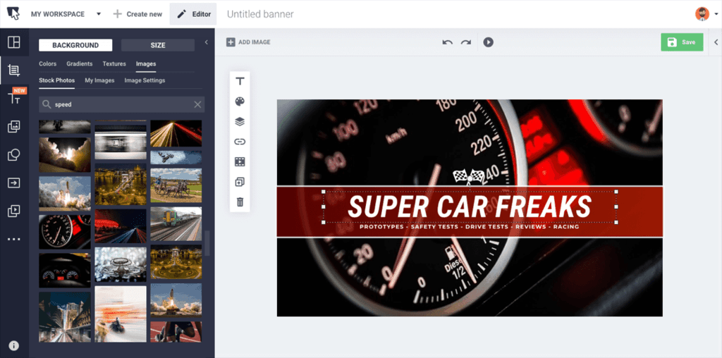
Formerly known as Bannersnack, Creatopy is a user-friendly banner maker. The availability of pre-baked templates and in-built assets such as text presets, fonts, clipart, and more can help you quickly design your banner.
You’re free to use personalised assets such as fonts too. One downside, however, is that design elements don’t live in multiple banners. If you’re designing multiple banners, you have to manually copy the elements, which can duplicate them and add to the work.
You can get started for free, but you’re limited to 10 designs in the freemium version. In case you need more designs, you’ll have to switch to the premium option, choosing between pricing plans for individuals or teams.
Venngage
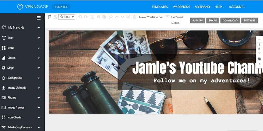
Venngage is an incredible, user-friendly tool. Start your design from scratch or customise the built-in templates to get the banner of your dreams. The design tool also boasts a collection of stock photos, illustrations, and icons. Alternatively, you can add your own images, logos, and other important design elements.
The only catch here is that your options for downloading your finished designs are limited. You can only export the file in PDF or PNG with no option of getting the cover in JPG format. Both freemium and premium versions are available with the premium version branching into separate paid plans for individuals and businesses.
YouTube channel art – top tips
While a Youtube banner maker can help you create a channel art cover like a professional, there’s still a lot that depends on you, especially in the design department. To help you, here are our pro tips:
Keep branding consistent
Ever noticed Coca-Cola using the colour blue in their cover? Nope. That’s because red is part of its branding – and, as you’d expect, it’s the key accent colour on the brand’s YouTube channel. You need to follow suit. Stick to your brand elements to make your channel recognisable across all platforms.

Keep your channel consistent
Just as it’s important to stay dedicated to your branding across various platforms, it’s also essential that you focus on theme consistency too. People get to your channel either when a link points to it or when they come across a video of yours.
From there on, it is up to your banner to tell your viewers what your channel offers with its style, image, and tagline. For example, if you own a travel channel, your cover art should hint at that theme with its design:

Add your brand tagline
Including your brand slogan is another quick way to narrate what your channel covers. What’s more, it can leave a memorable impression on your channel visitors. Include the tagline on the top or bottom of your banner and stick to a short and snappy tagline to avoid cluttering your design.

Keep it simple
A cluttered design with an overload of design elements can quickly distract viewers and make them switch off. Minimalism, on the other hand, shines the spotlight on your logo and tagline, making your cover clear and unforgettable.
Simplicity in YouTube cover art is also important from the size aspect. Odds are your tagline or logo in a heavily-designed cover may get cropped out on a specific device.

Focus on the middle
We’ve talked about the safe area above. When designing your cover, you need to see this safe zone as the sweet spot where your important branding elements go. In other words, your headline, illustration, tagline, and logo come over here.

Use a high-quality image with high resolution only
Poor quality images will appear pixelated on large screens and a hazy, unclear picture fails to capture a visitor’s interest or build credibility. Stock photo sites such as Unsplash provide high-quality images. If you plan to use an original image for your YouTube art, you need to ensure that the quality is superb and the image is clear and crisp.
Choose the right font size and shape
For YouTube users on mobile devices, a small font would be challenging to read. Therefore, choosing a bold or large font is a wise move to make. This will ensure that your viewers can see your channel name clearly.
Besides, select a font that reflects your channel’s style. Fonts communicate style and tone. Research agrees as it highlights that different fonts depict different personalities.
For instance, rounded fonts are known to communicate comfort, femininity, and softness. On the other hand, angular fonts convey durability and masculinity. Pay attention to the font and its size to ensure it reflects your brand personality. Finally it needs to be readable – but don’t be afraid to inject some fun in there too. It’s your brand after all!
Consider dimensions and sizing
The most beautiful artwork in the world will still look terrible if it isn’t the right size. It’s important to familiarise yourself with the size and dimensions for YouTube – we’ve created a full guide below which you can check out!
Our favourite YouTube banner maker
Ok so let’s get off the fence. We’ve picked our top 5 – but cards on the table, gun to our heads, which is the top ONE?
All things considered, our vote for the best cover maker has to go to Snappa based on its user-friendly interface and its bank of customisable graphics, templates, shapes, typefaces, and fonts.
The icing on the cake is that Snappa offers a lot in its free version so your creativity isn’t stifled by a ‘this-feature-is-locked’ pop-up.
If you’d like to know more about the tool, check out our in-depth Snappa review.
Closing thoughts
A YouTube banner gives you the opportunity to win viewers over by displaying your brand personality and subtly showing off what your channel features. The design tools we’ve listed will help you create a professional-looking cover in no time!
If you’ve been having trouble with your newly set up channel, our post on how to get verified on YouTube can help. For more tips on diversifying your channel, head over to our round up of how to make YouTube playlists.

