Last updated on 16th May 2024
According to YouTube, 90% of the best-performing videos on the platform have custom thumbnails.
And University of Oklahoma research found that people spend only 1.5 seconds on average looking at a YouTube thumbnail before deciding whether to click on the video or not.
An extra bit of text on a thumbnail – adding extra interest or summarising the content – is a great way to add an extra reason for a ‘scroller’ to become a ‘clicker.’
Choosing the right font is an important part of creating a standout thumbnail.
A font that’s easy to read, unique, and visually appealing can make your thumbnail pop and draw in viewers.
And so (drumroll, please!) we’ve compiled a list of the 7 best YouTube thumbnail fonts in 2024, to help you make the most of this critical aspect of your video marketing strategy. Let’s jump in!
What are the best YouTube thumbnail fonts?
2. Bebas
3. Badaboom BB
4. Budmo
5. Bernhard Modern std
6. River Drive
7. DK Mandarin Whispers
1. Impact
Impact is a simple and bold font used to capture attention, and forgive us, make an impact, without taking too much attention away from the actual thumbnail image.
Like many other bold fonts, Impact is a strong and eye-catching typeface, with plenty of versatility value.

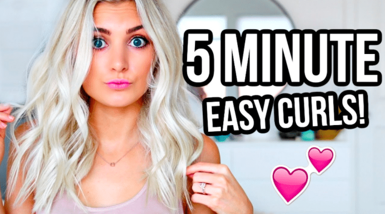
2. Bebas
You may recognise this font if you watch a lot of instructional videos. Bebas is the go-to for thumbnails on make-up tutorials, recipe walkthroughs and other videos in that same category.
Many people choose to use this font in their YouTube banner as well as thumbnails, making it a good ‘all rounder’ YouTube font.
3. Badaboom BB
Badaboom, just like its name, is here to make a fun impression. This choice may not be as versatile, but it’s certainly an impactful and fun font!
The font can be edited to be different colours and have a variety of highlights around it.
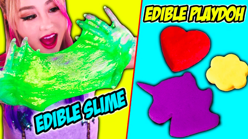
(Wengie)
4. Budmo
Budmo is a step up from a simple font and is great when paired with subtle colours. This can be useful for content creators that use filters to change the colouring of their videos.
The font gives off a ‘glitzy’ vibe because it looks like it’s ‘lit up’ like a neon light.

Budmo is the Ukrainian word for ‘cheers.’ It’s pronounced ‘Budj-mah.’
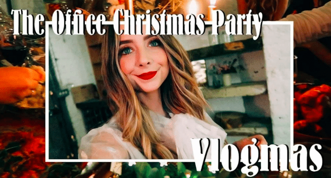
5. Bernhard Modern std
Bernhard Modern std is made up of elegant and funky lettering.
The font is used by famous YouTuber Zoe Sugg who enhances her thumbnails even further with a frame.
6. River Drive
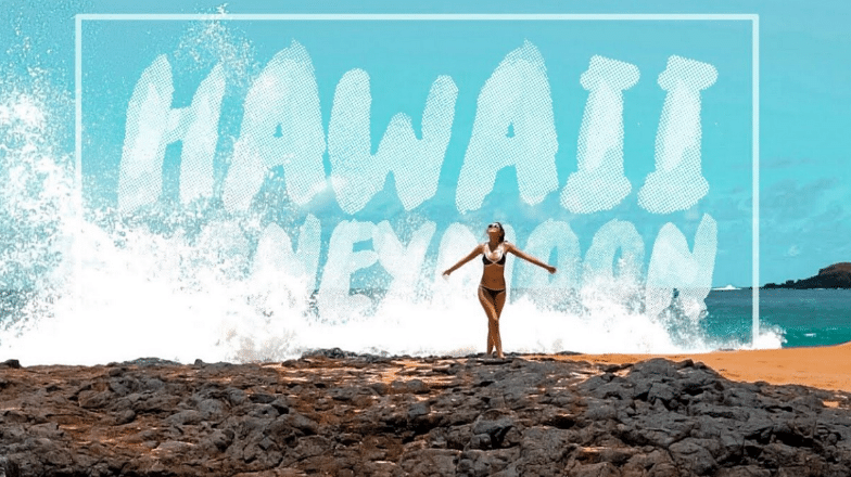
If you’re looking for something different, River Drive could be the font for you.
It has a ‘Heavy chalk’ effect and if paired with the right background it looks as though it’s a part of the image.
The font is really impactful, so when people are scrolling through the YouTube home page it will grab their attention.
7. DK Mandarin Whispers
DK Mandarin Whispers comes in both upper case and lower case and can be given a strong outline effect.
Described as ‘whimsical and eye-catching’ it can be seamlessly integrated with different colour palettes and images.
For example, in the thumbnail below the font is used alongside stickers to create impact.

Tips and tricks for thumbnail fonts
1. Add colour
Adding colour to text on thumbnail images can help make the text more readable and visible.
This is because our eyes are drawn to colours and contrast, and using contrasting colours for the text and background can make it stand out – particularly important when you’re trying to get people scrolling the SERP page to click your video!
Colours subconsciously evoke emotion, too: for example, warm colours such as red, orange, and yellow can create a sense of excitement or urgency, while cool colours such as blue and green can convey calmness or serenity.
Understanding the psychology of colour can be a helpful tool when choosing colours for text on thumbnail images – and more widely across your channel art.
It’s important to note that using too many colours or using colours that clash with each other can actually make the text more difficult to read. When selecting colours, it’s best to choose a colour palette that complements the overall design of the thumbnail image while also ensuring that the text is easily readable.
2. Be consistent
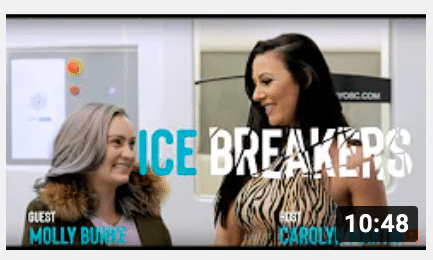
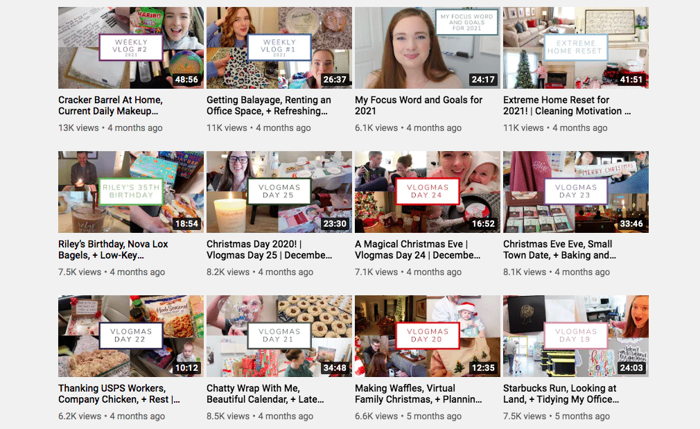
Consistency is key when it comes to creating a strong visual brand identity for your YouTube channel.
By using the same font for your thumbnails, you can make your channel more recognisable and memorable to your audience. When people see a thumbnail with a consistent font style, they’re more likely to recognise it as one of your videos and click through to watch.
Consistency can also help build trust with your audience. When people see a consistent visual identity across your channel, they’re more likely to perceive your content as professional and trustworthy, which can lead to increased engagement and loyalty.
Overall, maintaining a consistent visual identity across your thumbnails can be an effective way to build your brand, increase your CTR, and foster a deeper connection with your audience.
3. Use uppercase and lowercase
Using a combination of uppercase and lowercase letters in your thumbnail fonts can help to draw attention to certain words and make them stand out.
This can be particularly effective for highlighting buzzwords that are relevant to your video content or that may be of interest to your audience.
For example, if you’re creating a video about a new product launch, you may want to use uppercase letters to draw attention to the product name or to key features of the product that you want to highlight.
Mixing uppercase and lowercase letters can also add visual interest to your thumbnails and make them more eye-catching.

4. Mix it up!
Using different fonts on a single thumbnail can create a dynamic and visually interesting image, especially when you want to emphasise different words. However, it’s important to keep the design clean and simple, and avoid using too many different fonts or colours, which can make the thumbnail look cluttered and confusing.
One effective way to mix fonts is to pair a bold, attention-grabbing font with a more subtle font for the supporting text. This creates a hierarchy of information and directs the viewer’s attention to the most important elements. When using different fonts, it’s also important to maintain consistency in the overall design and branding of your channel.

5. Background
Adding a coloured background or ribbon to your thumbnail can help make it more visually appealing and eye-catching. It can also help draw attention to the font and make it easier to read.
However, it’s important to choose a background or ribbon that doesn’t clash with the font or make it difficult to read. You want the text to be the focal point of the thumbnail, so the background should enhance it, not detract from it.
One tip is to use a contrasting colour for the background or ribbon to make the font stand out.
For example, if the font is black, a bright or pastel-coloured background can make it pop.
Another option is to use a gradient or texture that complements the font and adds visual interest without overpowering it.
Overall, the key is to strike a balance between the font and background, so they work together to create an appealing and cohesive thumbnail.
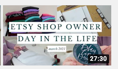
Final thoughts
In conclusion, selecting the right font style for your YouTube video thumbnails can make all the difference in capturing the attention of viewers and growing your YouTube channel. With so much competition on the platform, it’s really important to put in the extra effort to create custom thumbnails that stand out from the crowd.
Whether you prefer bold and playful fonts or sleek and sophisticated ones, there are plenty of options to choose from. And with so many free fonts available online, there’s no excuse not to experiment and find the perfect YouTube thumbnail font for your brand.
So, take the time to create an eye-catching, professional-looking video thumbnail for each of your videos – and think about including one of the YouTube fonts we’ve suggested in this post!
In short, don’t underestimate the power of a great YouTube thumbnail font. By selecting the best font styles when you create YouTube thumbnails, you can supercharge your video performance and take your channel to new heights!

