Last updated on 28th November 2023
We all have our favourite apps. The ones we use on a daily basis and can’t imagine life without!
But, for most mobile apps, life is surprisingly short.
Around 80-90% of all mobile apps launched in app stores are abandoned after one single use.
And research suggests that an average mobile app tends to lose somewhere around 77% of daily active users within just three days of installation.
With any software, there is always going to be some level of user churn – but churn rates don’t have to be so high!
One way to reduce user churn is to equip your users with the knowledge to get the most out of your website or app.
According to our recent customer onboarding survey, 8 in 10 users say they’ve deleted an app because they didn’t know how to use it.
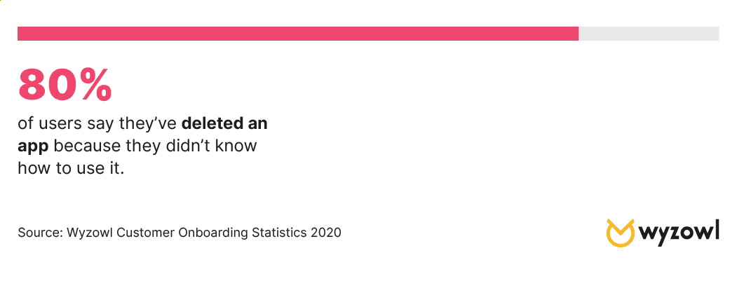
That’s 80%!
Imagine reducing user churn by 80% simply by giving users a thorough walkthrough of your app or website.
A warm welcome can go a long way.
Today, we’re going to look at 5 amazing walkthrough examples for apps and websites so that you can gather some inspiration that will hopefully lead to happier customers and longer life cycles.
What makes an amazing walkthrough?
A walkthrough is a meticulous way of onboarding users. It ensures that no stone is left unturned and gives new users a great understanding of how the product works.
But not all walkthroughs are made equal.
A walkthrough, if done the wrong way, can have too much emphasis on hand-holding and not enough focus on engagement. This could frustrate new users and actually send them packing before they’ve even finished onboarding.
An amazing walkthrough is:
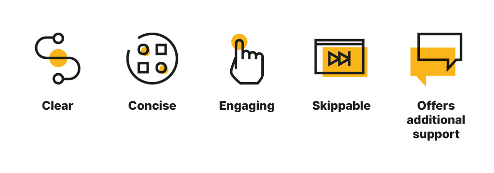
- Clear – telling users exactly how each feature works
- Concise – covering all bases without dragging on
- Engaging – giving users the option to interact rather than just watch
- Skippable – to accommodate faster learners
- Offers additional support – a live chat feature, for example, for users that are struggling to follow
5 amazing walkthrough examples for apps and websites
1. Grammarly
Grammarly is a digital writing tool that checks your grammar – I guess the clue is in the name!
You’ve likely heard of it already because it has an impressive 7 million active daily users.
Upon installing the Chrome Extension, Grammarly asks new users to personalise their experience:
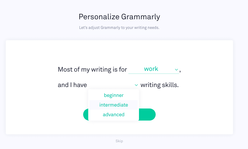
Note the skip button. It’s always a good idea to offer users an ‘opt out’ of your walkthroughs in case they’re too busy, or simply don’t feel as though they need a walkthrough.
The next step in the walkthrough is a quick video tour. Users can click through at their own pace, and engaging GIFs show users how the product works. Again, this is skippable.
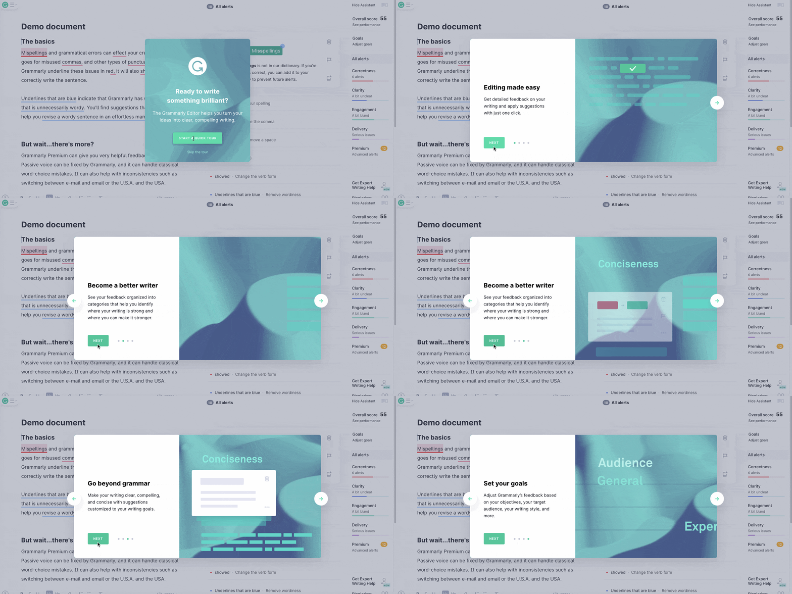
After the video tour, new users are taken to a demo view. Now, this can be intimidating if you’ve never used Grammarly before. There’s a lot of different things going on.
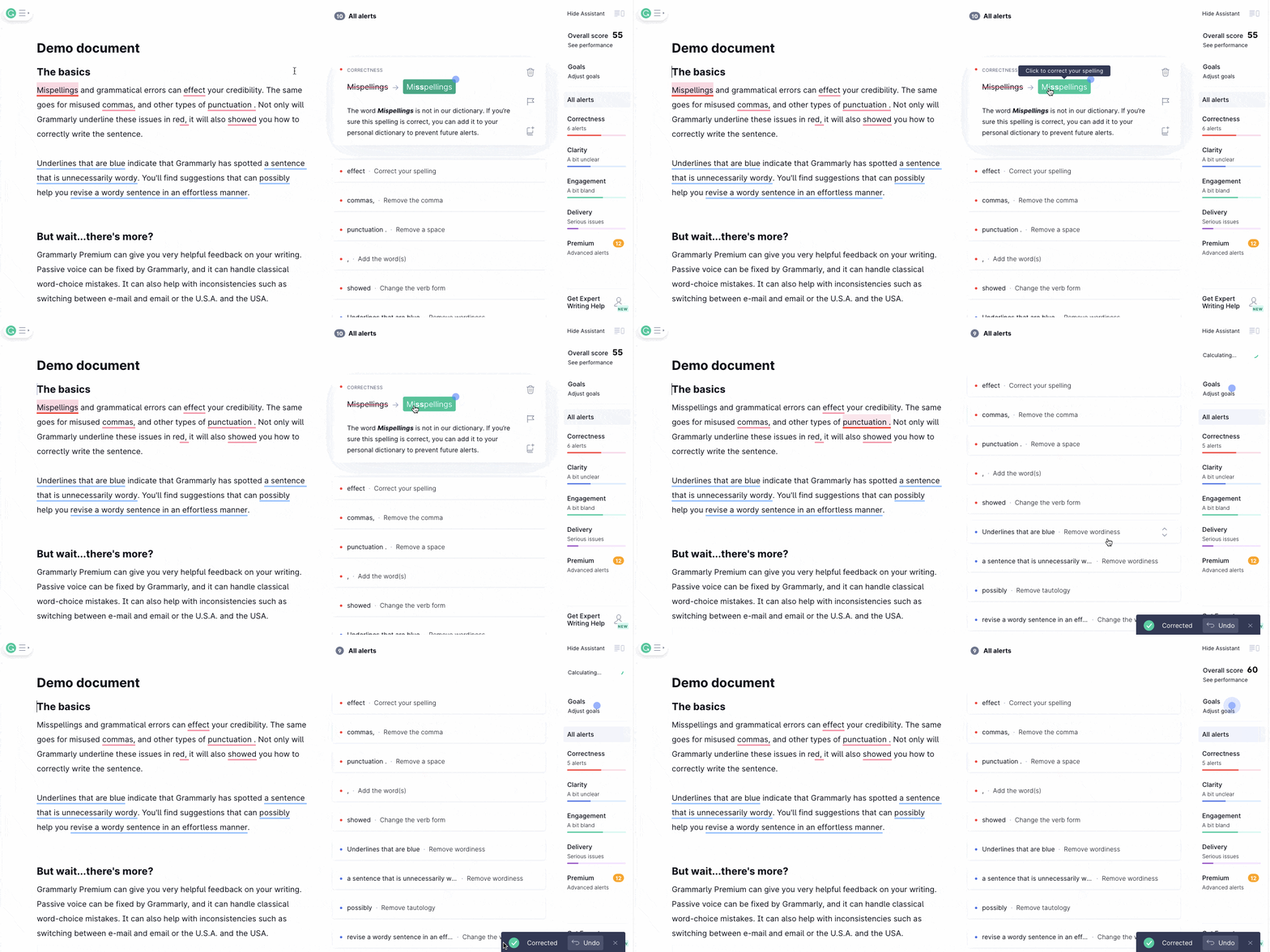
To guide users that may be feeling overwhelmed, Grammarly places pulsing blue hotspots around the screen that tell users what to click on. When hovering over a hotspot, users are told what to do – for further clarification:
Grammarly’s walkthrough is so great because each step is less and less hands-on, until they let you loose to navigate the app on your own.
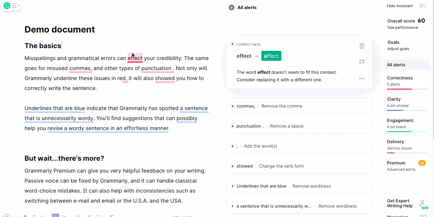
The last step in the walkthrough is a demo document with a lot of grammar mistakes. Users are invited to click through, as though it were their own work, and see how Grammarly helps out.
2. MyFitnessPal
Fitness applies to everybody. Every single person needs to stay fit and active in some way.
As a result, the fitness industry is enormous. According to Statista, the global health and fitness industry generates a whopping 80 billion U.S. dollars every year.
This makes the fitness industry lucrative, but it also makes it very competitive. For a fitness app like MyFitnessPal, an amazing walkthrough is vital for encouraging new users to get started.
After asking a couple of necessary questions:
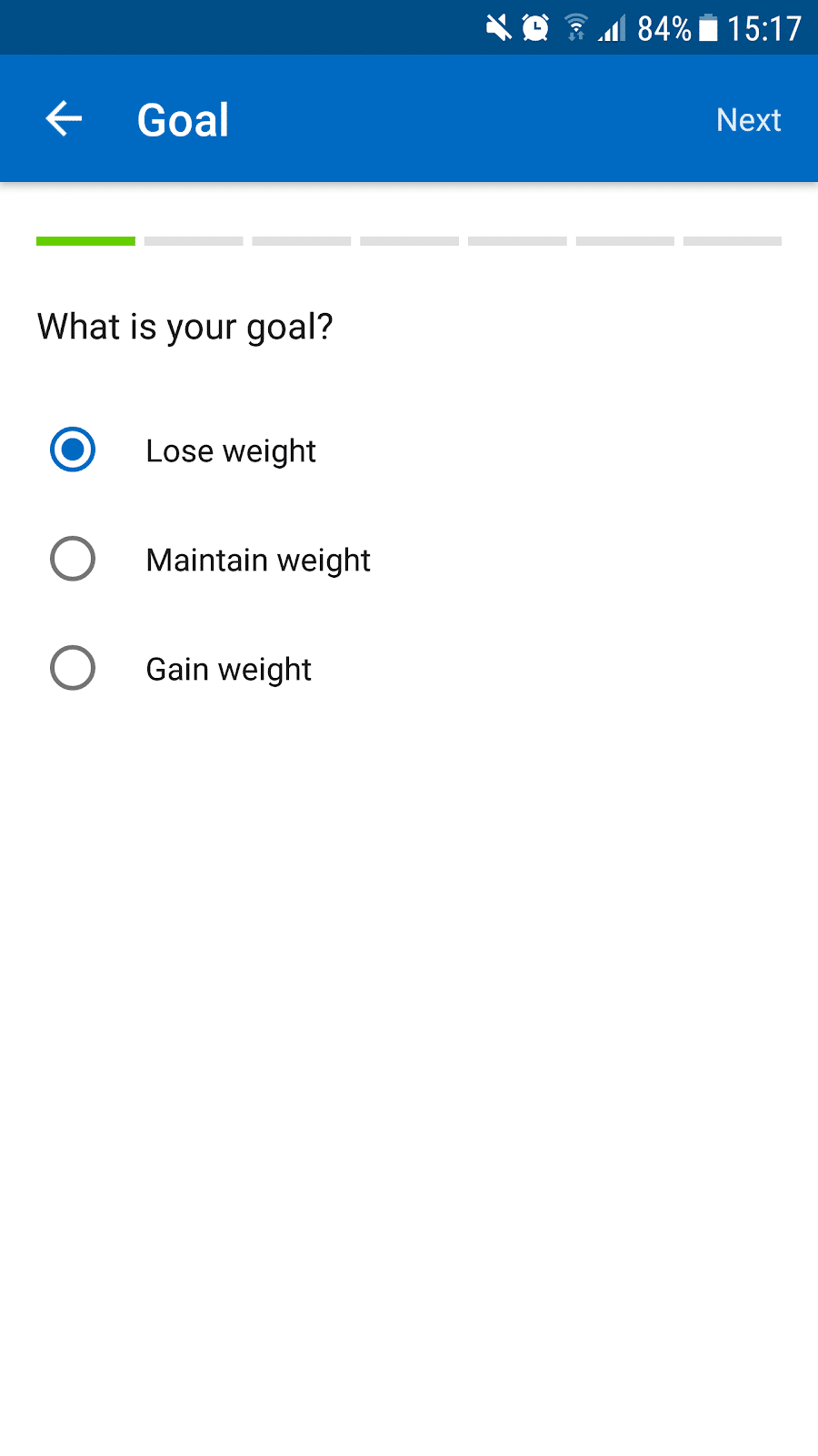
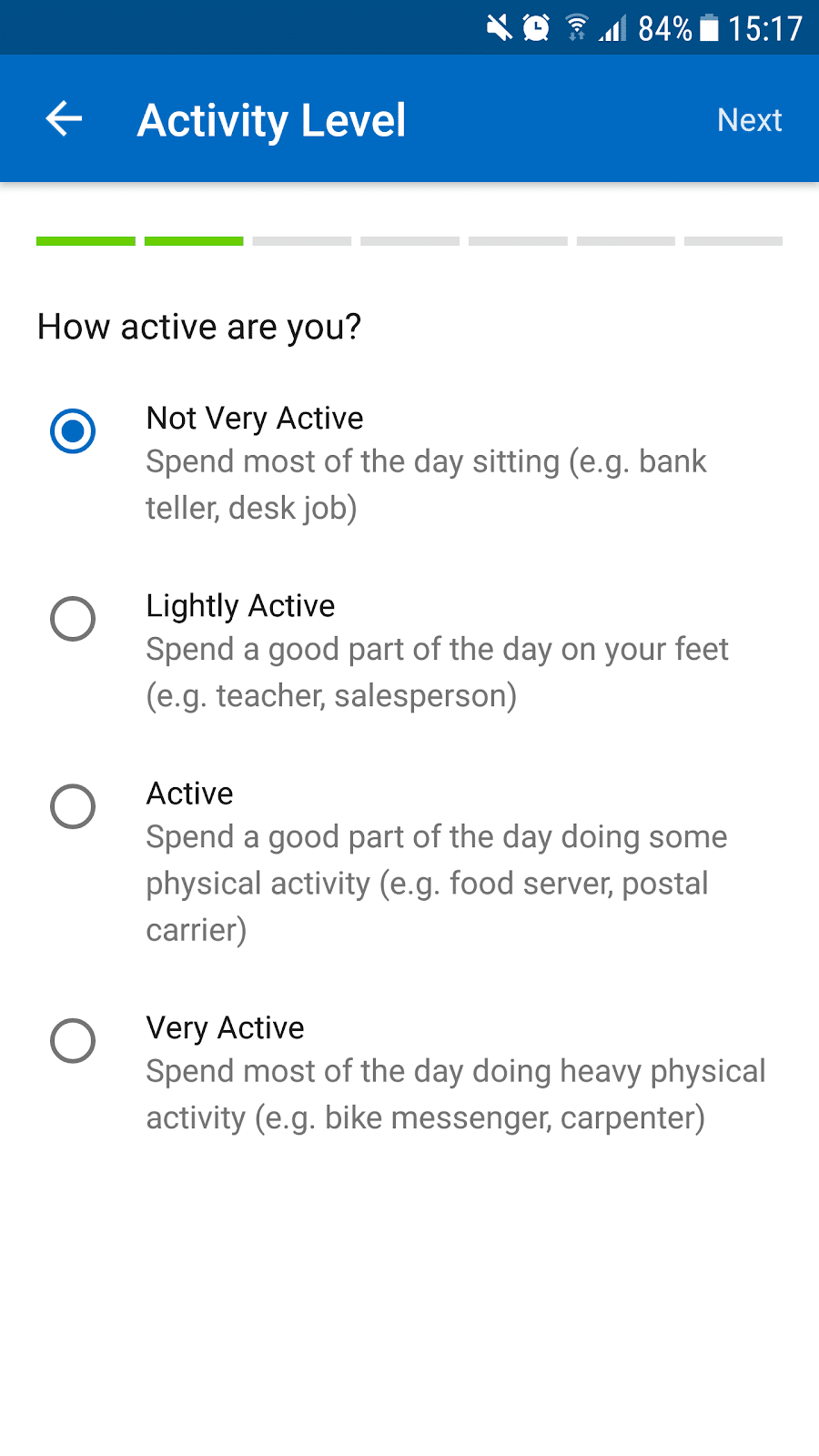
The app creates a custom plan for new users designed to help them with their fitness goal:
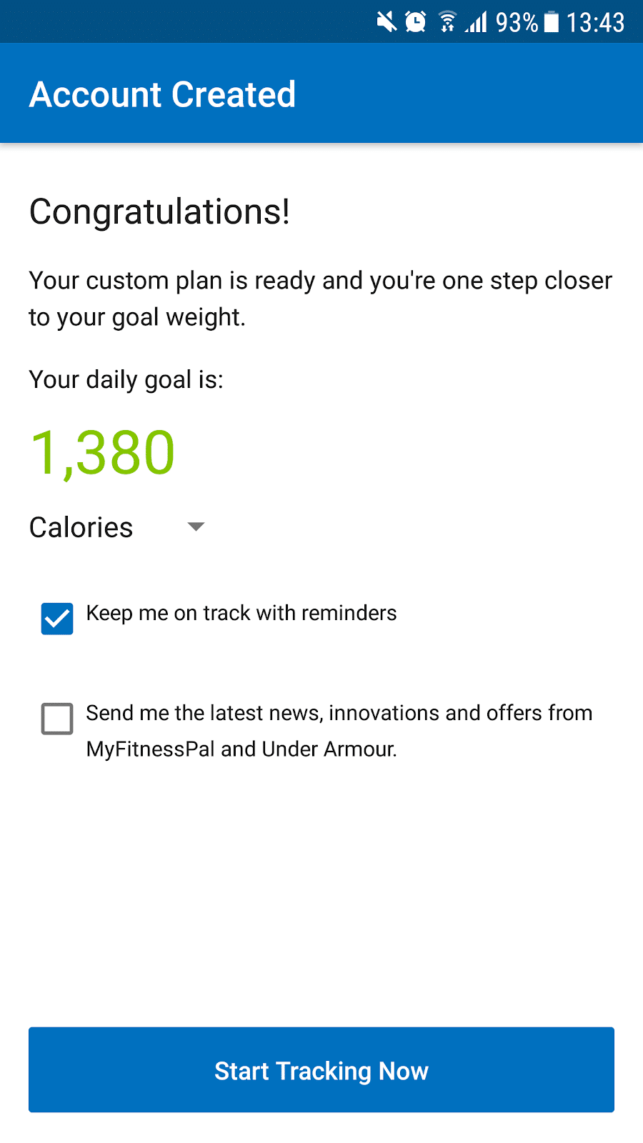
Then the walkthrough begins. Users are first asked to enter the last meal they ate. Pop-up boxes appear around the screen, helping users navigate the app for the first time:
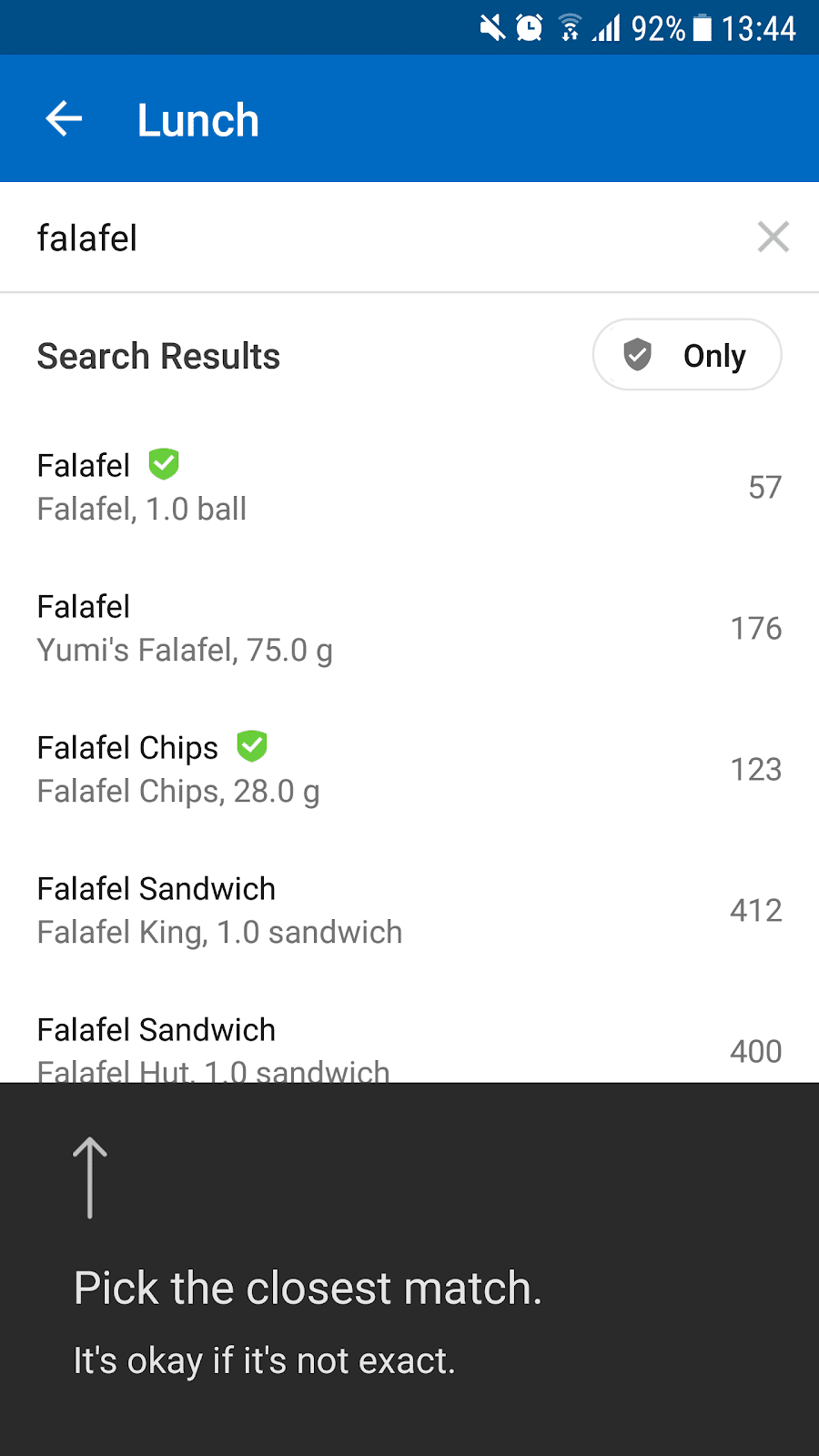
Directional arrows support the text, showing users where to click:
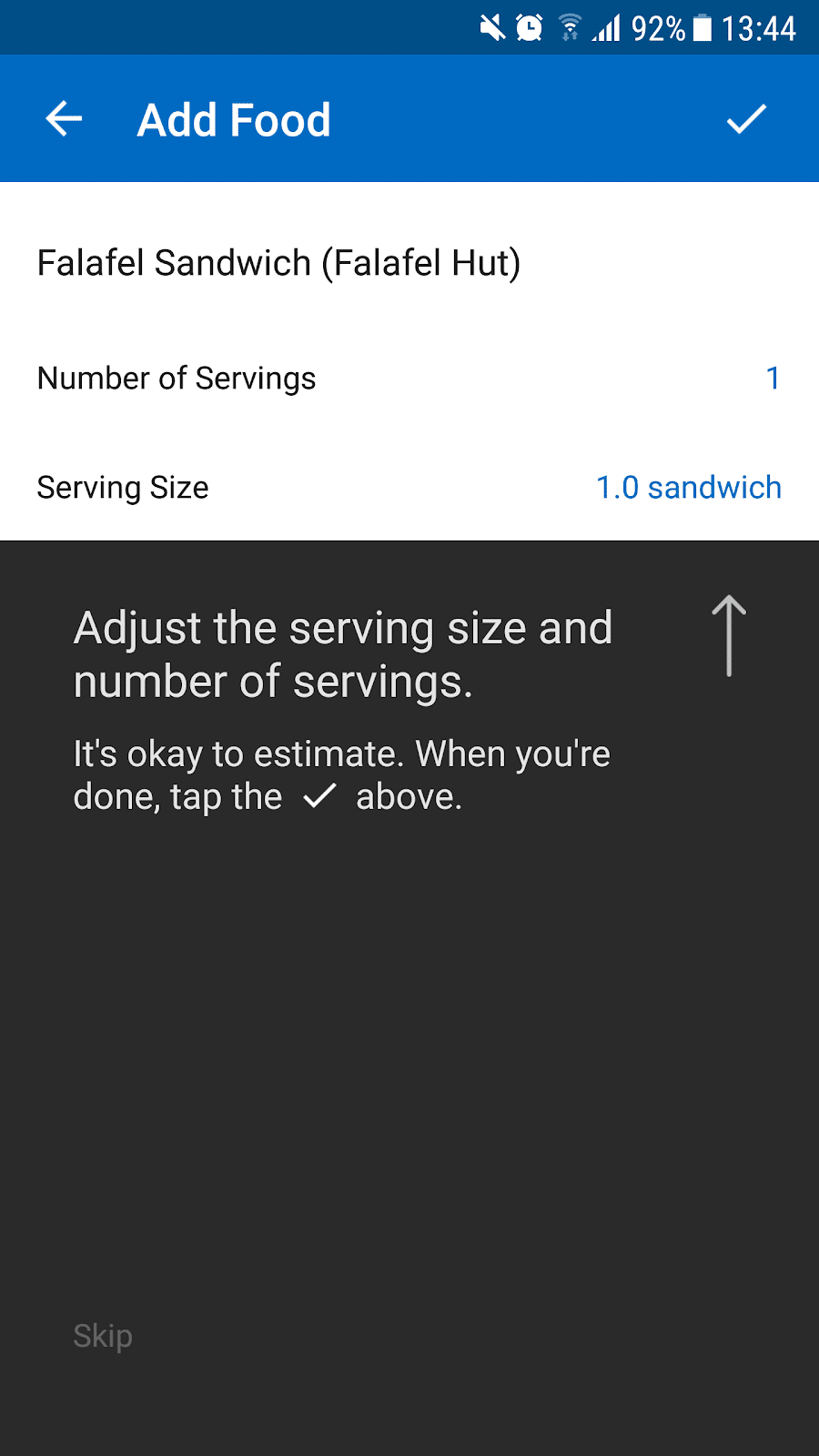
And these pop-up boxes continue to appear whenever a user is doing something on the app for the first time. This helps users get the most out of the app as it informs them of all the things they can do, like this pop-up:
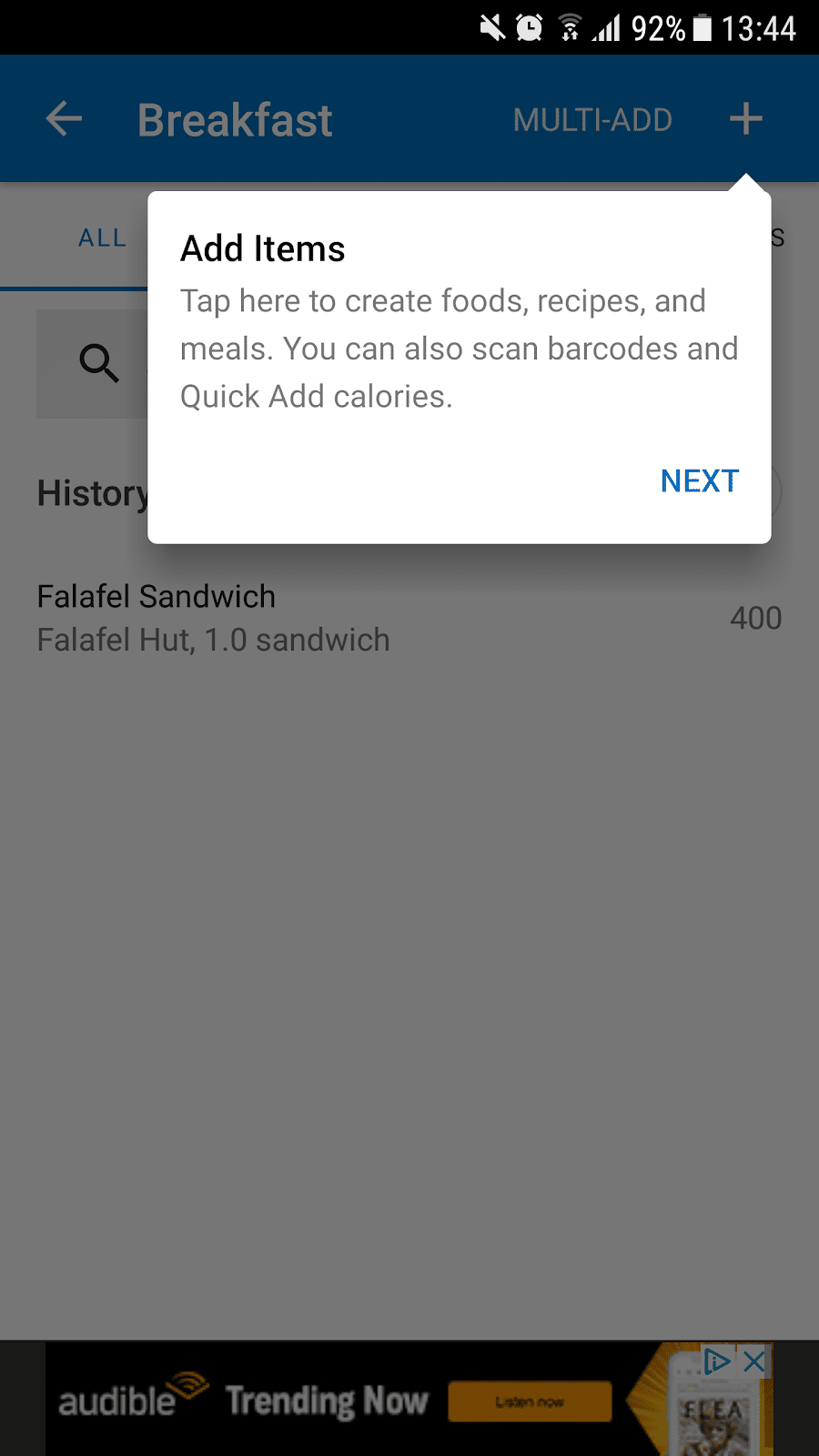
This pop-up box style of walkthrough makes MyFitnessPal’s onboarding clear and concise, but also non-intrusive. Users can simply click anywhere on screen to remove the pop-up boxes if they no longer need them.
3. Diner Dash
Just like fitness, mobile gaming is a competitive industry. In 2021, the App Store had almost 4 million apps, and almost one million of those were games!
Diner Dash Adventures is a very popular mobile game with a score of 4.4/5 stars from almost 45,000 reviews (on the App Store).
The game also won Google Play’s ‘Best of 2019’ award.
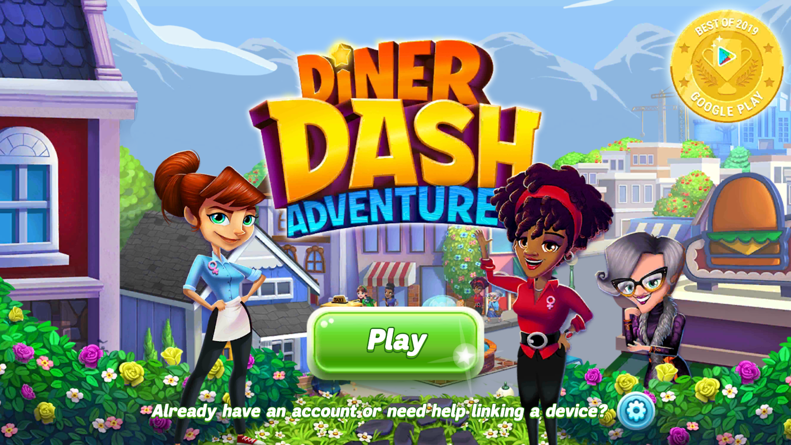
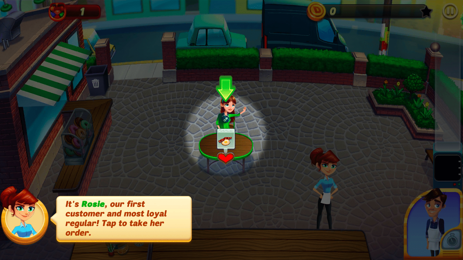
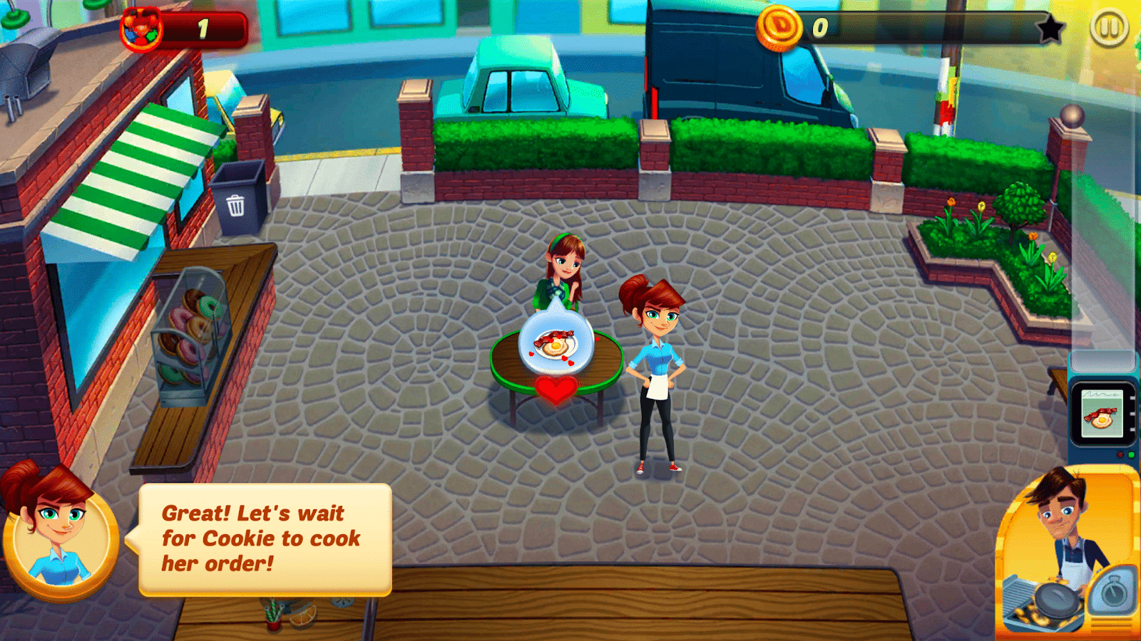
The walkthrough for Diner Dash Adventures is very comprehensive and engaging – exactly what’s needed to get new downloaders excited about a game.
It combines text pop-ups and highlighted hotspots to guide users through a simplified version of a level:
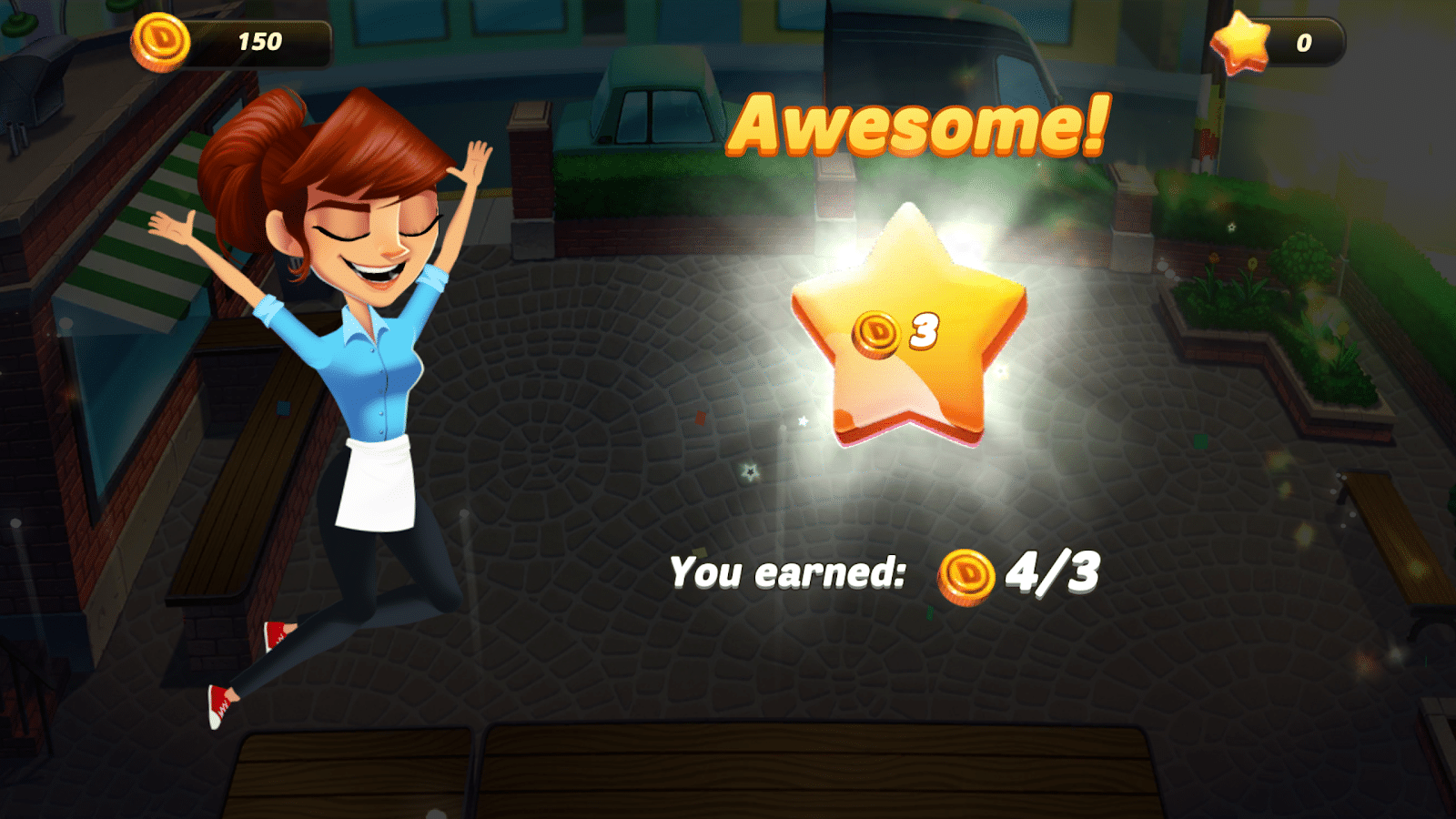
When the level is complete a celebratory screen congratulates users for a job well done – encouraging further engagement:
As users progress throughout the game, the highlighted hotspots and text pop-ups are reduced, but still show up every time there is something new to review:
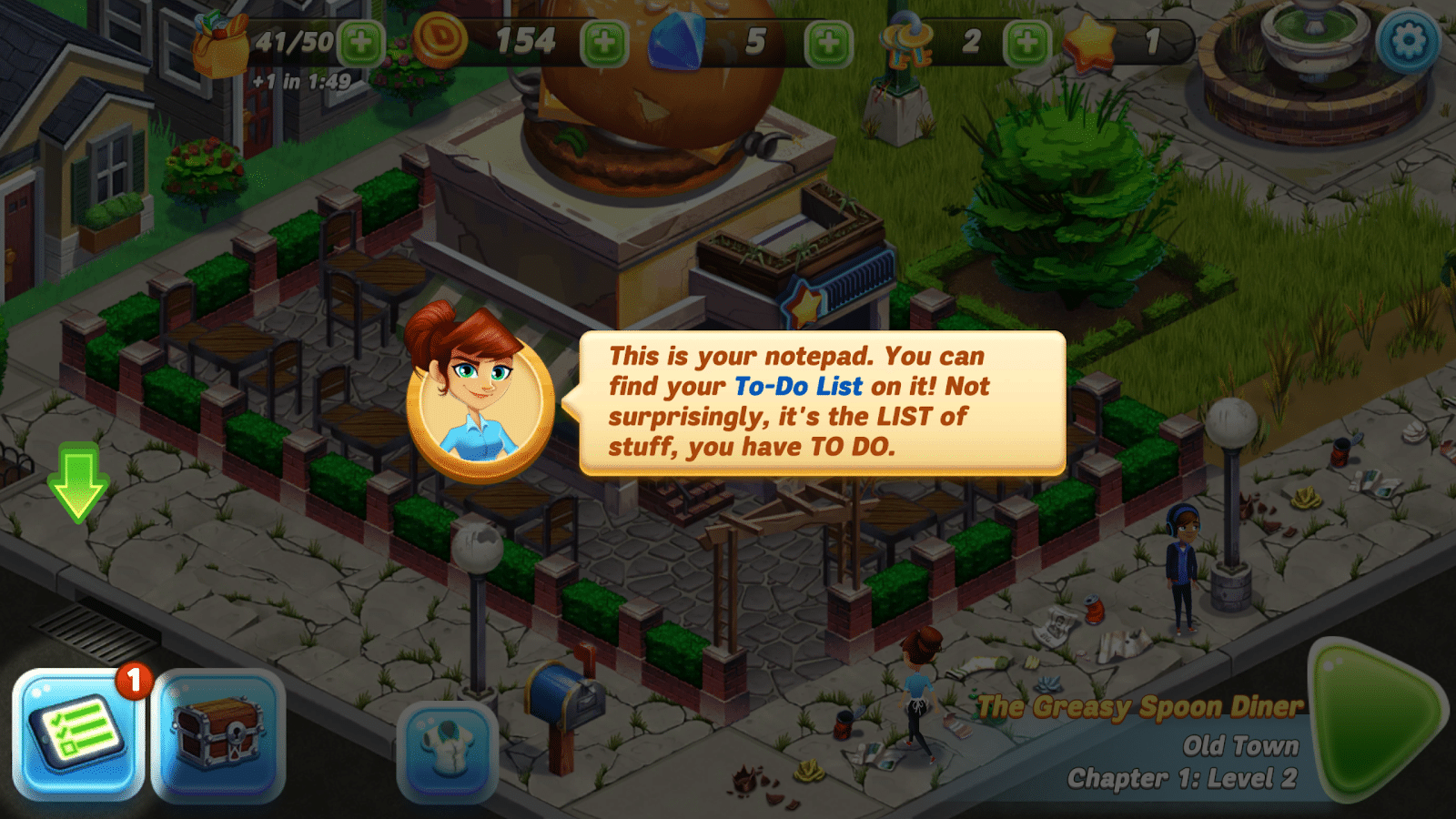
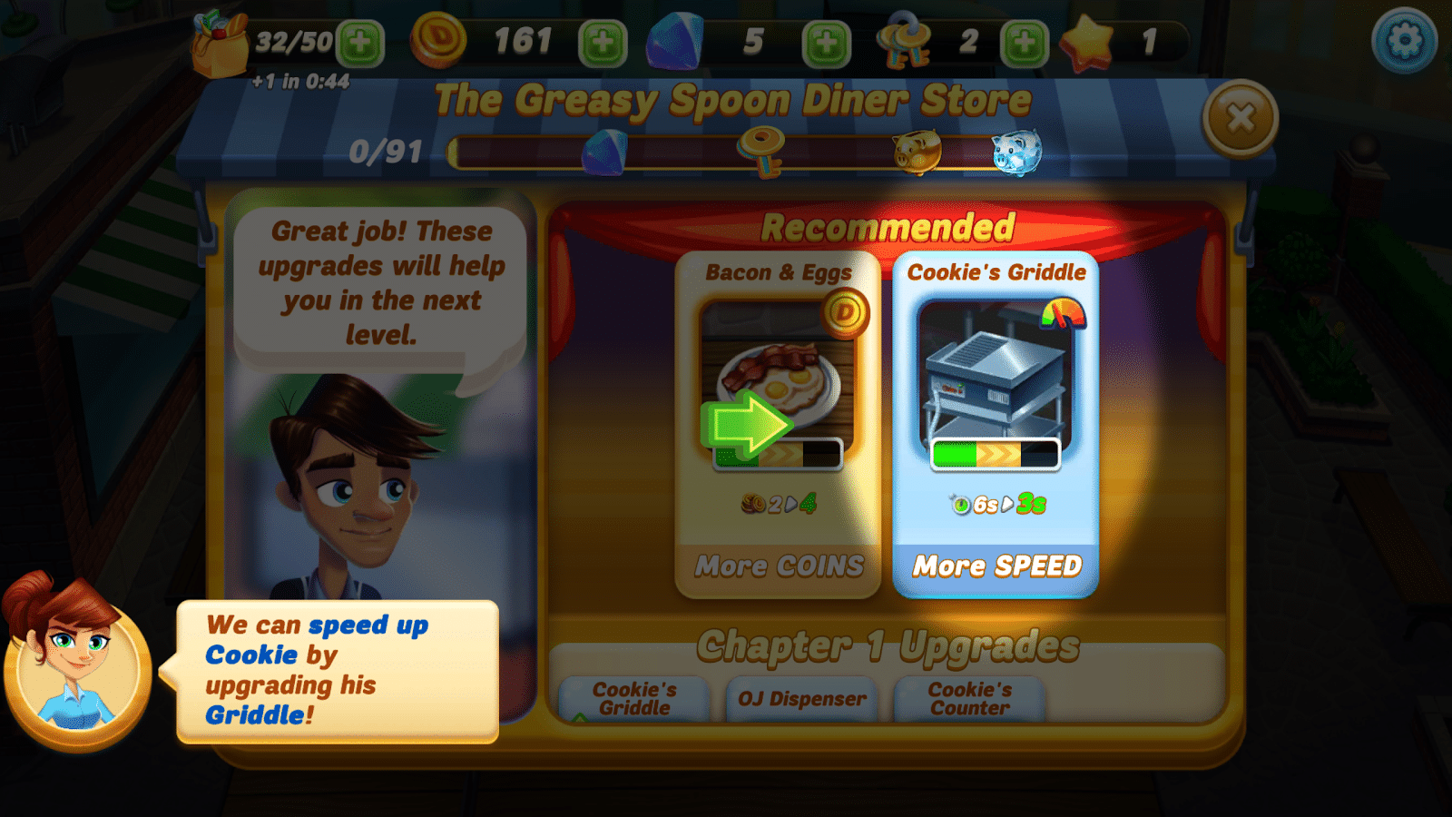
This ensures that users know exactly what every part of the game does so that they can get the maximum enjoyment out of it.
4. Honey
Honey is a coupon site that automatically applies online coupons for users when they are shopping on eCommerce websites.
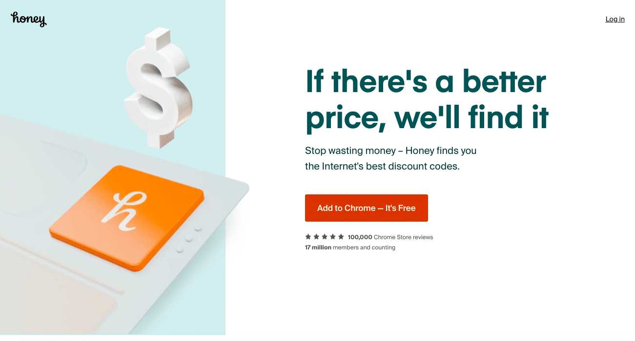
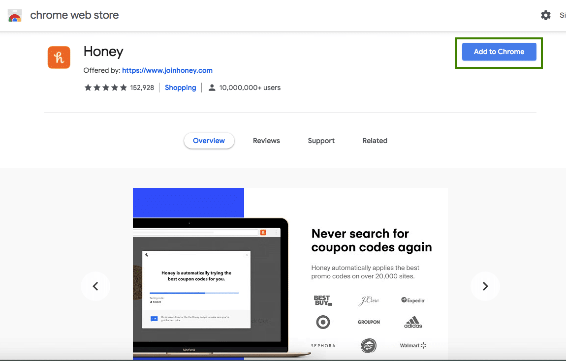
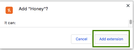
Users can add the Chrome extension to their browser in just a couple of clicks:
From there, users are invited to watch snappy GIFs that demonstrate exactly how Honey works:
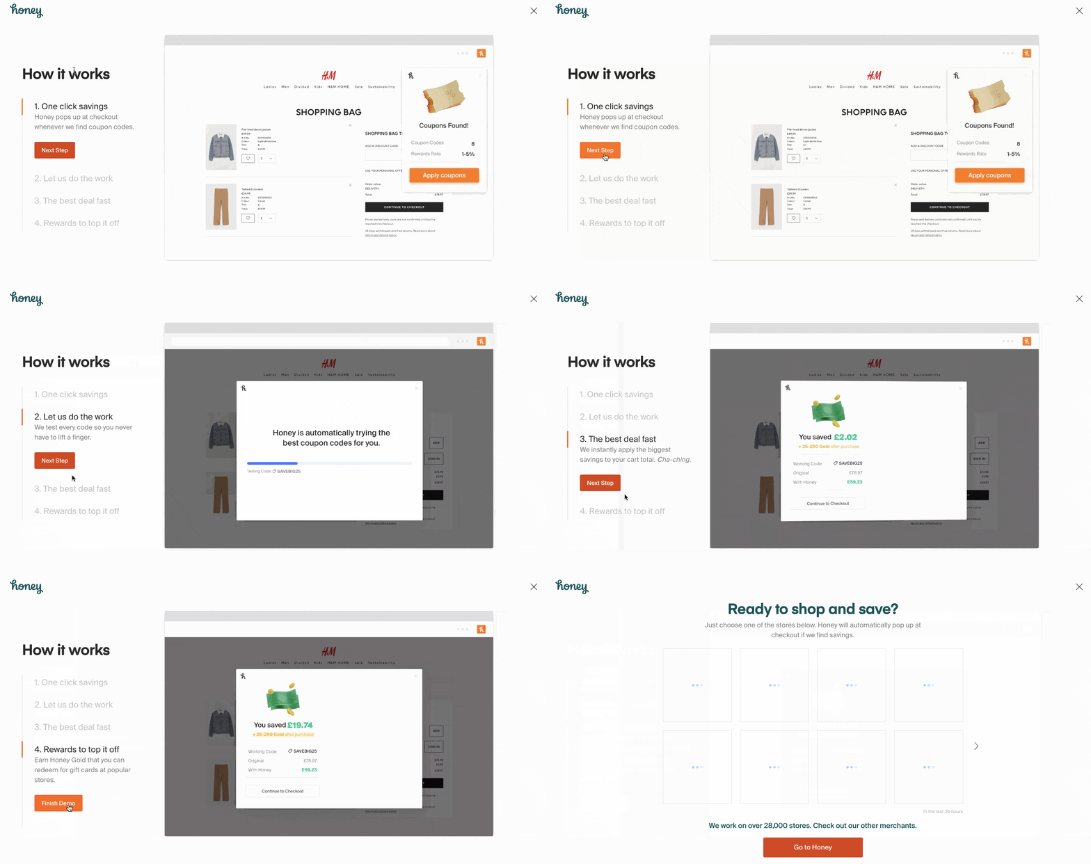
Users can click through the steps in their own time so that they can learn at their own pace.
However, while this is great onboarding, it’s not what we’d class as a walkthrough.
Honey goes a further step to walk users through the process of using the extension to find coupons:
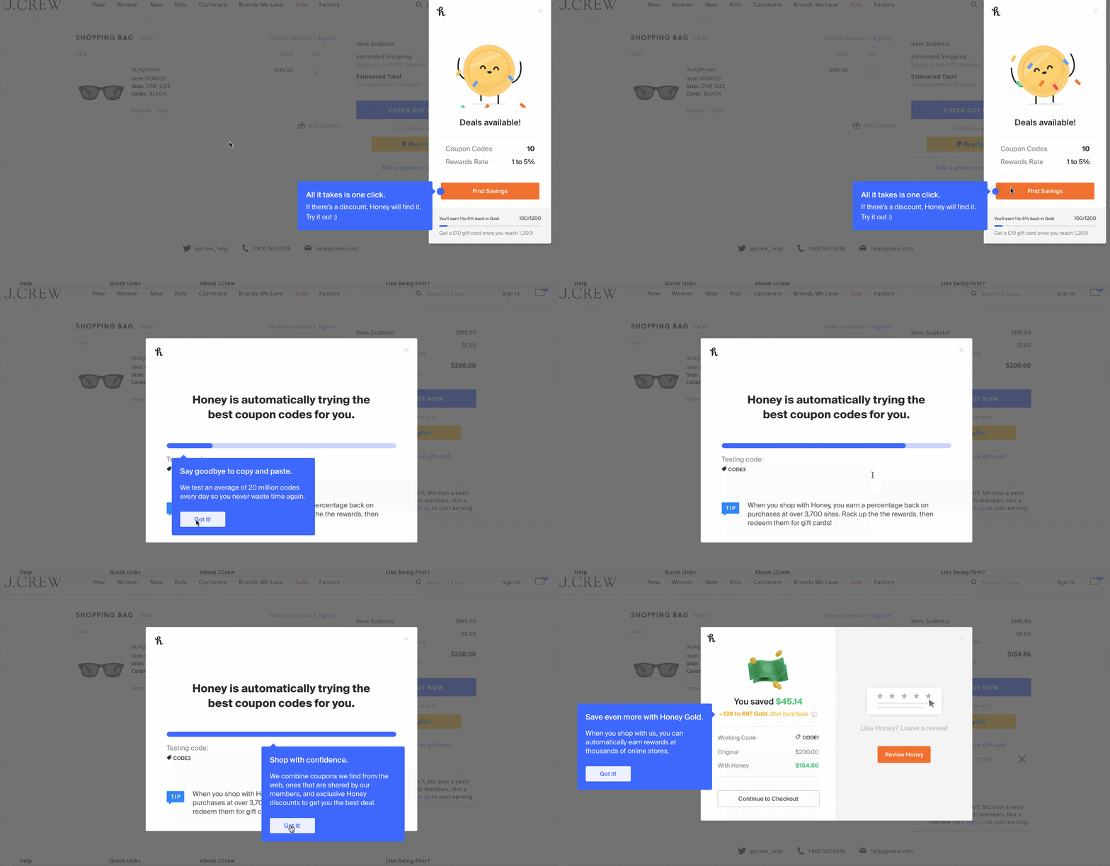
This click-through demonstration is engaging and lets new users get a feel for how they might use Honey when they’re shopping online.
Honey also automatically pops up the first time new users visit the checkout page of an eCommerce site after adding the Chrome extension.
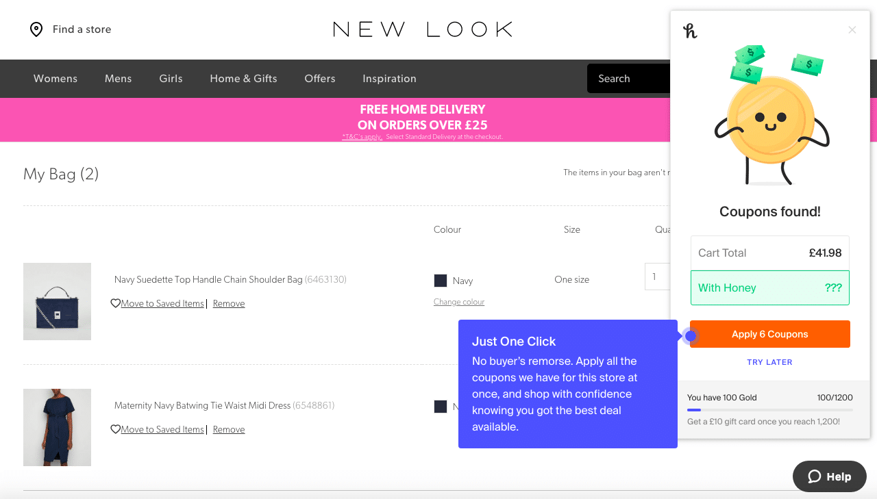
Clear and concise pop up boxes show users exactly what to do in order to apply coupons and save money.
Alternatively, they can also click the ‘Try Later’ text beneath the ‘Apply & Coupons’ button if they don’t feel like using Honey at that time.
5. Slack
Slack is an instant messaging platform that acts as an alternative to email. The instant nature of the platform means that it’s great for keeping remote teams in touch with each other.
As more and more businesses move to remote working, apps that work both on desktops and on smartphones are becoming more of a necessity.
Slack’s mobile app has an amazing walkthrough!
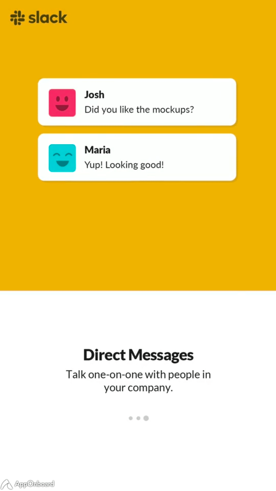
It begins with some succinct and engaging screens that let users know about the top features of the app:

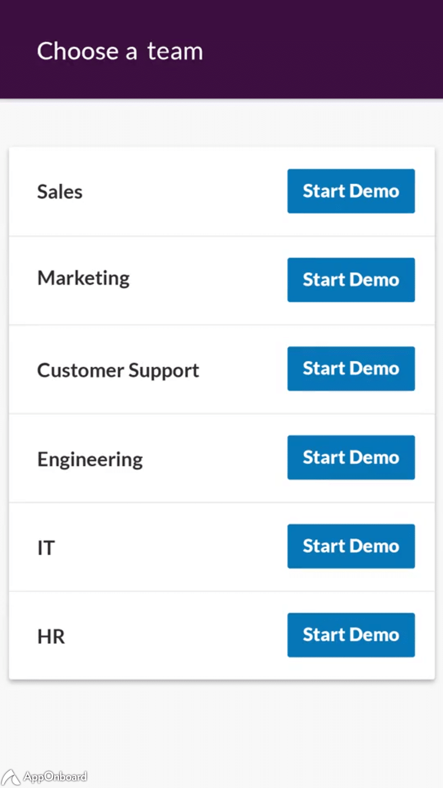
From there, users can select a team that is most relevant to them and watch an interactive demo play out:
We selected the marketing demo. As you can see, helpful hotspots guide users through the demonstration:
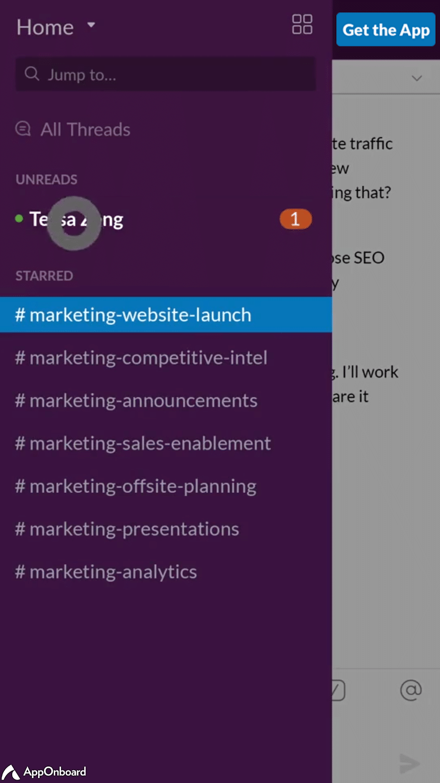
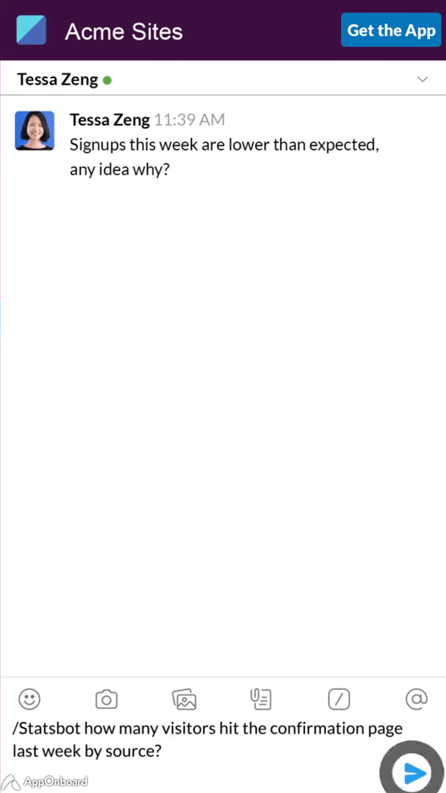
This interactivity helps users to get a better grasp of how everything works before they start using the app for themselves.
Final thoughts
An amazing walkthrough is a great way to welcome new customers to your website or app. It helps you to make a lasting first impression and will hopefully encourage users to come back to your product again and again.
If you want to know more about how to welcome new users, click here to find out about our onboarding videos.

