Last updated on 25th April 2024
In today’s fast-paced digital landscape, product demo videos have emerged as an essential tool for businesses to captivate their audience, showcase their offerings, and make a lasting impression.
These videos serve as dynamic windows into the world of products, bringing them to life and enabling consumers to make informed decisions.
We’ve compiled 20 of the best product demo videos out there so you can gather some inspiration and make your video one of the best yet!
1. Headspace
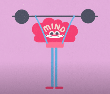
Headspace is a meditation app. And, seeing as meditation isn’t a tangible thing you’d think that creating a product demo for this would be difficult.
But this ‘how it works’ video does a great job of explaining what meditation is and who can benefit by using quirky and fun characters.

The actual demonstration of the app, while in keeping with the quirky style, is clear and concise – telling potential users exactly what they need to do to get started.
2. Nespresso
EVERYTHING about this video cries out to potential customers of this Nespresso coffee machine. From the chilled out music to the relaxing and spacious apartment – this demo doesn’t just sell the product, it sells a story.
And the story is: “If you buy this coffee machine you can enjoy wonderful moments of calm in a fashionable apartment.”
Whether that’s true or not is beside the point – because when you’re watching it feels true.
3. Slack
We don’t feel like Slack needs an introduction because, as this video says at the beginning: ‘You’ve probably heard of Slack.’
This product demo video has a lot of layers: there’s clever interaction between the voiceover artist and the actor, there are screenshots of the software alongside live action scenes, and the bright colours really make it pop.
But what makes this video really great is Brianna. Without the character of Brianna, this video would probably be a straight-forward screen-recorded video. And, while there is nothing wrong with that, it’s nice for viewers to see someone they can relate to.
4. Doorport
As you may have noticed with the Headspace video, you can create an amazing product demo without actually showing your real product!
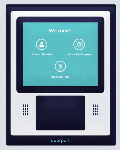
Doorport is another great example of this. Doorport is an apartment access app, and they’ve used animation to tell an engaging story that showcases their features and benefits.

To fit in with their animated story, they’ve created an animated version of their Arrive System that looks just as good as the real thing without detracting from the story world they’ve created.
5. Peloton
Peloton is an online fitness company that invites people to join live indoor fitness classes from their own homes.
This ad does a great job of not only explaining that, but also showing potential customers what it feels like with an inside look at the development process.
This product demo works hard to squash any doubts and that, paired with the motivational soundtrack, is what makes it so great!
6. Project.co
This video is a classic example of show, don’t tell.
Project.co is a project management software, and this product demo shows off their breadth of features.
The use of title slides helps to split the features into engaging, bite-sized segments. And the upbeat soundtrack and slick animation really makes this product demo video stand out.
It just goes to show that you can successfully tell a complete story without saying a word!
7. Google Chrome
This lovely video by Google Chrome is another example of showing viewers what your product can do, instead of simply telling them.
This thought-provoking video not only demonstrates the best features of Google’s well-known products, like Gmail, YouTube, and Google maps, it also tells a beautiful story that tugs at your heartstrings.
This is a great example of a video that people just love to share with others – and it probably encouraged a lot of people to use Google Chrome in exactly this way.
8. Soapbox
Soapbox is a webcam and screen recording app by Wistia.
Instead of creating a straight-forward demo that shows potential customers the features of Soapbox, Wistia went for something a little different.
Straight off the bat, this ad is self-aware. It tells you you’re watching an ad! And that’s great. After all, people know they’re watching an ad, so why hide that fact?
This self-awareness gives an element of humour to the video that makes it an interesting watch. It’s a little on the long side, but it does show potential users how to use the platform while also telling a story.
If you’re interested, Wistia created two more ads for Soapbox at different price points (to compare the difference in quality):
9. Apple
Apple is a company that knows how to create hype. And that’s why people love Apple so much.
This product demo pairs an awesome soundtrack with blink-and-you’ll-miss-it editing to create a bold and energetic ad.
In a world where we’re so bombarded with ads that we’ve become experts in ignoring them, Apple’s product demo demands attention.
Biggest takeaway: Be bold.
10. DuoLingo
DuoLingo is a language learning app that uses gamification to keep users engaged.
The beauty of this product demo video is it’s simplicity. It shows different features of the app in a clear and easy-to-understand way – it also showcases a couple of different languages in order to appeal to a wider audience.
This simplicity means that potential customers could download the app and get started almost immediately after watching – which is a great result for any product demo video!
11. Microsoft Surface
There’s no getting away from it: sometimes, specs matter! This is particularly true in something like laptop retail.
This video does an amazing job of throwing loads of juicy product info at you in a way that isn’t at all overwhelming.
By using captions and illustrating the physical location of these features on the product, we’re left with a super clear idea of what this product is and what we can expect should we buy it. A very nice job!
12. Paymentshield
While not as ‘flashy’ as some of the videos on this list, this product demo by insurance company Paymentshield does exactly what it sets out to.
As this is a software product, the video shows viewers simplified versions of what they would see on the actual dashboard. The animation works well here because it allows Paymentshield to only draw attention to the features that they want to highlight.
This makes the video more clear and concise for viewers. And the text-labels on screen also help to call out certain features and their uses.
13. Nintendo Switch
As a home console that can also be portable, the Nintendo Switch was quite revolutionary in the gaming world upon its release.
As such, this product demo needed to present the many different uses cases of the console to entice fans to purchase it.
This ad shows people using the Nintendo Switch at home, while travelling, and with friends – it also showcases different games available for the console.
By doing all of this in a smooth way that doesn’t feel forced, Nintendo is able to appeal to multiple different customers with just one product demo video.
14. Kite/Shopify
When making a product demo video, it’s best to assume that the person watching has never seen or even heard of your product before. This will help you to create a walkthrough with completely fresh eyes.
That’s exactly what this product demo by Kite (a Shopify app) does. It takes users through every little detail, from logging in, to customising their store.
This is a great way to ensure that everyone who purchases your product gets the most out of it.
15. Amazon Echo Dot
Amazon always seem to absolutely nail it when it comes to their product marketing, and this intro to the 3rd generation Echo Dot is a perfect example.
The video covers a lot of ground for 2 minutes – but it doesn’t even try to get across all the functionality, because that just isn’t possible. They know this video’s place in the funnel: an introductory demo. And they make sure that’s all they do.
If you spend a few minutes combing the Amazon YouTube page you’ll find a range of more specific feature videos to further educate users about what the product can do.
But the intro video is designed to ‘intro.’ And that’s what it does!
16. IKEA Place
IKEA Place is an augmented reality app that customers can use to find out whether furniture fits, or looks good, in their homes before they make a purchase.
This bright and upbeat video does a great job of explaining what the app does, and even showing some step-by-step walkthroughs.
And it also makes the video relatable to a wide variety of people. It shows lots of different homes, of every shape and size, in many locations.
17. Grammarly
If you haven’t seen a Grammarly ad – where have you been?!
Grammarly is a digital writing tool that helps users with their spelling and grammar. Their product demo videos are very persuasive – particularly this one because it speaks to several different audiences – because they actually show their product in action.
If you want to attract new customers with your product demo, then make sure you show them all of the great things your product can do.
While you have their attention, this is your time to put a spotlight on your product and make a song and dance about how great it is.
18. Tasty
So, by now you’ve seen a lot of product demo videos! And you might be feeling a little overwhelmed. Hopefully this simple video by Tasty brought you some comfort.
Tasty is a food recipes network, and this product demo for their app is genius in its simplicity.
It simply talks users through what to do, and shows them how to do this in real-time. And that’s really all customers want from a product demo video – they want to know how to use the product correctly, in order to get the most out of it.
19. LEGO Life
As a toy brand, LEGO’s main demographic is children. So this product demo video for the LEGO Life app speaks directly to kids.
It has an upbeat soundtrack, bright colours, and fun icons – all of which are designed to appeal to a younger audience.
It also lists all of the fun things kids can do with the app and shows a child playing with LEGO figures while using the app.
Biggest takeaway: Speak directly to your audience.
20. Masterclass
Masterclass is an online education platform that offers students tutorials and lectures by many well-known names.
Despite having such a powerful and unique offering, Masterclass still relies on product demo videos to sell their platform.
This video is great because it makes viewers feel like they’ve already bought the product – giving them a taste of what it’s like.
By using content from the actual masterclass and cutting that together to create an engaging experience, the viewer feels as though they’re being taught one-on-one by the celebrity.
Final Thoughts
So, that was A LOT! A lot of videos, a lot of inspiration, and a lot of takeaways.
But hopefully now you’re feeling more inspired and ready to create an amazing demo video for your product.
For more info on how to get started, head on over to our product video production page.


