Last updated on 10th January 2024
When you’re looking for a reliable graphic design platform, it can be hard to know which one to use.
It’s important to choose the right fit for your business because visuals are so important when it comes to marketing campaigns. According to our The Power of Visual Communication infographic, visuals are processed 60,000x faster than text and while people only remember 20% of what they read, they remember 80% of what they see!
So, with that in mind, let’s take a look at two popular graphic design platforms to find out which is better for your business in 2024, Canva vs Snappa…
TL;DR
Canva is an online design and publishing tool that has helped users create over 10 billion designs. The platform features over 100 million graphic elements, images, and videos, 610,000+ professional templates, and a huge app directory.
Pro 1 – Easy to use
Pro 2 – Free to get started
Pro 3 – Huge library of assets
Con 1 – Free plan is limited
Con 2 – Can’t create unique design elements
Con 3 – Tough to use on mobile

Snappa is a cloud-based application that helps users create graphics in a snap! The UI is clean and easy to navigate, and the library features an impressive 6,000+ templates and 5,000,000+ HD photos and graphics. Plus, Snappa integrates with Facebook, Twitter, and Buffer, so it’s easy to share your graphics to social media.
Pro 1 – Easy to use
Pro 2 – Free to get started
Pro 3 – Excellent customer support
Con 1 – Free plan is limited
Con 2 – Canva’s library is bigger
Con 3 – No mobile app

What is Canva?
Canva is an online design and publishing tool. Launched in 2013, the Australian company’s mission is to “empower everyone in the world to design anything and publish anywhere.” And so far their mission is going pretty well!
According to their website, Canva has helped users create over 10 billion designs. The Canva app is available on iOS, Android, Windows, and Mac, and it’s often praised for its ease of use.
Regardless of device, users can head to Canva to create custom graphics for everything from social media content and posters, to corporate presentations and business cards.
What is Snappa?
Snappa claims to help users create online graphics in a snap. The Canada-based company was founded in 2015 and since then has helped thousands of marketers and entrepreneurs to create a wide range of graphics.
Like Canva, Snappa allows users to choose from pre-defined templates or stock libraries to create stunning, professional graphics.
Snappa is a cloud-based application and has been used to create over 25 million images, and counting!
Who is Canva & Snappa for?
Both tools are aimed at people who aren’t designers but need professional designs and image content for one reason or another.
Canva & Snappa are aimed at individuals, freelancers, small businesses, enterprises, students, teachers, entrepreneurs, and everyone in between!
Canva’s user base
Canva has over 100 million monthly active users in over 190 countries! According to a study of almost 400 companies that use Canva, most users are from the United States and work in the higher education industry.
The same study also found that Canva is most often used by companies with 10-50 employees and between $1-10 million in revenue.
Snappa’s user base
Snappa’s user base seems to be a lot smaller than Canva’s. There doesn’t seem to be much information out there but it’s clear that Snappa serves ‘thousands’ of customers, rather than millions.
And Snappa was a little bit later to the game than Canva. However, that didn’t stop the tool clocking up over 1,500 new paying users within the first 15 months of being launched.
Canva’s onboarding
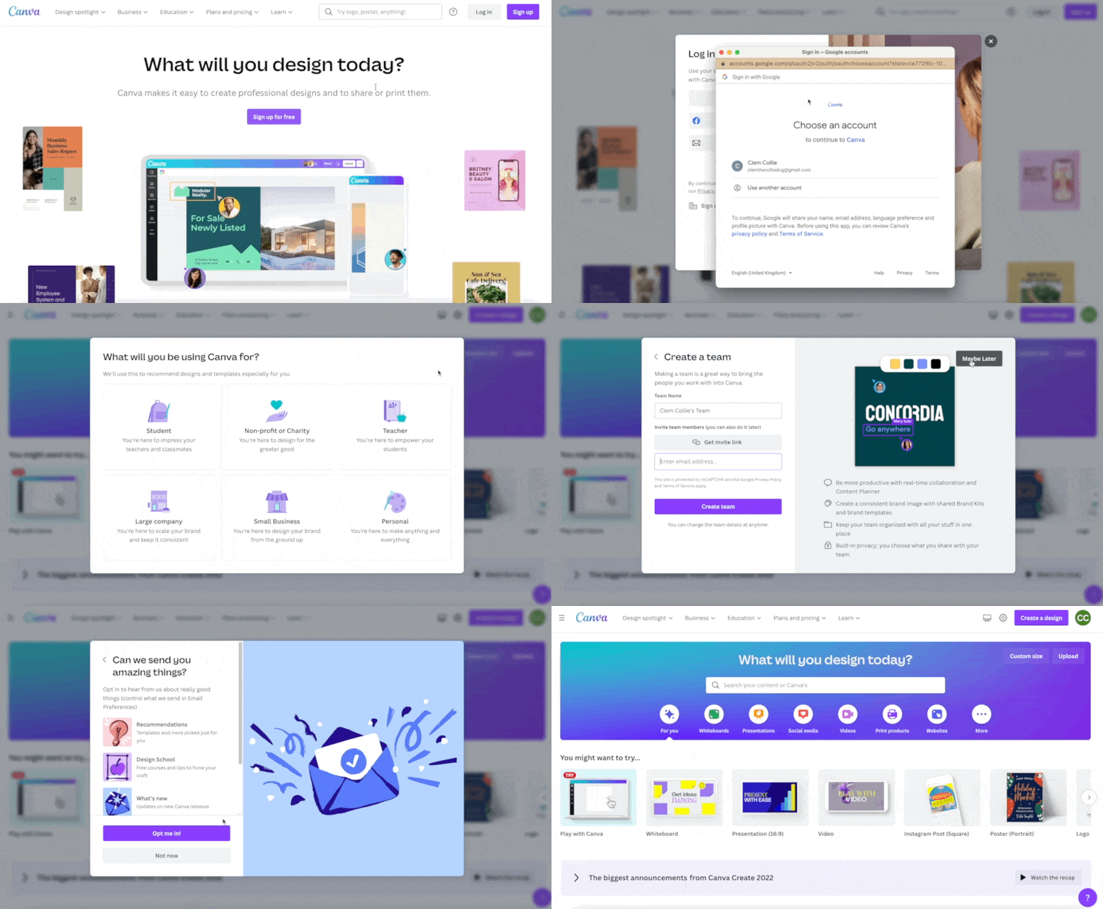
Canva’s onboarding is quick and easy, but the trade off is that it’s not that hands-on. It starts in the way that most app sign ups do, by asking you for some personal details and offering some upsells, like Canva Pro.
The confetti cannons at the end of the very short onboarding flow are a nice touch:
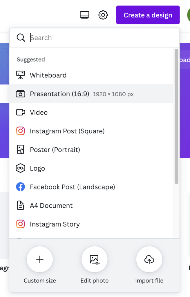
There’s no real direction after that so we clicked on the ‘Create a design’ button. It seemed like the obvious place to start.
A dropdown menu shows a list of suggested options and their sizes:
We selected Presentation first, and this opened a new tab:
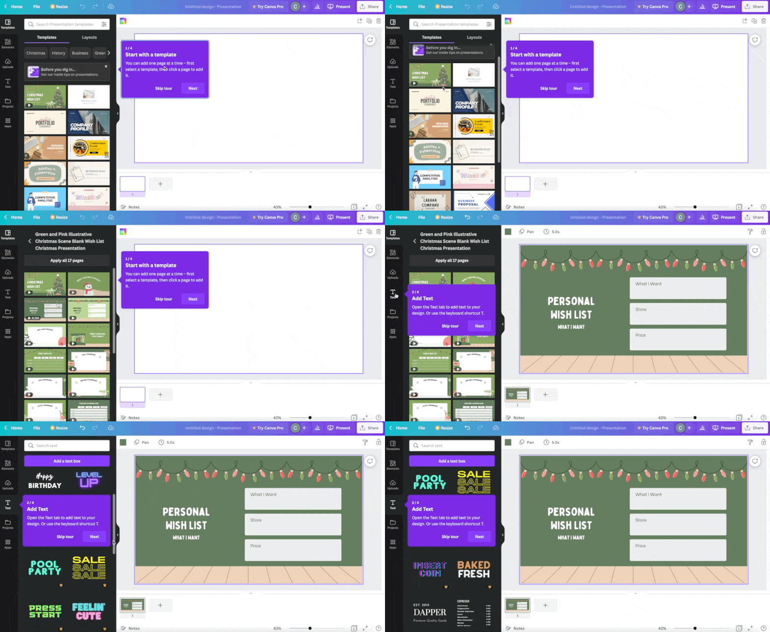
We were glad to find a four step tour that offered some more direction in terms of how to use the product. Step one was to choose a template, and step two was to add a text box to personalise the design.
As you can see from the GIF above, we initially chose a text graphic that wasn’t available on the free plan. This is easy to do as Canva shows users a lot of Pro assets. However, once you know how to spot them (the small crown icon in the bottom right) they become easier to avoid.
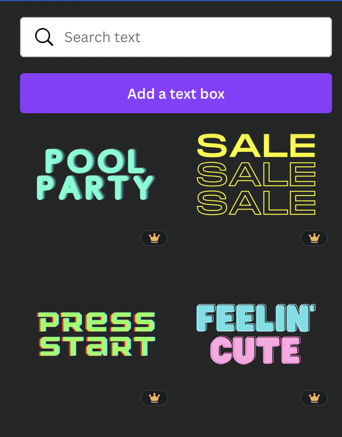
Template selected and text box added, it was time for step 3 of creating a presentation:
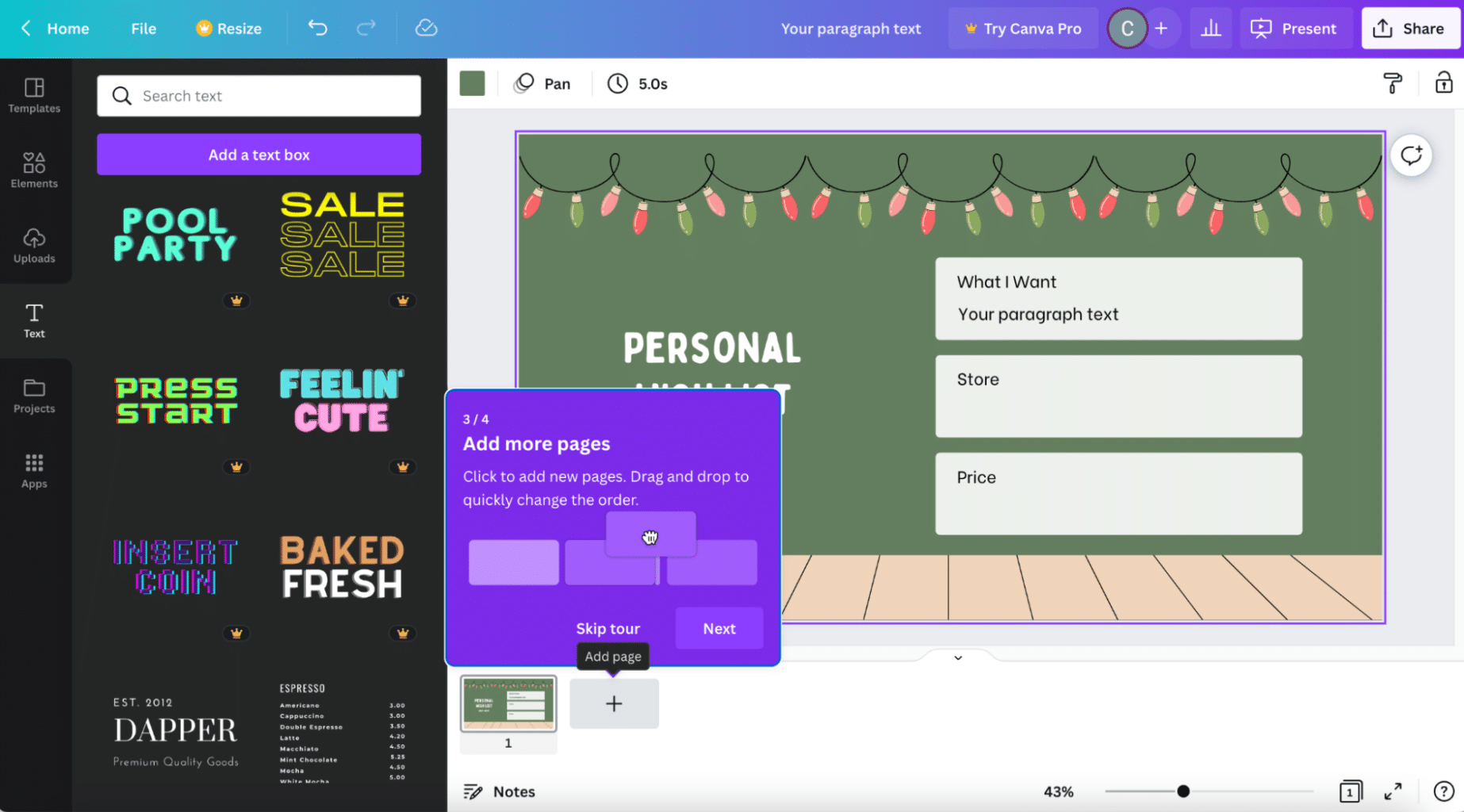
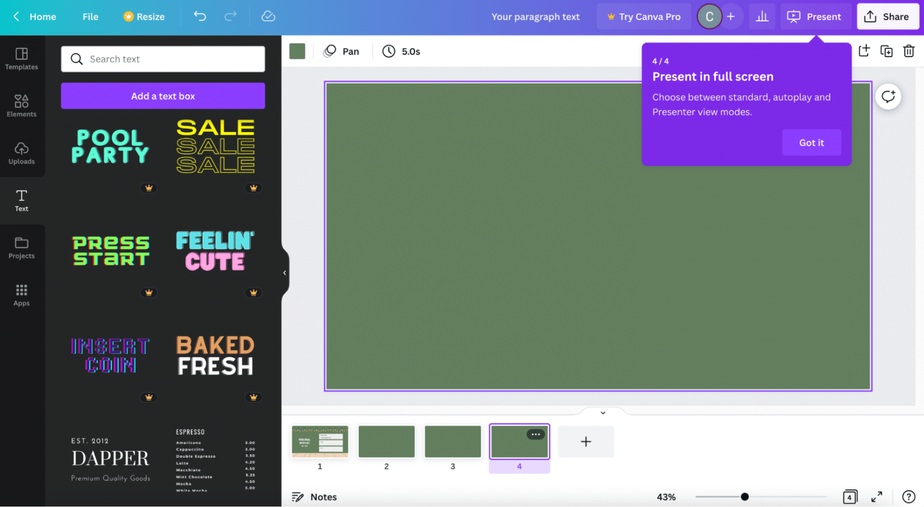
The tour demonstrated how to add more pages with a simple drag and drop functionality. The last step in the tour was showing users how to present their presentation in full screen:
These helpful pop ups also appeared in several different places as we navigated Canva for the first time, showing us how to add feedback:
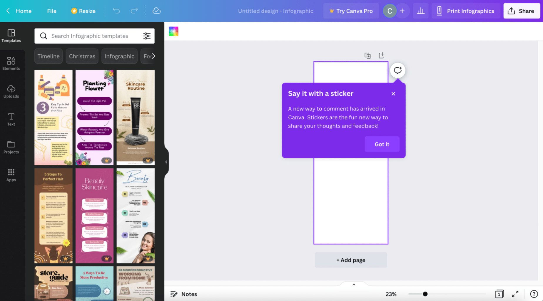
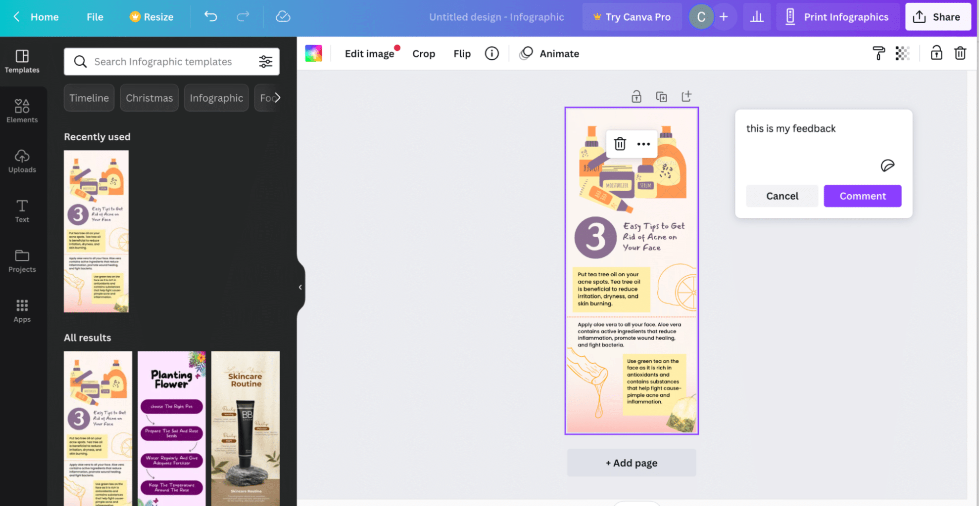
And also how to save and schedule social media posts (although this feature is not available for people using the free plan):
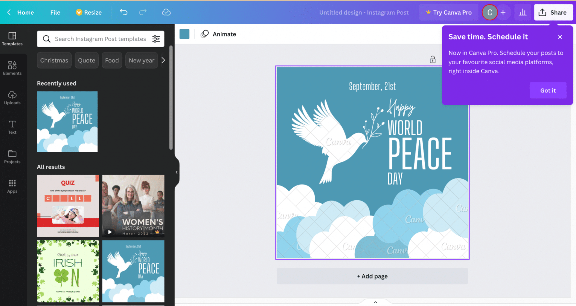
Overall, Canva’s onboarding is non-invasive but could perhaps be considered too hands off for some new users.
Snappa’s onboarding
Snappa’s onboarding, after asking for the usual info (email address and password) begins with a video:
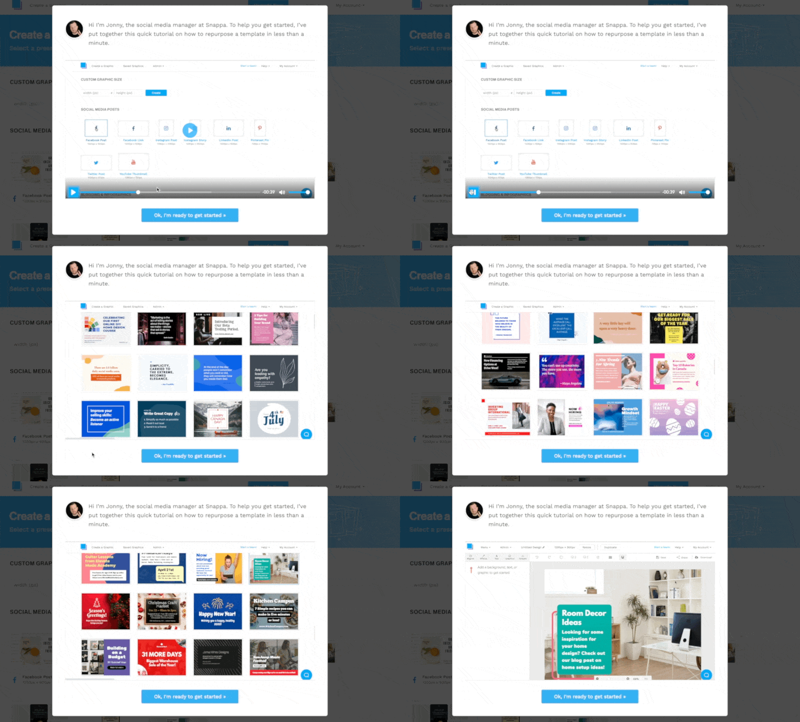
We love this! We’ve written extensively about the power of a great onboarding video and we’ve also created many onboarding videos for our customers.
This video is great because it’s quick, easy to follow, and personal – with a voiceover from Snappa’s very own social media manager.
Another great thing about Snappa’s onboarding is that even after showing you the video, there are still prompts that help you to use the tool effectively:
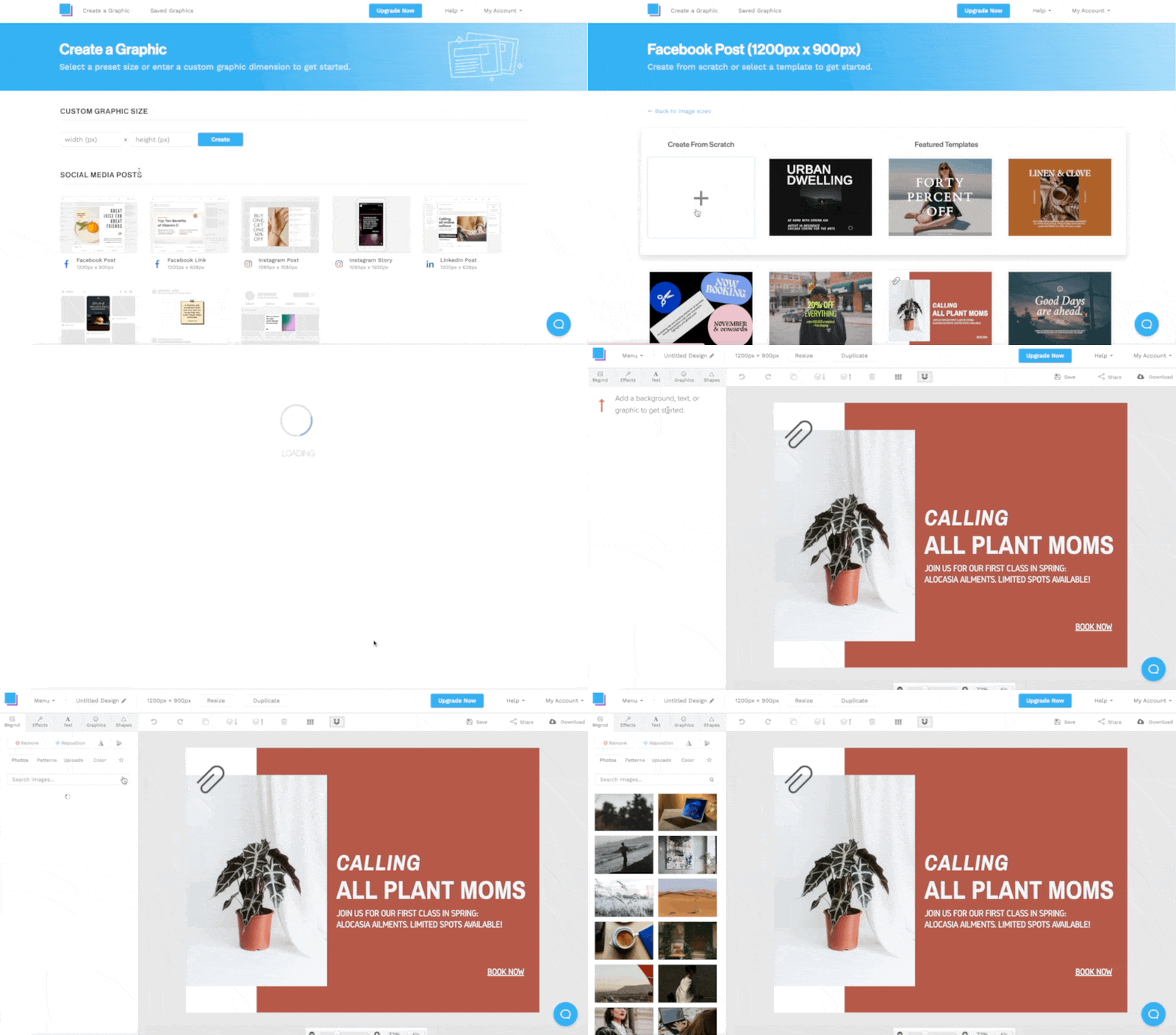
Aside from that there doesn’t appear to be much more onboarding involved, but it also doesn’t feel needed. The tool is simple, intuitive, and easy to use.
Watching the onboarding video should give users enough of an understanding to get started.
Canva’s UI
Canva’s initial dashboard is quite busy, but this also means that users have almost everything they could possibly want to see all in one place so they can easily start their journey:
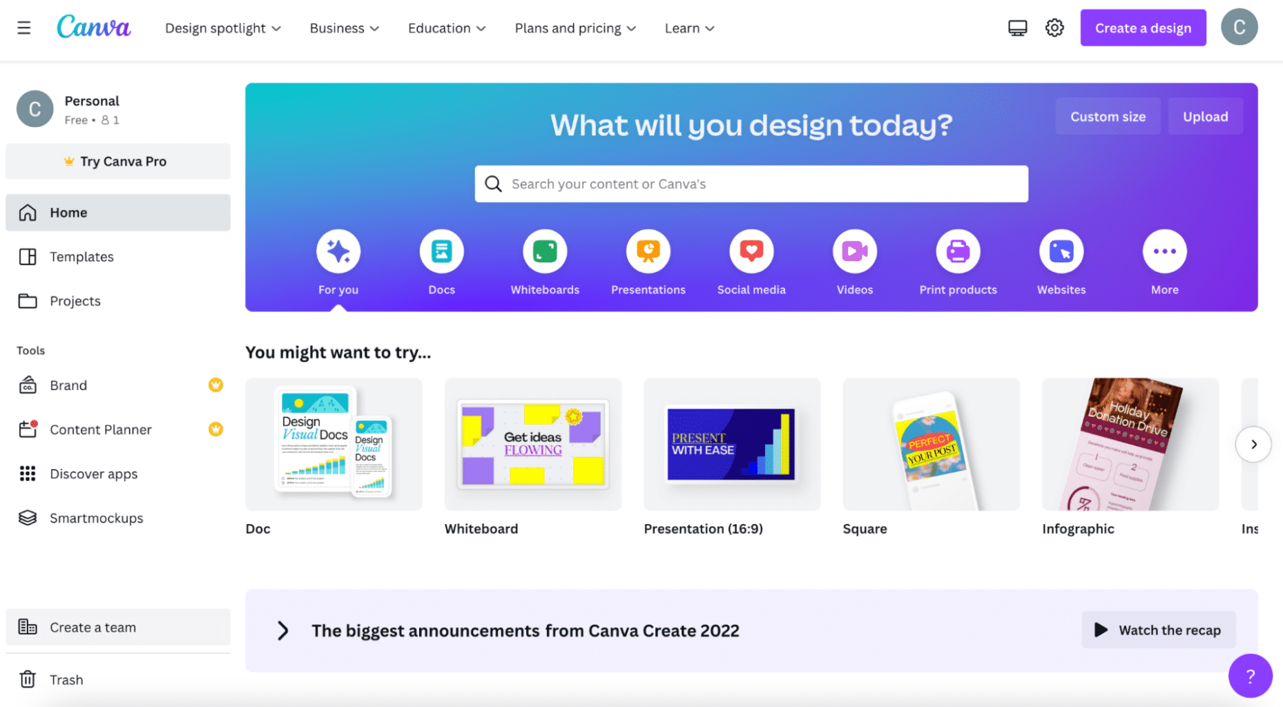
When entering the image editor, that business clears right up. The platform seems to split into two, with the user’s image on the right and available features and assets on the left:

The editor is a pleasure to use. The drag and drop functionality is simple and users can smoothly move through the process of editing their image:
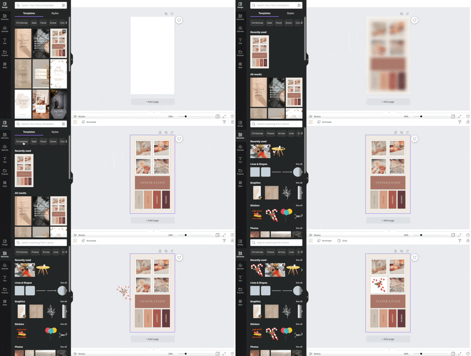
It’s great how things adapt intuitively – in real time – like how we change an icon in the above GIF.
Snappa’s UI
Snappa is a clean-looking platform with lots of white space:
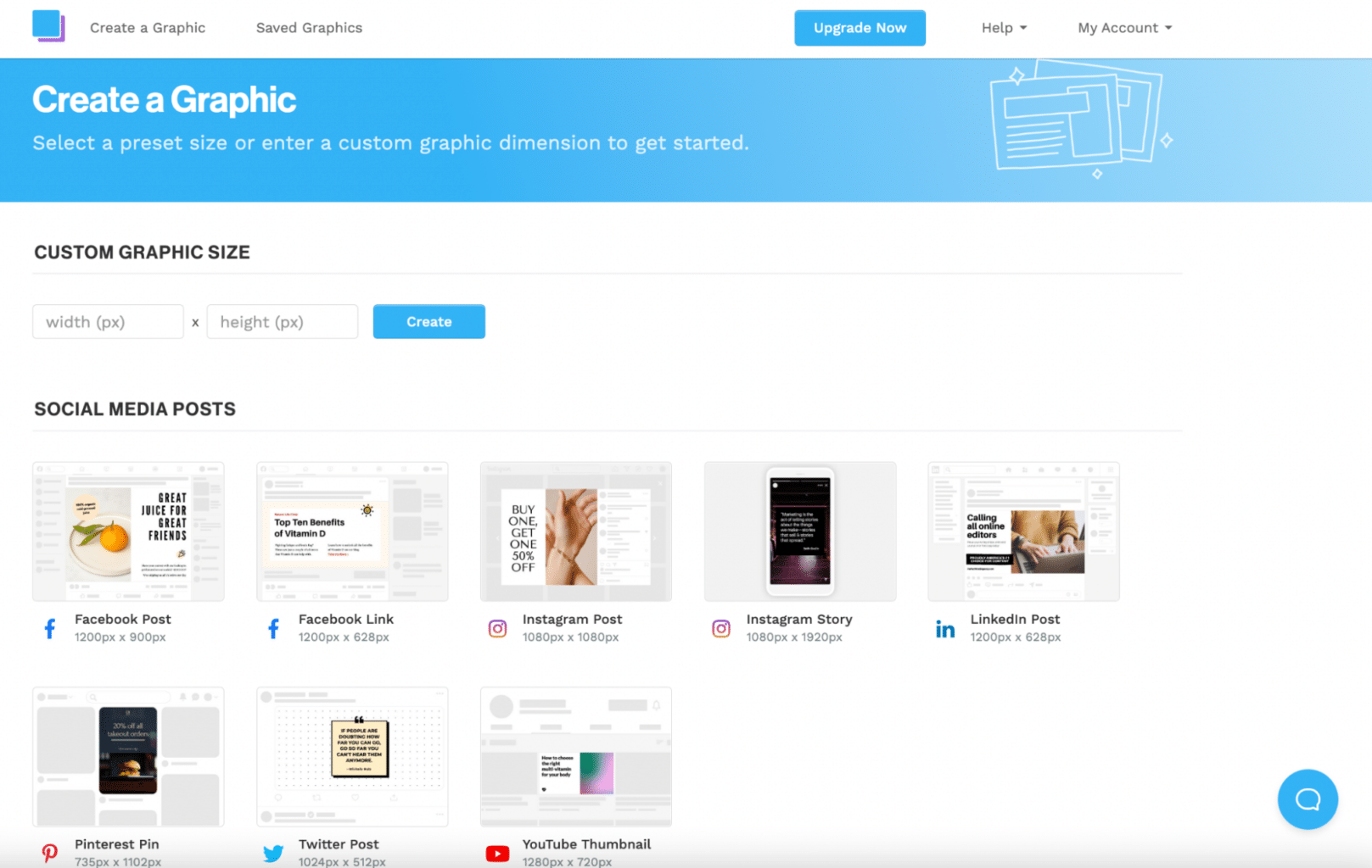
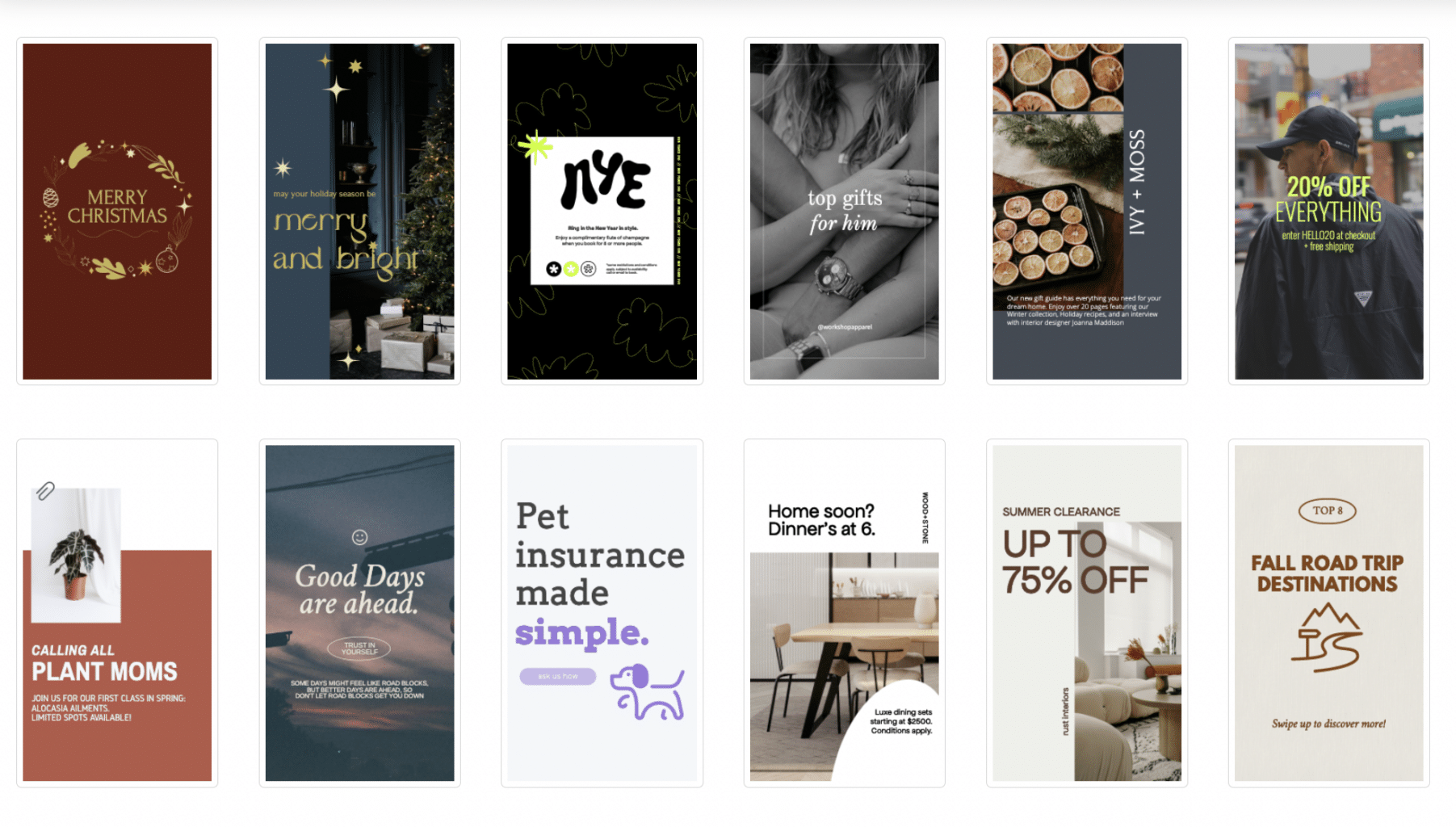
This makes it easy and enjoyable to navigate. Plus, templates are laid out in a neat and simple way, so you can quickly choose one that stands out to you:
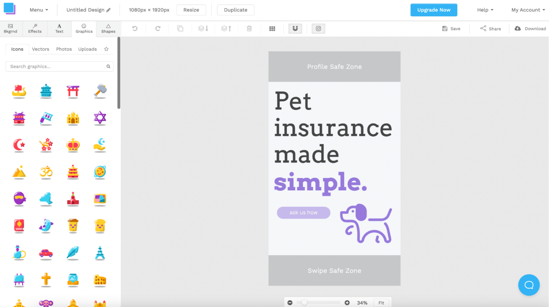
The graphic editor is very minimal and grey, but again this works in Snappa’s favour. The tools aren’t overwhelming and virtually everything a user is ever going to need is available to them on one screen:
The search functionality is easy to use but doesn’t always bring up exactly what you’re looking for because assets are limited:
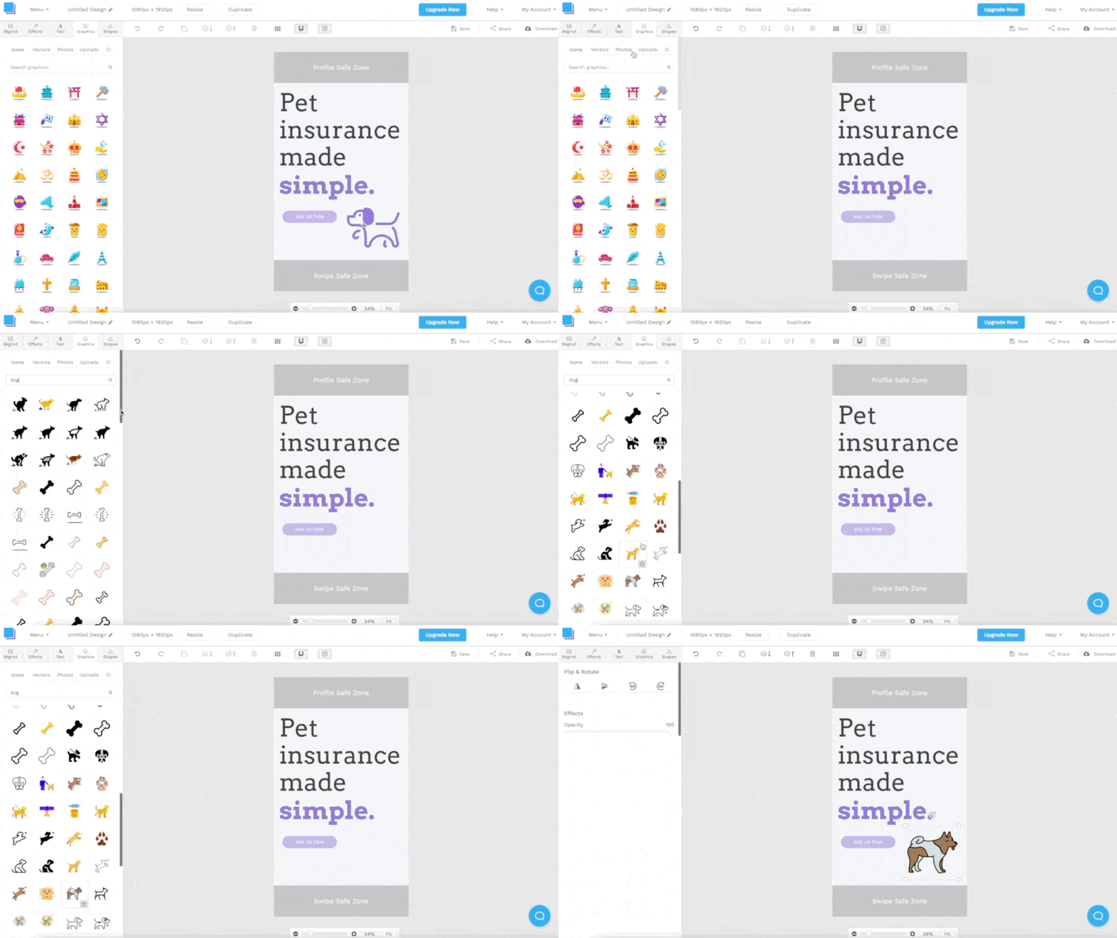
Even in this short GIF it’s plain to see just how easy Snappa is to use. You really can create a custom graphic in seconds.
Canva’s content (templates, assets, library)
Canva boasts a lot of content. In fact, it could possibly have the biggest library of templates and assets of any design tool out there.
To be a little more precise, Canva has over 100 million graphic elements, images, and videos available for users. The platform also offers 610,000+ professional templates, to make creating graphics even easier.
Here’s a quick snippet of what we found on offer:

However, it’s worth noting that 75 million of the graphic elements, images, and videos are only available for premium users. Similarly, over half of the professional templates are also exclusive to premium users.
Snappa’s content (templates, assets, library)
Snappa’s library is a lot smaller than Canva’s, but they still offer users an impressive 6,000+ templates and 5,000,000+ HD photos and graphics.
What’s great about Snappa’s content is that it’s all available to every type of user. Whether you’re on a paid plan or not you still get access to all of their assets and templates – which is quite rare when it comes to design tools!
Like with Canva, we thought we’d show you what we found on offer:
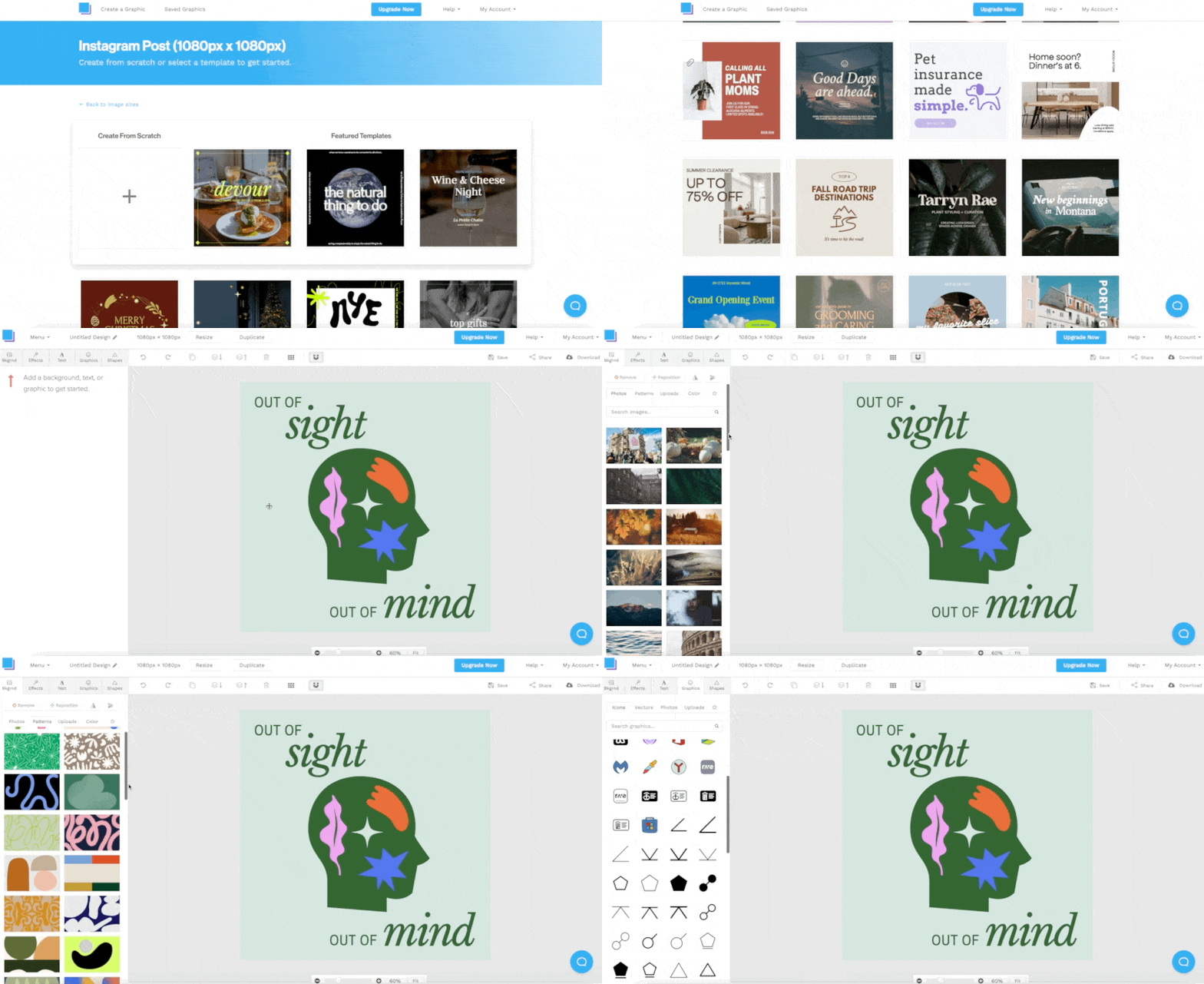
Even though the library is a lot smaller than Canva, we still felt spoilt for choice!
Canva’s apps & integrations
Canva has a huge app directory that you can use to supercharge your workflow. You can use apps to import media (e.g. Google Photos), discover content (e.g. Giphy), and publish your content (e.g. Mailchimp).
There’s so much choice:
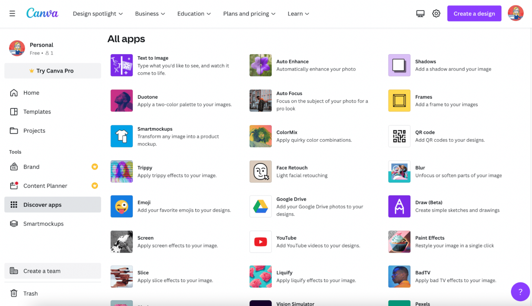
And all of the apps and integrations are available to everyone, regardless of what plan you choose.
Integration is simple too. Just click the app you want to connect with:
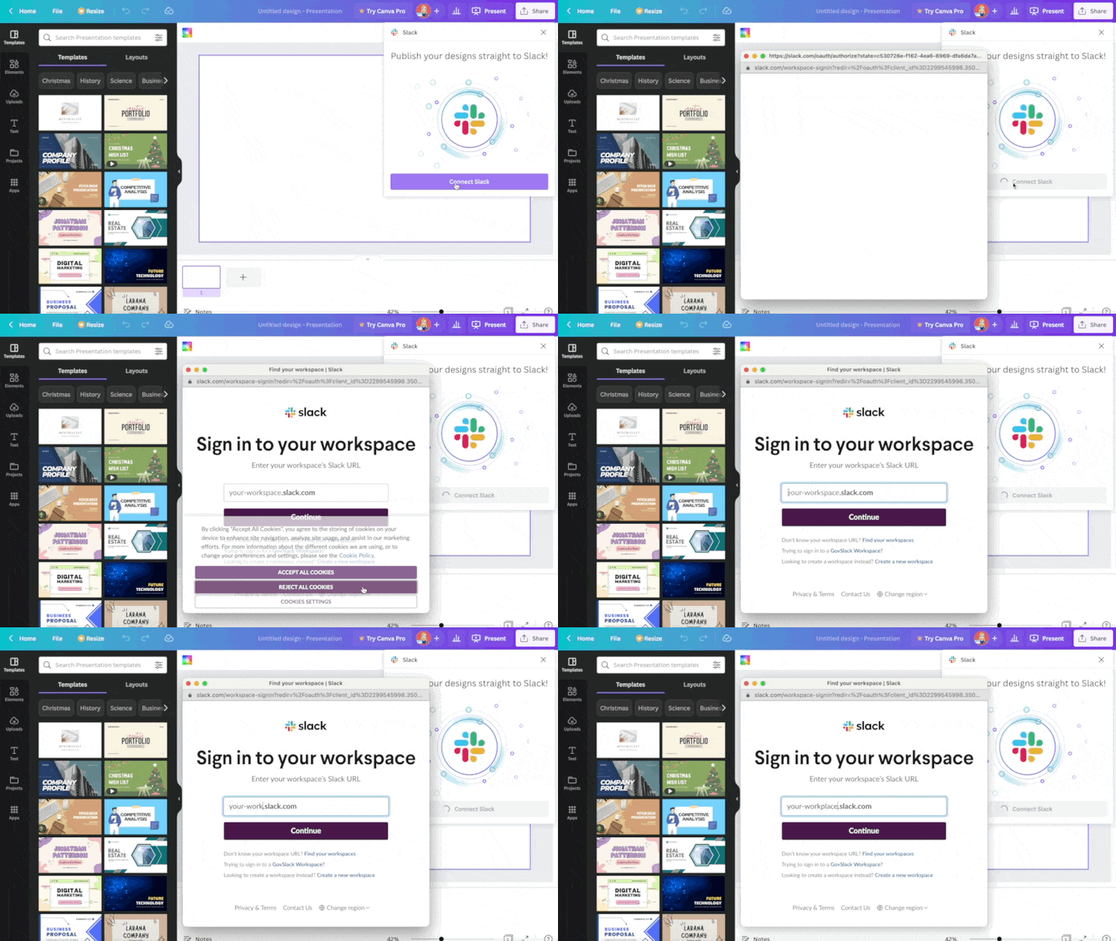
Enter your login details for that app and you’re done!
Snappa’s apps & integrations
Snappa currently has 3 integrations, all for social media: Buffer, Twitter, and Facebook. It’s great that they integrate with Buffer because that allows you to post your images to any of the platforms connected to your Buffer account, like Instagram or Pinterest (even though these tools don’t integrate with Snappa directly).
To share a graphic to your Buffer account, all you need to do is hit “Share” while still in the editor. From there, you can integrate with Buffer:
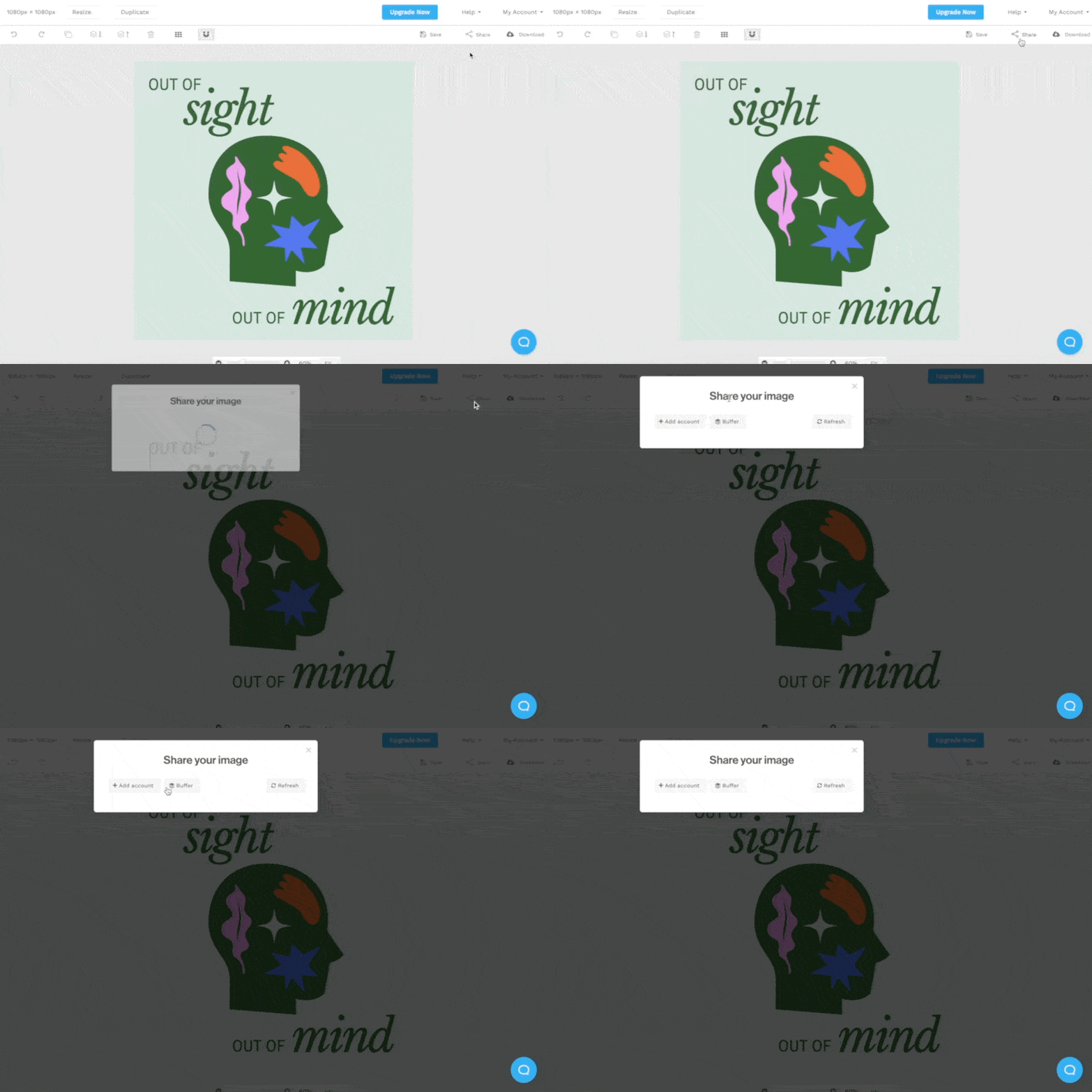
If you want to connect Snappa to Twitter and Facebook, simply click “My Account” and then “Social Accounts”:
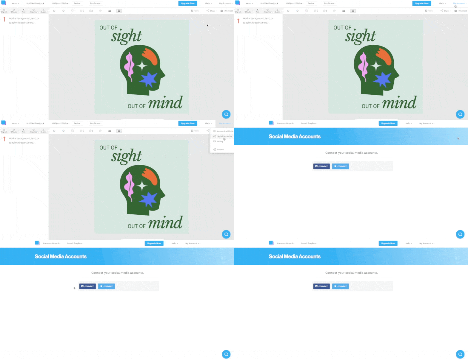
From there, you can login to your Twitter and Facebook pages. It’s pretty quick and painless!
Canva pricing plans
Canva has 5 pricing plans: free, pro, teams, education and nonprofit.

The free plan is, of course, free. But it’s limited. Free users get access to a smaller library of templates and assets, and less cloud storage (5GB compared to the Pro plan’s 1TB). Still, it’s a great place to start and users still get access to intuitive features and 24/7 support.
Canva Pro is $12.99 per month and is designed to be used by one person only. This package is suggested for freelancers and solopreneurs. It offers everything the free plan does, plus more features and a lot more assets and templates.
Canva for Teams is the next level up. It costs $14.99 per month for the first 5 users (and then increases incrementally after that). Canva for Teams includes everything that Canva Pro does, plus additional features designed to allow teams to collaborate together with ease. These features include approval workflows, brand controls, and the ability to assign tasks.
Canva for Education is a little bit different. It includes all of the Canva for Teams features, as well as additional features specifically for educators. Teachers can invite their students, create engaging lesson plans, and send assignments directly through Canva. The best part is, it’s absolutely free! Currently this plan is aimed at K-12 students and teachers; it isn’t yet available for colleges or universities.
Canva for Nonprofits is similar to Canva for Education. It’s a free, tailored version of Canva that charities can use for creating impactful communications. This plan includes all of the premium features of Canva Pro, like almost 500,000 free templates and extra storage.
Snappa’s pricing plans
Snappa has 3 pricing plans that are split in a similar way to Canva. They are: Starter, Pro, and Team.
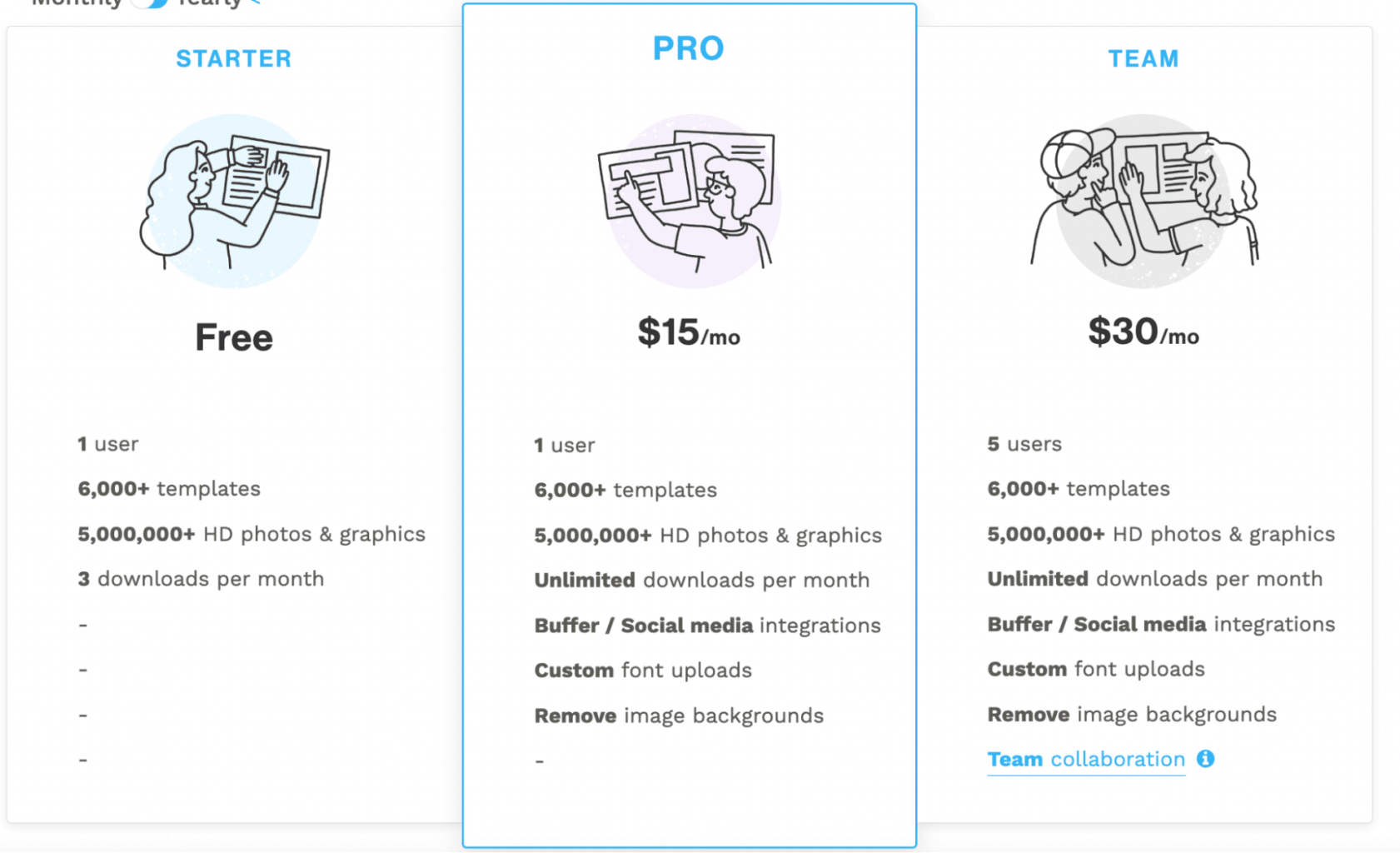
The Starter plan is absolutely free for 1 user. It includes access to all templates, HD photos and graphics – which is really rare for a free plan! But the limit comes from only allowing users to download 3 times per month.
The Pro plan costs $15 per month and is also for one user. With this plan, users get access to unlimited downloads as well as social media integrations, custom fonts, and the ability to remove image backgrounds.
The Team plan is identical to the Pro plan, but it allows for more users. Up to 5 users can access the account for $30 per month. There’s also additional sharing functionality so that teams can collaborate with more ease.
For teams with more than 5 users, Snappa has a contact form. So it appears they can accommodate more than 5 users, but there isn’t a set plan for this use case.
Canva’s customer support
If you get stuck while using Canva then you can click on the small help icon in the bottom right-hand corner of the screen.
This will open an intuitive search bar that allows you to search for your issue and find articles that will help solve your problem.
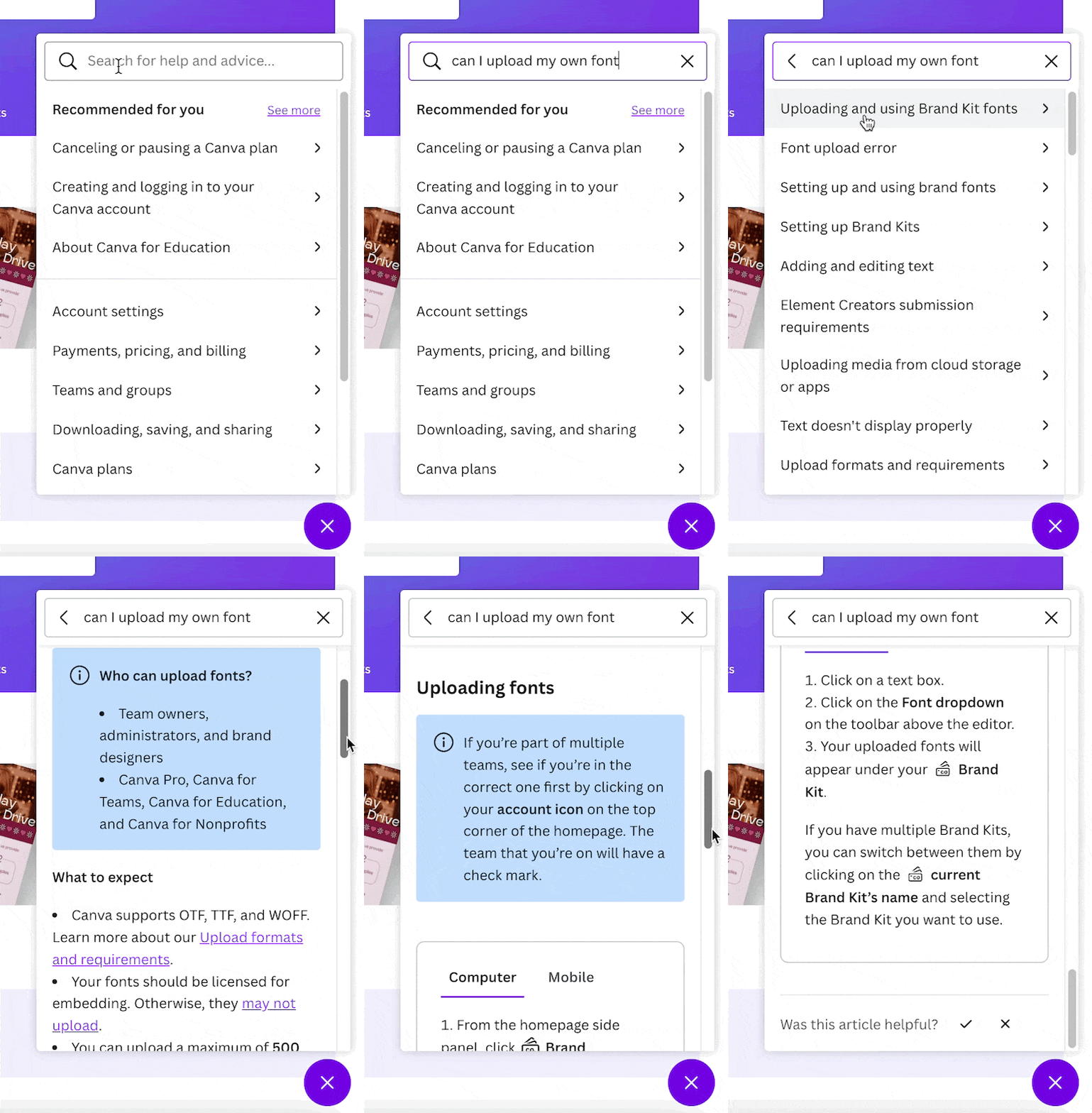
There’s no option to talk to a human here, but the articles are very comprehensive and our example question was answered thoroughly and quickly.
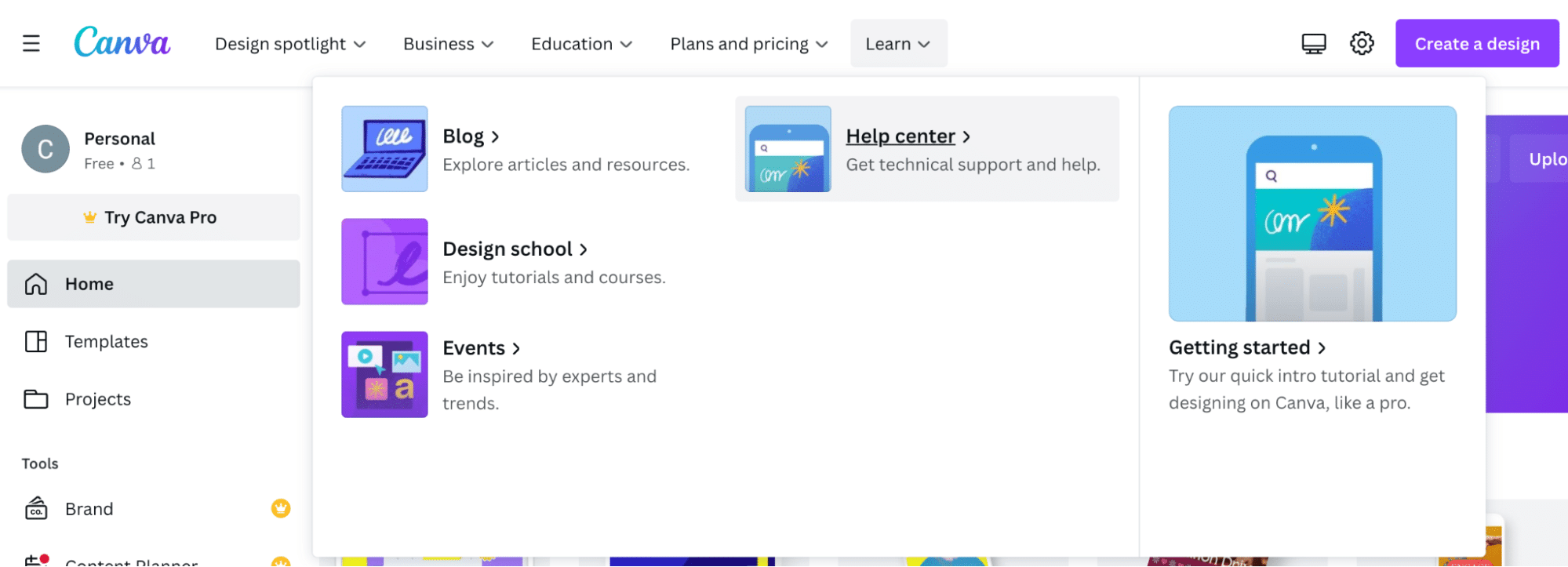
If you do want to speak to a human member of their support team then you’ll need to navigate to the Canva Help Centre. You can access this via the Learn tab at the top of the screen:
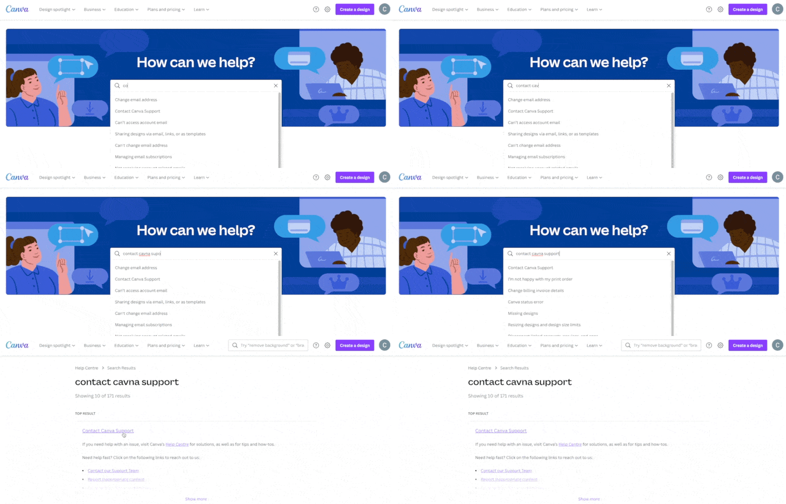
On arriving in the Help Centre, search for “contact Canva support”:
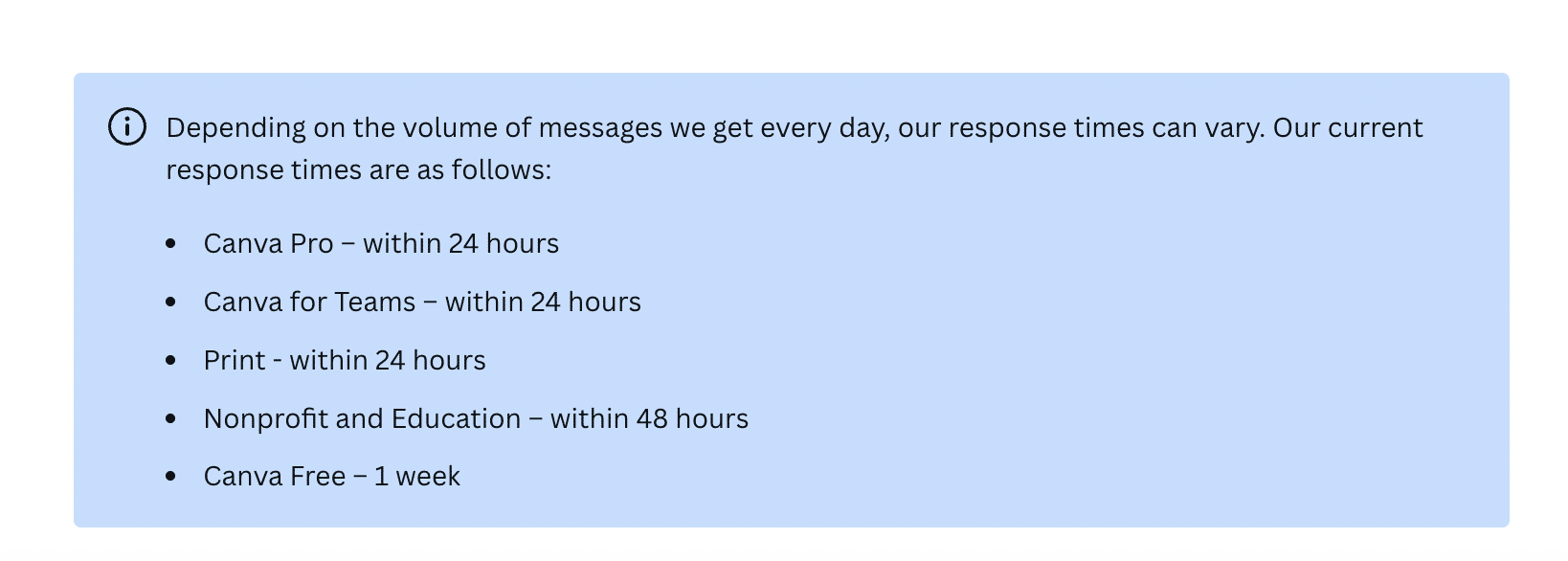
A pop up informs users that response times will vary based on the volume of messages Canva receives on that day and also the type of plan the user is on. We’re on the free plan so we were expecting the response to take around a week:
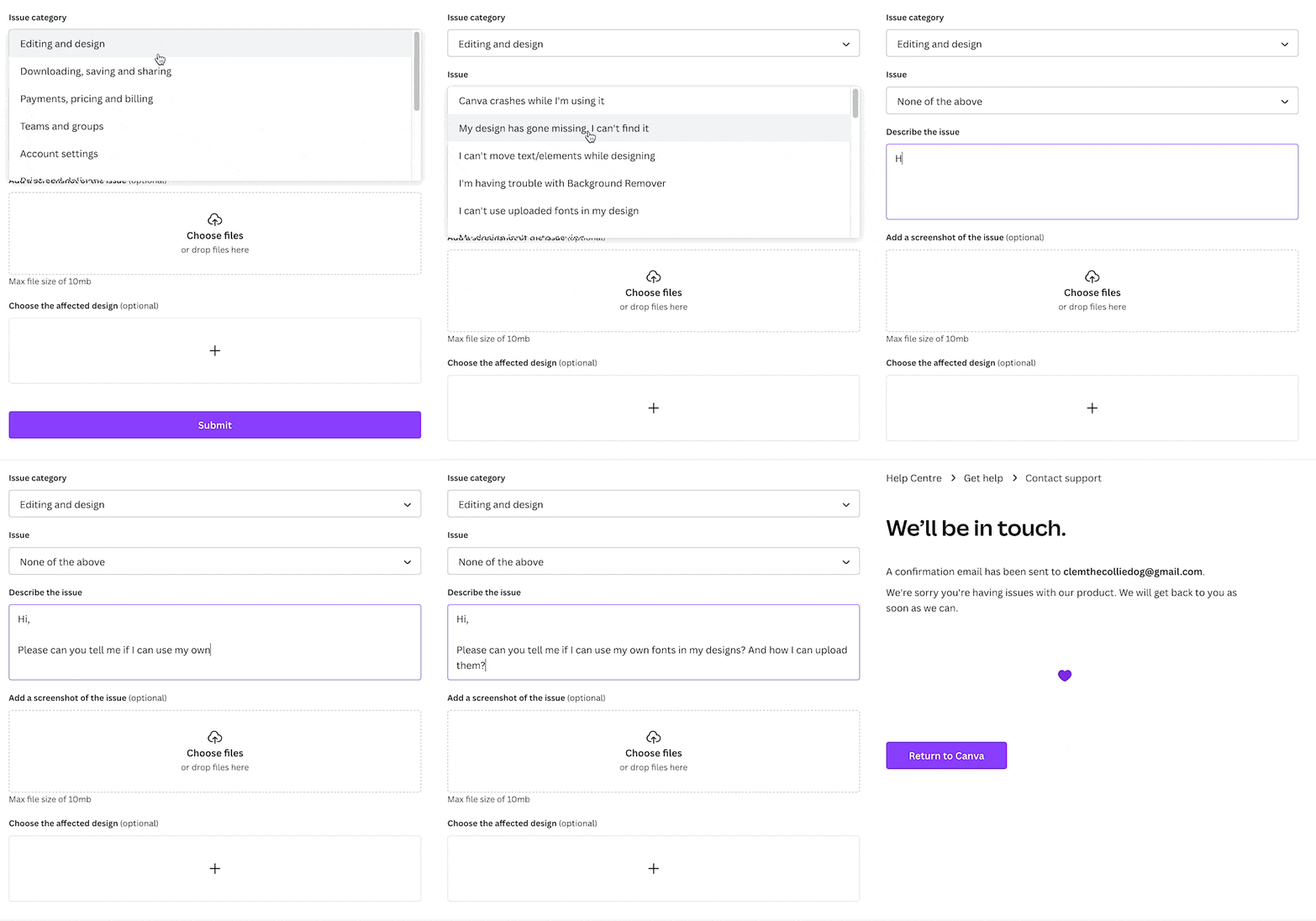
We filled out the support form and waited for our response:
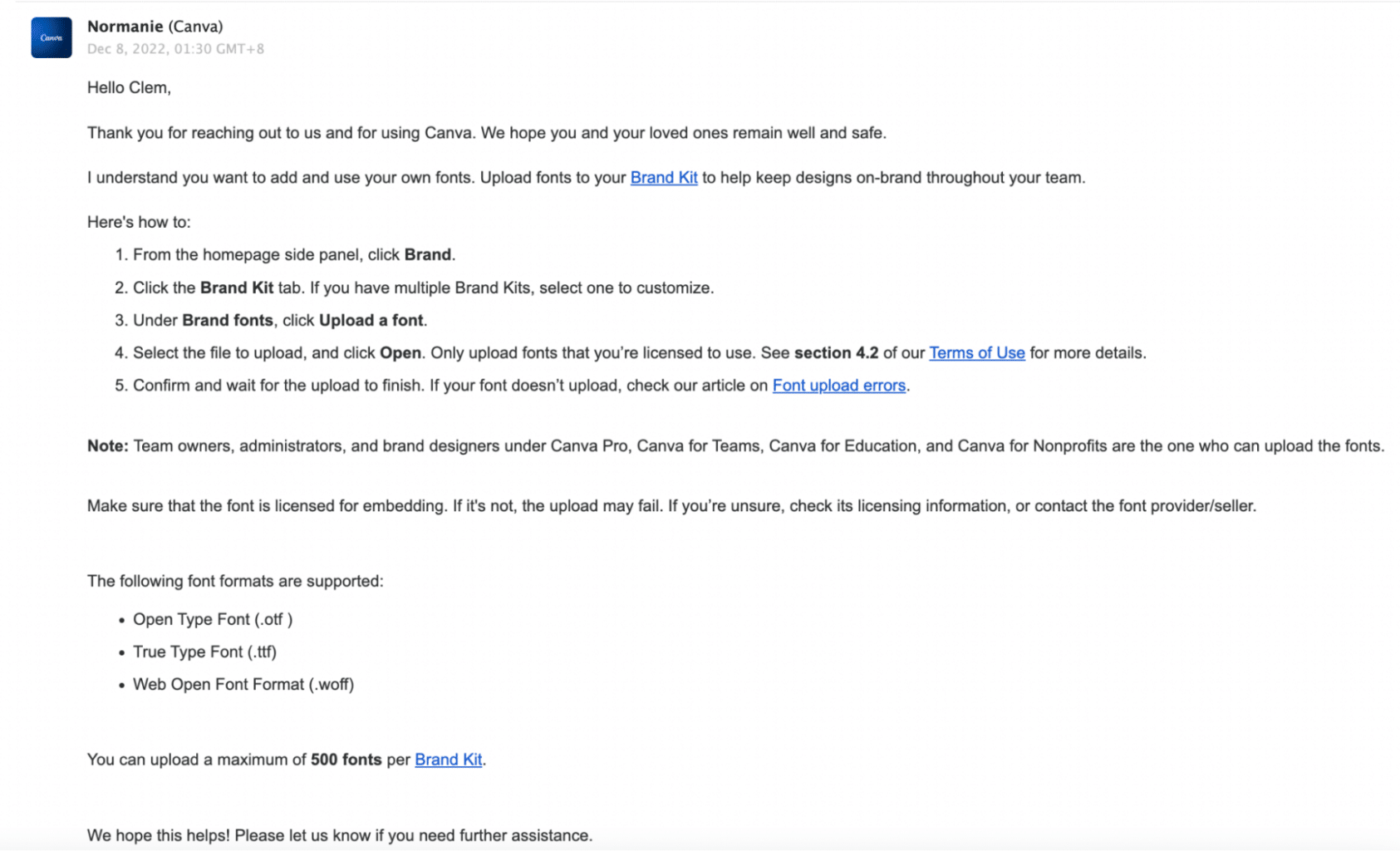
Surprisingly, Canva got back to us really quickly – within one hour! The response was professional, friendly, and comprehensive:
The whole experience with Canva support from start to finish was easy and painless.
Snappa’s customer support
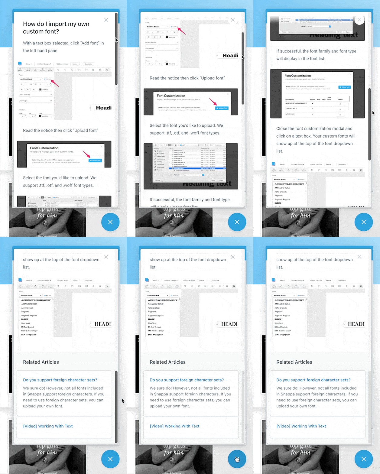
Snappa has a similar help icon in the bottom right-hand corner of their screen if users require support:
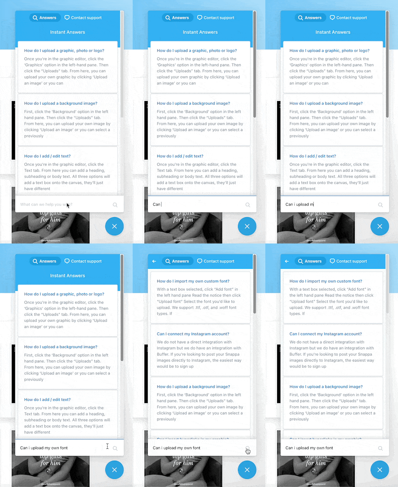
The pop up offers “Instant Answers” to common queries, but also allows users to search for specific questions. We used the same question as we did with Canva support and, similarly, we received a scrollable article that answered the question in detail – complete with helpful screenshots!
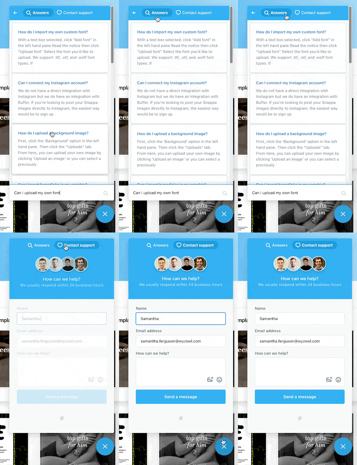
Where Snappa and Canva differ slightly is that the human support team is available to contact directly from this window. All users have to do is toggle from “Answers” to “Customer Support”:
From here, it’s easy to type a message out to the Snappa team:
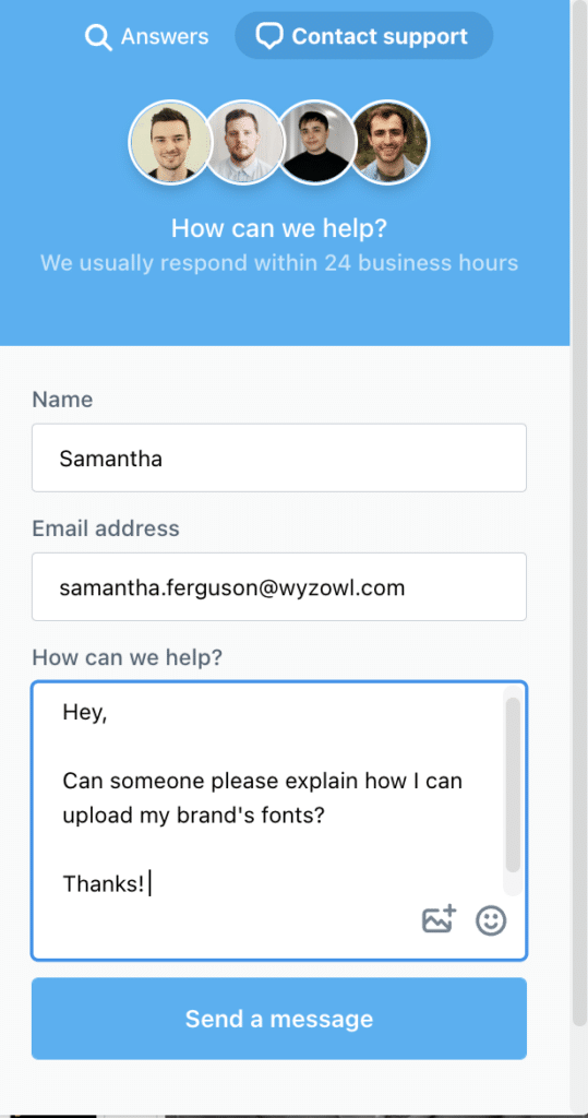
It’s a really nice touch to see photos of the support team here along with information informing users that responses typically take 24 business hours.
Like with Canva, we received a response much quicker than that from Snappa (less than one hour):
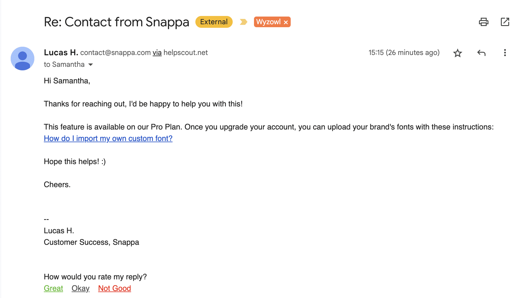
The response wasn’t as detailed as Canva’s, but the question was answered clearly and the message was friendly.
Canva vs Snappa: who’s the winner?
You can probably make your own mind up here on which platform you consider to be the “winner”. It all depends on what’s more important to you as a user.
Canva serves more users and has more assets and integrations available. Their customer support rocks and they’re less expensive per month than Snappa.
On the other hand, Snappa is perfect if you don’t want to be overwhelmed by choice. It’s really intuitive, easy to use and their customer support also rocks!
The bottom line is, both platforms have different strengths and the winner will likely depend on your specific needs as a user.
Final thoughts
A great graphic design tool can really elevate your marketing, so it’s important to find one that works for you and your business.
If you’re still undecided why not check out these in-depth reviews:

