Last updated 14th April 2022
Alright, we’re gonna call it; the world of online video is pretty unfair! How can a video with a kid getting his finger bitten receive millions of views, whilst quality business videos like your own struggle to get anywhere close?
The data tells us time and again the breathtaking possibility of what can be achieved with video – 86% of businesses use video as a marketing tool in 2022 (up from 61% in 2016), while 87% of marketers say video, in general, gives them a good return on their investment.
But, whether you’re already using video or not – there are always lessons to be learned by looking at the companies absolutely knocking it out of the park with their video marketing.
In this post we’ve picked out 5 of our favourites…
1. Bulb
Do you stand out in your niche? Are you trying to unseat old, established competitors?
If so, you might want to follow some of the examples set by Bulb – the UK’s fastest-growing energy supplier – which has truly disrupted a highly-established, mature market since setting up just a few years ago.
And video marketing is right at the heart of that achievement…
From offbeat, eye-catching video ads, through to instructional ‘how-to’ content, via powerful, emotive video testimonials and employer branding content, Bulb uses video throughout the user journey to build a real sense of a vibrant, holistic brand – with a purpose and a soul.
Engaging video ads
Taking a look at Bulb’s TV ad campaigns, a few things spring to mind that help communicate a lot about the brand. They’re quirky, vibrant, simple – and relaxed in tone.
Given that part of Bulb’s mission is about making it easier and less stressful for people to switch energy provider, you can see how the idea of calm, ‘light entertainment’ video ads would really work. Why would you want frantically paced, overly salesy video ads when you’re trying to communicate that you make life easier?
From a design perspective, the vibrancy of the colours used (always based on a background of neon hot pink) offers further evidence that this brand is a ‘little different’ from many of its competitors, which often stick to ultra-safe, conservative colour palettes and graphic styles.
Is this a lesson you could take away for your own brand? Don’t be afraid to be different. Take a look at your competitors’ latest ad campaigns and, as a starting point, consider what’s the MOST different you could be? How do you make it totally clear to your audience that you represent something different, something better, than what the competition do?
Click here to find out more about video ads…
Powerful testimonials
Bulb has also created some powerful video testimonials from some stellar brands, highly-recognised in the UK and beyond, such as Innocent Drinks and Ella’s Kitchen.
Scratch the surface and these are even more powerful than they seem.
Why? Well, ethics and sustainability are big parts of the Bulb brand.
‘Purpose’ is very much front-and-centre – 100% renewable, 100% carbon-neutral, public commitments to fighting climate change, paying the Living Wage and even a charitable arm which collects £2 for every new account signup.
And if we look at some of the brands featured in these testimonials, they invariably share these qualities. Most importantly, a commitment to environmental sustainability is part of their identity.
These don’t just build credibility for the brand (presumably helping generate more B2B accounts.) They just continue to reiterate the ethical side of the Bulb brand itself.
When you’re creating testimonials that highlight your success stories, don’t just think about the words the customer uses. Think about what their brand stands for, and how closely that aligns with a) the types of customer you want to attract, and b) the overall message you want to associate with your own brand.
Find out more about testimonial videos
Helpful demo videos
Part of Bulb’s offering is an in-home display device, which allows people to track their energy usage and cost in real-time, saving money and improving energy efficiency.
This is a great differentiator from many competitors – but its full value relies on the user’s ability to control and understand it.
And so, we see they’ve created a short series of instructional animated demo videos. These are super short – 45 to 60 seconds – and just demonstrate in clear detail exactly how to set up particular features of the device.
Remember: don’t just think about what customers can do with your product. Consider using animated demo videos to make sure they know how.
Find out more about product demo videos…
What you can learn from Bulb…
- Being different, visually, linguistically, in the content you create, is scary – but can pay off handsomely. First impressions count: make sure your audience knows immediately that you’re not just another ‘me too’ product or service.
- Consider using video testimonials and case studies to tell your story – and particularly leverage brands who share elements of your mission.
- Use demo videos to ensure your customers know exactly how to unlock full value from your product or service.
2. Slack
Slack was launched in August 2013, and by February 2015, they were picking up a whopping 10,000 new active users per week. That growth continued to soar, and by June 2019 was valued at more than $20 billion.
So what role does video play in Slack’s not-so-overnight success story? Let’s take a look…
Informative home page videos
Like any app or software tool, understanding is absolutely key. Anyone landing on the Slack website needs to understand what’s on offer, quickly, or you can guarantee they’ll leave.
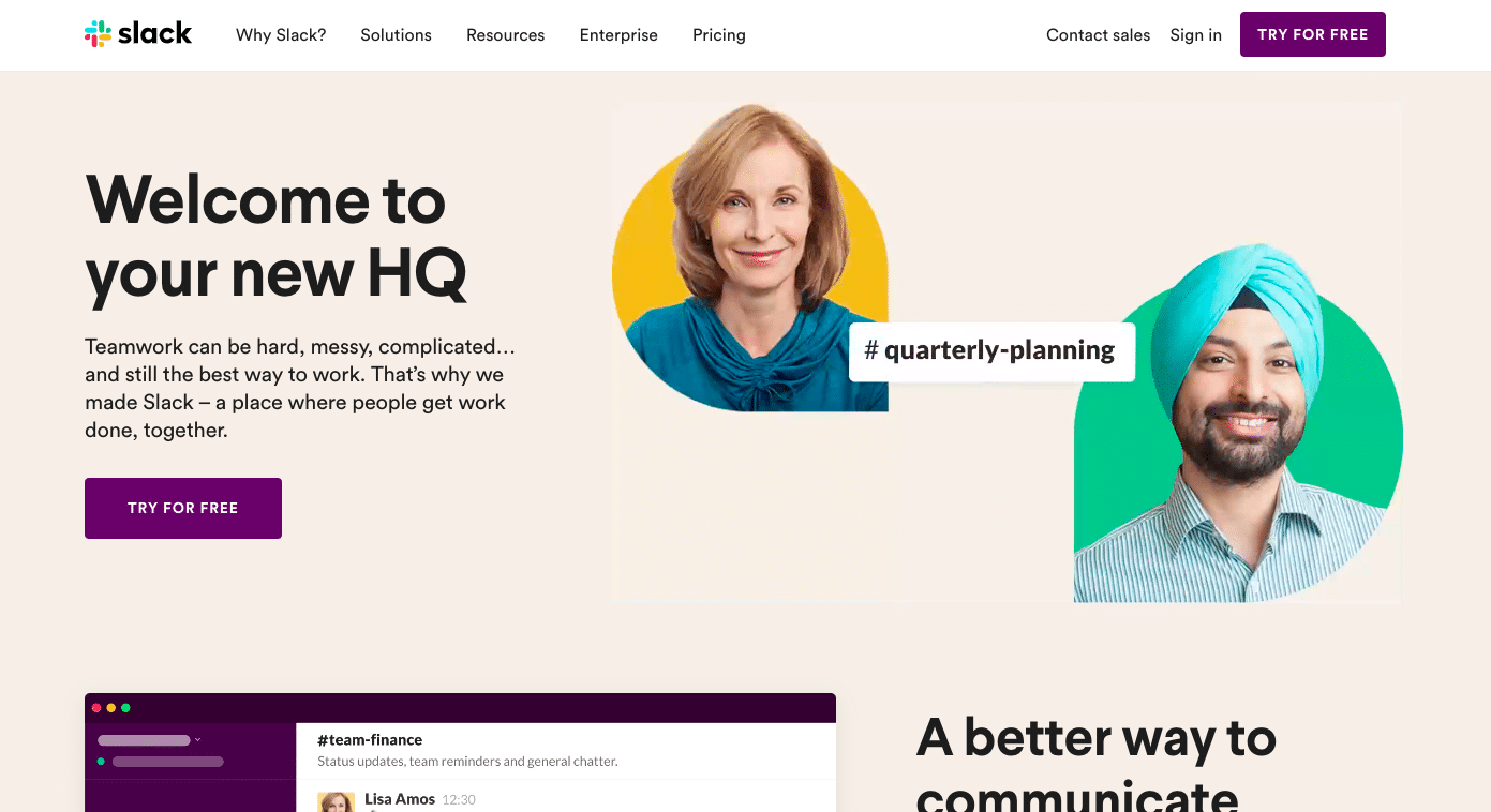
And while Slack don’t have a central explainer video on their home page, the site is positively swimming with motion thanks to the use of animated graphics.
This is a quite subtle way to make it clear what Slack is and how it works – without getting bogged down into too much detail. There’s a lesson here – even if you don’t want to use traditional video on your home page, animated graphics can be a great way to a) catch the eye and break up the ‘scroll’ of your audience, and b) give some pretty clear cues about what your product or service does, and who it’s for. Check out how well the context of the messages compliments the messaging of the page in general: it’s clear that this is a powerful, chat-style communication tool for business teams, and it’s also clear that the interface is really slick and easy-to-use. Much of the functionality is shown, rather than explained, meaning that – without even really thinking about it – you immediately know that you can share messages, files, react with emojis, create spaces for particular projects and teams – all with about 100 words of copy.
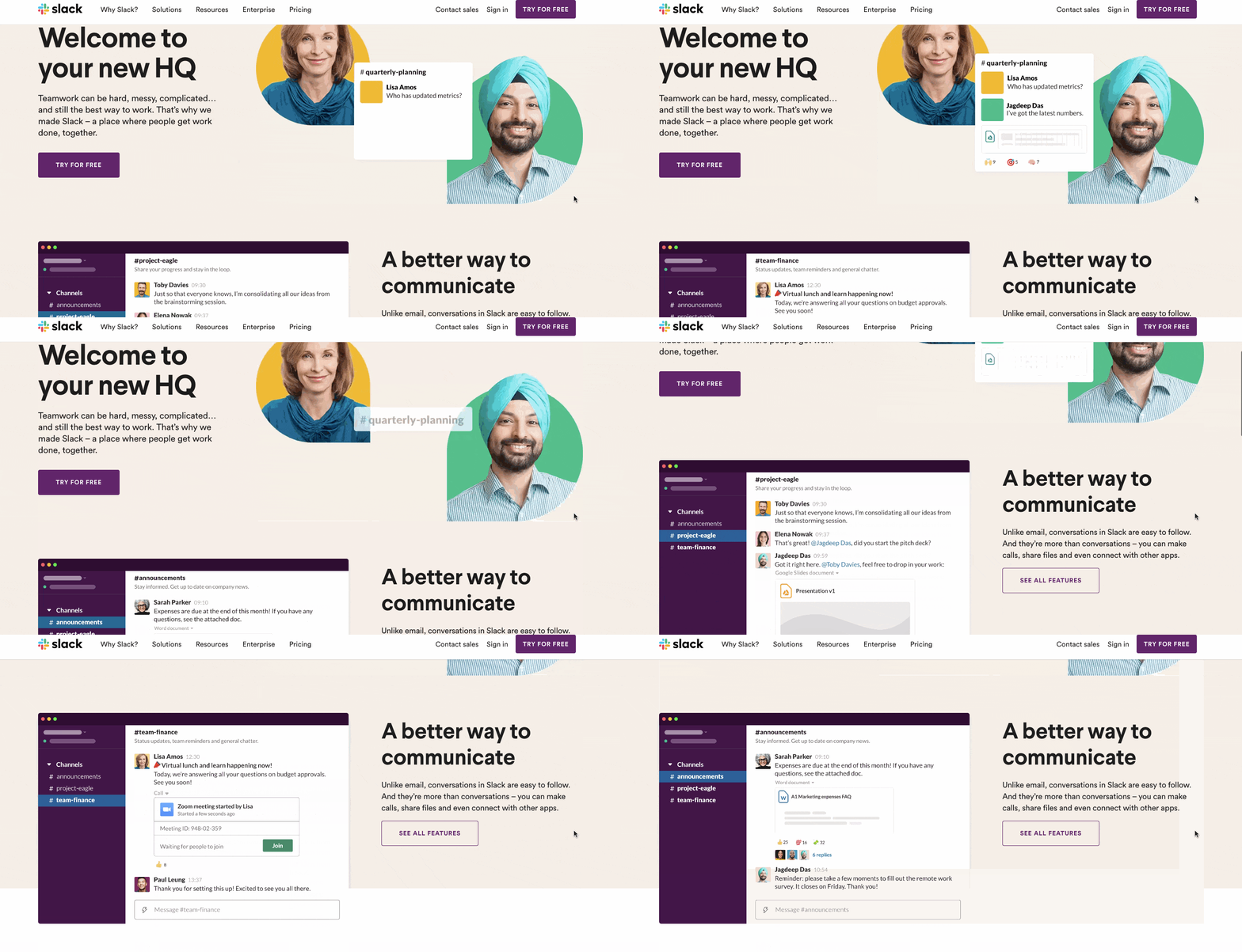
Take a look, which one of these is more persuasive?
| Option A | Option B |
| 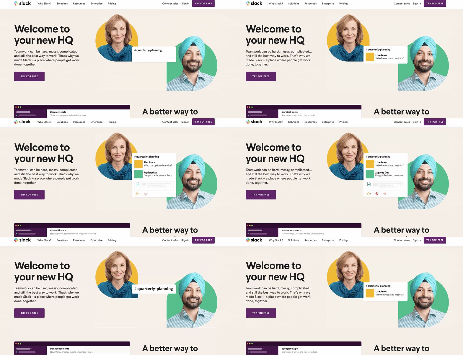 |
This commitment to animated graphics – as opposed to static screenshots, which can be drab and uninspiring – is fairly consistent across the website, and it really makes things pop.
Empowering demo content
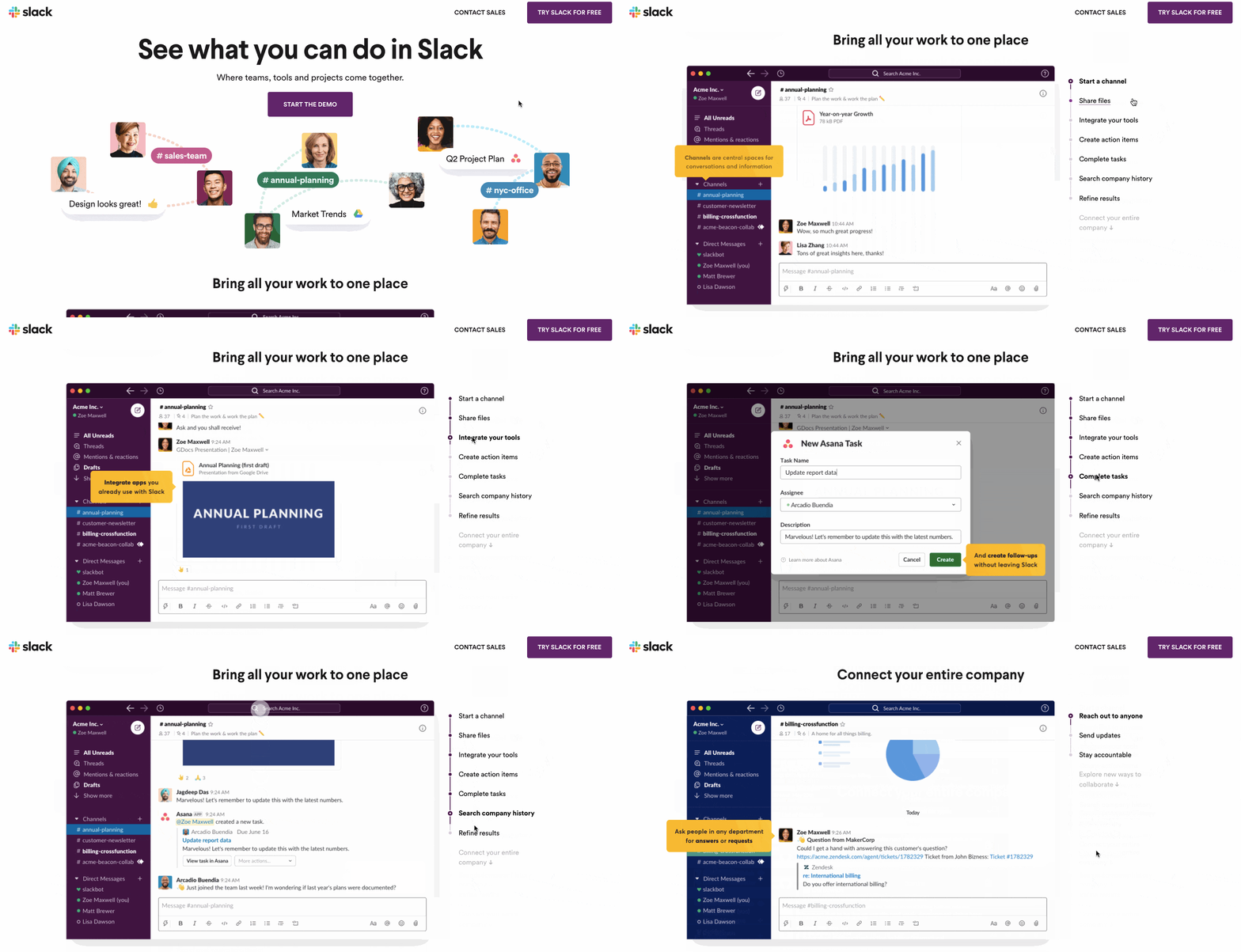
Again, anyone involved in SaaS marketing will appreciate the value of audience understanding in reaching a positive sales outcome. Interestingly, Slack’s ‘animated graphic’ approach is also used for demonstrating the inner workings of the product. There’s a full ‘Demo’ page which looks like it’s been truly painstakingly created – but rather than using a screen recorded video, it uses scrollable graphics, demonstrating the UX and putting motion at the very core of the user-led experience. This can be digested at the user’s own pace, back and forth.
Testimonials and social proof
Another factor that’s impossible to overstate in importance is social proof – and the role it plays in developing trust and credibility, influencing purchase decisions. Who wants to get stung by a software tool that promises the world only to let you down?
That’s why we’re big advocates of testimonial videos, and you’ll find these in abundance on Slack’s ‘Customer Stories’ section, like this one for food delivery giant Deliveroo…
It’s all good and well saying you can do X, Y and Z – but what’s much more powerful is showing real-life people talking about how you’ve actually done it for them. If you haven’t already invested heavily in case studies and testimonials, this should be a priority area for you this year.
Informational content and webinars
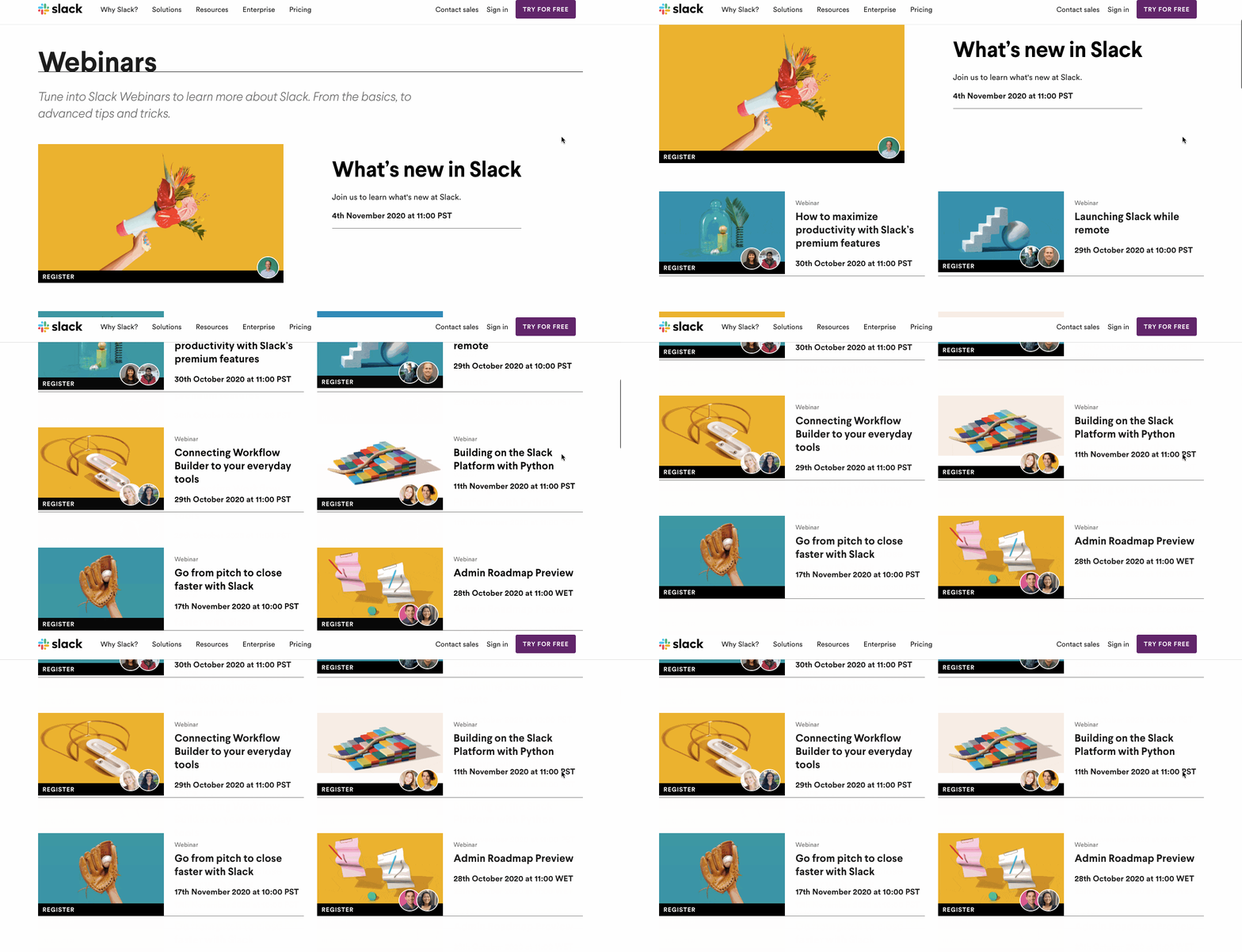
It’s clear that Slack are committed to supporting users and adding value to their audience. Their website features a wealth of webinar content designed to answer pertinent questions and help users get more out of the product.
Now, we know: webinars are heavy-duty, intensive pieces of content to create – generally running in the region of an hour-long – but that can really pay off when it comes to reaching new audiences and establishing yourself as a trusted, thought leader in your niche. (We’ve written about some of our experiences with webinars here.) Why not consider putting together a webinar as one of your marketing tactics this year? It gives you plenty of time to plan things out and execute. You could use a high-performing post topic from your company blog as a topic that has demonstrable cut-through for your audience, and really take a deep dive on it. This piece of content is then there to re-use and recycle time and again, adding value for literally years to come.
Powerful video ads
Looking beyond the Slack website at some of their ads and promos, we can see a great variety of content and themes.
From shorter promotional videos which ‘give you the gist’ of Slack in 30 secs while also giving a clear depiction of why that matters right now (i.e. it makes remote work easier and keeps teams connected!)
Through to videos that introduce individual features…
What you can learn from Slack…
- Support the whole user journey. What’s clear from even spending a few minutes interacting with the Slack brand is the extent to which they use video and motion graphics as tools to support the whole user journey.
- Use video and video ads to reach beyond your audience. Video is used as a promotional tool – telling short compelling stories that encapsulate what Slack is, who it’s for and why it’s of benefit to the target audience. These videos are shared on YouTube, and presumably as part of social media ad campaigns to reach the ‘right’ audience with the ‘right’ message, raising awareness and driving web traffic.
- Use educational, instructional content to demonstrate how to achieve optimal results. This helps in building and developing initial audience understanding to help generate signups and more productive sales conversations – and also as a powerful tool post-sale, helping users get the absolute maximum value out of the product, making them likely to succeed, enjoy value, stay around and refer the product to others.
- Social proof. Testimonial videos on page offer living proof that Slack gets results. They basically scream ‘Trust us! We won’t let you down!’ In a B2B space this is just invaluable, and the more you can get this story through, the better.
3. Grammarly
“If you write anything on your computer – you NEED to get Grammarly.”
Ever found yourself wishing you had a dollar for every time you heard that line?
There are some prolific advertisers on YouTube – but few can compete with Grammarly.
It sometimes feels like every YouTube video is preceded by a Grammarly ad!
And indeed, if we take a look at their channel, and use the ‘Sort by: Most popular’ function on YouTube…
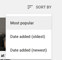
…we see hundreds of millions of views for many of their top uploads, suggesting massive investment in paid ad campaigns…
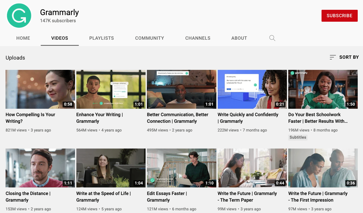
…and what particularly caught our eye was that their two most viewed videos have racked up well over a billion views between them. ONE BILLION!

What does this tell us? Frankly, it tells us…
- They have plenty of ad dollars to spend.
- They REALLY believe in YouTube as a channel to spend those dollars.
And most of all…
- It tells us which videos they most want their audience to see.
So what is it that’s so special about these two videos? Let’s take a look at them.
First we have “Enhance Your Writing,” viewed 564 million times…
This is clearly their pillar, catch-all, introductory content – explaining why it’s the most viewed/promoted content on the channel.
Just check out those first 5 seconds. Like we said at the start – “If you write anything on your computer…you NEED to get Grammarly.” it’s the line that grabs your attention, tells you who the ad is for, and most likely comes to mind whenever you subsequently think of Grammarly. Job done!
Throughout the rest of the video they showcase more specifically some of the audience sectors – students, jobseekers, marketers, entrepreneurs – always showing rather than telling with actual screen captures overlaid showing real, embarrassing, contextual errors being caught and corrected. And keeping things vague enough that, if you don’t fall into one of those categories – you don’t feel that Grammarly definitely isn’t for you.
This helps you visualise and understand the full value of the software, building understanding without going into technicalities.
Similarly – check out how they describe what Grammarly is. If we’re being technical here, Grammarly is a digital writing assistance tool, based on artificial intelligence and natural language processing. But it’s also ‘your own personal proofreader.’ Which one do you think is more compelling? Which one resonates with the audience and helps them understand exactly what they’re getting? You got it – and that’s the one that’s included in the video.
Don’t get caught up in what you offer and how it works – sell how it helps your audience. Not once does the ad get tied up in the tech-stuff of how it works. Truth is, the audience doesn’t care. They just want it to improve their writing. Who cares how it’s done?
How about that call-to-action? “Sign up for free.” Clear, direct, enticing. When people get to the end of your video – signpost them to the next step, and do it EXPLICITLY.
And then we have “How Compelling Is Your Writing?” viewed 821m times…
Unlike the “Enhance Your Writing” video, this one is laser-focused towards a particular audience: students.
The first 5 seconds again set the tone: “Good grammar and spelling are important – but if you want to write essays that inspire…”
From this cold intro, we can put together the fact that Grammarly goes beyond grammar and spelling – and helps people write amazing essays. The video then shows how else Grammarly can help – with compelling emails/messages and cover letters.
Again, rather than getting stuck into the technicalities, we’re shown specifics: the video shows an actual sentence which is grammatically correct, but wordy and hard to read. We see the actual process by which Grammarly tidies this up, making it better and more impactful.
And because it depicts the scenario of a job application cover letter, we can clearly see how this would benefit a later-stage student getting ready to start their careers. It’s designed to make the viewer think: Wow, that would be helpful!
Digging deeper into other videos on the channel, we can see dozens of other videos focused on different verticals – Grammarly for business, for students, hobbyists, writers and more.
Perhaps the reason the first video is one of the most-viewed on the channel is that this is a ‘gateway’ to Grammarly: a catch-all introduction that gives you a really good entry-level understanding of what Grammarly is.
They then follow that with more targeted campaigns that capitalise on that brand recall and show you more specific ways in which it can help you in your particular circumstances.
What can you learn from Grammarly?
- They don’t try and say it all in one video. Some people will buy after watching that introductory elevator pitch, but often, it’s more of a journey. Think of your first video ad as a gateway – an introduction. Then consider using follow up videos to segment your audience and talk to them at a more targeted level.
- They show, rather than tell. Grammarly consistently use contextual examples of the real changes their software can make, while never straying from why that’s important to the viewer.
- They talk about what they help the audience achieve more than how great their product is.
- They ditch the tech specs. It’s not a golden rule, but generally, people don’t care how something works – they just care that it works. (Incidentally, Grammarly created a whole separate video about how the tool works.)
4. Tuft & Needle
Okay, so while there were some solid takeaways from Grammarly, you’d be forgiven for thinking: not everybody has that kind of budget!
So next we wanted to look at a company that really started from nothing – and they credit video advertising with kickstarting their explosive growth!
Tuft & Needle is a mattress company with a story that’ll resonate with many entrepreneurs. Two best friends from college started the company in 2012, with just $6,000 saved up. They were inspired by a crummy experience buying mattresses and determined to make things better.
And it’s fair to say they’ve been successful: not too long after launching they did $100 million in sales!
In a YouTube case study, company founders Daehee Park and JT Marino explained: “Video was the most powerful way to show the stark difference between our authentic approach and the traditional mattress industry’s gimmicks.”
“And video ad targeting helped us reach likely customers – people visiting our website, looking for real estate or doing searches like “best mattress.”
Below is just a small selection of videos from the Tuft & Needle YouTube channel, which features around 80 uploads.
These include everything from super short form ‘sting’ ads clearly designed for use as pre-rolls…
Through to longer form explainer videos which lay out the idea behind the company…
While other ads touch on different angles of the business, from humorous ‘story’ led videos that lay out the problem the brand was created to solve…
Through to ads that specifically talk about the product and the journey behind its creation…
And even an official unboxing video that shows the product in all its glory…
What can you learn from Tuft & Needle?
- Start small and test – The Tuft & Needle team are living proof of how successful you can be when you start off with small experiments to see what resonates with your audience, and then scale. “Starting on a budget of just $50-$100 a day, we now dedicate half of our Google advertising to YouTube,” they say. “It gets results.
- Short and sweet – We regularly tell our customers how important it is to keep videos short – getting across as much as you possibly can, without boring or losing the attention of your audience. This is baked into the Tuft & Needle strategy. “We try to keep our video ads 30 seconds to two minutes long,” they say. “This gives us enough time to tell our business story and keeps more potential customers watching until the end.”
- Mixing up the message – And, because it’s impossible to say everything in one short 15-30 second video – they have plenty of different videos for different stages in the audience journey. Showing the same ad to the same people time and again quickly becomes an inefficient way to spend ad dollars. But when you can target people who, for example, are searching for mattresses with a company intro… then, next time they see an ad, it’s a product demo... then, in the next ad, you talk about your customer service… then, next time, you showcase a customer testimonial… you’re suddenly taking your audience on a powerful journey with many touches that keep them constantly thinking about you, your brand and your product.
This helps build familiarity, keep the product top-of-mind, and ultimately build long-term relationships that are more likely to lead to sales.
5. Evian
Next, let’s take a look at Evian – a brand of bottled mineral water owned by French multinational Danone.
When you’ve got a channel with 225k subscribers – and your product is something as simple and, dare we say, uninspiring as bottled water – you’re clearly doing something right.
Let’s drill into what that is and where the success has come from…
‘This is Evian’ is a 3:53 live action video that introduces the spa town in the French Alps where Evian water comes from. By telling that story, explaining why it’s so special, how it’s bottled – and also hinting at an ethical sustainability that is an important strand to the Evian brand – this content makes a great first impression.
It’s on the long side for an explainer video but it does a fantastic job of distilling (no pun intended) the essence of the brand.
True stories of what products are, and where they come from, are often much more magnetic than simply listing features and benefits.
An introductory explainer video should live at the very front of your YouTube channel so that anybody arriving there can understand who you are and what you do ASAP.
Try to make it evocative and immersive; imbue it with a sense of what your brand stands for, and how you want people to feel when they hold and use it.
…repurposed into 15 second vignettes.
The introductory video may have been on the longer side – but it’s actually been broken down into several 15 second vignettes, presumably for use as unskippable pre-roll ads.
This is very smart, enhancing the impact of the pillar content in an incredibly cost-effective way.
When creating the script for your explainer video, try to keep in mind the ability to repurpose into smaller, bite size videos. (This is something we can do for you when writing your script.)
Playlists to keep content organised
The Evian channel itself is really well organised, with playlists containing different ‘types’ of video.
This is key. The easier you can make it for people to navigate to your video content, the more likely they are to find it – and, if it resonates with them, and they see a volume of interesting content rather than just one video, there’s a much higher chance that they’ll subscribe to be informed about new content as and when it’s posted.
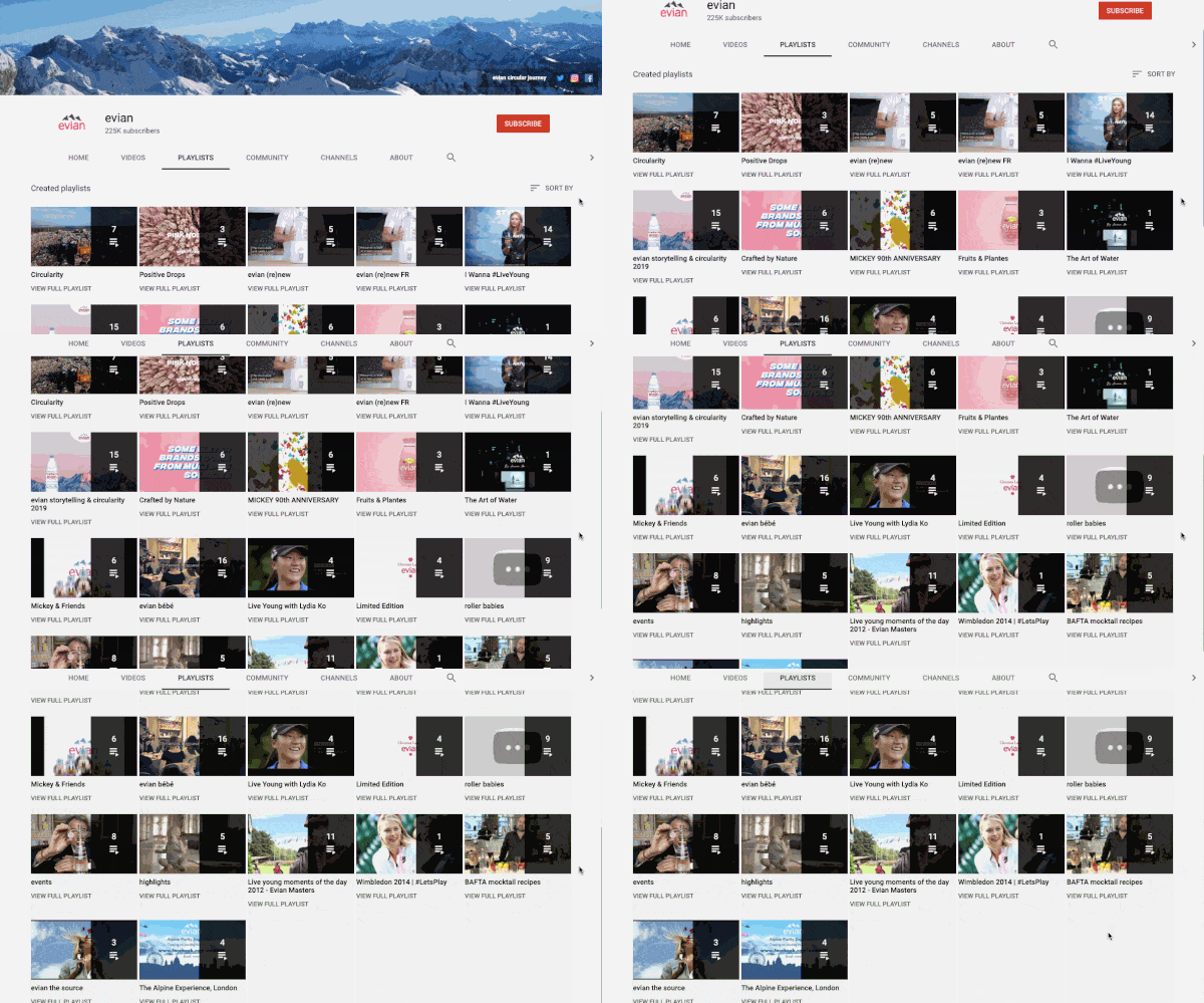
Think of your content in ‘groups’ – this will help you ideate content, but also organise them into playlists which are like channels for people to watch.
This will increase overall watch time as you’ve organised your videos for people. This is significant, since YouTube tend to want to promote videos and channels that keep people on their site longer – and watch time is a key ranking signal that should lead to better visibility for your content.
The most popular content
The next step in our investigation is to take a look at the individual video uploads and, particularly, sort them by popularity – to understand what’s been watched, how many times, and try to establish why?
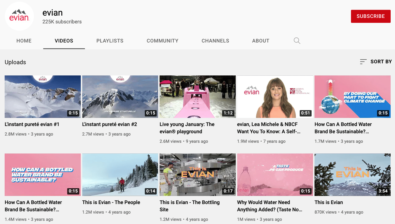
7 of the top 10 videos – accounting for 12 million total views! – are in the 14-17 second mark, which illustrates the extent to which we’d estimate they’ve leaned on advertising.
Organic reach is great, but remember the real power of YouTube is often to reach ‘new’ people in a highly targeted way using ads.
And, as a wider point, whenever you create content – don’t forget to make a realistic plan of how it’s going to reach your audience.
Do your research to understand what content is likely to perform best, and zero down on this content.If you already have some experience of sharing content on YouTube, try sorting your own uploads by popularity to understand what resonates best.If you have no content yet, or haven’t had much traction with anything, try researching your competitors – look at what they do, and which content works well for them.
On-brand, on-message – but striking a balance
Another thing that stands out on the Evian channel is how strongly their brand message comes through.
The company’s strapline ‘Live Young’ is reinforced by some very watchable, viral content like ‘The Evian Playground’ watched 2.6m times…
This is a really clever ‘sweet spot’ for YouTube marketers to aim for: it’s watchable, fun, engaging content that resonates much more strongly than a traditional ‘ad.’ This strikes to the heart of what YouTube is and who it’s for.
In a Think With Google case study, Michael Aidan, VP Marketing Danone Waters (CMO) & Head of Digital at Danone, said, “The beautiful thing about YouTube is that the engagement coming out of it has nothing to do with a forced message. I click to watch videos because I want to. I share videos because I like them. ”
And when it comes down to it, this level of visibility is crucial – in some industries more than others. Next time you’re shopping for water – a product side-by-side with five or six other products that look and taste the same – people have a reason to choose Evian.
Following on from this we see yet more 15-second snippets which underpin key elements of the brands ethical position around sustainability.
Choose your marketing strapline/angle, and set about creating compelling, entertaining video content that underpins that message. Don’t just say it – show it!
If you’re in a crowded marketplace with lots of competition, don’t underestimate the importance of visibility metrics like views and shares – these could make the difference the next time one of your customers is deciding to buy your product or your competitors.’
What can you learn from Evian?
- Differentiate your product through video. It’s hard to imagine a blander product than water – it literally tastes of nothing! And yet Evian through their YouTube channel demonstrate that a big brand can create a big impression.
- Make your brand stand for something. People are unlikely in the extreme to subscribe to content about water, and how good it tastes. But by making the brand stand for more than this – they both differentiate the product when consumers see it on the shelves – and create an ethical and moral affinity between the audience and the brand.
- Consider structure and navigation – make sure people can find your content. This, as well as formatting and structuring their channel well with playlists and ‘hero content’ – and then targeting great content to targeted people through TrueView ads – explains why they’ve been able to reach such a lofty number of subscribers.
Thanks for reading!
What comes across in a big way here is the extent to which video can be used in so many different ways.
Each company creates different types of videos, to achieve different goals.
Whether it’s an explainer video to introduce a product or service, a customer testimonial to build social proof and confidence, or an inspirational video ad that engages and raises awareness, every brand on this list uses to video to nurture customers along the sales cycle – and that’s the sign of a good video marketing strategy!


