Last updated on 10th January 2024
In this article we’re going to take a look at 26 awesome video landing page examples.
You’re probably aware by now that video is a powerful marketing tool, and there’s plenty of data to back that up. According to our Video Marketing Statistics 2022, 87% of marketers say video has helped them increase traffic and 82% agree that video has helped to increase dwell time.
So there’s plenty of reason to consider a landing page video for your site, but what does an amazing one look like?
Let’s find out…
What is a video landing page?
Video landing pages are an amazing way to really WOW visitors when they land on your site. They can make people sit up and take note, and really differentiate your company from the competition.
4 Types of video landing pages
There are 4 main types of video landing pages. Let’s take a look at what distinguishes them from one another.
1. Background video landing page
Quite simply, this is a video that sits in the background of the site. Often background video landing pages will autoplay when visitors land on the site, making them a great option for grabbing attention.
2. Hero video landing page
A hero video landing page is similar to a background video landing page in that it sits front and centre, above the fold, and grabs attention immediately.
The biggest difference usually is that a hero video won’t autoplay. Viewers instead have the option to click ‘play’ if they want to watch the video.
3. Supporting video landing page
A supporting video landing page is a typical static web page that includes videos as supporting content.
These types of landing page videos are great for giving visitors additional information or peace of mind about your products. For example, a demo of how your software works or a testimonial video showing your happy customers.
4. Pop up video landing page
Lastly, there are pop up video landing pages. As you can probably guess from the name, these videos pop up when visitors land on the page (or when a play button is clicked).
These types of videos are great for keeping your landing page free from clutter and giving visitors the power to decide how they want to interact with your web content.
26 Video landing page examples to inspire you
1. Adidas
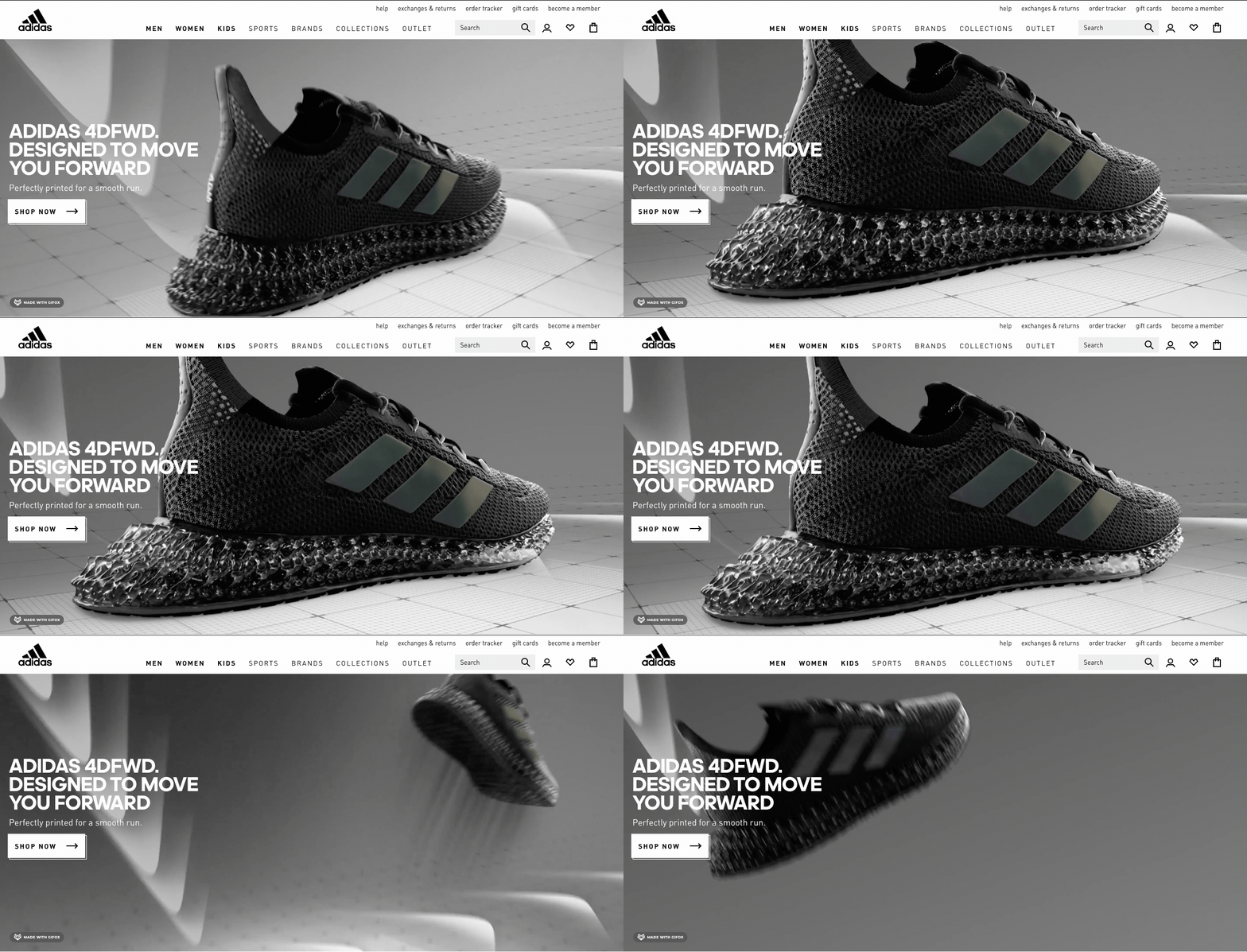
This energetic background video landing page showcases the new Adidas 4DFWD running shoes in a way that instantly hooks visitors.
The slow motion effect as the shoe hits the ground highlights the cushioning offered, and the animated forward moving arrows give the impression of speed and smoothness – all qualities that are no doubt important to people landing on the page.
2. Imperative
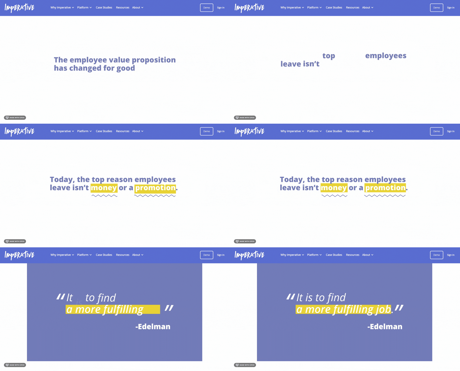
This video we made for Imperative (one of our 3,500+ clients) makes for a perfect supporting video on their homepage.
The kinetic typography combined with stock footage and icons helps to tell a story in which Imperative is the hero.
Explainer videos like this make great landing page content because they allow you to get your message across in a way that is clear, concise, and entertaining.
3. Rolex
This looping background video on the Rolex homepage oozes luxury.
The sweeping close up shots are able to highlight the fine detail of the watches and all of the small touches that make them distinctly ‘Rolex’. This no doubt appeals to shoppers as soon as they land on the page.
4. Airbnb host
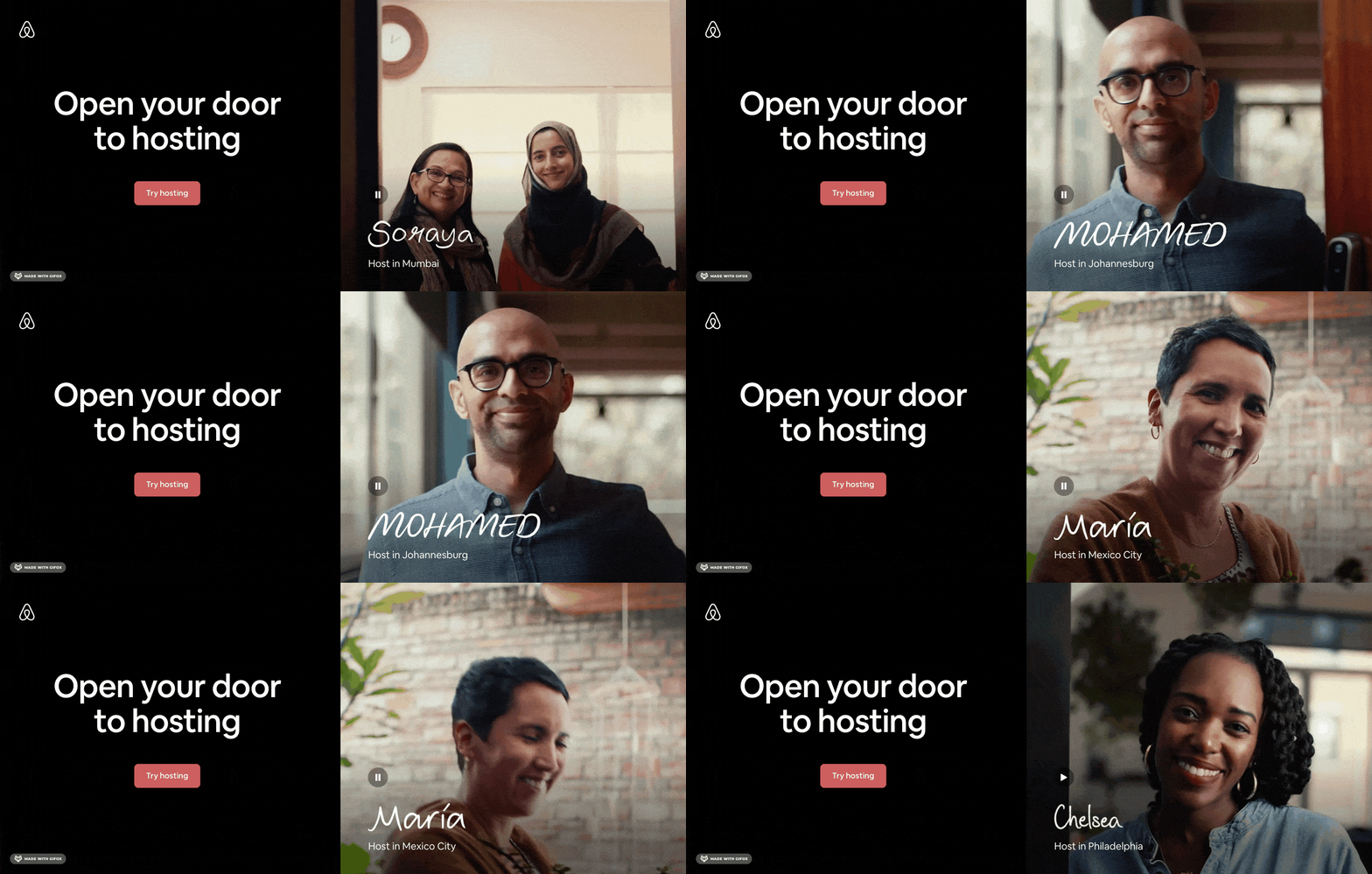
This landing page is a bit different in that it shows an autoplay video on one side and a static, more traditional landing page layout on the other side.
This works in a couple of different ways. On one level, it gives visitors two options. They can watch the video or click the button to find out more. On another level, this smaller frame makes the video look just like a door – which is exactly the impression that Airbnb wants to give.
The video is inviting and shows hosts from all different backgrounds and all different places. In just a couple of seconds it does a great job of piquing the interest of visitors and encouraging them to want to find out more.
5. Samsung Galaxy
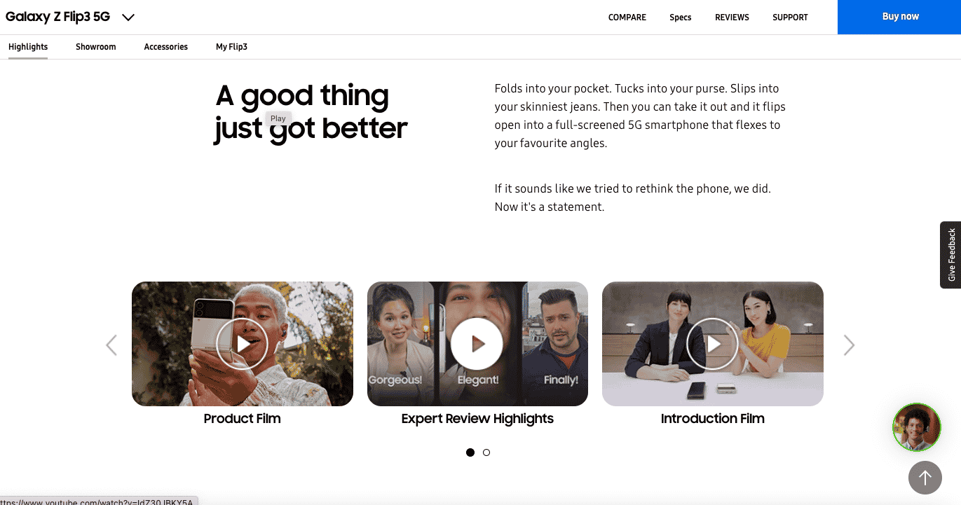
The landing page for the Galaxy Z Flip3 5G has a lot going on – but so has the product! The page shows beautiful images of the phone and includes a lot of detailed written descriptions.
But the star of the show are the 5 supporting videos that give visitors great additional information that can help them make an informed purchasing decision.
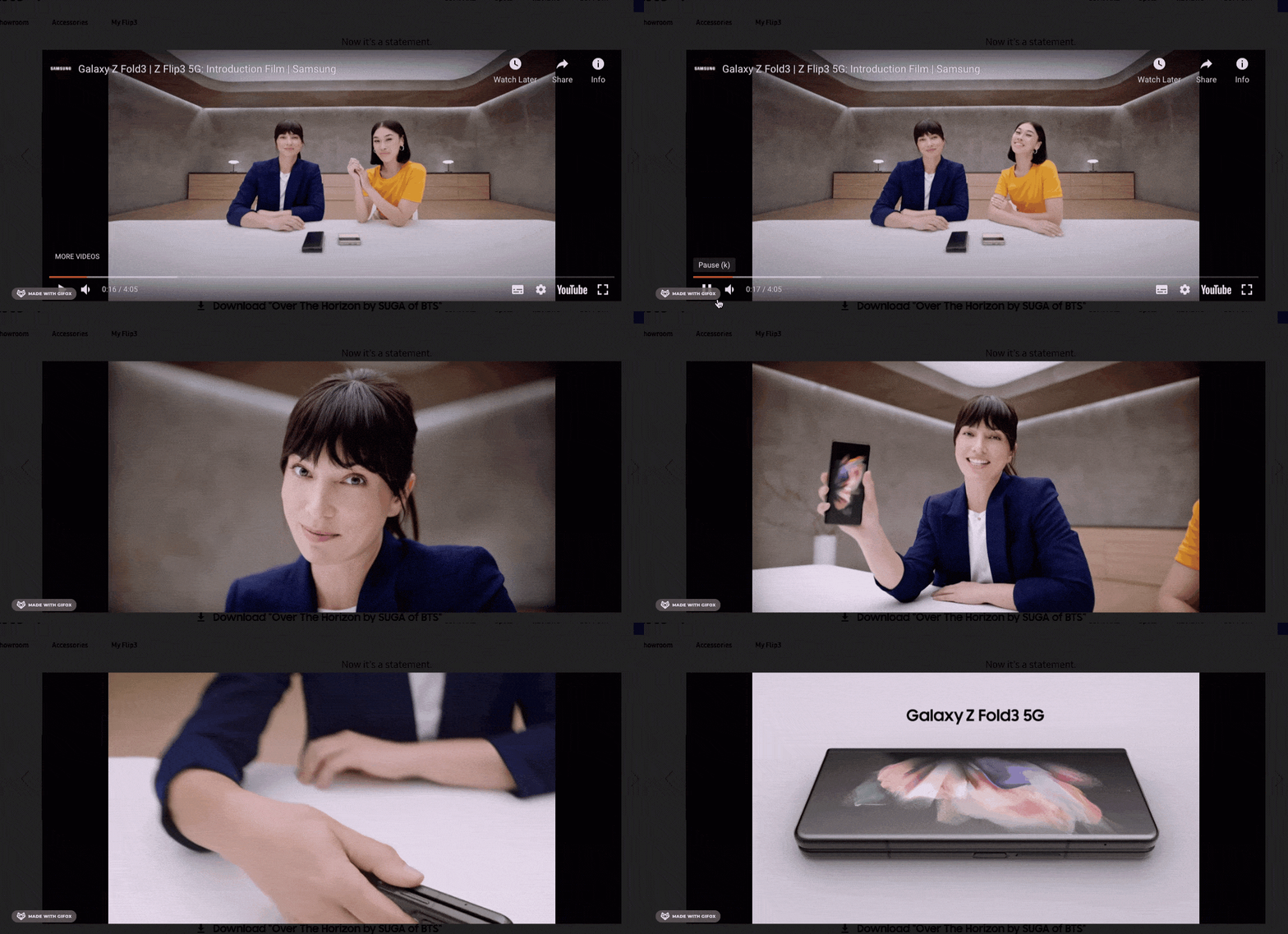
There’s a product film, reviews from experts, and a 4 minute introduction to all of the great features the phone has to offer.
6. Shopify Plus
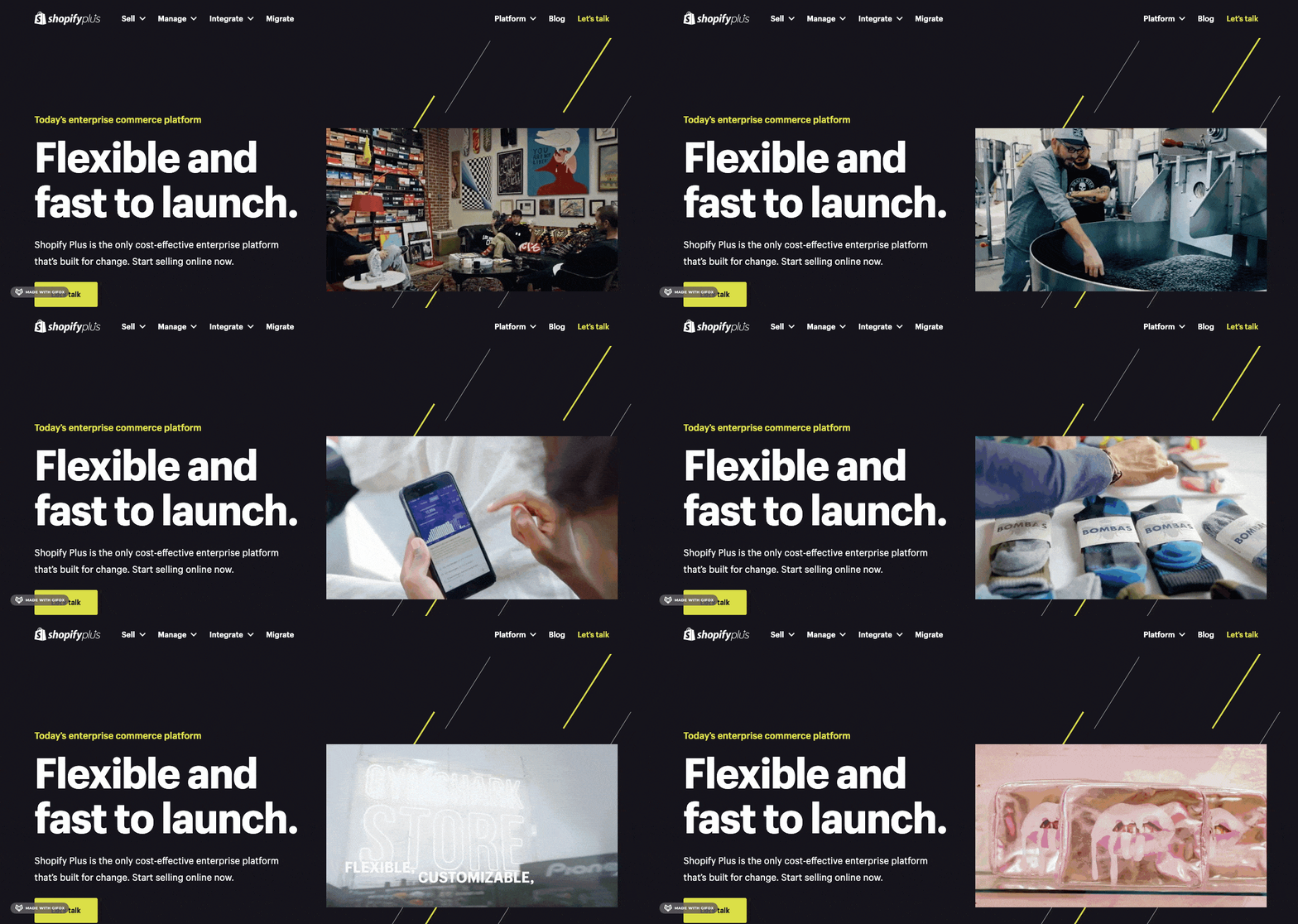
Shopify Plus is an eCommerce platform for enterprise businesses. This energetic hero video landing page highlights some of their biggest customers, including Kylie cosmetics and Bombas socks.
In just 30 seconds, this video leaves viewers feeling inspired and ready to launch their own store with Shopify.
7. Asana
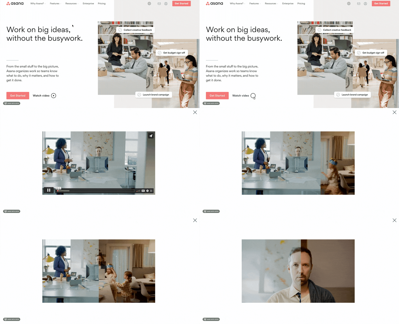
Asana’s homepage is clean, organised, and interactive – which is exactly what you’d expect from a project management tool.
Visitors to the site can choose to watch their pop up landing page video if they want to find out more information about the software.
The video is fun and smart in the way that it shows how the world of work has changed, and how Asana fits neatly into this new way of working.
8. Johnnie Walker

This simple background video on the Johnnie Walker homepage uses colours and stop motion animation to hook visitors when they land on the site.
It also gives the brand an opportunity to showcase all of their different labels right away, and the sloshing of the liquid in the bottles makes the page feel more alive and vibrant.
9. Natural Cycles
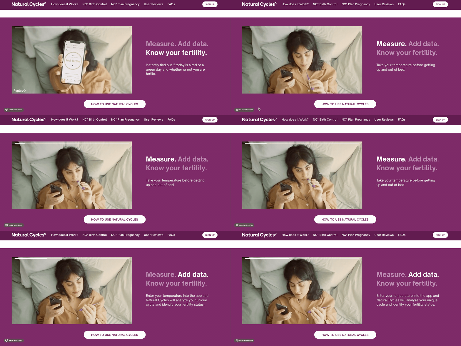
This video from Natural Cycles is a supporting piece of content for their landing page. When visitors scroll down the page, this video auto plays and shows potential customers exactly how easy it is to use the product in real time.
The text alongside the video also changes as the footage progresses to further explain to visitors how the product works in 3 simple steps.
10. Hermès
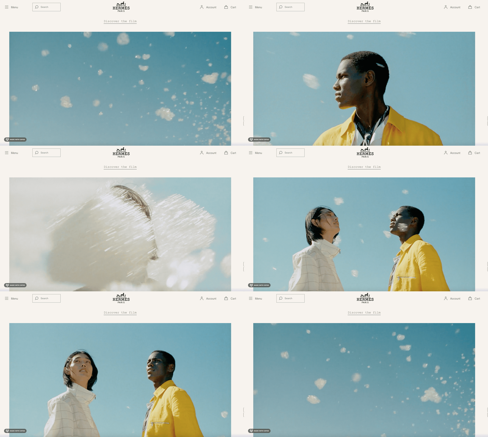
Hermès is a French luxury goods company that specialises in fashion and jewellery. The video that plays on their landing page evokes a sense of mystery and wonder. We see models standing outside as clouds of bubbles float around them.
This video is intriguing and different, and definitely does a good job of stopping visitors in their tracks – even for a moment or two. There’s also the option to ‘Discover the film’ if visitors want to watch the video in its entirety.
11. Bodyform
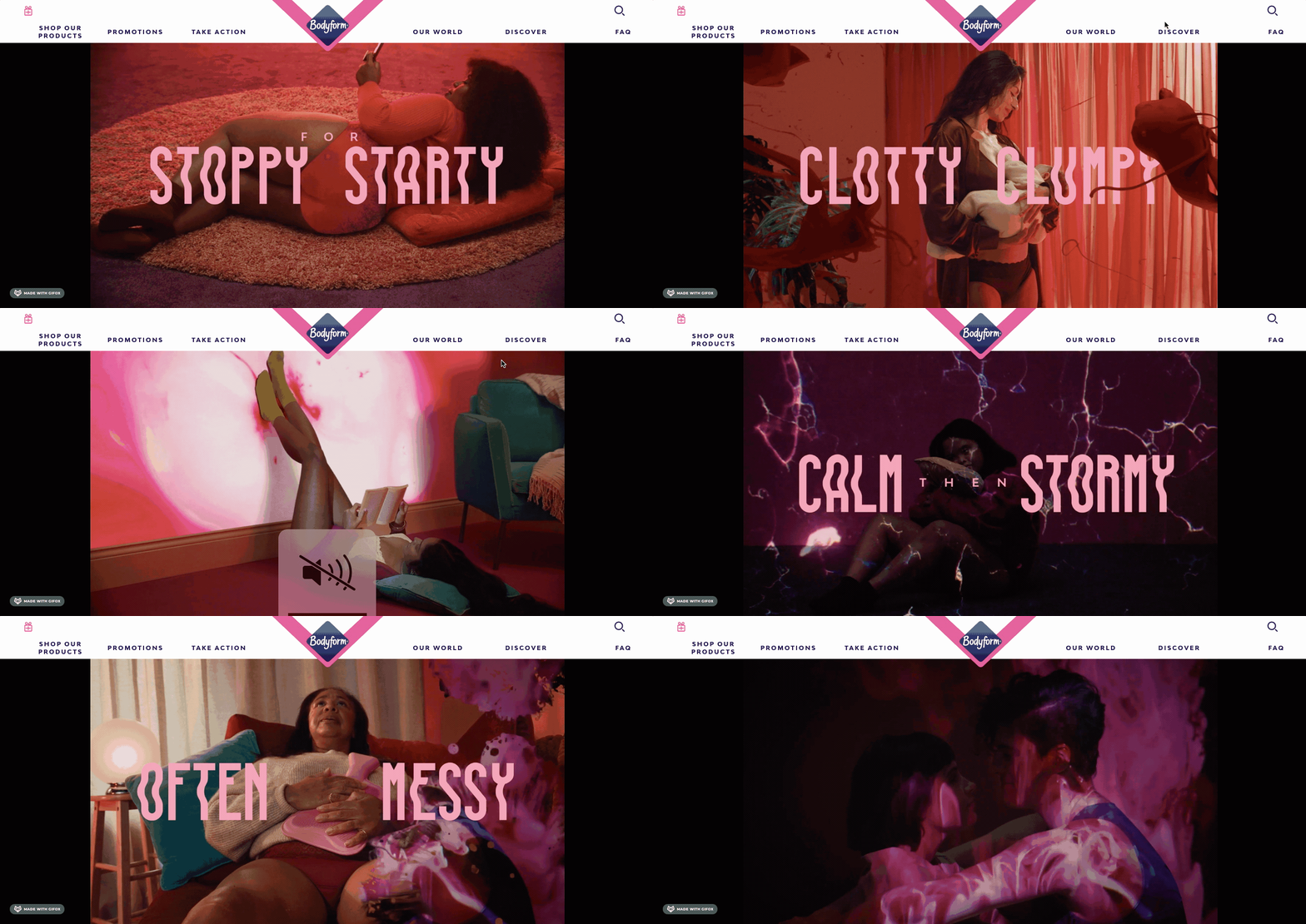
Bodyform are known for their bravery when it comes to tackling subjects that have been historically seen as ‘taboo’ – and this video is a great example of that.
The second visitors land on the page they are greeted by this powerful video that shows a lot of uncomfortable images that are relatable to many women.
This video is in fact an ad for a new product but because they have taken this story-led approach it doesn’t feel overly salesly.
12. Wistia
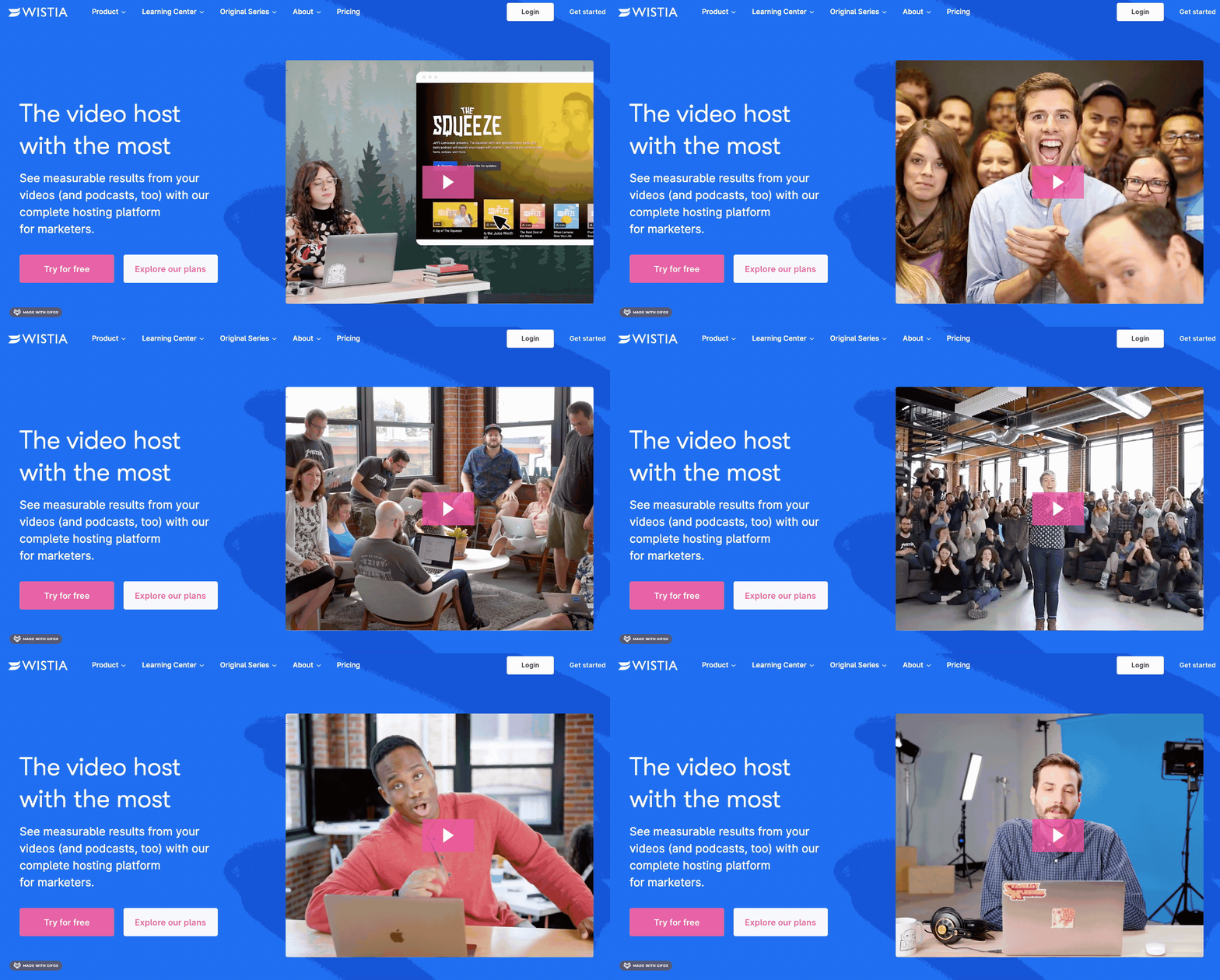
Wistia has an engaging hero landing page video above the fold and, well, you’d expect nothing less from a video hosting service!
This introductory video is humorous, outside-the-box, and humanises the brand by showing the happy faces behind it.
13. Thorpe Park
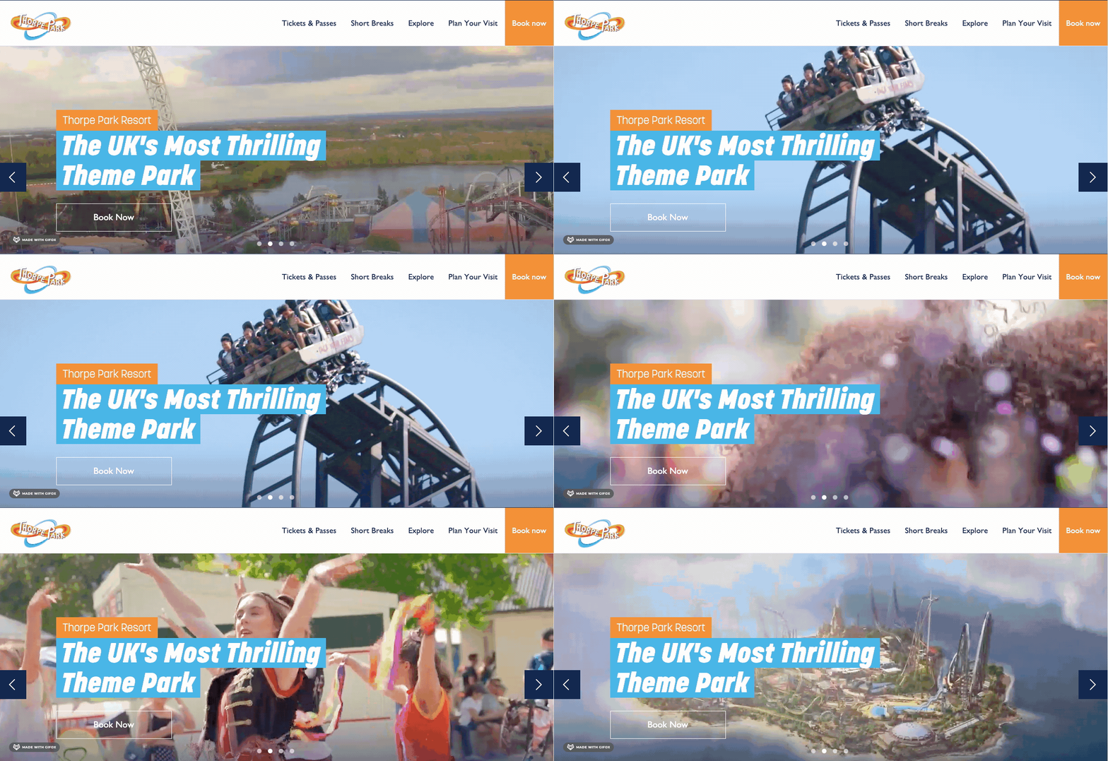
Thorpe Park, the self-proclaimed “UK’s most thrilling theme park” has a great background video on their homepage that showcases all of the different things that make their park great.
In just a few short seconds, visitors to the site can see the sprawling landscape of the park, the thrilling rides, and the fun parades. All of this footage works together to encourage visitors to book tickets.
14. GO APE
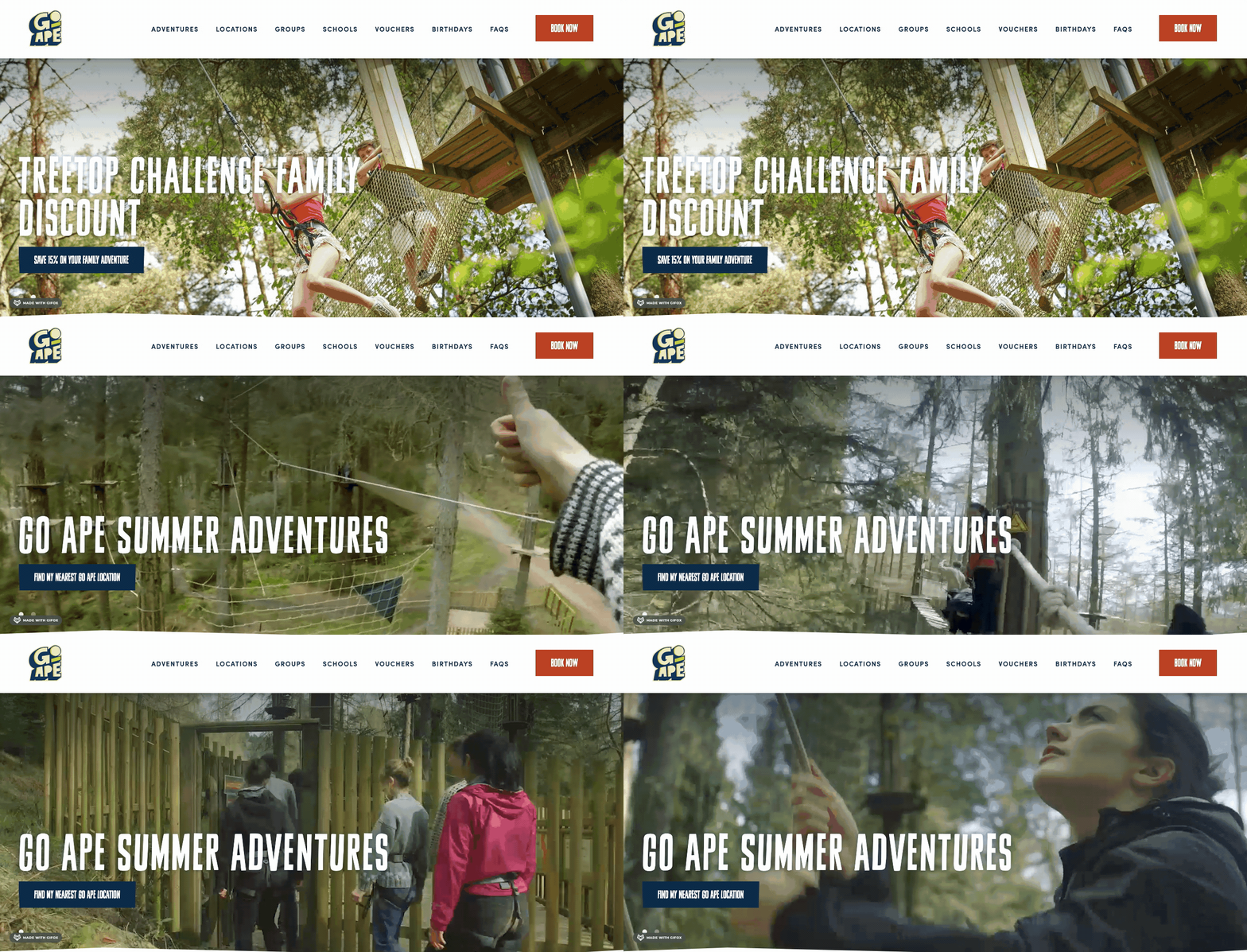
When landing on the Go Ape site, visitors are shown a carousel that automatically switches between photo and video content.
The fun video gives an instant snapshot of the exciting, adrenaline-fuelled activities on offer, and it does so in a way that’s much more powerful than still images and written descriptions.
15. Accolade
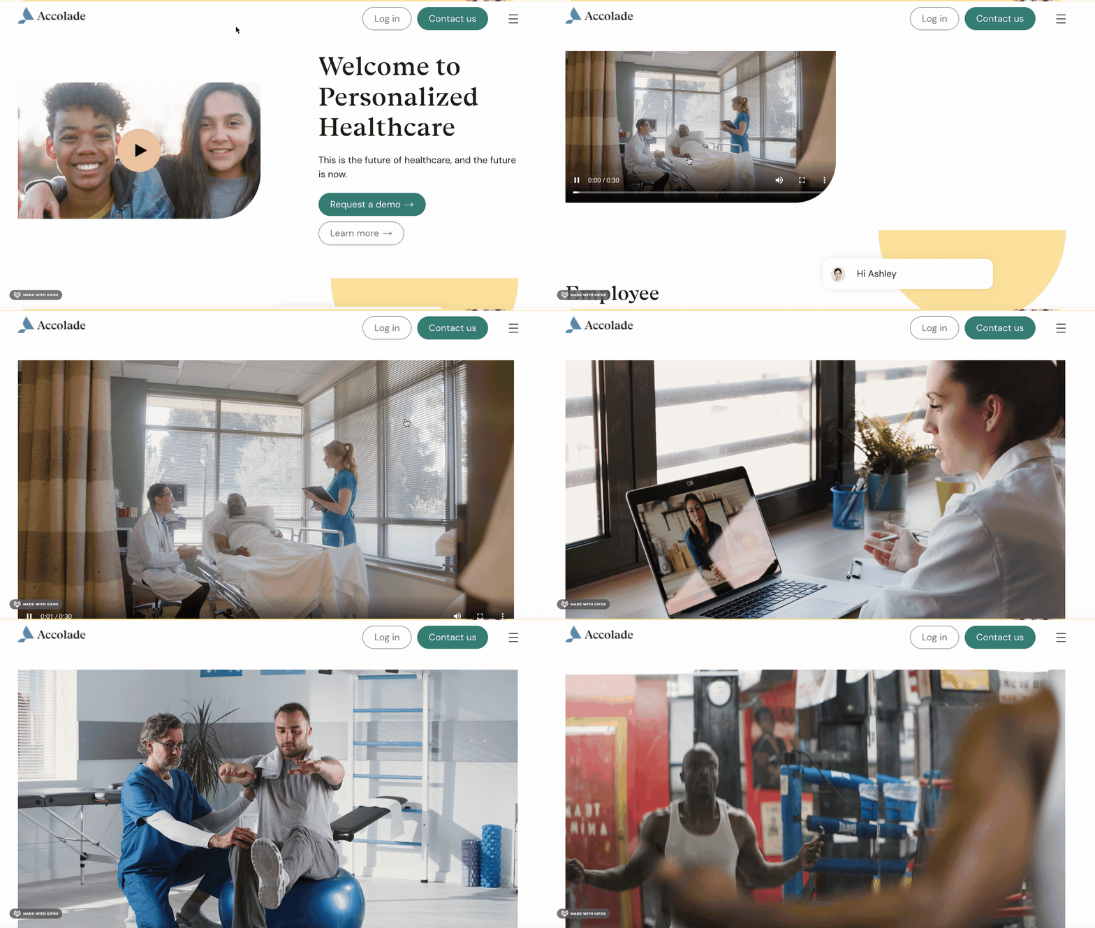
This simple yet persuasive video from Accolade helps to explain their product to new visitors in just 30 seconds.
We love how the video expands to cover the full screen after clicking play. It’s a nice touch and makes the viewing experience more enjoyable without being obtrusive. As soon as you click anywhere else on the page, the video automatically shrinks back down.
16. Michael Kors
This background landing page video features a lot of glamorous shots that sell the lifestyle of this luxury brand.
With beautiful cinematography and editing, plus an interesting cover of The Who’s “My Generation” for the soundtrack, this feels more like watching a short film than a brand video.
17. Answer The Public
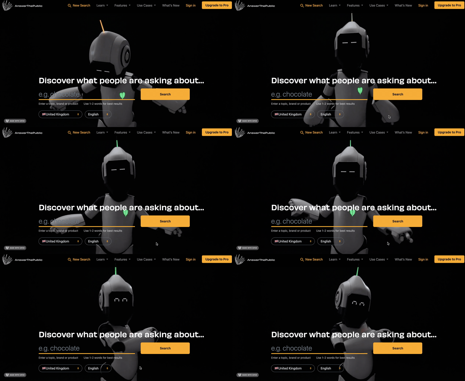
Answer The Public is a search listening tool that allows you to find out what keywords people are searching for online.
This site has quite a strange yet interesting background video landing page. A robot wiggles around on screen and shows different emotions. At one point, the robot also looks down at the search bar, as though inviting visitors to start their search.
18. Woodgreen
This background video landing page puts one particular dog from this animal shelter in the spotlight. As everyone knows, some dogs stay at shelters longer than others and a video like this one – that automatically showcases the dog’s personality, front and centre on the homepage – could be the extra chance that this pup needs to get adopted!
19. Ferrari
It can be safe to assume that visitors to the Ferrari website like fast cars, so what better way for the company to showcase their vehicles than with a high energy landing page video?
This fast-paced video shows lots of scenes that would encourage a visitor to the site to convert into a customer, from close ups of the most beautiful parts of the cars to wide shots that show Ferraris driving along clear roads.
20. Siff.io
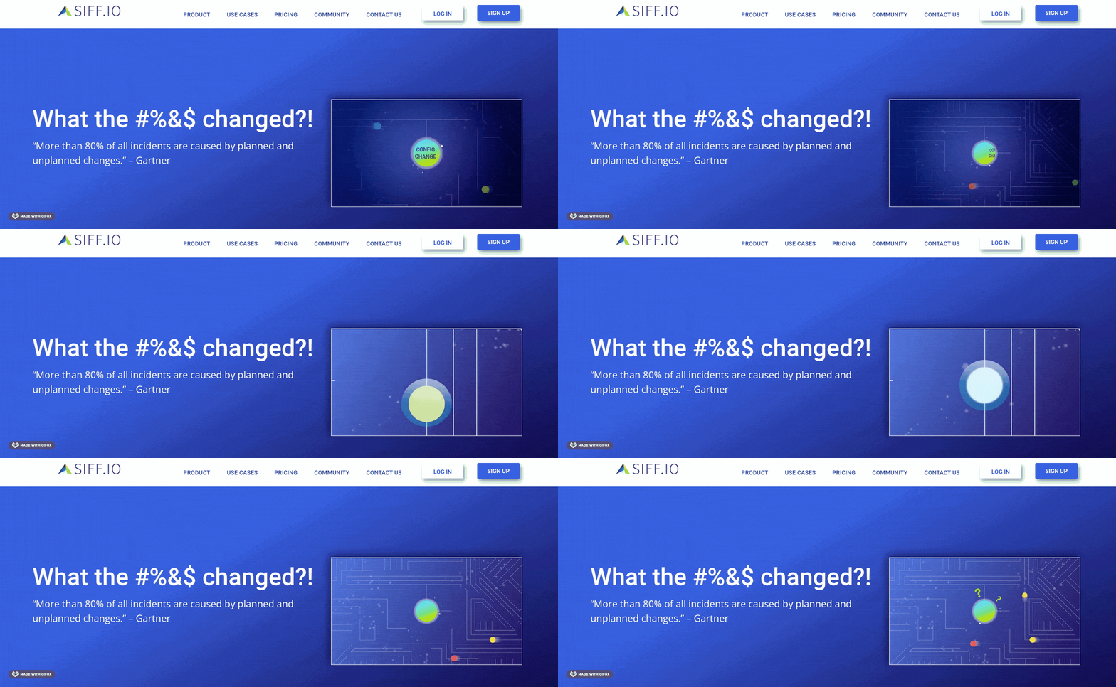
Configuration changes can be a dry topic and quite difficult to explain with text alone. That’s why Siff.io came to Wyzowl to create a dynamic animated explainer video that makes their product easy to understand.
This supporting video landing page captures attention straight away as it is placed right at the top of the page. Visitors to the site can take a look at the video first and then explore the rest of the site as more informed individuals, possibly closer to making a purchasing decision.
21. Headlime
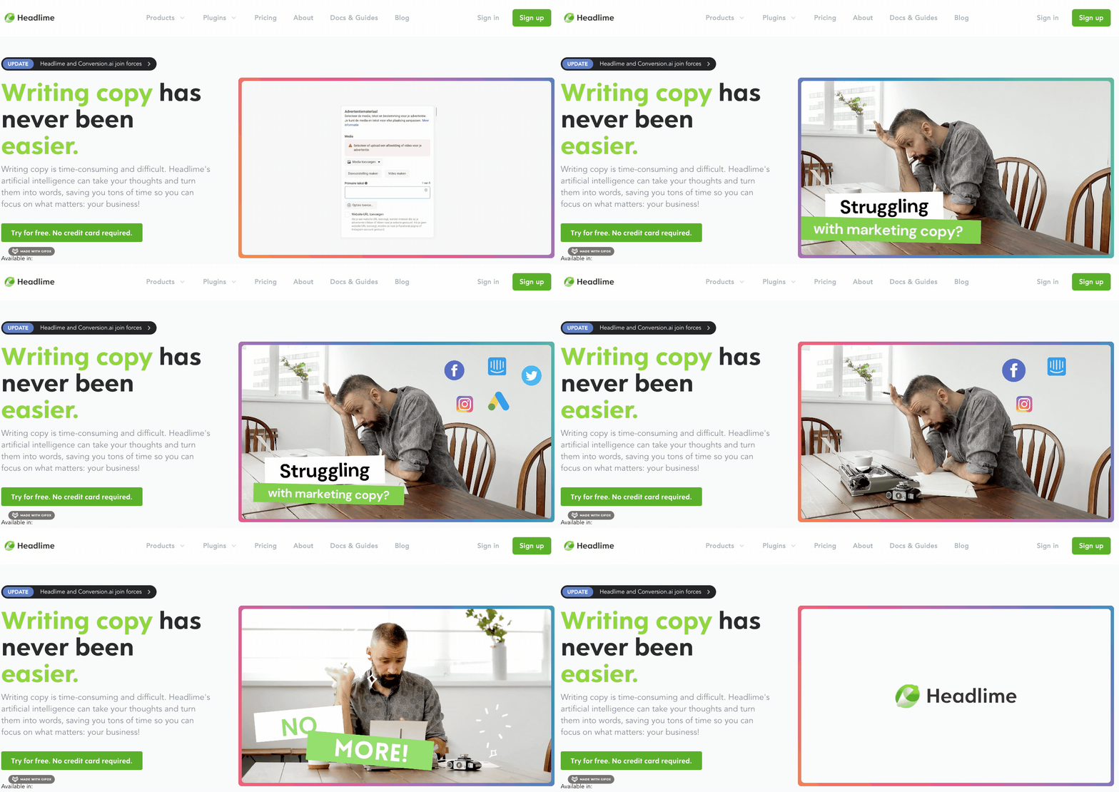
Headlime is an AI writing tool that helps marketers to save time on writing content. The idea of using artificial intelligence to write copy is still pretty alien to most people, so this landing page video helps to explain the tool in a quick and clear way.
This video, positioned in the exact same place as the Siff.io video above, does a great job of giving new visitors the contextual information they need to then explore the rest of the site and possibly convert into customers.
22. Samsung Freestyle
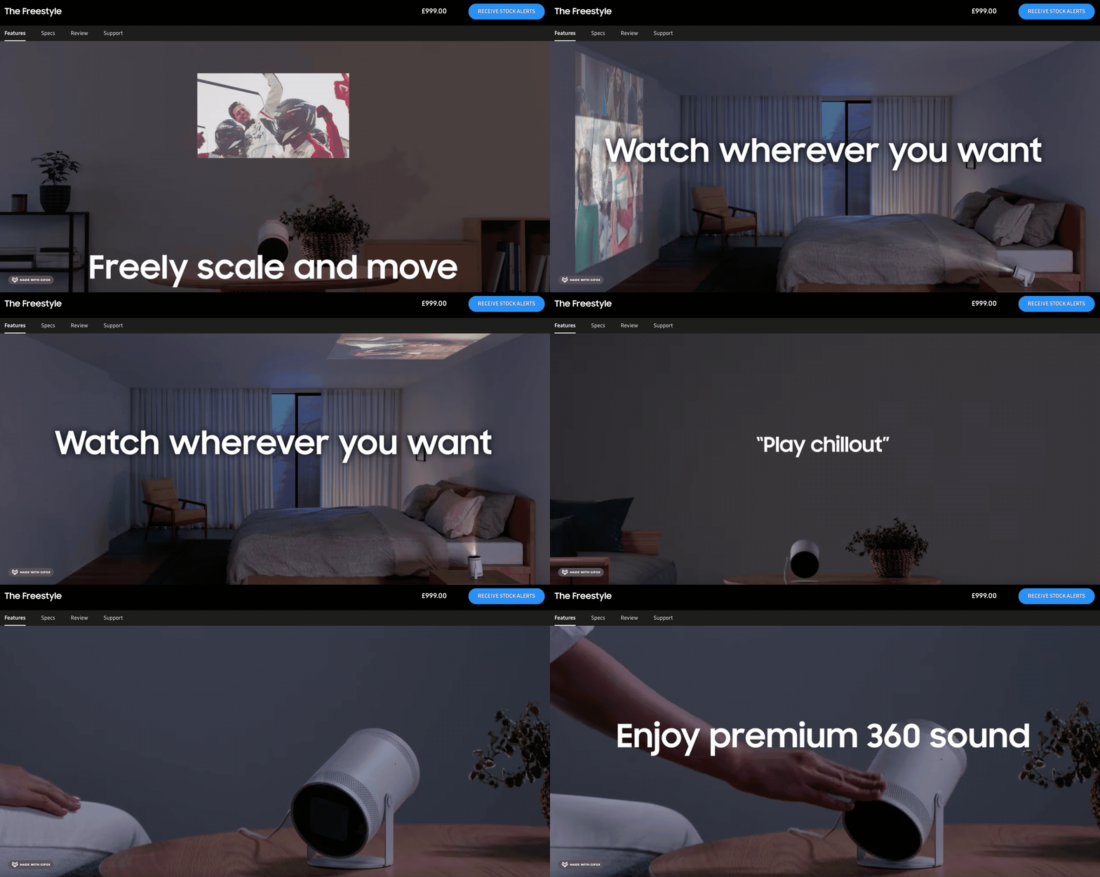
Yes, this is the second time we’re featuring Samsung on our list but their product videos are just knocking it out of the park!
This video on the landing page for the Freestyle projector features a great soundtrack and shows the product in action – for many different use cases – really selling the features to website visitors.
23. Podium
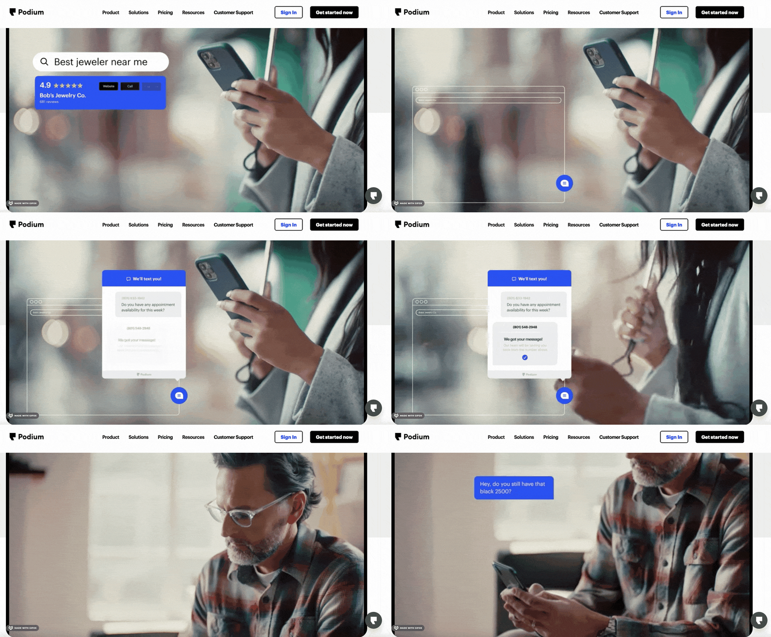
Podium is a messaging software tool that helps local businesses attract new customers and stay in touch with existing ones.
This mixed media video does a great job of highlighting all of the features of the software with animated pop ups that show the platform in action.
24. P&O Cruises
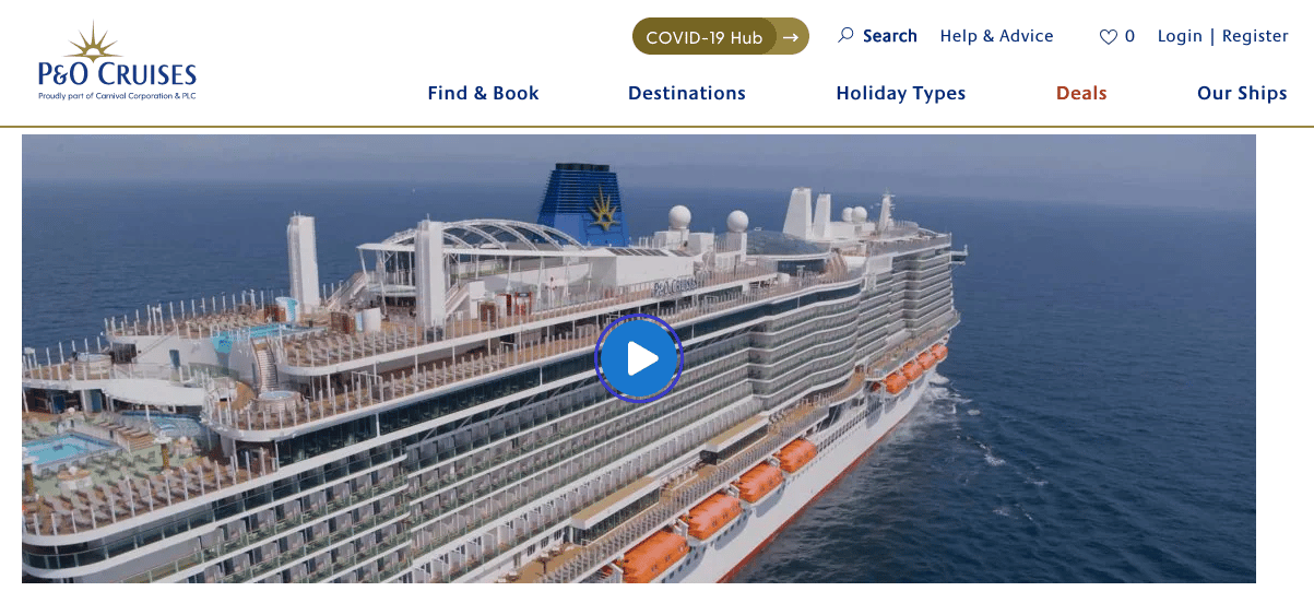
This supporting video is at the bottom of the P&O Cruises homepage:
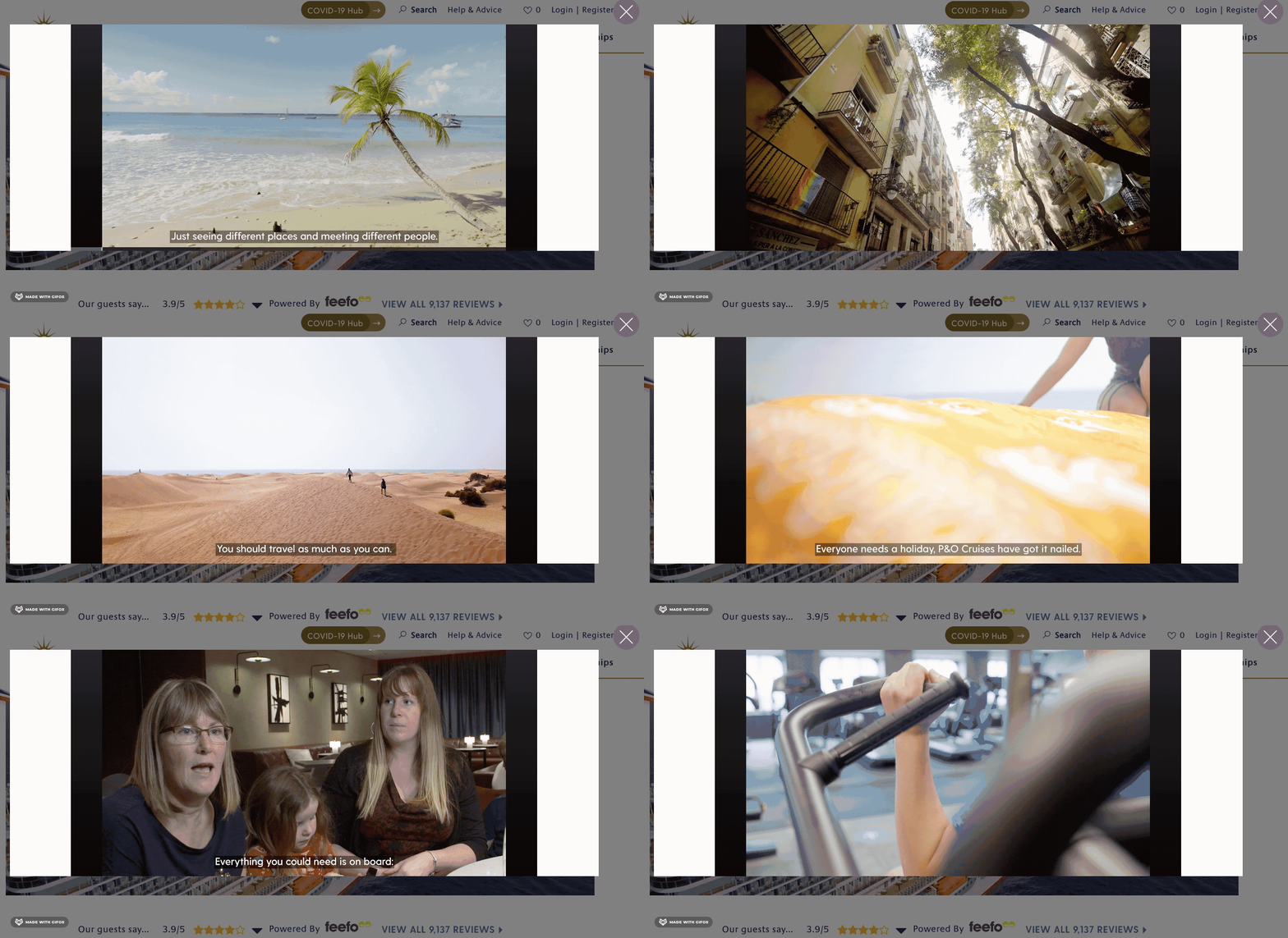
The video features testimonials from customers cut together with footage from the cruises and different locations around the world to really give viewers a taste of what a P&O Cruise is like and ultimately encourage them to make a booking.
25. Visit Scotland

Here’s another travel video, this time from Visit Scotland.
The video takes a different approach from P&O Cruises by using actors to show a montage of different activities that holidaymakers can enjoy in Scotland – from clubbing to surfing.
Featuring a Scottish cover of the song “Bonfire Heart”, this short but punchy video does a great job of evoking emotions that would encourage people to visit Scotland.
26. The Body Coach
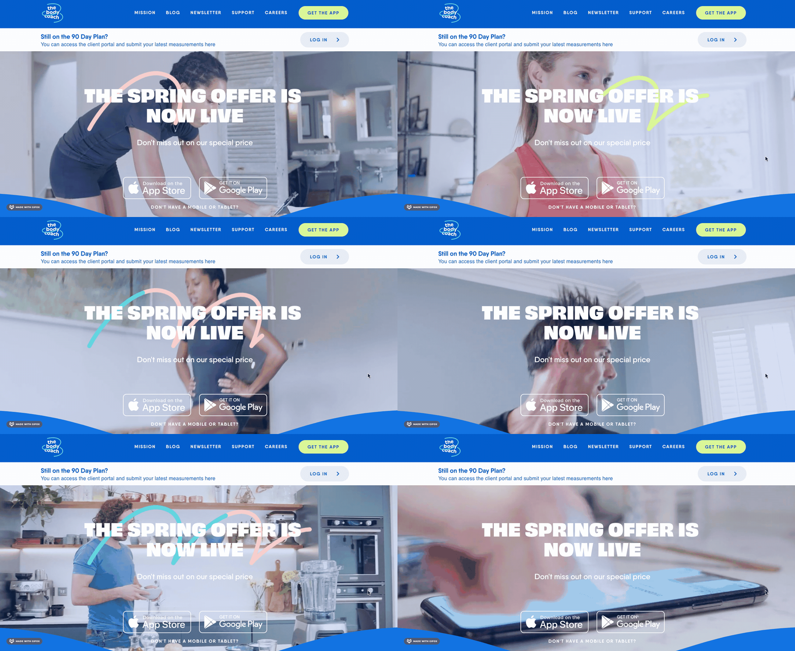
This background video landing page is doing an amazing job on many levels. For starters, it autoplays as soon as visitors land on the site, and it isn’t disruptive in any way. Another great thing to mention is that it shows motivational scenes of people using the app in different ways, both to workout and to make nutritional meals.
Lastly, the download buttons are right there – front and centre! – so if visitors like what they see in the video then they can instantly download the app and get started.
Final thoughts
Landing page videos come in all different shapes and sizes. The most important thing to consider is what type of video would work best on your webpage.
Explainer videos are usually a great place to start. These powerful videos can create lightbulb moments for your website visitors to help them quickly understand your product or service. Take a look at some explainer video examples here.


