Last updated on 10th January 2024
YouTube is a competitive battleground for video marketers. So much so, that something as seemingly trivial as your YouTube thumbnail image can actually make a huge difference in the overall success of your videos.
In this article, we’re going to take a look at everything you need to know about YouTube video thumbnails, from the ideal dimensions, through to best practices and examples, and even design tools that can make your thumbnails pop.
What are YouTube thumbnails?
YouTube thumbnails are the preview images that represent the videos. They give viewers a hint of what to expect from the video before they click on it. Here are some examples:
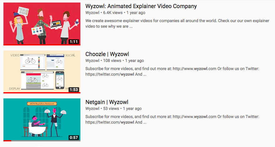
YouTube thumbnail images should not be a random still from your video. They should be carefully chosen to grab the attention of potential viewers.
When people search for a YouTube video, they’re looking for visual content. So even though your video will pop up with a title, your channel name, and even the number of views, a lot of focus will be on the thumbnail image – so it needs to stand out! That’s why many choose to create custom YouTube thumbnails.
Ideal YouTube thumbnail dimensions
In order for your YouTube thumbnail image to have the best impact, it needs to be the correct size. The ideal YouTube thumbnail dimensions are as follows:
- Resolution: 1280×720 (with a minimum width of 640 pixels)
- Aspect Ratio: 16:9
- Maximum File Size: 2MB
The accepted image formats are: JPG, GIF, and PNG.
How to add a custom thumbnail image
When you upload a video to YouTube, the platform will automatically generate three thumbnails for you. These are selected at random from the video content and will appear at the bottom of the upload page:

As you can see, these are just stills selected from the video. And none of them really stand out. To add custom thumbnails, click the customised thumbnail button and upload thumbnail. Then click the save changes button, and you’re done!
Best practices
In an arena as competitive as YouTube, it’s not enough to simply know how to do something. You need to know how to do it well.
Here are 7 best practices for creating a YouTube thumbnail…
1. Grab attention with text overlays
Adding text to your thumbnail can help to draw viewers in and give them a quick insight into what the video is going to be about. This is especially helpful if you want to add more context than you did in the title. Here’s an example:

‘Fake duck kidney’ isn’t exactly a great keyword to include in your video title! But, including it in the thumbnail can spark curiosity and encourage people to click and watch.
2. Make it relevant
Nobody likes clickbait. So make sure your thumbnails reflect what actually happens in your videos.
By giving potential viewers a hint of what they will see in the video – like the thumbnail below – you can not only encourage them to click, but also ensure they won’t be disappointed by what they see.

3. Include your logo
By including your logo in your thumbnail you can strengthen your brand presence and also improve your chances of viewers remembering your brand name. This will not only come in handy when they want to search for you on YouTube, but it could also help you generate some word of mouth marketing if they tell their friends.
Instead of plastering your logo over the main image, place your logo in a discreet place, and keep the placement consistent. Vevo always include their logo in the bottom left-hand corner:
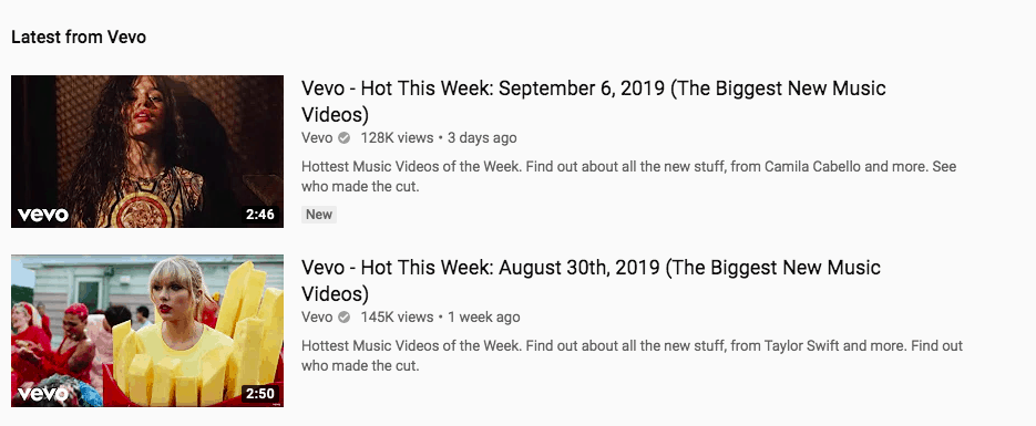
It doesn’t detract from the main image at all, but makes it instantly clear that Vevo uploaded and owns the video.
4. Less is more
YouTube thumbnails are quite small, so it’s important that you don’t overcrowd your image. This may sound contradictory, especially when we’re also advising you to include your logo and text overlays, but there is an important balance to strike.
If there’s too much happening on-screen, then your thumbnail could actually turn people away instead of drawing them in. And that’s the opposite of what you want!
5. Make people curious
Your thumbnail is the main selling point of your video. It’s often the difference between people watching your video or watching another (probably made by a competitor).
If your thumbnails make people curious, then they’re more likely to click on the video. You can spark curiosity with action shots, like this:

Or, if there aren’t any interesting action shots in your video, you can create a thumbnail with graphics that will pique the interest of potential viewers:

6. Test! Test! Test!
When it comes to creating a custom Youtube thumbnail, the possibilities are almost endless. There’s only one way to find out what works and what doesn’t, and that’s to get testing.
To find out what your viewers respond to, swap out your thumbnails every couple of weeks and measure the difference in views. You may find that you get more views on a video with text in the thumbnail, but why stop there? You could tweak the size of the text, the font, the colour, and so on!
There’s no right or wrong thing to do here. It’s all about testing and finding out what your viewers prefer.
7. Be consistent
Consistency will help viewers to identify your videos among the masses of results on their YouTube homepage or search results screen. And it will also help to strengthen your brand presence on the platform. Take a look at this example:
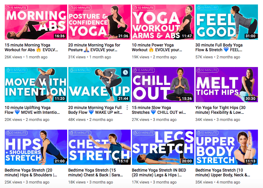
This is an especially good idea if you’ve already tested your thumbnails and know what works best for your channel.
Great thumbnail examples
Now that you have some best practices under your belt, let’s take a look at them in action. Here are 5 examples of great thumbnails…
1. Refinery29
Refinery29 is a female-focused lifestyle brand, with a YouTube channel that covers everything from lighthearted make-up routine videos, to hard-hitting mini documentaries about women in impoverished countries.
Despite their video content being so varied, their thumbnails are always consistent. They show a still of a woman from the video and their logo in the bottom left-hand corner:
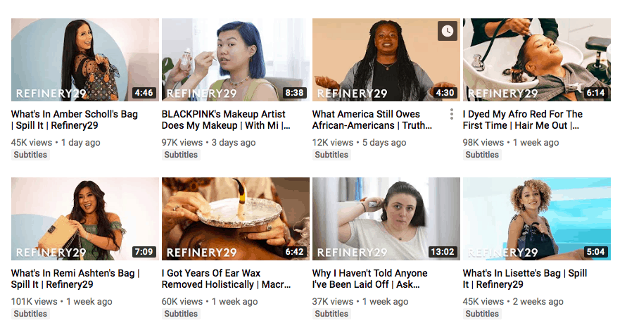
As we mentioned above, including your logo in your thumbnails is important because it helps to strengthen your brand’s presence on YouTube.
Here’s a keyword that Refinery29 is ranking number one for:

It’s a controversial topic and the image of a woman staring straight into the camera while her hair is being cut is thought-provoking. The other results for this keyword don’t have anywhere near as many views:
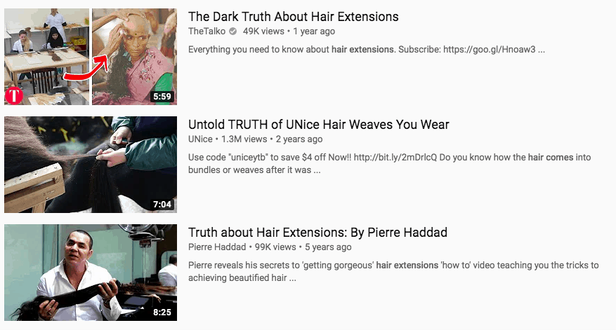
As you can see, the thumbnails don’t have the same impact. Most of them are just stills from the video, and this isn’t enough to spark the curiosity of viewers.
2. Yoga with Adriene
Yoga with Adriene is a yoga community that posts free online yoga classes for all levels. Yoga with Adriene is so successful that when you type ‘yoga’ into YouTube, videos from the channel appear for the first 10 results! And maybe the secret is in the thumbnails…
Here’s a typical Yoga with Adriene thumbnail:

It features the instructor, Adriene, mid-pose, and also big, bold text that explains what is happening in the video. Other videos that rank for the same keyword pale in comparison:


Yes, they feature instructors posing, but there is no text on screen (apart from the title of the video in the first one). Text overlays help thumbnails stand out from others and work to draw viewers in.
Yoga with Adriene practices consistency, too. All of the videos have the same structure – instructor in the centre, and big, bold text around her:
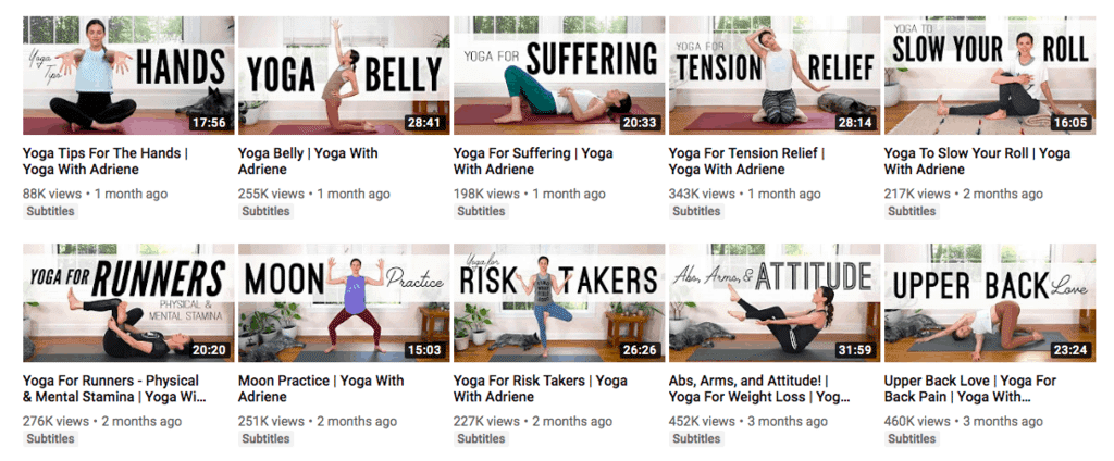
And, with over 5 million subscribers, it seems to be working a treat!
3. The Infographics Show
The Infographics Show makes animated videos about all kinds of interesting facts and stories.
Their thumbnails are always bright and colourful, and include a shortened version of the video title that can pique the interest of potential viewers:
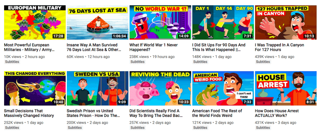
This formula helps them to stand out in the search results. Here is a keyword they rank number one for:

And here are some other videos that rank for the same keyword:
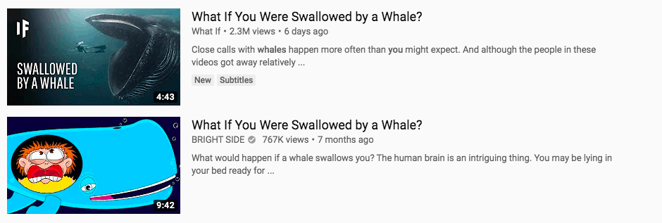
These thumbnails certainly aren’t bad, but they’re not as eye-catching as The Infographics Show’s. And this is evident when comparing the number of views each video has.
4. Red Bull
Red Bull have long had a marketing strategy to be envious of. They’re known for crazy publicity stunts, like the Red Bull Space Dive, and creating amazing video content that people actually want to watch. Their YouTube channel is thriving at almost 9 million subscribers!
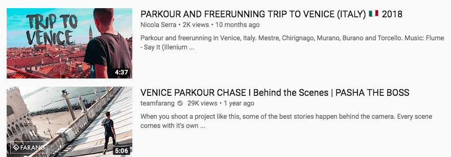
Their thumbnails often feature action shots that practically beg to be clicked on. Here’s a YouTube search for the keyword ‘freerunning in Venice’:

The Red Bull thumbnail delivers on the topic – we can see someone mid-jump. The competing videos for this keyword don’t show action shots, and also don’t have as many views:
5. DIY Creators
DIY Creators is aimed at DIY enthusiasts who want to improve their skills and learn new ones. As the videos are mainly ‘how to’ focused, a lot of the thumbnails show what the finished product will look like:

This acts as an incentive to encourage people to click on the video – because they can see how amazing the project turned out and they want to know how they can also achieve that.
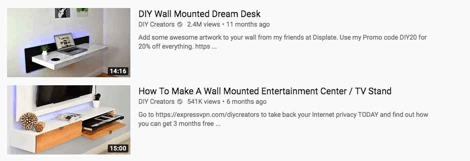
The images are clean, consistent, and highlight the DIY project as the sole focus.
Best YouTube thumbnail makers
You don’t need to be a whizz at design to create a YouTube thumbnail! There are some great design tools out there that make it easy…
1. Canva
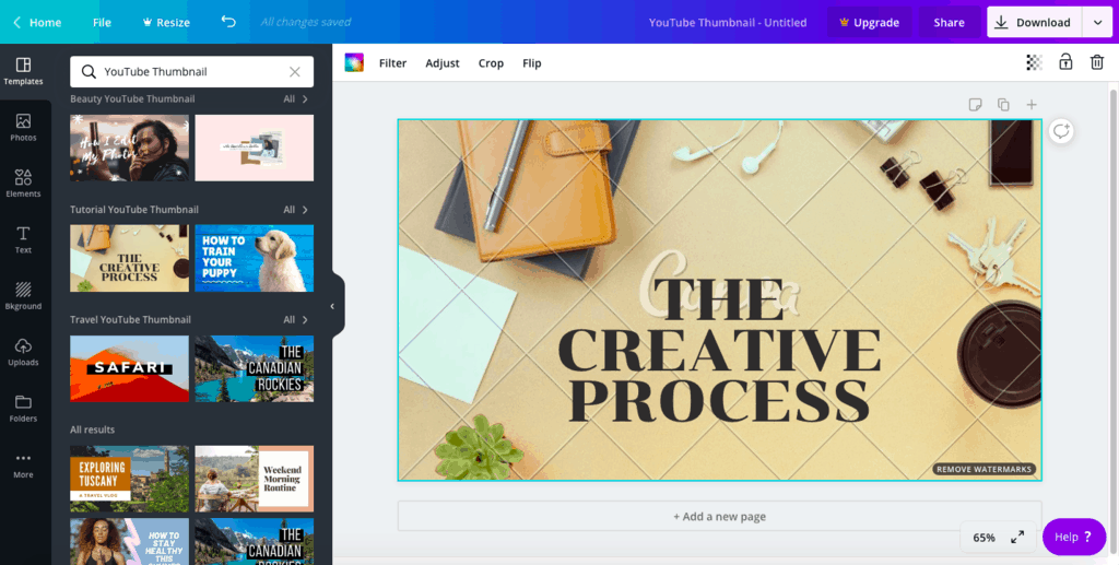
When you first open Canva, you can search for YouTube thumbnails and find instant templates that are ready to use:
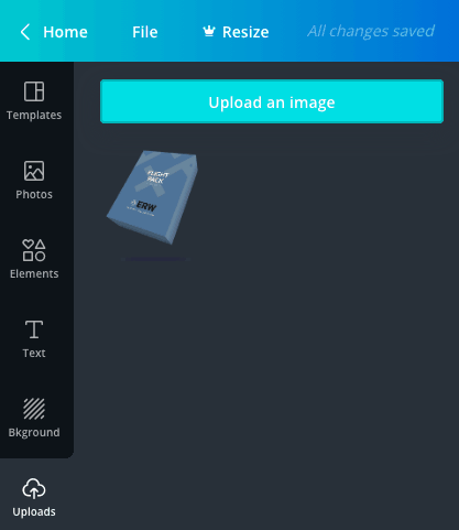
However, if you want to make your thumbnails more personal (and we’d recommend that you do!) then you can upload your own images:
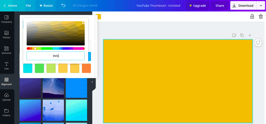
And update the background and font to match your brand guidelines. Canva has hundreds of free fonts to choose from, and you can enter hex codes to find any background colour you desire.
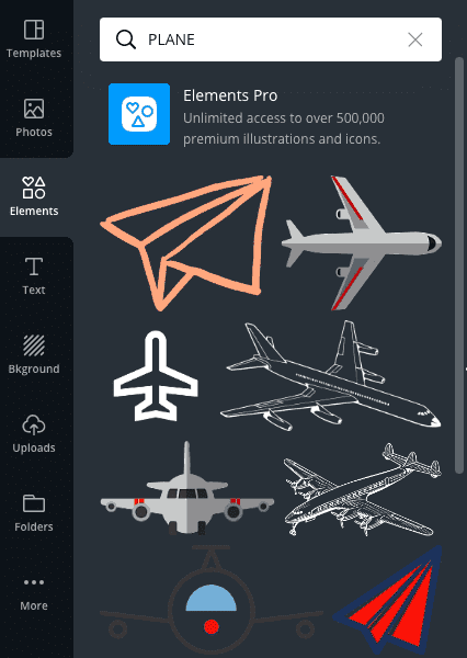
They also have over 2 million assets on offer. So if you don’t have any graphics to add to your thumbnail, you can choose from their extensive library:
Canva is free and easy to use, with a simple drag-and-drop functionality. However, it’s worth noting that some assets are only free for premium users. Users on the free plan will have to pay a small fee to use these assets.
(Click here for our full Canva review)
2. Snappa
With Snappa, you can instantly create images for any social media platform – the sizes are automatically generated. To make a YouTube thumbnail, just click on the button:

You will then have the option to create a thumbnail from scratch or choose from their templates.
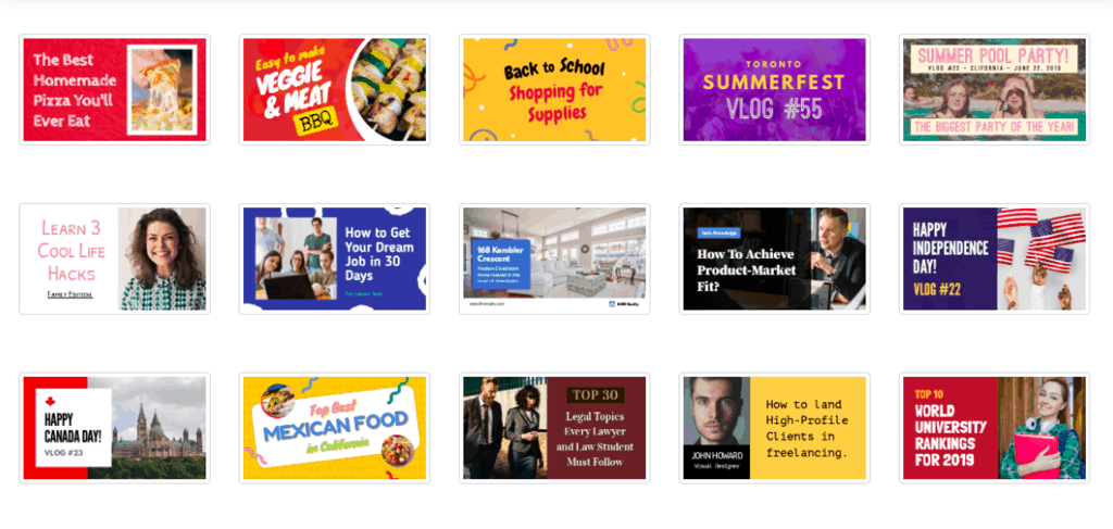
All templates are customisable, so don’t worry if there isn’t one that instantly jumps out at you. Snappa has over one million high-resolution, royalty-free photos to choose from, and also plenty of graphics, shapes, and fonts:
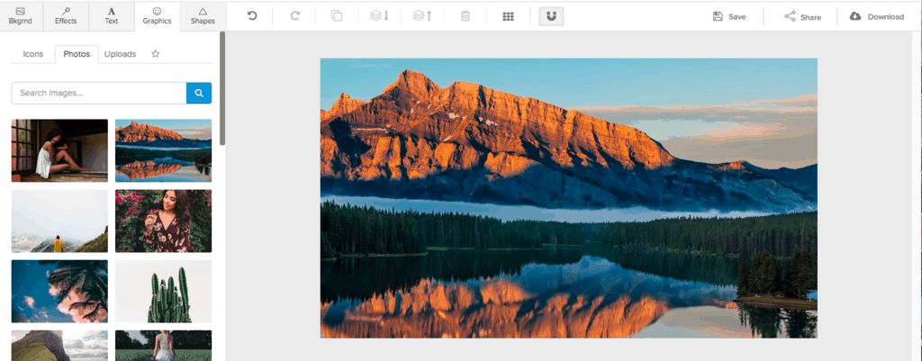
It’s completely drag-and-drop, so it’s easy to make the perfect thumbnail in just a few seconds:
When you’re happy, simply download the thumbnail as a high-res PNG.
(Click here for our full Snappa review)
3. Visme
Visme is a free design tool that you can use to create everything from infographics to printables, and, of course, YouTube thumbnails. To get started, click on the social graphics tab:

And then click YouTube. You can choose to create channel art or video covers. For the purposes of creating a thumbnail, you’ll need to click video covers:
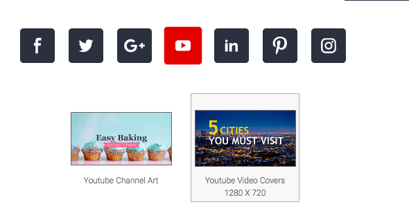
Like the other design tools, you can choose from customisable templates or create your own thumbnail from scratch:
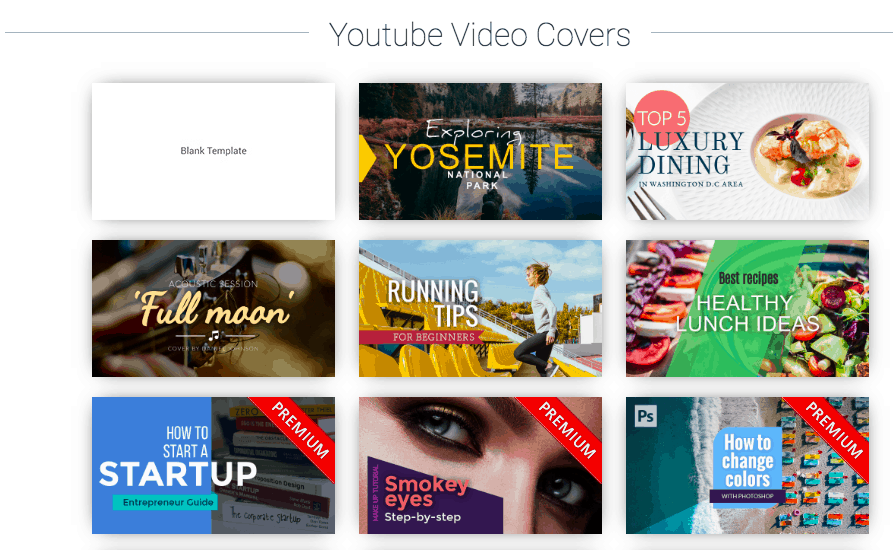
It’s easy to customise the templates, although the choice of graphics and fonts seems to be more limited than the other tools mentioned:
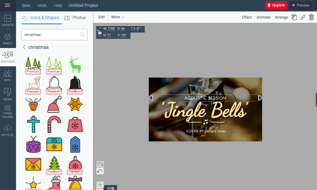
There are a lot of the graphics available for premium members only, but the cost of this starts at $15 per month:
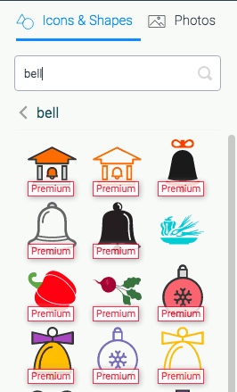
It’s also worth noting that free members can only download their thumbnails as JPGs, rather than PNGs.
Final thoughts
If you’re serious about video marketing (and you should be!) then YouTube is a channel that you need to master.
The pointers in this article should be enough to make you a thumbnail master…but a custom video thumbnail is just the start! What about your YouTube banners?
Don’t worry. We’ve got you covered there, too: YouTube Banner Size and Dimensions Guide.


