Last updated on 10th November 2023
It’s easy to think of the company logo as a modern concept.
But a little research reveals that it’s almost as old as business itself. Take a company like Twinings, for example. They first used their logo way back in 1787, and it’s remained unchanged ever since – making it the oldest unaltered logo in continuous use!

For as long as businesses have been marketing their products and services, they’ve been using symbols and logos to distinguish and differentiate their offerings.
The technological revolution of the last half century has only made it more important for brands to stand out, with increased global competition and a shrinking human attention span. Companies increasingly look for every opportunity to make a great first impression with their brand, and set themselves apart from their competitors.
New and exciting technology can help enhance this effect – a great example of which is logo animation. Combining great logo design with animation creates a vibrant, fun and visually striking slice of brand identity that invariably leaves a great and lasting impression on an audience.
In this article we’ll be looking at awesome ways to use logo animation and also some examples of it in action.
Why you should use logo animation
Logo animation is essentially taking a ‘static’ logo, breaking it into parts, and having those parts animate together – breathing new life into the idea of logo design, and giving your digital brand toolkit more punch than ever before!
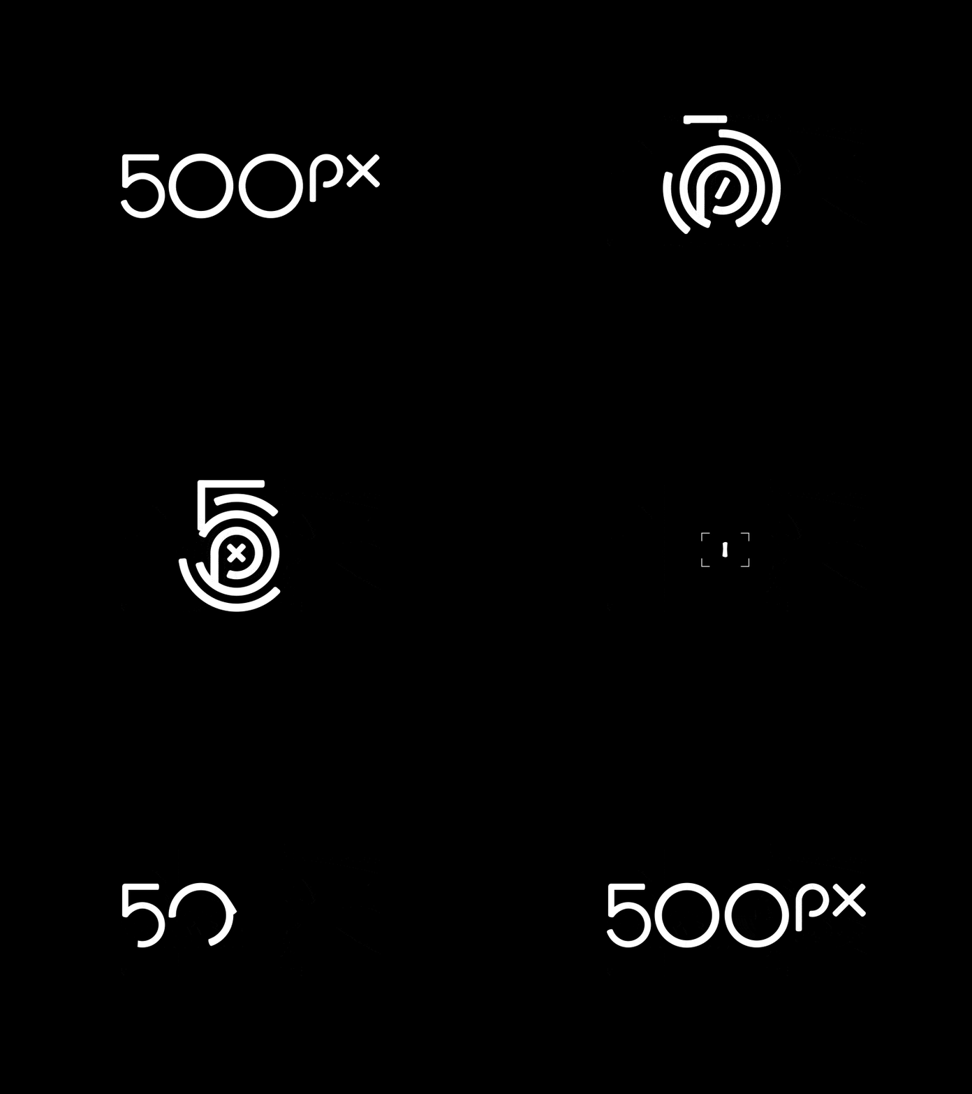
This technique is still relatively under-used and so all brands who embrace it have the opportunity to benefit from an instant edge in their market.
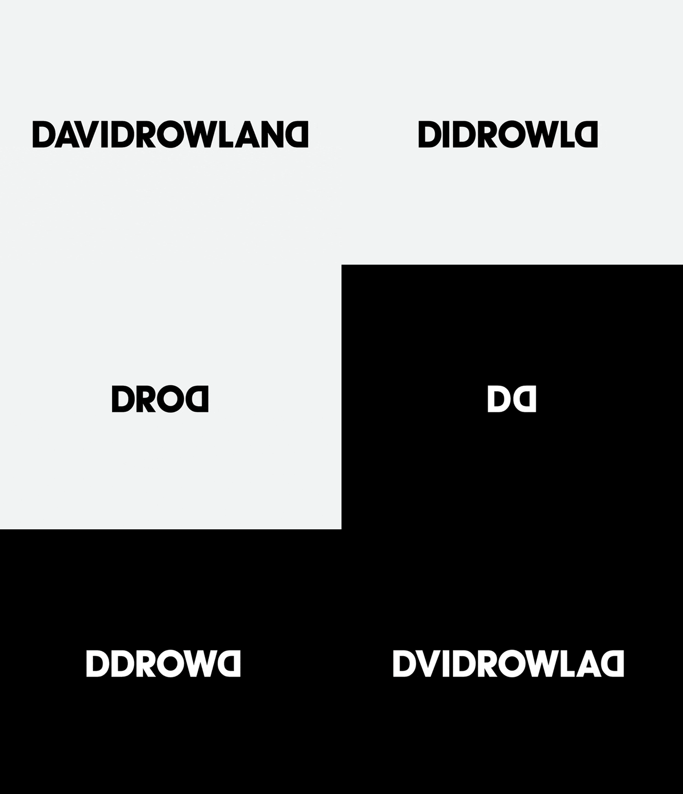
Not only that, motion is attention-grabbing. When people see something move, their eyes are drawn to it. This kind of visual appeal, in a digital world full of noise and distractions, could be exactly what you need to grab and hold the attention of your customers.
8 awesome ways to use logo animation
Animated logos are fun and they can help you stand out in a crowded marketplace. But where and how should you use your logo animation in order to get the most traction?
Here are some ideas…
1. Intro to branded videos
Video marketing is huge. And it’s only getting bigger. According to our State of Video Marketing survey, a staggering 91% of marketers are using video, with 96% saying they continue to value video as an ‘important part’ of their marketing strategy.
But this increase in video marketing also brings with it an increase in competition. Starting your videos with an animated logo can help you look more professional, while also sending out a clear message of ownership from the moment people press play.
2. Outro to branded videos
Animated logos work just as well for outros as they do for intros. Including your animated logo at the start and end of your branded videos is a great way to bookend your message and remind viewers who you are.
When people finish watching your video, you usually want them to take the next step along your funnel, whether that’s contacting you for a demo of your product, downloading your app, or anything else!
By ending your videos with your logo you can keep your brand at the forefront of customers’ minds and hopefully encourage them to take that all-important next step.
3. Attract attention at trade shows
Trade shows are a great way to meet potential customers face-to-face and increase brand awareness. But these events are very fast-paced with a lot happening, so attendees won’t be able to remember everybody.
The exhibits that stick in people’s minds are those that offer something a little bit different – like a screen showing their animated logo!
According to a survey of trade show exhibitors, 48% agreed that an eye-catching stand is the most effective method for attracting trade show attendees – even more effective than giveaways (34%).
4. Email signatures
Email is still one of the most widely-used communication methods, particularly in B2B businesses. But most email signatures include the same (rather dull!) information: name, job title, static logo, maybe a short quip.
They’ve become so formulaic that it’s easy to ignore them completely. An animated logo would spice up any email signature and drive recipients to take a second look.
5. Presentations
Similar to trade shows, presentations allow you to show off your brand to people in real-time – meaning you benefit from their undivided attention. This is the perfect place to show off your animated logo, and it could also make your presentation more memorable.
6. Social media
Social media is becoming more and more of a visual platform. According to Venngage, 49% of marketers rate visual marketing as “Very Important” to their marketing strategy
But when it comes to visual content, video trumps all else. Motion grabs people’s attention, and with social media sites becoming more crowded with each passing week, it’s important to stand out – an animated logo can help you do just that!
7. Website homepage
If you’re going to use your animated logo in lots of different places, then it should also appear on your website.
An animated logo on your homepage can surprise and delight website visitors. However, it’s important to note that your animation should only loop once. Continuous motion could be distracting and potentially annoying to visitors.
8. Digital advertising banners
You may have heard of ‘banner ad blindness’ – this refers to customers ignoring banner ads because they are exposed to so many. An effective way to combat this is to infuse your banner ads with movement.
Enter: your animated logo.
Animated logos can enhance your digital advertising banners, gaining more attention and increasing your click-through rate.
10 of the best animated logos
It’s time for some inspiration! Here are 10 awesome animated logos…
1. MasterCard
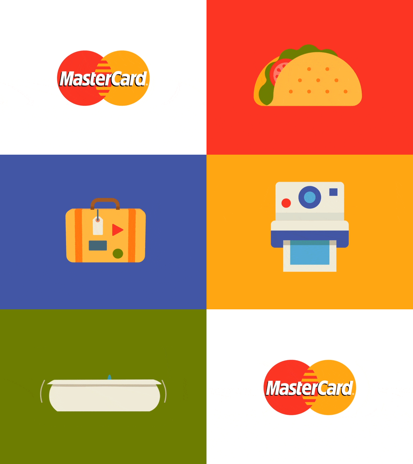
The MasterCard logo is one that is instantly recognisable across the globe. This animated logo grabs the attention of viewers by transforming their traditional venn diagram shape into the kind of things people use MasterCard for – everything from food, to travel, to making memories.
Not only is it visually appealing, it’s an ingenious way to market their product.
2. Burger King

Another brand that is recognisable all over the world is Burger King. This animated logo isn’t as flashy as the MasterCard example, but it certainly demands more attention than a static logo would.
The way the elements animate onto screen one by one is almost reminiscent of the way a burger is made – by stacking one thing on top of the other.
3. FedEx

FedEx experimented with a couple of different logos before landing on the ‘hidden arrow’ design in 1994. This design was so successful that is has remained largely unchanged since then.
In this animated logo, FedEx does something a little different and draws attention to the hidden arrow between the ‘E’ and the ‘X’. The way the letters animate from different directions is also a great nod to their business offering – delivering packages all over the world.
4. Flickr
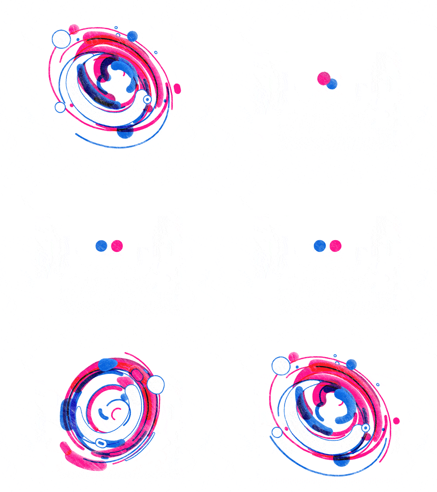
Flickr is an image and video hosting service that people can also use to find stock images and footage to use in their content. This animated logo starts off exactly as their static logo – a blue dot next to a pink dot – but then explodes out into a portal of pink and blue shapes.
This is an interesting way to highlight what they do – ‘we fit all this stuff into our little blue and pink dots!’ – while remaining on-brand.
5. Bundle
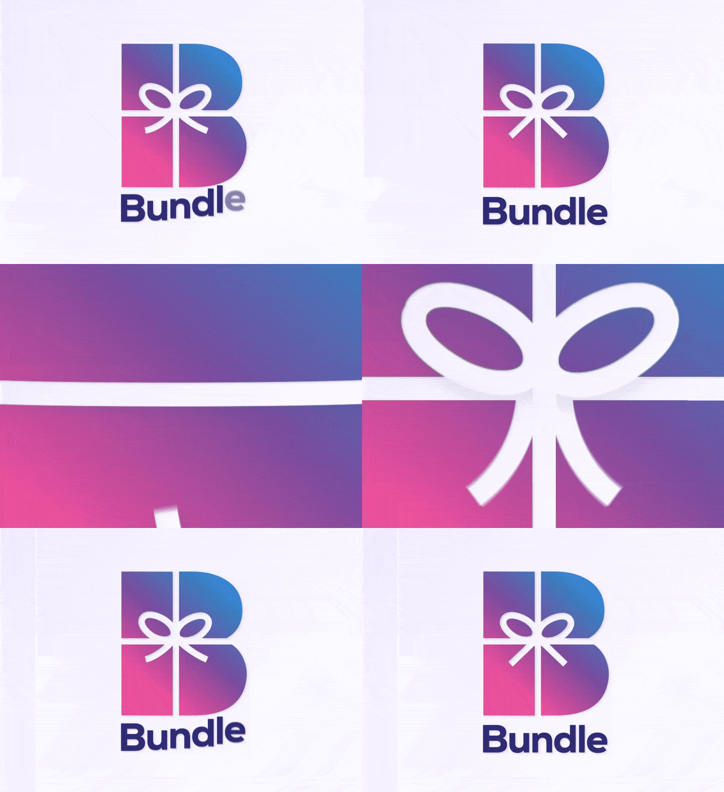
Bundle is a rewards app that consumers can use to earn points when they shop at their favourite stores. This animated logo for the app was created by an artist on Dribbble.
The animation is simple, but does a great job of highlighting what the app does, while also implementing the brand colours.
6. Google
What logo roundup would be complete without Google? Google’s logo has evolved many times over the years, in very subtle ways.
This animated logo still has the ‘Google feel’ in that the font is the same and so are all of the colours. What differs is that, just like the MasterCard example, this animation showcases what users can now do with Google – search by voice.
7. Sello
Sello helps online entrepreneurs to get started selling products in different marketplaces and also in their own webshops. As you can imagine, their audience is far-reaching.
This simple animated logo helps them to appeal to all store owners, from those who want to sell jewelry to those looking at selling sports goods.
8. Firecracker
Firecracker markets itself as: ‘an advanced learning platform for the next generation of physicians.’
Although medicine is advancing all the time, the study of medicine brings to mind late nights in a library, hunched over large, dusty books. As an online platform, Firecracker is disrupting this and so requires a punchy logo to match.
9. Lighthouse No. 6

This animated logo is a concept design from another Dribbble artist. The graphical elements merge together so beautifully that it’s almost like an optical illusion – is it a lighthouse or a number 6? (Hint: it’s both!)
The slick movement of the beam of light from the lighthouse, that then seamlessly stops to form a number 6, is a great embodiment of the brand name.
10. Yondr Studio
Yondr Studio is a design studio based in Edmonds, Washington, known for the Olympic Mountains (the crown jewel of which is the famous Mount Olympus). The landscape of the area is clearly reflected in the logo, but the unique style of the brand is also maintained.
Timing is everything with this animation. Everything happens at just the right moment, from the stars appearing on screen one after the other, to the arrow that flies in at the very last second – a lot happens in a short time, but not one element distracts from another.
Final thoughts
If there’s one thing you can take away from this article, it’s that there are many different ways to use logo animation. All it takes is a little bit of experimentation to find out what works best for your logo.
For more animation tips and tricks, take a look at this article: 11 Types of Animation Styles (With Examples)


