Last updated on 10th January 2024
When you stop to think about it, our lives are just a series of interactions – both micro and macro.
Asking your partner what they want to eat for breakfast is an interaction between two people, but when you make the breakfast you also have micro interactions with all of the appliances around you:
– The toaster pops up to tell you your toast is ready
– The kettle whistles to let you know that it’s boiled
– The egg timer pings to inform you that your eggs are cooked to perfection
These interactions are so small that we go about our lives without ever thinking about them. It’s only when things don’t go as planned that we realise their significance. For example, if the toaster pops up too late and presents you with two slices of burnt bread.
So…why are we telling you all of this?
Well, microinteractions exist in the online world, too. They make your website more welcoming and engaging, and they give customers an element of feedback or satisfaction from completing a task – however tiny.
At the time of writing this article, there are 1.5 billion websites online – that’s a lot of competition. So you need your website to be the best it can be, and in 2024 that means microinteractions!
In this article we’re going to take a look at everything you need to know about microinteractions, from common uses to our top tips…
What is a microinteraction?
According to Dan Saffer, author of the highly-respected book: Microinteractions: Designing with Details, a microinteraction is:
“A contained product moment that revolves around a single use case or task.”
He uses the examples of ‘liking a post’ or ‘setting an alarm’ as common microinteractions that most of us do every day.
Saffer also explains in his book that microinteractions can be broken down into a 4 part structure:
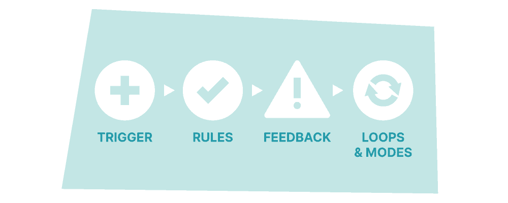
The first step, or ‘trigger’, is what initiates the microinteraction. For example, if you want to wash your hands with a sensor tap then you’ll wave your hand in front of the sensor.
The second step, or ‘rules’, determine what is going to happen. Sticking with the tap example, the sensor recognises your hands.
The third step, or ‘feedback’ is the verification of the microinteraction. This is when the tap starts running, so you can wash your hands.
The final step is ‘loops and modes’, and this determines the meta-rules of the microinteraction. If the microinteraction needs to be repeated, then it will loop – like a refrigerator alarm that won’t stop beeping until you close the door. Modes control actions that do not require repetition.
Of course, this all refers to microinteractions that are triggered by a person. But not all microinteractions happen this way. Some are system-initiated – in other words, triggered by software.
A well-known example is when you enter the wrong password and see the login box do a little shuffle from side to side:

Or when you scroll down a website and see a cool animation that captures your attention:

When someone lands on the Wyzowl homepage, we have a nifty little microinteraction that waves at our new visitor and then gives them a peek into what we can do with animation.
Microinteractions – common uses
Now that you know what microinteractions are, let’s take a look at some popular uses of them in our everyday lives…
1. Scrolling
Did you know that you can trigger a microinteraction just by scrolling down a web page?
Scrolling is one of the most common microinteractions online, and something we often take for granted. The interaction occurs because you, as the user, are changing your location on the page and receiving visual feedback on that – in other words, you see what you want to see.

Some web pages even tell you how far along you are, or how much of the page is left before you get to the bottom, thanks to a scroll bar on the right hand side, like the example above from HubSpot. This, too, is a type of microinteraction.
2. Loading
Loading screens are a familiar sight to anyone who has ever played video games. Over the years they’ve become more and more impressive, take the Skyrim loading screen as an example:
The loading screen features different 3D models that users can interact with while waiting to play the game.
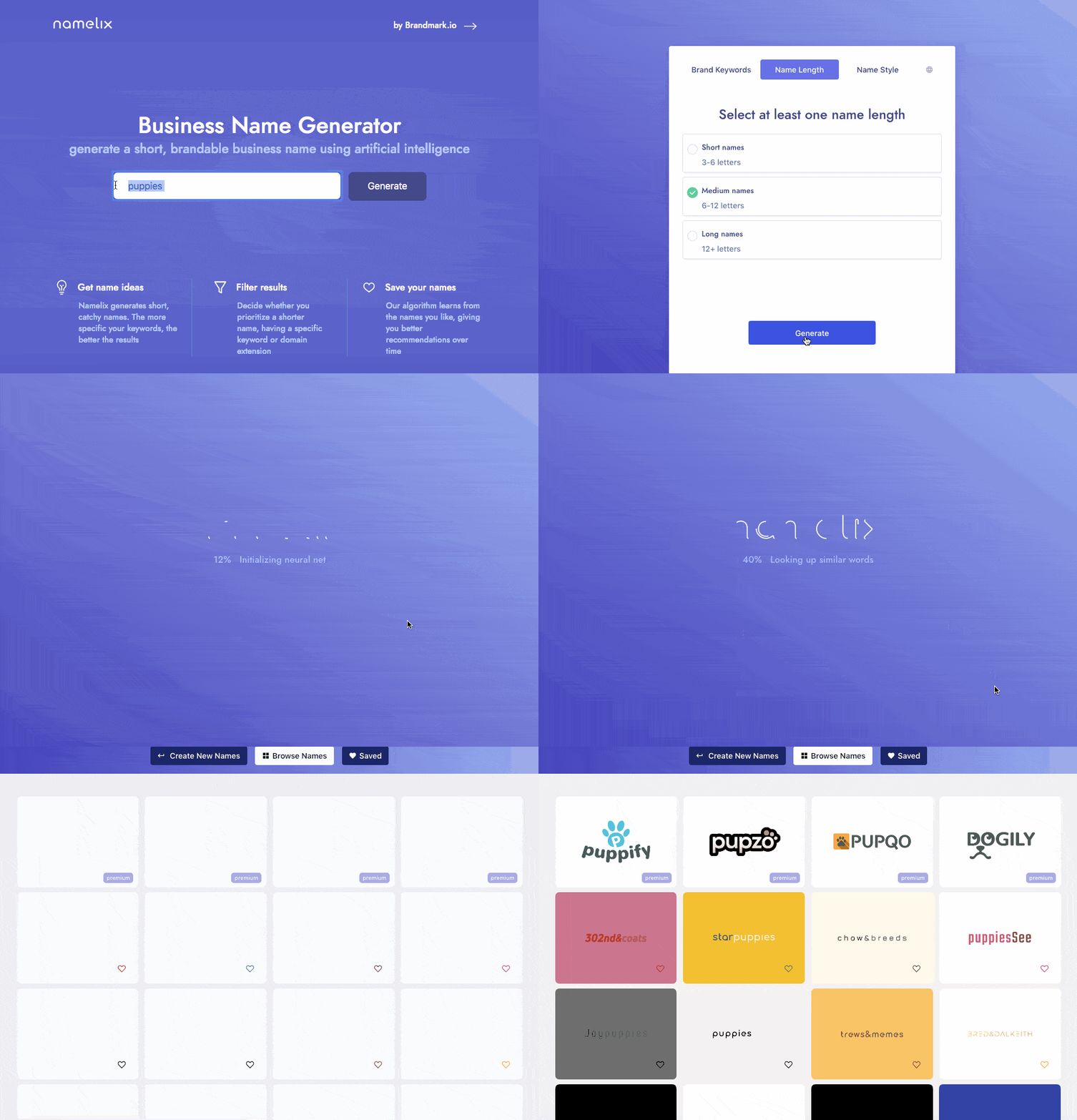
Loading is a necessary evil, but microinteractions can make the process more engaging. If you have a function on your site that requires a little loading time, consider implementing a microinteraction to entertain users in the meantime. Here’s an example from Namelix:
3. Downloading
Similar to loading, downloading is another action that takes time – and, thanks to this world of ‘instant gratification’ that we find ourselves in, users can be impatient.
In fact, a study of 2,000 British people found that the average person finds themselves getting frustrated in just 16 seconds when waiting for something to load.

(Source)
A microinteraction can help entertain users, or hold their attention, while waiting for their download.
4. Calls to action
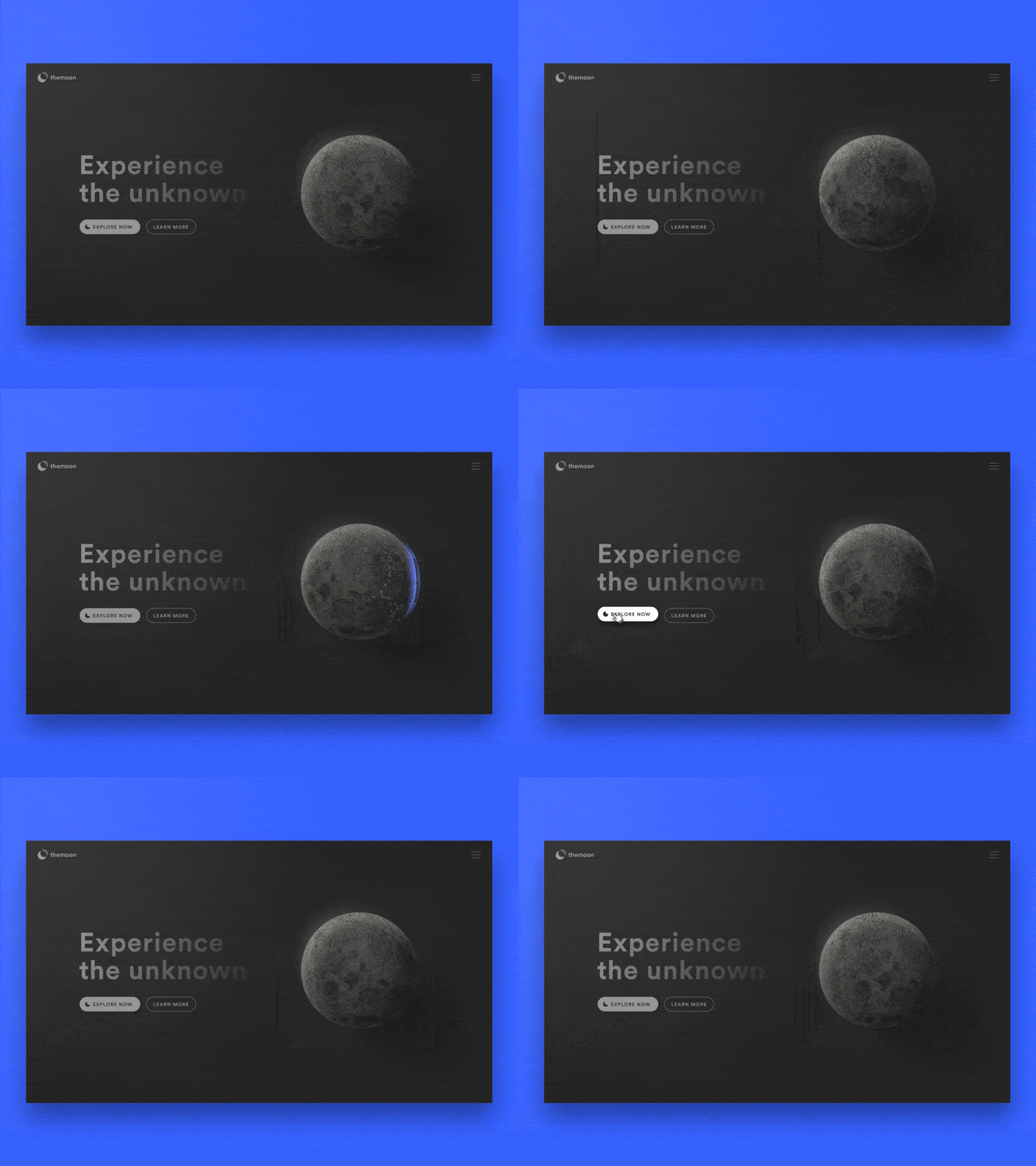
Your call to action is so important. It’s the one thing you want your customers to click, so you should make sure that the experience is tempting for them. You don’t need to reinvent the wheel here (or with any microinteractions), just a subtle animation can be enough to encourage users to click:
(Source)
This example shows users the different cycles of the moon when they hover over the button, capturing their attention further and hopefully enticing them to click.
5. Notifications
A study by the New York Post found that people check their phones every 12 minutes, that’s 80 times a day! And what are they checking for?
Notifications!

(Source)
Microinteractions can make notifications more exciting, and also more noticeable for users. A little bit of movement (as seen above) is much more eye-catching than a still graphic.
6. Swiping
Touchscreens are such a huge part of our lives that swiping has almost become second nature. Microinteractions help to give users an acknowledgement of their swipe:

(Source)
This fun concept for a microinteraction allows users to delete items by swiping. It’s important that users never accidentally delete something, and a microinteraction can make sure this doesn’t happen by demanding focus and attention from the user.
7. Switches
Switching from one view to another, or between folders, is another microinteraction that people use on a daily basis. Here’s an example:

(Source)
This is a really cool and fresh way to show a switch, which is great for customer happiness. But it’s also very functional too, which is super important when it comes to microinteractions.
8. Hovering over something
You may have noticed that when you hover over the like button on Facebook different animated emoticons pop up for you to choose from:

Social networks are all about user engagement, and microinteractions like this encourage users to engage with posts in different ways.
9. Highlighting
A highlighting microinteraction is very similar to hovering over something. It simply lets the user know that there is something there that deserves their attention – whether that’s a clickable icon or just a fun animation:

(Source)
This concept shows different ways that icons can be animated when highlighted, but the possibilities with this one are virtually endless.
10. When connecting devices
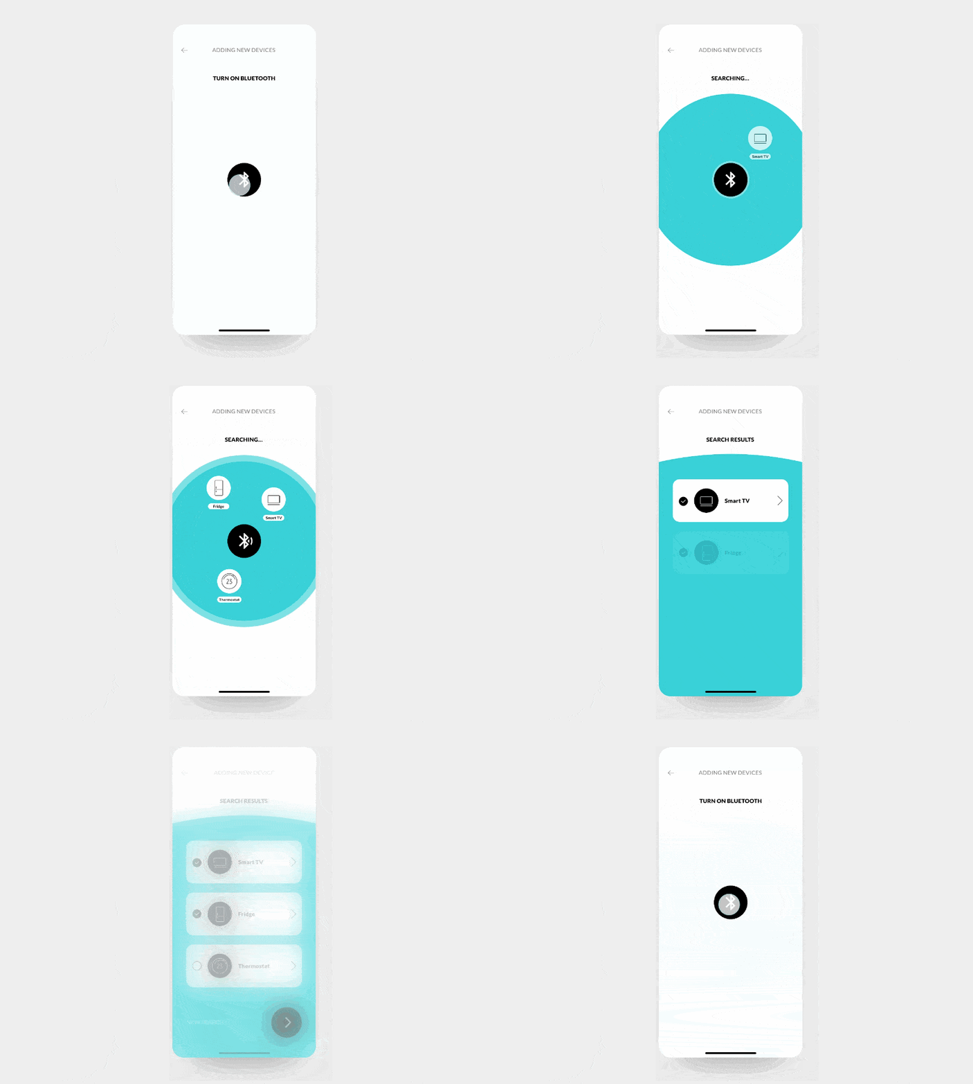
Some microinteractions are ‘nice to have’ and some are very much needed. When you’re connecting devices, you need some kind of feedback that lets you know the connection is working. A microinteraction like this is probably familiar to you:
(Source)
It’s an example of what devices look like when they are searching for another device to connect to via bluetooth. This can take a little bit of time so microinteractions, in additional to being functional, also provide some mild entertainment for users to prevent them from getting bored or frustrated while they wait.
Examples of effective microinteractions
So, it seems that microinteractions are pretty much everywhere! Let’s take a look at some particularly effective examples…
1. Social Share
You may not realise it, but when we share things like videos on social media we always wait for a ‘receipt’ – proof that the post has actually gone live. Here’s an example:

(Source)
This has been drilled into us because it’s how most social networks operate, but it shows that subtle microinteractions are everywhere – and most of the time we don’t even notice them!
2. Typing…
Another common microinteraction that we’ve grown used to seeing is the ‘typing’ functionality that is now part of most messaging apps. Here’s an example:
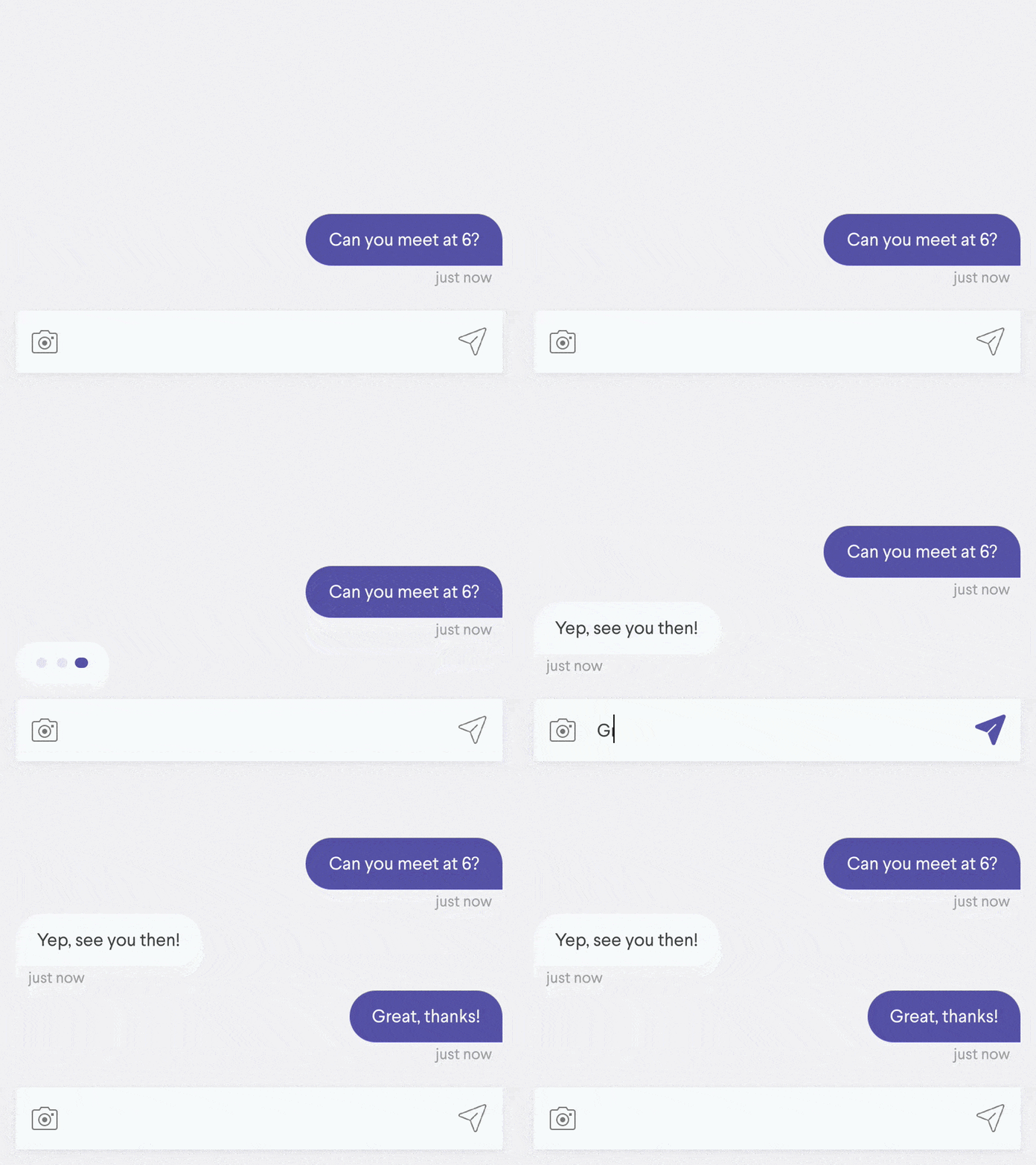
(Source)
This tiny interaction keeps users engaged, with the window open, as they know that a reply is imminent. It also gives users an indication of when to type and when to wait for the other person to finish typing their message.
3. Downloading
We’ve already talked about downloading above, but of course, some microinteractions are better than others. Here’s a great example of a downloading microinteraction:

(Source)
Although it may not seem like it, there’s a lot happening here. There is a counter and also a green bar travelling across, symbolising the progress of the download. Once the microinteraction is complete, the download button switches to ‘Done’ and turns green.
This is just one example of how to create a downloading microinteraction – the possibilities are practically endless!
4. Pull to refresh
‘Pull to refresh’ is a common interaction on most smart devices, but the only way to know that the page has actually refreshed is if there is some kind of microinteraction to show you that the software understood your request.
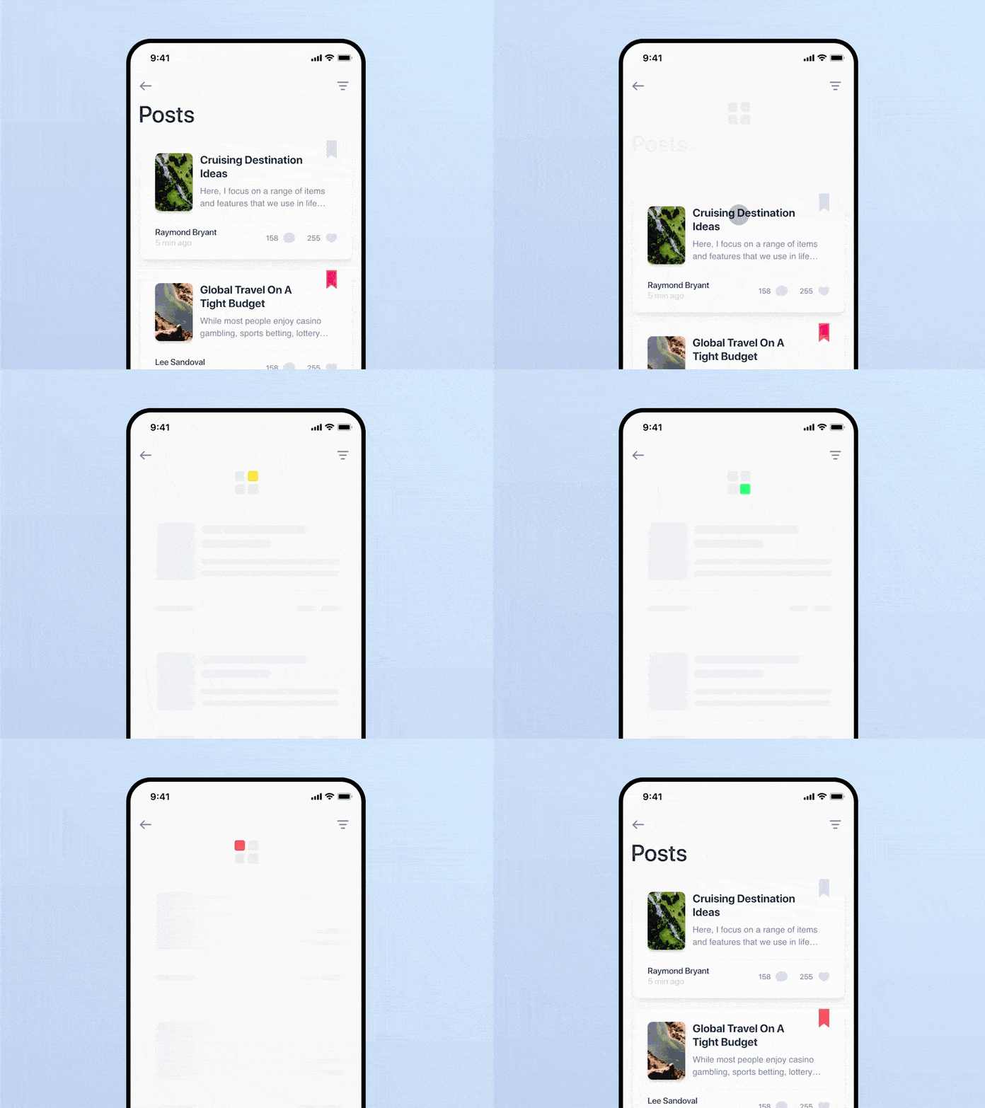
(Source)
This design concept for a refresh animation is great because it’s clean and clear, but also nicely branded. Presenting a brand consistently across all platforms can increase revenue by up to 23%.
5. Swipe
Another interaction that we’ve grown used to as software users is the ‘swipe’. As mentioned above, swiping is now almost second nature for people who use smart devices. Here’s an example:
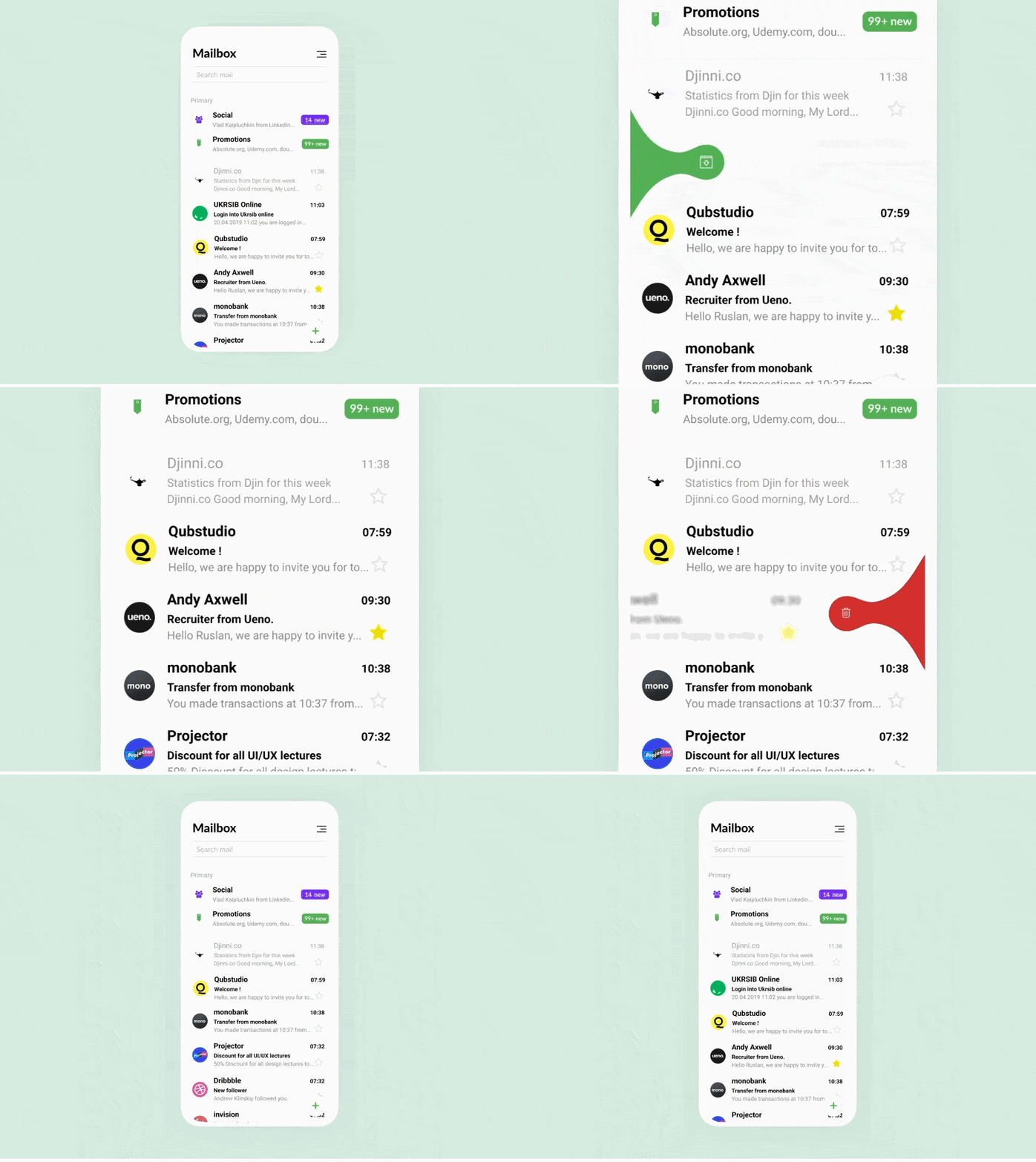
(Source)
This example shows a playful way to delete and archive emails with a simple swipe. The colours red and green make it easy for users to distinguish between each option.
Creating microinteractions – 5 top tips
We’ve looked at A LOT of microinteractions so far, and, if you don’t have any on your site then perhaps you’re feeling a little bit of FOMO (fear of missing out). Let’s change that!
Here are our 5 top tips for creating microinteractions…
1. Make them functional
First thing’s first, microinteractions must have a purpose. After all, they’re supposed to encourage users to interact with a certain part of your website – so make them functional.
2. Keep it simple
They’re called microinteractions for a reason. They should be short and sweet. Microinteractions are there to improve your UI and make everything look and feel cleaner, so keeping them simple is key.
3. Follow the structure
When it comes to microinteractions, Dan Saffer knows his stuff. So make sure that your microinteractions follow his 4 part structure. Remember: Trigger > Rules > Feedback > Loops & Modes.
4. Think about longevity
One of the key things that we’ve mentioned time and time again is that microinteractions are supposed to feel so natural that users don’t even notice them most of the time. And if they do, it should be because they’ve had a pleasant experience, not because they’re fed up of seeing a distracting or over-elaborate animation.
So, when creating your microinteractions think about how they’ll hold up over time.
5. Experiment and test
As with anything that you’re rolling out to the public, microinteractions need to be tested and improved upon. Make sure you gather lots of user feedback from your microinteractions, and experiment with different ways of doing things.
Final thoughts
In 2024, it’s safe to predict that users will want more from their interactions. And one way to ensure that you’re meeting that need is with subtle, but useful, microinteractions.
We hope this article has been helpful for teaching you all about how they work and that you feel inspired to create your own. If you’re ready to get started, we actually create microinteractions as a service – covering everything from conception to design and animation.


